Last modified: August 22, 2025
The Input component renders a text input field where a user can enter a custom text value. Like other inputs, this component should only be used within a Form that has a submit button.
design-guidelines-input
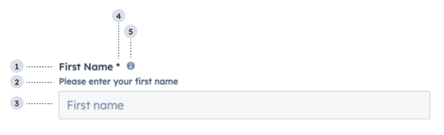
  1. Label: the input’s label.
  2. Description: the text that describes the field’s purpose.
  3. Placeholder: the placeholder value that displays when no value has been entered.
  4. Required field indicator: communicates to the user that the field is required for form submission.
  5. Tooltip: on hover, displays additional information about the field.
import { useState } from 'react';
import { Form, Input } from '@hubspot/ui-extensions';

const Extension = () => {
  const [name, setName] = useState('');
  const [validationMessage, setValidationMessage] = useState('');
  const [isValid, setIsValid] = useState(true);

  return (
    <Form>
      <Input
        label="First Name"
        name="first-name"
        tooltip="Please enter your first name"
        description="Please enter your first name"
        placeholder="First name"
        required={true}
        error={!isValid}
        validationMessage={validationMessage}
        onChange={(value) => {
          setName(value);
        }}
        onInput={(value) => {
          if (value !== 'Bill') {
            setValidationMessage('This form only works for people named Bill');
            setIsValid(false);
          } else if (value === '') {
            setValidationMessage('First name is required');
            setIsValid(false);
          } else {
            setValidationMessage('Valid first name!');
            setIsValid(true);
          }
        }}
      />
      <Input
        label="Password"
        name="password"
        description="Enter your password"
        placeholder="Password"
        onInput={() => {}}
        type="password"
      />
    </Form>
  );
};
PropTypeDescription
nameStringThe input’s unique identifier, similar to the HTML input element name attribute.
labelStringThe text that displays above the input. Required if inputType is not set to hidden.
requiredBooleanWhen set to true, displays a required field indicator.
valueFunctionThe value of the input.
type'text' (default) | 'password'The type of input. An input with the 'password' type will hide the characters that the user types.
readOnlyBooleanWhen set to true, users will not be able to enter a value into the field.
descriptionStringDisplayed text that describes the field’s purpose.
tooltipStringThe text that displays in a tooltip next to the input label.
placeholderStringThe text that appears in the input before a value is set.
errorBooleanWhen set to true, validationMessage is displayed as an error message if provided. The input will also render in an error state so that users are aware. If left false, validationMessage is displayed as a success message.
validationMessageStringThe text to show if the input has an error.
onChange(value: string) => voidA callback function that is invoked when the value is committed. Currently, these are onBlur of the input and when the user submits the form.
onInput(value: string) => voidA function that is called and passes the value when the field is edited by the user. Should be used for validation. It’s recommended that you don’t use this value to update state (use onChange instead).
onBlur(value: string) => voidA function that is called and passes the value when the field loses focus.
onFocus(value: string) => voidA function that is called and passed the value when the field gets focused.

Usage example

Use for form fields where a user can enter any text value, such as email address or name.

Guidelines

  • DO: make label and description text concise and clear.
  • DO: include placeholder text to help users understand what’s expected in the field.
  • DO: indicate if a field is required.
  • DO: include clear validation error messages so that users know how to fix errors.
  • DON’T: use this component for long responses, such as open-ended comments or feedback. Instead, use the TextArea component.
  • DON’T: use placeholder text for critical information, as it will disappear once users begin to type. Critical information should be placed in the label and descriptive text, with additional context in the tooltip if needed.