The LoadingSpinner component renders a visual indicator for when an extension is loading or processing data.
- Label: the text that describes the loading state.
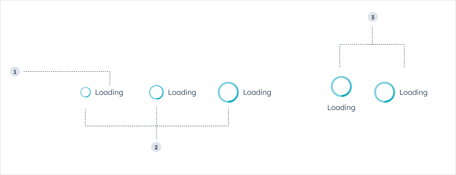
- Size: the size of the component. From left to right: extra small (
'xs'), small ('sm', default), medium ('md').
- Layout: the positioning of the spinner. From left to right:
inline, centered.
Props
Usage examples
- A loading state after the user submits form data to an external system (e.g., “Submitting contact details”).
- A loading state as the card retrieves customer purchase history from an external system (e.g., “Loading purchase history”).
Guidelines
- DO: keep label text as concise as possible.
- DO: use label text to describe what’s happening during the loading process.
- DO: use complete sentences in label text.
- DON’T: include multiple loading spinners at once in a single card to avoid confusion.
Last modified on March 29, 2026