Last modified: August 22, 2025
The NumberInput component renders a number input field. Commonly used within the Form component.
design-guidelines-number-input
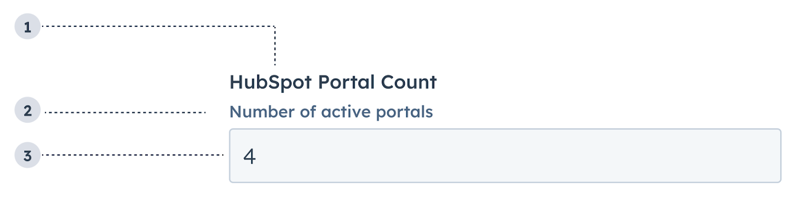
  1. Label: the input’s label.
  2. Description: the text that describes the field’s purpose.
  3. Value: an entered value.
import { NumberInput } from '@hubspot/ui-extensions';

const Extension = () => {
  const [portalCount, setPortalCount] = useState(0);
  return (
    <NumberInput
      label={'HubSpot Portal Count'}
      name="portalsNumber"
      description={'Number of active portals'}
      placeholder={'number of portals'}
      value={portalCount}
      onChange={(value) => setPortalCount(value)}
    />
  );
};
PropTypeDescription
nameStringThe input’s unique identifier.
labelStringThe text that displays above the dropdown menu.
valueString | numberThe value of the input.
defaultValueNumberThe value of the input on initial render.
descriptionStringText that describes the field’s purpose.
requiredBooleanWhen set to true, displays a required field indicator.
readOnlyBooleanWhen set to true, users will not be able to enter a value into the field. Set to false by default.
placeholderStringThe text that appears in the input before a value is set.
tooltipStringThe text that displays in a tooltip next to the label.
errorBooleanWhen set to true, validationMessage is displayed as an error message if provided. The input will also render its error state to let the user know there’s an error. When false (default), validationMessage is displayed as a success message.
validationMessageStringThe text to display if the input has an error.
minNumberSets the lower bound of the input.
maxNumberSets the upper bound of the input.
precisionNumberSets the number of digits to the right of the decimal point.
formatStyle'decimal' | 'percentage'Formats the input as a decimal or percentage.
onBlur(value: number) => voidA function that is called every time the field loses focus, passing the value.
onChange(value: number) => voidA callback function that is invoked when the value is committed. Currently these times are onBlur of the input and when the user submits the form.
onFocus(value: number) => voidA function that is called every time the field gets focused on, passing the value.

Usage example

A field in a form where salespeople can enter the total deal amount.

Guidelines

  • DO: make label and description text concise and clear.
  • DO: include placeholder text to help users understand what’s expected in the field.
  • DO: indicate if there is a minimum or maximum number requirement.
  • DO: indicate if a field is required.
  • DO: include clear validation error messages so that users know how to fix errors.
  • DON’T: use this component for long responses, such as open-ended comments or feedback. Instead, use the TextArea component.
  • DON’T: use placeholder text for critical information, as it will disappear once users begin to type. Critical information should be placed in the label and descriptive text, with additional context in the tooltip if needed.