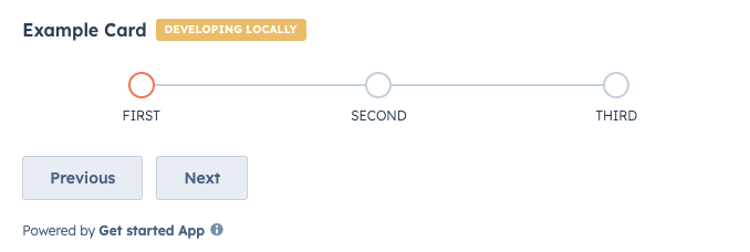
StepIndicator component renders an indicator to show the current step of a multi-step process.
Props
Variants
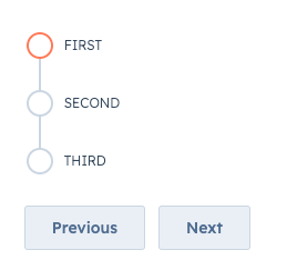
By default, the step indicator will be laid out horizontally, but you can use thedirection prop to set the orientation to vertical instead.
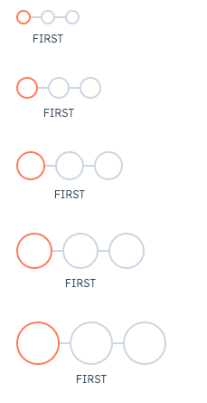
circleSize prop, ranging from 'xs'/'extra-small' to 'xl'/'extra-large'.