Use the AutoGrid component to arrange components into columns based on available space and specified column width restraints. Includes two modes: fixed column sizing (default), and flexible column sizing. For both modes, the layout will be responsive automatically, whether you’re using it in an app card, app home page, or app settings page.
import { AutoGrid, Tile } from "@hubspot/ui-extensions";
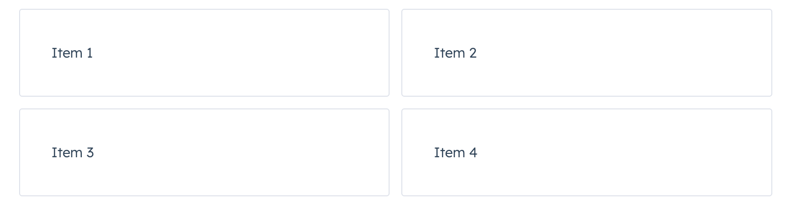
<AutoGrid columnWidth={250} gap="small">
<Tile>Item 1</Tile>
<Tile>Item 2</Tile>
<Tile>Item 3</Tile>
<Tile>Item 4</Tile>
</AutoGrid>;
Props
Examples
Flexible grid with minimum column width
With flexible set to true, the specified columnWidth is used as a minimum width. Compare the width of the tiles in this example to the example at the top of the page, which doesn’t include flexible={true}.
import { AutoGrid, Tile } from "@hubspot/ui-extensions";

<AutoGrid columnWidth={250} gap="small" flexible={true}>
  <Tile>Item 1</Tile>
  <Tile>Item 2</Tile>
  <Tile>Item 3</Tile>
  <Tile>Item 4</Tile>
</AutoGrid>;
Fixed card layout with large gap
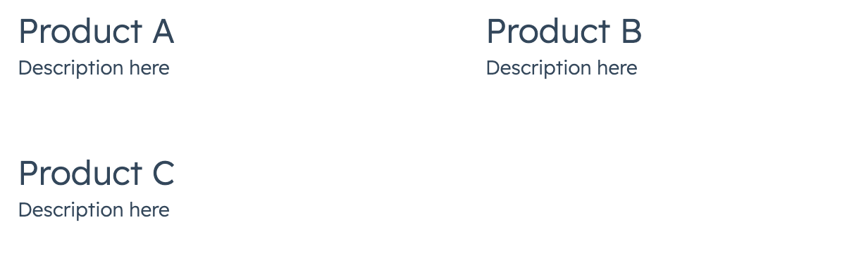
import { AutoGrid, Card, Heading, Text } from "@hubspot/ui-extensions";

<AutoGrid columnWidth={300} gap="large" flexible={false}>
  <Card>
    <Heading>Product A</Heading>
    <Text>Description here</Text>
  </Card>
  <Card>
    <Heading>Product B</Heading>
    <Text>Description here</Text>
  </Card>
</AutoGrid>;
Last modified on January 30, 2026