The Box component renders an empty div container for fine tuning the spacing of components. Commonly used with the Flex component.
To see an example of how Flex and Box can be used for layout, check out HubSpot’s Manage layouts: Flex and Box sample project.
import { Flex, Box, Tile } from "@hubspot/ui-extensions";
const Extension = () => {
return (
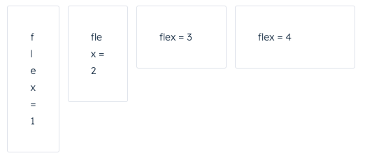
<Flex direction={"row"} justify={"start"} gap={"small"}>
<Box flex={1}>
<Tile>flex = 1</Tile>
</Box>
<Box flex={2}>
<Tile>flex = 2</Tile>
</Box>
<Box flex={3}>
<Tile>flex = 3</Tile>
</Box>
<Box flex={4}>
<Tile>flex = 4</Tile>
</Box>
</Flex>
);
};
Props
| Prop | Type | Description |
|---|
alignSelf | 'start' | 'center' | 'end' | 'baseline' | 'stretch' | Distributes a child component along the cross-axis using the available free space. Use this prop for nested Box components to align them differently from other child components in the Flex group. |
flex | 'initial' | 'auto' (default) | 'none' | Number | Distributes components based on the available empty space around them. Options are as follows:initial: The item is sized according to its width and height properties. It shrinks to its minimum size to fit the container, but does not grow to absorb any extra free space in the flex container. auto: The item is sized according to its width and height properties, but grows to absorb any extra free space in the flex container, and shrinks to its minimum size to fit the container.none: The item is sized according to its width and height properties. It is fully inflexible: it neither shrinks nor grows in relation to the flex container.- Number: tells a component to fill all available space, shared evenly amongst other components with the same parent. The larger the flex given, the higher the ratio of space a component will take compared to its siblings.
|
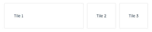
Box as a wrapper for components that you want to adjust. For example, if you wrap one component in a Box with a flex value, only that one component will have its width adjusted based on the available empty space.
<Flex direction={"row"} justify={"start"} gap={"small"}>
  <Box flex={1}>
    <Tile>Tile 1</Tile>
  </Box>
  <Tile>Tile 2</Tile>
  <Tile>Tile 3</Tile>
</Flex>;
Usage examples
Using numbers in flex
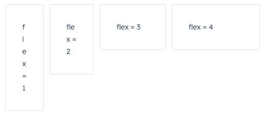
Use the flex prop in a Box component to assign any extra spacing to components using either a default value (e.g. auto) or a specific number. When using a number, the components will be distributed based on the ratio of their assigned numbers. This also means that, when assigning a flex value for only one Box, you can use any number, because any number by itself will result in all available space being assigned to that Box.
For example, the four tiles below take up an increasing amount of space based on their flex values.
<Flex direction={"row"} justify={"start"} gap={"small"}>
  <Box flex={1}>
    <Tile>flex = 1</Tile>
  </Box>
  <Box flex={2}>
    <Tile>flex = 2</Tile>
  </Box>
  <Box flex={3}>
    <Tile>flex = 3</Tile>
  </Box>
  <Box flex={4}>
    <Tile>flex = 4</Tile>
  </Box>
</Flex>;
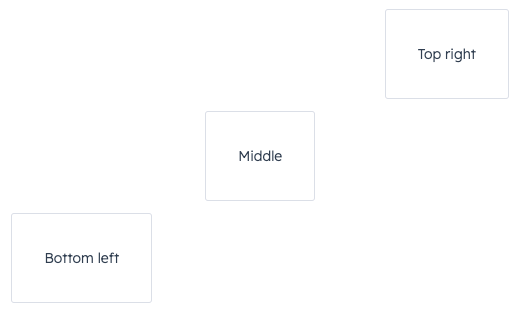
Using alignSelf
Use the alignSelf prop to override alignment rules for individual Box components.
<Flex direction={"column"} gap={"small"} align={"start"}>
  <Box alignSelf={"end"}>
    <Tile>Top right</Tile>
  </Box>
  <Box alignSelf={"center"}>
    <Tile>Middle</Tile>
  </Box>
  <Tile>Bottom left</Tile>
</Flex>;
Last modified on January 28, 2026