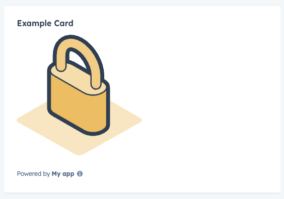
Illustration component renders an illustration from HubSpot’s illustration library. Use this component to add a visual indicator to your app card.
Props
| Prop | Type | Description |
|---|---|---|
alt | String | The illustration’s alt text for accessibility. Default value is <name> illustration. |
height | Number | The height of the illustration in pixels. |
name | String | The name of the illustration. See available illustrations. |
width | Number | The width of the illustration in pixels. |
Available illustrations

addOnReporting
api
automatedTesting
callingSetUp
companies
contacts
contentStrategy
customObjects
customerExperience
customerSupport
deals
developerSecurityUpdate
electronicSignature
electronicSignatureEmptyState
emailConfirmation
emptyStateCharts
errorGeneral
errorHourglass
integrations
leads
lock
meetings
middlePaneCards
multipleObjects
object
paymentsButton
productsShoppingCart
propertiesSidebar
registration
sandboxAddOn
sidebar
social
store
storeDisabled
successfullyConnectedEmail
target
task
tickets
unlock