Text component renders text with formatting options.
Props
Variants
Using theformat prop, you can style text with a number of options:
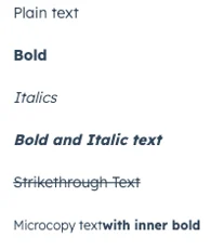
{fontWeight: 'bold'}: sets the text to bold.{fontWeight: 'demibold'}: sets the text to a lighter bold.{italic: true}: sets the text to italics.{lineDecoration: 'strikethrough'}: adds a strikethrough to the text.{lineDecoration: 'underline'}: underlines the text.{textTransform: 'none'}: no capitalization changes (default){textTransform: 'uppercase'}: transforms all characters to uppercase{textTransform: 'lowercase'}: transforms all characters to lowercase{textTransform: 'capitalize'}: capitalizes the first letter of each word{textTransform: 'sentenceCase'}: capitalizes the first letter of the text and makes the rest lowercase<Text inline={true}>: enables you to set text styling within the same line by adding more text without breaking the line if possible. Line will still break when text content would extend past the boundaries of its container. For example:<Text>Text <Text inline={true} format={{fontWeight: 'bold'}}> with inner bold.</Text>.
variant prop.
variant="bodytext"(default)

variant="microcopy"

Usage examples
- Use body text when you want to display a summary of the last call with a contact.
- Use microcopy to include an explanation of a displayed status on a contact record.
Guidelines
- DO: use text with clear messaging.
- DO: use text formatting thoughtfully. For example, don’t bold all of the text that can be seen. Instead, only bold key words and phrases for easier scanning.
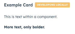
- DON’T: use the text component for the primary textual information on a card. Instead, consider using the Heading component.
- DON’T: use underline formatting for text that’s next to a hyperlink, as it will also look clickable.
- DON’T: use microcopy for important or critical information. Instead, consider whether an Alert component would fit better.
- DON’T: use text components in place of headers, alerts, and errors.