> ## Documentation Index
> Fetch the complete documentation index at: https://developers.hubspot.com/docs/llms.txt
> Use this file to discover all available pages before exploring further.
---
id: 7e71495e-b64b-4777-b42d-5817c905f019
---
# Create an app home page
> Learn how to create a home page for your app.
export const MinimumCliVersion = () =>
The latest version of the HubSpot CLI, which is recommended, is 8.8.0. You can check which version of the CLI you have installed by running hs --version.
;
[App pages](/apps/developer-platform/add-features/ui-extensions/extension-points/app-pages/overview) are a newer extension point and provide additional functionality compared to the app home page feature described in this article. While app home pages are still supported, it's recommended you try out app pages to leverage new components and features such as page routing and passing parameters between pages.
App home pages let you create a custom landing experience for users when they navigate to your app in HubSpot. Built with React and powered by the [UI extensions SDK](/apps/developer-platform/add-features/ui-extensions/ui-extensions-sdk), home pages are built with the same toolkit available for [app cards](/apps/developer-platform/add-features/ui-extensions/extension-points/app-cards/create-an-app-card) and [settings pages](/apps/developer-platform/add-features/ui-extensions/extension-points/create-a-settings-page), including HubSpot's UI components and data fetching utilities.
Below, learn how to create an app home page on the latest versions of the developer platform (`2025.2` and `2026.03`).
## Prerequisites
* If you haven't done so yet, [create a new app](/getting-started/quickstart).
* Ensure you've installed the latest version of the [HubSpot CLI](/developer-tooling/local-development/hubspot-cli/install-the-cli).
## Create an app home page
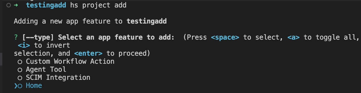
To add a home page component to an existing app, use the terminal to navigate into your local project directory, then run the following command:
```shell theme={null}
hs project add
```
Then, when prompted to select a component to add, select **Home**.
A new `pages/` directory will be created in the project's `src/app/` directory. The `pages/` directory will contain:
* A JSON configuration file (`*-hsmeta.json`)
* A React component file (`.tsx`)
* A `package.json` file
```shell theme={null}
myProject
└── src/
└── app/
└── pages/
├── home-hsmeta.json
├── Home.tsx
└── package.json
```
```json theme={null}
{
"uid": "app-home",
"type": "page",
"config": {
"entrypoint": "/app/pages/Home.tsx",
"location": "home"
}
}
```
```tsx theme={null}
import React from "react";
import { EmptyState, Text, hubspot } from "@hubspot/ui-extensions";
import {
HeaderActions,
PrimaryHeaderActionButton,
SecondaryHeaderActionButton,
} from "@hubspot/ui-extensions/pages/home";
hubspot.extend<"home">(({ context }) => {
return ;
});
const NewHomesPage = ({ context }) => {
return (
<>
console.log("P1")}>Primary 1
console.log("S1")}>Secondary 1
console.log("S2")}>Secondary 2
Build your application home page here!
);
};
```
```json theme={null}
{
"name": "hubspot-example-extension",
"version": "0.1.0",
"license": "MIT",
"dependencies": {
"@hubspot/ui-extensions": "latest",
"react": "^18.2.0"
},
"devDependencies": {
"typescript": "^5.3.3"
}
}
```
To upload your home page to HubSpot:
* Run `hs project install-deps` from within your local project directory to install necessary dependencies. This will create a `package-lock.json` file, which will speed up the project build time and ensure that any dependencies in your local development environment and production match.
* Then, run `hs project upload`.
* After the project finishes deploying, open the project in HubSpot by running `hs project open`. Alternatively, in HubSpot you can navigate to **Development** > **Projects**, then click the **name** of your project.
* Your home component should now be listed on the details page.
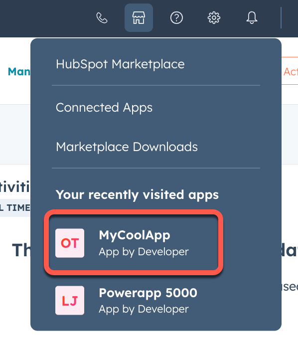
 ## View the app home page in HubSpot
To verify the home page is working correctly:
* In the HubSpot account where you've installed the app, click the **Marketplace** icon.
* In the *Your recently visited apps* section, click the **name of the app** to open the app's overview page.
## View the app home page in HubSpot
To verify the home page is working correctly:
* In the HubSpot account where you've installed the app, click the **Marketplace** icon.
* In the *Your recently visited apps* section, click the **name of the app** to open the app's overview page.
 If your app doesn't appear in the dropdown menu, or if you have more than three apps installed, you can access your app home page directly at the following URL:
`https://app.hubspot.com/app/{HubID}/{appId}`
If your app doesn't appear in the dropdown menu, or if you have more than three apps installed, you can access your app home page directly at the following URL:
`https://app.hubspot.com/app/{HubID}/{appId}`
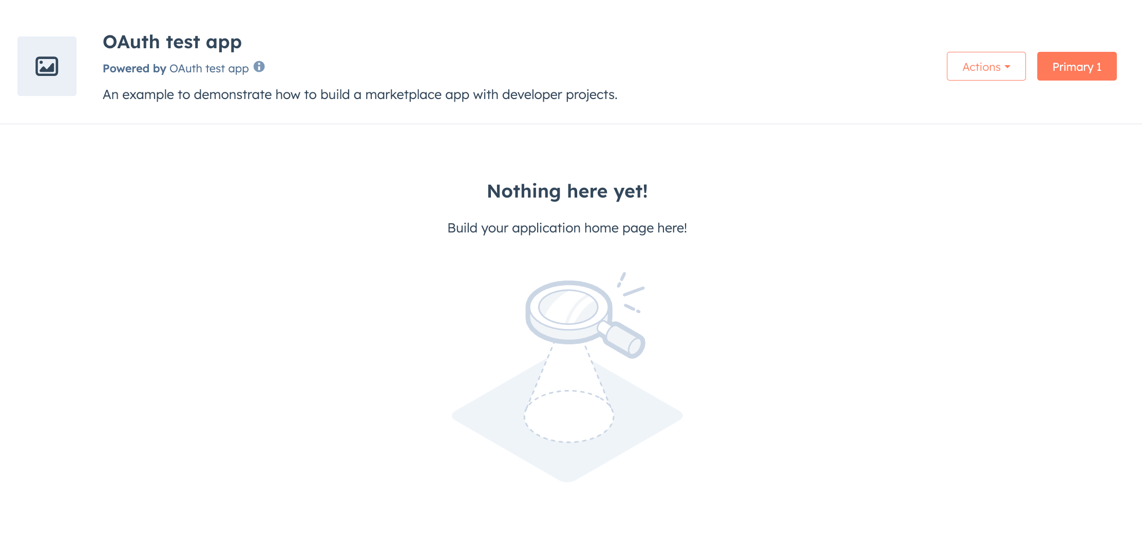 You can now continue to build out your app's home page as needed. Similar to building app cards, you'll use the UI extensions SDK to add functionality and visual elements to your home page. Note that all the existing limitations around building UI extensions apply to building a settings page.
* Use `hubspot.fetch` to leverage your backend to save and retrieve settings. Learn more about using this approach in the legacy documentation.
* Check out the reference documentation on [standard components](/apps/developer-platform/add-features/ui-extensions/ui-components/overview) for how to use React components when building your extension, or use the component in the [Figma Design Kit](/apps/developer-platform/add-features/ui-extensions/ui-components/figma-design-kit).
* Use the `hs project dev` command to iteratively build out your settings page and preview your changes locally.
The local development server will only pick up changes saved to the front-end React file. If you update the `*-hsmeta.json` or `package.json` files, you'll need to stop the server, upload your changes, then start the server again.
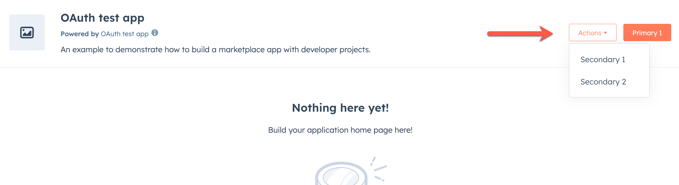
## Home page components
In addition to the full set of [UI components](/apps/developer-platform/add-features/ui-extensions/ui-components/overview), there are three UI components specific to app home pages that you can use together to add action buttons to the header area:
* ``
* ``
* ``
To use these components, you'll need to be on version `0.10.0` or later of the `ui-extensions` NPM package. You can check your current version by running `npm list` or `npm list -g`, and install the latest version by running `npm i @hubspot/ui-extensions`.
These components imported from `@hubspot/ui-extensions/pages/home`.
You can now continue to build out your app's home page as needed. Similar to building app cards, you'll use the UI extensions SDK to add functionality and visual elements to your home page. Note that all the existing limitations around building UI extensions apply to building a settings page.
* Use `hubspot.fetch` to leverage your backend to save and retrieve settings. Learn more about using this approach in the legacy documentation.
* Check out the reference documentation on [standard components](/apps/developer-platform/add-features/ui-extensions/ui-components/overview) for how to use React components when building your extension, or use the component in the [Figma Design Kit](/apps/developer-platform/add-features/ui-extensions/ui-components/figma-design-kit).
* Use the `hs project dev` command to iteratively build out your settings page and preview your changes locally.
The local development server will only pick up changes saved to the front-end React file. If you update the `*-hsmeta.json` or `package.json` files, you'll need to stop the server, upload your changes, then start the server again.
## Home page components
In addition to the full set of [UI components](/apps/developer-platform/add-features/ui-extensions/ui-components/overview), there are three UI components specific to app home pages that you can use together to add action buttons to the header area:
* ``
* ``
* ``
To use these components, you'll need to be on version `0.10.0` or later of the `ui-extensions` NPM package. You can check your current version by running `npm list` or `npm list -g`, and install the latest version by running `npm i @hubspot/ui-extensions`.
These components imported from `@hubspot/ui-extensions/pages/home`.
 ```tsx theme={null}
import {
HeaderActions,
PrimaryHeaderActionButton,
SecondaryHeaderActionButton,
} from "@hubspot/ui-extensions/pages/home";
console.log("P1")}>Primary
console.log("S1")}>Secondary 1
console.log("S2")}>Secondary 2
;
```
Below, learn more about each component.
### HeaderActions
The `HeaderActions` component is the main wrapper component for the primary and secondary header action button components. It's recommended to only include one instance of `HeaderActions` in your app, and to avoid adding/removing it dynamically which can result in unexpected behavior.
Only `PrimaryHeaderActionButton` and `SecondaryHeaderActionButton` are supported as children.
```jsx theme={null}
import { HeaderActions, PrimaryHeaderActionButton } from "@hubspot/ui-extensions/pages/home";
Primary button
;
```
### PrimaryHeaderActionButton
The `PrimaryHeaderActionButton` component renders an orange button, and should be used for the primary action on the home page. `HeaderActions` can contain only one instance of `PrimaryHeaderActionButton`. For additional buttons, use `SecondaryHeaderActionButton`.
```tsx theme={null}
import {
HeaderActions,
PrimaryHeaderActionButton,
SecondaryHeaderActionButton,
} from "@hubspot/ui-extensions/pages/home";
console.log("P1")}>Primary
console.log("S1")}>Secondary 1
console.log("S2")}>Secondary 2
;
```
Below, learn more about each component.
### HeaderActions
The `HeaderActions` component is the main wrapper component for the primary and secondary header action button components. It's recommended to only include one instance of `HeaderActions` in your app, and to avoid adding/removing it dynamically which can result in unexpected behavior.
Only `PrimaryHeaderActionButton` and `SecondaryHeaderActionButton` are supported as children.
```jsx theme={null}
import { HeaderActions, PrimaryHeaderActionButton } from "@hubspot/ui-extensions/pages/home";
Primary button
;
```
### PrimaryHeaderActionButton
The `PrimaryHeaderActionButton` component renders an orange button, and should be used for the primary action on the home page. `HeaderActions` can contain only one instance of `PrimaryHeaderActionButton`. For additional buttons, use `SecondaryHeaderActionButton`.
 ```jsx theme={null}
import {
HeaderActions,
PrimaryHeaderActionButton
} from '@hubspot/ui-extensions/pages/home';
// Basic primary button
saveData()}>
Save changes
// Primary button as link
View details
```
| Prop | Type | Description |
| --------------------- | ---------------- | ------------------------------------------------------------------------------------------------------------------------------------------------------------------------------------------------------------------------------------------------------------------------------------------------------------------------------------------------------------------------------------------------------------------------------------------------------------------------------------------------------------------------------------------------------------ |
| `children` (required) | ReactNode | The button text or content. |
| `onClick` | `() => void` | A function that will be invoked when the button is clicked. It receives no arguments and it’s return value is ignored. |
| `href` | String \| Object | Include this prop to open a URL on click. Contains the following fields:
```jsx theme={null}
import {
HeaderActions,
PrimaryHeaderActionButton
} from '@hubspot/ui-extensions/pages/home';
// Basic primary button
saveData()}>
Save changes
// Primary button as link
View details
```
| Prop | Type | Description |
| --------------------- | ---------------- | ------------------------------------------------------------------------------------------------------------------------------------------------------------------------------------------------------------------------------------------------------------------------------------------------------------------------------------------------------------------------------------------------------------------------------------------------------------------------------------------------------------------------------------------------------------ |
| `children` (required) | ReactNode | The button text or content. |
| `onClick` | `() => void` | A function that will be invoked when the button is clicked. It receives no arguments and it’s return value is ignored. |
| `href` | String \| Object | Include this prop to open a URL on click. Contains the following fields:- `url` (string): the URL that will open on click.
- `external` (boolean): set to `true` to open the URL in a new tab and display an external link icon. By default:
- Links to HubSpot app pages will open in the same tab and will not include an icon.
- Links to non-HubSpot app pages will open in a new tab and include the icon.
When a button includes both `href` and an `onClick` action, both will be executed on button click. |
| `disabled` | Boolean | When set to `true`, the button will render in a greyed-out state and cannot be clicked. |
| `overlay` | Object | Include a [Modal](/apps/developer-platform/add-features/ui-extensions/ui-components/standard-components/modal) or [Panel](/apps/developer-platform/add-features/ui-extensions/ui-components/standard-components/panel) component in this object to open it as an overlay on click. Learn more about [using overlays](/apps/developer-platform/add-features/ui-extensions/ui-extensions-sdk#open-overlays). |
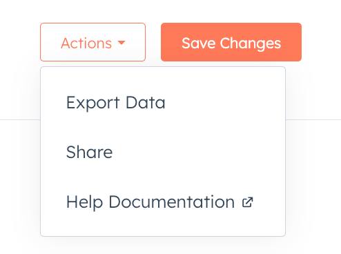
### SecondaryHeaderActionButton
The `SecondaryHeaderActionButton` component renders additional buttons that appear in an *Actions* dropdown menu next to the primary button. You can include multiple secondary buttons, and each will appear as another item in the *Actions* dropdown menu.
 ```jsx theme={null}
import {
HeaderActions,
PrimaryHeaderActionButton,
SecondaryHeaderActionButton,
} from "@hubspot/ui-extensions/pages/home";
hubspot.extend <
"home" >
(() => {
return ;
});
function AdvancedHeaderActions() {
const [isSaving, setIsSaving] = useState(false);
const handleSave = async () => {
setIsSaving(true);
try {
console.log("Saving...");
} finally {
setIsSaving(false);
}
};
return (
{isSaving ? "Saving..." : "Save Changes"}
console.log("Export Data")}>Export Data
console.log("Share")}>Share
Help docs
);
}
```
```jsx theme={null}
import {
HeaderActions,
PrimaryHeaderActionButton,
SecondaryHeaderActionButton,
} from "@hubspot/ui-extensions/pages/home";
hubspot.extend <
"home" >
(() => {
return ;
});
function AdvancedHeaderActions() {
const [isSaving, setIsSaving] = useState(false);
const handleSave = async () => {
setIsSaving(true);
try {
console.log("Saving...");
} finally {
setIsSaving(false);
}
};
return (
{isSaving ? "Saving..." : "Save Changes"}
console.log("Export Data")}>Export Data
console.log("Share")}>Share
Help docs
);
}
```