> ## Documentation Index
> Fetch the complete documentation index at: https://developers.hubspot.com/docs/llms.txt
> Use this file to discover all available pages before exploring further.
---
id: f92fd2b7-bc35-43b2-a2f2-013ee381a63b
---
# PageHeader
> Learn about the PageHeader component and action buttons for app pages.
export const ComponentProp = ({name, required, type, description, defaultValue, seeItems}) => {
const renderSeeItems = () => {
if (!seeItems || seeItems.length === 0) {
return null;
}
if (seeItems.length === 1) {
return
See: {seeItems[0]}
;
}
return
See:
{seeItems.map((item, index) => - {item}
)}
{name}
{required && <> Required}
|
{type}
{defaultValue &&
Default: {defaultValue}
}
|
{description}
{renderSeeItems()}
|
;
};
export const ComponentProps = ({children}) => {
return
| Prop |
Type |
Description |
{children}
;
};
export const Tag = ({children, type = 'default', className = ''}) => {
return
{children}
;
};
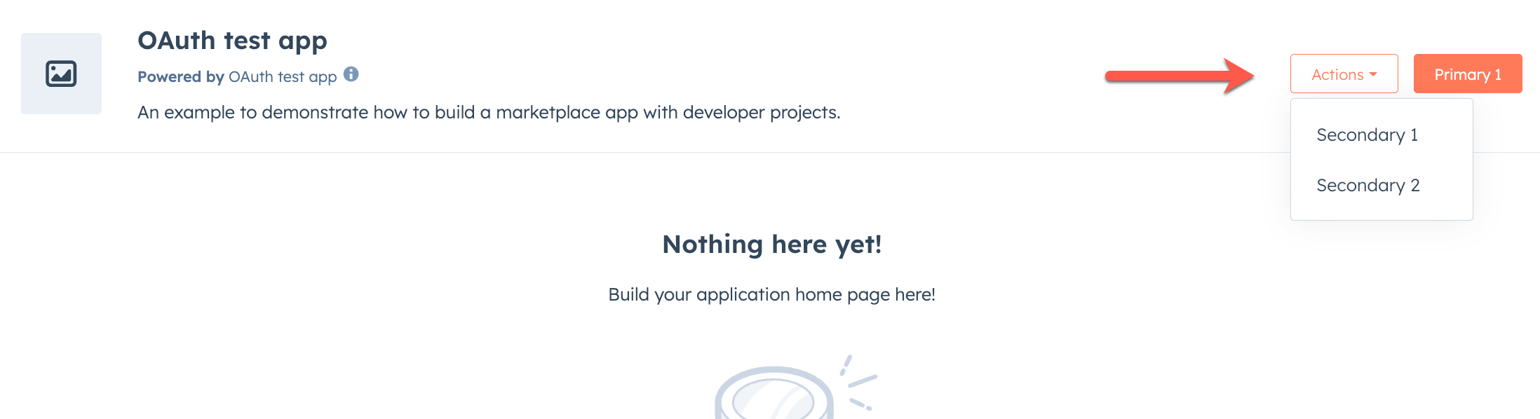
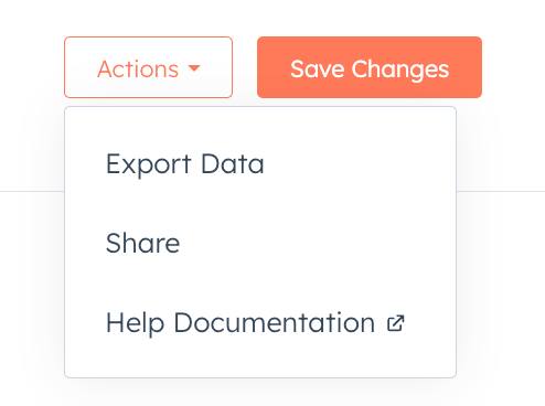
The `PageHeader` component and its sub-components are used to add action links to the header area of app pages. These components allow you to create primary and secondary actions that users can take within your app.
 ```tsx theme={null}
import { PageHeader } from "@hubspot/ui-extensions/pages";
Home
Documentation
Support
External Link
```
To use these components, you'll need to be on version `0.13.0` or later of the `ui-extensions` NPM package. You can check your current version by running `npm list` or `npm list -g`, and install the latest version by running `npm i @hubspot/ui-extensions`.
## PageHeader
The `PageHeader` component is the main wrapper component for primary and secondary header actions. It's recommended to only include one instance of `PageHeader` in your app, and to avoid adding/removing it dynamically which can result in unexpected behavior.
Only `PageHeader.PrimaryAction` and `PageHeader.SecondaryActions` are supported as children.
```tsx theme={null}
import { PageHeader } from "@hubspot/ui-extensions/pages";
Home
```
### Props
```tsx theme={null}
import { PageHeader } from "@hubspot/ui-extensions/pages";
Home
Documentation
Support
External Link
```
To use these components, you'll need to be on version `0.13.0` or later of the `ui-extensions` NPM package. You can check your current version by running `npm list` or `npm list -g`, and install the latest version by running `npm i @hubspot/ui-extensions`.
## PageHeader
The `PageHeader` component is the main wrapper component for primary and secondary header actions. It's recommended to only include one instance of `PageHeader` in your app, and to avoid adding/removing it dynamically which can result in unexpected behavior.
Only `PageHeader.PrimaryAction` and `PageHeader.SecondaryActions` are supported as children.
```tsx theme={null}
import { PageHeader } from "@hubspot/ui-extensions/pages";
Home
```
### Props
ReactNode} description={<>} />
string} description={<>Used by findByTestId() to locate this component in tests.} seeItems={[<>Testing utilities reference]} />
## PageHeader.PrimaryAction
The `PageHeader.PrimaryAction` component is a wrapper for the primary action in the page header. It can contain a `PageHeader.PageLink` component (for navigating to another page in your app) or a `PageHeader.Link` component (for URLs outside your app pages). The primary action is displayed as a button.
`PageHeader` can contain only one instance of `PageHeader.PrimaryAction`.
 ```tsx theme={null}
import { PageHeader } from '@hubspot/ui-extensions/pages';
// Primary action linking to another app page
Documentation
// Primary action as external URL
View Details
```
`PageHeader.PrimaryAction` can only contain `PageHeader.PageLink` or `PageHeader.Link` components. No other component types are supported.
### Props
```tsx theme={null}
import { PageHeader } from '@hubspot/ui-extensions/pages';
// Primary action linking to another app page
Documentation
// Primary action as external URL
View Details
```
`PageHeader.PrimaryAction` can only contain `PageHeader.PageLink` or `PageHeader.Link` components. No other component types are supported.
### Props
ReactNode} description={<>The content to render inside the primary action container.} />
string} description={<>Used by findByTestId() to locate this component in tests.} seeItems={[<>Testing utilities reference]} />
## PageHeader.SecondaryActions
The `PageHeader.SecondaryActions` component is a wrapper for secondary actions that appear in an *Actions* dropdown menu next to the primary action. It can contain multiple `PageHeader.PageLink` components (for navigating to other pages in your app) or `PageHeader.Link` components (for URLs outside your app pages).
 ```tsx theme={null}
import { PageHeader } from "@hubspot/ui-extensions/pages";
import { hubspot } from "@hubspot/ui-extensions";
hubspot.extend<"pages">(() => {
return ;
});
function AdvancedHeaderActions() {
return (
Home
Documentation
Support
External Resource
);
}
```
`PageHeader.SecondaryActions` can only contain `PageLink` or `Link` components. No other component types are supported.
### Props
```tsx theme={null}
import { PageHeader } from "@hubspot/ui-extensions/pages";
import { hubspot } from "@hubspot/ui-extensions";
hubspot.extend<"pages">(() => {
return ;
});
function AdvancedHeaderActions() {
return (
Home
Documentation
Support
External Resource
);
}
```
`PageHeader.SecondaryActions` can only contain `PageLink` or `Link` components. No other component types are supported.
### Props
ReactNode} description={<>The content to render inside the secondary actions container.} />
string} description={<>Used by findByTestId() to locate this component in tests.} seeItems={[<>Testing utilities reference]} />
## PageHeader.PageLink
The `PageHeader.PageLink` component renders a button that navigates to another page within your app when clicked. Use this component inside `PageHeader.PrimaryAction` or `PageHeader.SecondaryActions` for in-app navigation.
```tsx theme={null}
import { PageHeader } from "@hubspot/ui-extensions/pages";
// Navigate to a static path
Documentation
// Navigate with path parameters
View Contact
// Navigate with query string parameters
Search
```
### Props
ReactNode} description={<>Sets the content that will render inside the PageHeader action. This prop is passed implicitly by providing sub-components.} />
string} description={<>The path to navigate to when the link is clicked. Supports path parameters (e.g. /view-contact/:contactId).} />
Record<string, string>} description={<>Values for path parameters and query string entries.
Parameters matching :paramName tokens in to are substituted into the path.
Any remaining parameters are appended as query string entries.} />
string} description={<>Used by findByTestId() to locate this component in tests.} seeItems={[<>Testing utilities reference]} />
## PageHeader.Link
The `PageHeader.Link` component renders a button that opens a URL outside your app when clicked. It behaves like the standard [`Link`](/apps/developer-platform/add-features/ui-extensions/ui-components/standard-components/link) component, but is rendered as a button when used inside `PageHeader.PrimaryAction` or `PageHeader.SecondaryActions`.
```tsx theme={null}
import { PageHeader } from "@hubspot/ui-extensions/pages";
Visit HubSpot
```
### Props
ReactNode} description={<>Sets the content that will render inside the PageHeader action. This prop is passed implicitly by providing sub-components.} />
boolean} description={<>Determines whether or not the button should be disabled.} />
string} description={<>A URL that will be opened when the button is clicked. If the value is a URL external to hubspot.com it will be opened in a new tab.} />
(event: { type: string, bubbles: boolean, timeStamp: number, id: string }, reactions: { openPanel: (panelId: string) => void, closePanel: (panelId: string) => void, openModal: (modalId: string) => void, closeModal: (modalId: string) => void }) => Promise<void> | void} description={<>A function that will be invoked when the button is clicked. Do not use this function for submitting a form; use Form's onSubmit function instead.} />
string} description={<>Used by findByTestId() to locate this component in tests.} seeItems={[<>Testing utilities reference]} />
## Guidelines
* **DO:** use `PageHeader.PrimaryAction` for the most important action on the page.
* **DO:** use `PageHeader.PageLink` for navigating to pages within your app and `PageHeader.Link` for any URLs outside your app pages.
* **DO:** keep link labels short and action-oriented (e.g., "Documentation", "Support").
* **DO:** use `PageHeader.SecondaryActions` for additional or less common actions.
* **DON'T:** include more than one `PageHeader.PrimaryAction` in a PageHeader.
* **DON'T:** include components other than `PageHeader.PageLink` or `PageHeader.Link` in `PageHeader.PrimaryAction` or `PageHeader.SecondaryActions`.
## Related components
* [PageLink](/apps/developer-platform/add-features/ui-extensions/ui-components/app-page-components/page-link)
* [Link](/apps/developer-platform/add-features/ui-extensions/ui-components/standard-components/link)
* [Button](/apps/developer-platform/add-features/ui-extensions/ui-components/standard-components/button)
* [PageRoutes](/apps/developer-platform/add-features/ui-extensions/ui-components/app-page-components/page-routes)