> ## Documentation Index
> Fetch the complete documentation index at: https://developers.hubspot.com/docs/llms.txt
> Use this file to discover all available pages before exploring further.
---
id: 9bede5fc-46c1-4135-ac69-22f73cf54db8
---
# AutoGrid
> A responsive grid layout component that automatically arranges components.
export const Tag = ({children, type = 'default', className = ''}) => {
return
{children}
;
};
export const ComponentProp = ({name, required, type, description, defaultValue, seeItems}) => {
const renderSeeItems = () => {
if (!seeItems || seeItems.length === 0) {
return null;
}
if (seeItems.length === 1) {
return
See: {seeItems[0]}
;
}
return
See:
{seeItems.map((item, index) => - {item}
)}
{name}
{required && <> Required}
|
{type}
{defaultValue &&
Default: {defaultValue}
}
|
{description}
{renderSeeItems()}
|
;
};
export const ComponentProps = ({children}) => {
return
| Prop |
Type |
Description |
{children}
;
};
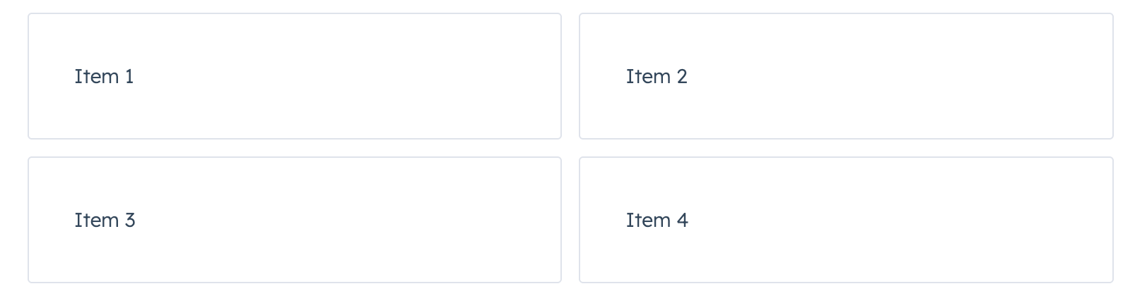
Use the `AutoGrid` component to arrange components into columns based on available space and specified column width restraints. Includes two modes: fixed column sizing (default), and flexible column sizing. For both modes, the layout will be responsive automatically, whether you're using it in an app card, app home page, or app settings page.
 ```jsx theme={null}
import { AutoGrid, Tile } from "@hubspot/ui-extensions";
Item 1
Item 2
Item 3
Item 4
;
```
## Props
```jsx theme={null}
import { AutoGrid, Tile } from "@hubspot/ui-extensions";
Item 1
Item 2
Item 3
Item 4
;
```
## Props
number} description={<>Sets width of each column in pixels. When flexible is true, acts as minimum width before expanding.} />
ReactNode} description={<>Sets the content that will render inside the component. This prop is passed implicitly by providing sub-components.} />
boolean} description={<>When false, columns have exact columnWidth. When true, columns expand equally to fill available space with columnWidth as the minimum.} defaultValue={<>false} />
"extra-large" | "extra-small" | "flush" | "large" | "lg" | "md" | "medium" | "sm" | "small" | "xl" | "xs"} description={<>Sets spacing between grid items.} defaultValue={<>"flush"} />
string} description={<>Used by findByTestId() to locate this component in tests.} seeItems={[<>Testing utilities reference]} />
## Examples
### Flexible grid with minimum column width
With `flexible` set to `true`, the specified `columnWidth` is used as a minimum width. Compare the width of the tiles in this example to the example at the top of the page, which doesn't include `flexible={true}`.
 ```jsx theme={null}
import { AutoGrid, Tile } from "@hubspot/ui-extensions";
Item 1
Item 2
Item 3
Item 4
;
```
### Fixed card layout with large gap
```jsx theme={null}
import { AutoGrid, Tile } from "@hubspot/ui-extensions";
Item 1
Item 2
Item 3
Item 4
;
```
### Fixed card layout with large gap
 ```jsx theme={null}
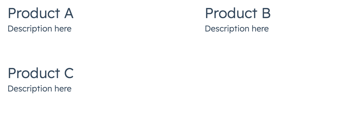
import { AutoGrid, Card, Heading, Text } from "@hubspot/ui-extensions";
Product A
Description here
Product B
Description here
;
```
###
## Related components
* [Flex](/apps/developer-platform/add-features/ui-extensions/ui-components/standard-components/flex)
* [Divider](/apps/developer-platform/add-features/ui-extensions/ui-components/standard-components/divider)
* [Tile](/apps/developer-platform/add-features/ui-extensions/ui-components/standard-components/tile)
```jsx theme={null}
import { AutoGrid, Card, Heading, Text } from "@hubspot/ui-extensions";
Product A
Description here
Product B
Description here
;
```
###
## Related components
* [Flex](/apps/developer-platform/add-features/ui-extensions/ui-components/standard-components/flex)
* [Divider](/apps/developer-platform/add-features/ui-extensions/ui-components/standard-components/divider)
* [Tile](/apps/developer-platform/add-features/ui-extensions/ui-components/standard-components/tile)