{name}
{required && <> | Prop | Type | Description |
|---|
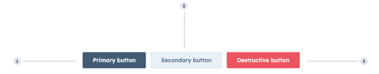 1. **Primary button:** only use one per extension.
2. **Secondary button:** only use with a primary and/or destructive button.
3. **Destructive button:** only use for actions that are destructive, paired with a secondary button.
```jsx theme={null}
import { Button, ButtonRow } from "@hubspot/ui-extensions";
const Extension = () => {
return (
1. **Primary button:** only use one per extension.
2. **Secondary button:** only use with a primary and/or destructive button.
3. **Destructive button:** only use for actions that are destructive, paired with a secondary button.
```jsx theme={null}
import { Button, ButtonRow } from "@hubspot/ui-extensions";
const Extension = () => {
return (
ReactNode} description={<>Sets the content that will render inside the component. This prop is passed implicitly by providing sub-components.} />
boolean} description={<>By default, when the number of buttons exceeds the available horizontal space, the extra buttons will collapse into a single dropdown menu button. Set this prop to true to prevent the dropdown button from being interacted with.} defaultValue={<>false} />
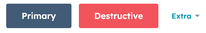
{ text: string, size: "extra-small" | "md" | "medium" | "sm" | "small" | "xs", variant: "primary" | "secondary" | "transparent" }}
description={<>When the included buttons exceed the available space, use this prop to customize the dropdown button. This prop takes an object containing the following key: 'value' pairs:
size: the size of the button. Can be 'xs', 'sm', or 'md' (default).text: the button's text. By default, is set to More. If set to an empty value, will display a gear icon.variant: the button variation. Can be 'primary', 'secondary' (default), or 'transparent'.string} description={<>Used by findByTestId() to locate this component in tests.} seeItems={[<>Testing utilities reference]} />
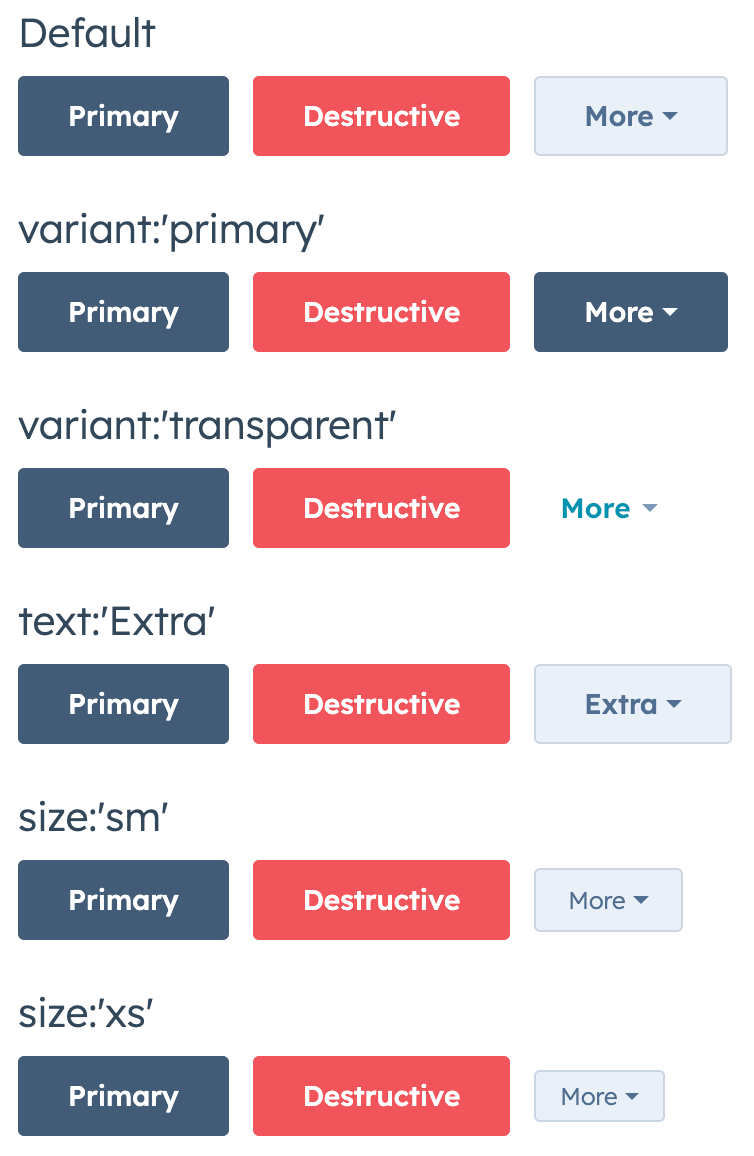 Comma-separate values in `dropDownButtonOptions` to configure multiple options.
 ```jsx theme={null}
import { Button, ButtonRow } from "@hubspot/ui-extensions";
const Extension = () => {
return (
```jsx theme={null}
import { Button, ButtonRow } from "@hubspot/ui-extensions";
const Extension = () => {
return (
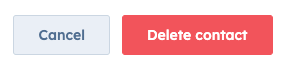
 * A `'destructive'` and `'secondary'` button in a row to confirm and cancel a contact deletion.
 ## Guidelines
* **DO:** include a secondary button with a destructive button to allow users to cancel the action.
* **DON'T:** use multiples of the same button type in a row. For example, don't include more than one primary button in one row.
* **DON'T:** use more than two secondary buttons in a single extension.
* **DON'T:** use more than three buttons in a row.
## Related components
* [Button](/apps/developer-platform/add-features/ui-extensions/ui-components/standard-components/button)
* [CRM action components](/apps/developer-platform/add-features/ui-extensions/ui-components/crm-action-components/overview)
* [CrmActionButton](/apps/developer-platform/add-features/ui-extensions/ui-components/crm-action-components/crm-action-button)
## Guidelines
* **DO:** include a secondary button with a destructive button to allow users to cancel the action.
* **DON'T:** use multiples of the same button type in a row. For example, don't include more than one primary button in one row.
* **DON'T:** use more than two secondary buttons in a single extension.
* **DON'T:** use more than three buttons in a row.
## Related components
* [Button](/apps/developer-platform/add-features/ui-extensions/ui-components/standard-components/button)
* [CRM action components](/apps/developer-platform/add-features/ui-extensions/ui-components/crm-action-components/overview)
* [CrmActionButton](/apps/developer-platform/add-features/ui-extensions/ui-components/crm-action-components/crm-action-button)