> ## Documentation Index
> Fetch the complete documentation index at: https://developers.hubspot.com/docs/llms.txt
> Use this file to discover all available pages before exploring further.
---
id: ca46872f-3a0a-4a98-99b5-c18772bdb0c2
---
# Checkbox
> Learn about the Checkbox component for use in UI extensions.
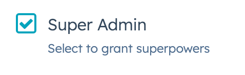
The `Checkbox` component renders single checkbox input. If you want to display multiple checkboxes, you should use [ToggleGroup](/apps/developer-platform/add-features/ui-extensions/ui-components/standard-components/toggle-group) instead, as it comes with extra logic for handling multiple checkboxes and radio buttons.
 ```jsx theme={null}
import { Checkbox } from "@hubspot/ui-extensions";
const Extension = () => {
return (
Super Admin
);
};
```
## Props
| Prop | Type | Description |
| ------------------ | ------------------------------------------- | ------------------------------------------------------------------------------------------------------------------------------------------- |
| `aria-label` | String | The checkbox's accessibility label. |
| `checked` | Boolean | When set to `true`, the checkbox is selected. Default is `false`. |
| `description` | String | Text that describes the field's purpose. |
| `initialIsChecked` | Boolean | When set to `true`, the checkbox is selected by default. Default is `false`. |
| `inline` | Boolean | When set to `true`, arranges checkboxes side by side. Default is `false`. |
| `name` | String | The checkbox's unique identifier. |
| `onChange` | `(checked: boolean, value: string) => void` | A callback function that is called when the checkbox is selected or cleared. Passes the new value. |
| `readOnly` | Boolean | When set to `true`, the checkbox cannot be selected. |
| `value` | String | The checkbox value. This value is not displayed on the card, but is passed on the server side when submitted, along with the checkbox name. |
| `variant` | `'sm'`, `'small'` \| `'default'` | The size of the checkbox |
## Related components
* [RadioButton](/apps/developer-platform/add-features/ui-extensions/ui-components/standard-components/radio-button)
* [ToggleGroup](/apps/developer-platform/add-features/ui-extensions/ui-components/standard-components/toggle-group)
* [TextArea](/apps/developer-platform/add-features/ui-extensions/ui-components/standard-components/text-area)
```jsx theme={null}
import { Checkbox } from "@hubspot/ui-extensions";
const Extension = () => {
return (
Super Admin
);
};
```
## Props
| Prop | Type | Description |
| ------------------ | ------------------------------------------- | ------------------------------------------------------------------------------------------------------------------------------------------- |
| `aria-label` | String | The checkbox's accessibility label. |
| `checked` | Boolean | When set to `true`, the checkbox is selected. Default is `false`. |
| `description` | String | Text that describes the field's purpose. |
| `initialIsChecked` | Boolean | When set to `true`, the checkbox is selected by default. Default is `false`. |
| `inline` | Boolean | When set to `true`, arranges checkboxes side by side. Default is `false`. |
| `name` | String | The checkbox's unique identifier. |
| `onChange` | `(checked: boolean, value: string) => void` | A callback function that is called when the checkbox is selected or cleared. Passes the new value. |
| `readOnly` | Boolean | When set to `true`, the checkbox cannot be selected. |
| `value` | String | The checkbox value. This value is not displayed on the card, but is passed on the server side when submitted, along with the checkbox name. |
| `variant` | `'sm'`, `'small'` \| `'default'` | The size of the checkbox |
## Related components
* [RadioButton](/apps/developer-platform/add-features/ui-extensions/ui-components/standard-components/radio-button)
* [ToggleGroup](/apps/developer-platform/add-features/ui-extensions/ui-components/standard-components/toggle-group)
* [TextArea](/apps/developer-platform/add-features/ui-extensions/ui-components/standard-components/text-area)