> ## Documentation Index
> Fetch the complete documentation index at: https://developers.hubspot.com/docs/llms.txt
> Use this file to discover all available pages before exploring further.

---
id: 69dfb158-4839-4f67-9d50-ba6c6160c428
---

# DateInput | UI components

> Learn about the date input component for use in UI extensions.

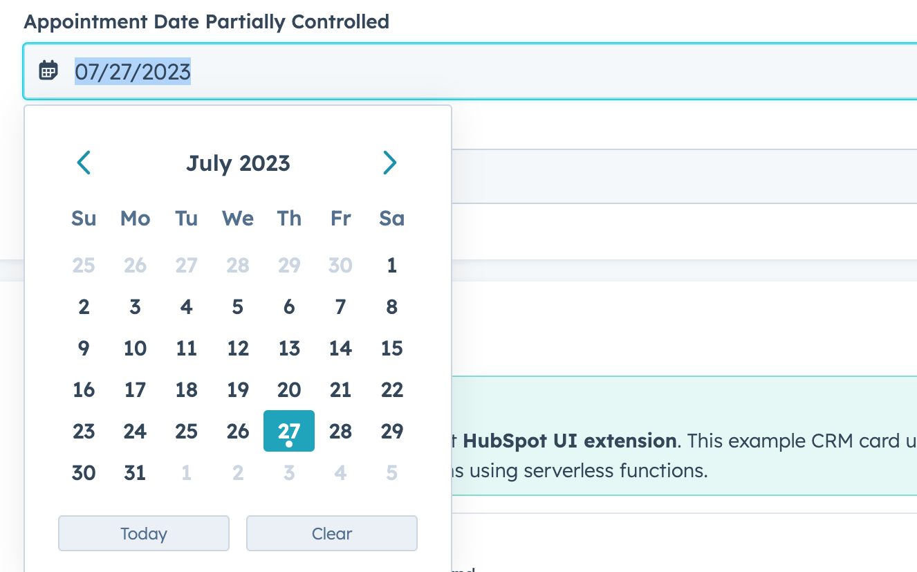
The `DateInput` component renders an input field where a user can select a date.

<Frame>
  <img src="https://www.hubspot.com/hubfs/Knowledge_Base_2023_2024/ui-extension-components-date-input.png" alt="ui-extension-components-date-input" />
</Frame>

```jsx theme={null}
import { Flex, DateInput } from "@hubspot/ui-extensions";

function RemoteApp() {
  const [dateValue, setDateValue] = useState(null);

  return (
    <Flex direction="column">
      <DateInput
        label="Appointment Date Partially Controlled"
        name="date"
        onChange={value => {
          setDateValue(value);
        }}
        value={dateValue}
        format="ll"
      />

      <DateInput label="Appointment Date Uncontrolled" name="appointment-date" format="LL" />
    </Flex>
  );
}
```

## Props

| Prop                   | Type                                                                                                   | Description                                                                                                                                                                                                                                                                                                                                                          |
| ---------------------- | ------------------------------------------------------------------------------------------------------ | -------------------------------------------------------------------------------------------------------------------------------------------------------------------------------------------------------------------------------------------------------------------------------------------------------------------------------------------------------------------- |
| `clearButtonLabel`     | String                                                                                                 | Sets the label of the button that clears the date.                                                                                                                                                                                                                                                                                                                   |
| `defaultValue`         | Object                                                                                                 | The default date value. Uses the same format as the `value` field.                                                                                                                                                                                                                                                                                                   |
| `description`          | String                                                                                                 | Text that describes the field's purpose.                                                                                                                                                                                                                                                                                                                             |
| `error`                | Boolean                                                                                                | When set to `true`, `validationMessage` is displayed as an error message if provided. The input will also render its error state to let the user know there's an error. If left `false` (default), `validationMessage` is displayed as a success message.                                                                                                            |
| `format`               | `'short'` (default) \| `'long'` \| `'medium'` \| `'standard'` \| `'YYYY-MM-DD'` \| `L` \| `LL` \| `ll` | The date format.<ul><li>`short`: 09/04/1986</li><li>`long`: September 4, 1986</li><li>`medium`: Sep 4, 1986</li><li>`standard`: 1986-09-04</li><li>`YYYY-MM-DD`: 1986-09-04</li><li>`L`: 09/04/1986</li><li>`LL`: September 4, 1986</li><li>`ll`: Sep 4, 1986</li></ul>                                                                                              |
| `label`                | String                                                                                                 | The text that displays above the input.                                                                                                                                                                                                                                                                                                                              |
| `max`                  | Object                                                                                                 | A Sets the latest valid date available using the following format:`{ year: number;``month: number;``date: number }`                                                                                                                                                                                                                                                  |
| `maxValidationMessage` | String                                                                                                 | Sets the message that users will see when the hover over dates after the max date.                                                                                                                                                                                                                                                                                   |
| `min`                  | Object                                                                                                 | Sets the earliest valid date available using the following format:`{ year: number;``month: number;``date: number }`                                                                                                                                                                                                                                                  |
| `minValidationMessage` | String                                                                                                 | Sets the message that users will see when they hover over dates before the min date.                                                                                                                                                                                                                                                                                 |
| `name`                 | String                                                                                                 | The input's unique identifier.                                                                                                                                                                                                                                                                                                                                       |
| `onBlur`               | `(value: DateInputEventsPayload) => void`                                                              | A function that is called and passes the value when the field loses focus.                                                                                                                                                                                                                                                                                           |
| `onChange`             | `(checked: boolean, value: string) => void`                                                            | A callback function that is invoked when the value is committed. Currently, this occurs on `onBlur` of the input and when the user submits the form.                                                                                                                                                                                                                 |
| `onFocus`              | `(value: DateInputEventsPayload) => void`                                                              | A function that is called and passed the value when the field gets focused.                                                                                                                                                                                                                                                                                          |
| `readOnly`             | Boolean                                                                                                | When set to `true`, the checkbox cannot be selected.                                                                                                                                                                                                                                                                                                                 |
| `required`             | Boolean                                                                                                | When set to `true`, displays a required field indicator.                                                                                                                                                                                                                                                                                                             |
| `timezone`             | `'userTz'` (default) \| `'portalTz'`                                                                   | Sets the timezone that the component will user to calculate valid dates.<ul><li>`userTz` (default): the user's time zone.</li><li>`portalTz`: the portal's default time zone.</li></ul>                                                                                                                                                                              |
| `todayButtonLabel`     | String                                                                                                 | Sets the label of the button that inserts today's date.                                                                                                                                                                                                                                                                                                              |
| `tooltip`              | String                                                                                                 | The text that displays in a tooltip next to the label.                                                                                                                                                                                                                                                                                                               |
| `validationMessage`    | String                                                                                                 | The text to display if the input has an error.                                                                                                                                                                                                                                                                                                                       |
| `value`                | Object                                                                                                 | The value of the input. Must include the year, month, and day: <br /> `{ year: number; month: number; date: number }`<ul><li>`year`: the four-digit year (e.g., `2023`).</li><li>`month`: starting at `0`, the number of the month (e.g., `0` = January, `11` = December).</li><li>`date`: the number of the day (e.g., `1` = the first day of the month).</li></ul> |

## Related components

* [Form](/apps/developer-platform/add-features/ui-extensions/ui-components/standard-components/form)
* [MultiSelect](/apps/developer-platform/add-features/ui-extensions/ui-components/standard-components/multi-select)
* [NumberInput](/apps/developer-platform/add-features/ui-extensions/ui-components/standard-components/number-input)
