> ## Documentation Index
> Fetch the complete documentation index at: https://developers.hubspot.com/docs/llms.txt
> Use this file to discover all available pages before exploring further.
---
id: 57eca1cc-957d-4f2a-b357-034507c589a2
---
# DescriptionList | UI components
> Learn about the DescriptionList component for use in UI extensions.
The `DescriptionList` component renders pairs of labels and values. Use this component to display pairs of labels and values in a way that's easy to read at a glance. It also contains a `DescriptionListItem` subcomponent.
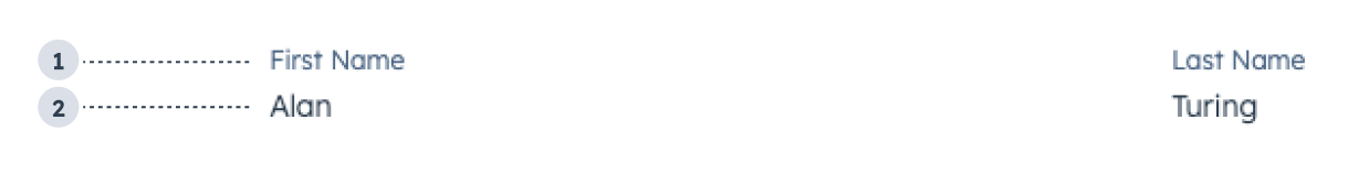 1. **Label:** describes the information being displayed.
2. **Value:** the information to display, contained in a `Text` component.
```jsx theme={null}
import { DescriptionList, DescriptionListItem, Text } from "@hubspot/ui-extensions";
const Extension = () => {
return (
Alan
Turing
);
};
```
## Props
**`` props**
| **Prop** | **Type** | **Description** |
| ----------- | --------------------------- | ----------------------------------------------------------- |
| `direction` | `column` (default) \| `row` | The direction that the label and value pairs are displayed. |
**`` props**
| **Prop** | **Type** | **Description** |
| -------- | -------- | ----------------------------- |
| `label` | String | Text to display as the label. |
## Variants
By default, list items will be stacked vertically. You can use the `direction` prop to stack them horizontally.
* `row`:
1. **Label:** describes the information being displayed.
2. **Value:** the information to display, contained in a `Text` component.
```jsx theme={null}
import { DescriptionList, DescriptionListItem, Text } from "@hubspot/ui-extensions";
const Extension = () => {
return (
Alan
Turing
);
};
```
## Props
**`` props**
| **Prop** | **Type** | **Description** |
| ----------- | --------------------------- | ----------------------------------------------------------- |
| `direction` | `column` (default) \| `row` | The direction that the label and value pairs are displayed. |
**`` props**
| **Prop** | **Type** | **Description** |
| -------- | -------- | ----------------------------- |
| `label` | String | Text to display as the label. |
## Variants
By default, list items will be stacked vertically. You can use the `direction` prop to stack them horizontally.
* `row`:
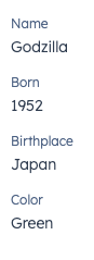
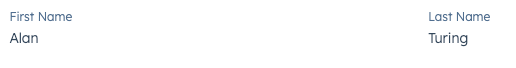 * `column` (default):
 ## Usage examples
* Display easy to scan information for a sales rep to use on a call.
* Highlight the most recently updated properties on a company record.
## Guidelines
* **DO:** keep copy succinct, ideally one word each for the label and value.
* **DO:** use the horizontal orientation for horizontal layouts, and vertical orientation for column layouts.
* **DON'T:** use this component to display long strings of text.
* **DON'T:** use this component for lists that you want to be editable in the UI.
## Related components
* [List](/apps/developer-platform/add-features/ui-extensions/ui-components/standard-components/list)
* [Table](/apps/developer-platform/add-features/ui-extensions/ui-components/standard-components/table)
* [Statistics](/apps/developer-platform/add-features/ui-extensions/ui-components/standard-components/statistics)
* [CrmPropertyList](/apps/developer-platform/add-features/ui-extensions/ui-components/crm-data-components/crm-property-list)
## Usage examples
* Display easy to scan information for a sales rep to use on a call.
* Highlight the most recently updated properties on a company record.
## Guidelines
* **DO:** keep copy succinct, ideally one word each for the label and value.
* **DO:** use the horizontal orientation for horizontal layouts, and vertical orientation for column layouts.
* **DON'T:** use this component to display long strings of text.
* **DON'T:** use this component for lists that you want to be editable in the UI.
## Related components
* [List](/apps/developer-platform/add-features/ui-extensions/ui-components/standard-components/list)
* [Table](/apps/developer-platform/add-features/ui-extensions/ui-components/standard-components/table)
* [Statistics](/apps/developer-platform/add-features/ui-extensions/ui-components/standard-components/statistics)
* [CrmPropertyList](/apps/developer-platform/add-features/ui-extensions/ui-components/crm-data-components/crm-property-list)