> ## Documentation Index
> Fetch the complete documentation index at: https://developers.hubspot.com/docs/llms.txt
> Use this file to discover all available pages before exploring further.
---
id: 4306ff31-514f-490e-87f1-819dd03c1097
---
# Divider
> Learn about the Divider component for use in UI extensions.
export const ComponentProp = ({name, required, type, description, defaultValue, seeItems}) => {
const renderSeeItems = () => {
if (!seeItems || seeItems.length === 0) {
return null;
}
if (seeItems.length === 1) {
return
See: {seeItems[0]}
;
}
return
See:
{seeItems.map((item, index) => - {item}
)}
{name}
{required && <> Required}
|
{type}
{defaultValue &&
Default: {defaultValue}
}
|
{description}
{renderSeeItems()}
|
;
};
export const ComponentProps = ({children}) => {
return
| Prop |
Type |
Description |
{children}
;
};
export const Tag = ({children, type = 'default', className = ''}) => {
return
{children}
;
};
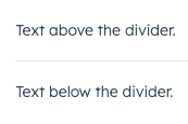
The `Divider` component renders a grey, horizontal line for spacing out components vertically or creating sections in an extension. Use this component to space out other components when the content needs more separation than white space.
 ```jsx theme={null}
import { Divider, Text } from "@hubspot/ui-extensions";
const Extension = () => {
return (
<>
Text above the divider.
Text below the divider.
);
};
```
## Props
```jsx theme={null}
import { Divider, Text } from "@hubspot/ui-extensions";
const Extension = () => {
return (
<>
Text above the divider.
Text below the divider.
);
};
```
## Props
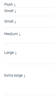
"extra-large" | "extra-small" | "flush" | "large" | "lg" | "md" | "medium" | "sm" | "small" | "xl" | "xs"} description={<>The space between the divider and the content above and below it.} defaultValue={<>"small"} />
string} description={<>Used by findByTestId() to locate this component in tests.} seeItems={[<>Testing utilities reference]} />
## Variants
Using the `size` prop, you can set the amount of padding above and below the divider. Values range from `'extra-small'` to `'extra-large'` (`'small'` by default).
 ## Guidelines
* **DO:** use dividers to group similar components together.
* **DO:** consider when a new card or component might be needed, rather than using a divider.
* **DON'T:** use two dividers in a row without content between them.
## Related components
* [Box](/apps/developer-platform/add-features/ui-extensions/ui-components/standard-components/box)
* [Accordion](/apps/developer-platform/add-features/ui-extensions/ui-components/standard-components/accordion)
* [Tile](/apps/developer-platform/add-features/ui-extensions/ui-components/standard-components/tile)
## Guidelines
* **DO:** use dividers to group similar components together.
* **DO:** consider when a new card or component might be needed, rather than using a divider.
* **DON'T:** use two dividers in a row without content between them.
## Related components
* [Box](/apps/developer-platform/add-features/ui-extensions/ui-components/standard-components/box)
* [Accordion](/apps/developer-platform/add-features/ui-extensions/ui-components/standard-components/accordion)
* [Tile](/apps/developer-platform/add-features/ui-extensions/ui-components/standard-components/tile)