> ## Documentation Index
> Fetch the complete documentation index at: https://developers.hubspot.com/docs/llms.txt
> Use this file to discover all available pages before exploring further.
---
id: dc96d81e-c073-4df6-9fb2-c1472154a90e
---
# Dropdown | UI components
> Learn about the Dropdown component for use in UI extensions.
export const Tag = ({children, type = 'default', className = ''}) => {
return
{children}
;
};
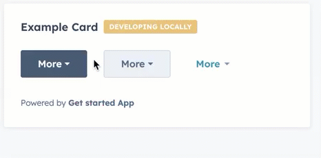
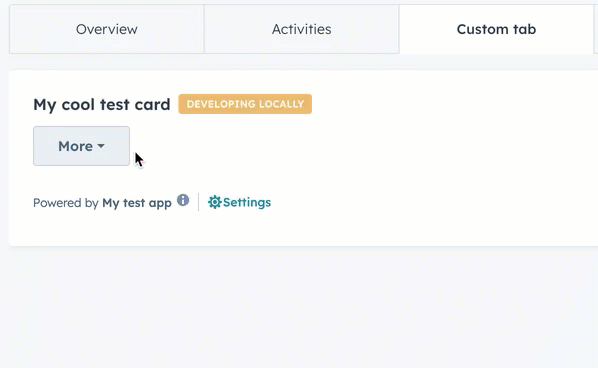
The `Dropdown` component renders a dropdown menu that opens on click, allowing users to select from a compact list of options. Define each dropdown item using `` with optional `onClick` handlers and `overlay` definitions for displaying tooltips and opening modals and panels.
```jsx theme={null}
import { Dropdown, Tooltip } from "@hubspot/ui-extensions";
const Extension = () => {
return (
console.log("clicked")}>Basic Action console.log("clicked")}
overlay={This action does something important}
>
Action with Tooltip
);
};
```
## Props
**`` props**
The `options` prop has been deprecated. Define options using `` child components instead, which provide more flexibility for [using overlays](#adding-overlays).
| **Prop** | **Type** | **Description** |
| ---------------------------------------------- | --------------------------------------------------------- | -------------------------------------------------------------------------------------------------------------------------------------------------------------------------------------------------------- |
| `buttonSize` | `'xs'` \| `'sm'` \| `'md'` (default) | The size of the button. |
| `buttonText` | String | The button text. |
| `disabled` | Boolean | When set to `true`, the dropdown button cannot be focused or clicked. Set to `false` by default. |
| `options` Deprecated | Object | The options included in the dropdown menu. Each option includes:
`label`: the text label for the option.
`onClick`: the function that gets invoked when the option is selected.
|
| `variant` | `'primary'` (default) \| `'secondary'` \| `'transparent'` | The type of dropdown button to display. `'primary'` and `'secondary'` will display a blue and grey button, respectively, while `'transparent'` will display a blue hyperlink. |
**`` props**
| Prop | Type | Description |
| --------- | ----------------- | ------------------------------------------------------------------------------------------------------------------------------------------------------------------------------------------------------------------------------------------------------------------------------------------------------------------------------------------------------------------------------ |
| `onClick` | `() => void` | The function invoked when the item is clicked. |
| `overlay` | Overlay component | An overlay component to attach to the item, such as a [Tooltip](/apps/developer-platform/add-features/ui-extensions/ui-components/standard-components/tooltip), [Modal](/apps/developer-platform/add-features/ui-extensions/ui-components/standard-components/modal), or [Panel](/apps/developer-platform/add-features/ui-extensions/ui-components/standard-components/panel). |
## Adding overlays
Similar to the example above, which adds a `Tooltip` overlay to a dropdown item, you can open modals and panels via dropdown items by defining the `Modal` or `Panel` within a `Dropdown.ButtonItem` component's `overlay` prop.
Learn more about opening overlays in the [UI extension SDK reference](/apps/developer-platform/add-features/ui-extensions/ui-extensions-sdk#open-overlays).
```jsx highlight={26-35} theme={null}
import {
Button,
Dropdown,
Tooltip,
Modal,
ModalBody,
ModalFooter,
Text,
hubspot
} from '@hubspot/ui-extensions';
hubspot.extend(({ actions }) => );
const Extension = ({ actions }) => {
return (
console.log('clicked')}>
Basic Action
This action does something important}
>
Action with Tooltip
Modal Content
}
>
Open modal
);
};
```
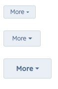
## Variants
Using the `variant` and `buttonSize` props, you can set the type of button along with its size.
* `'primary'` buttons with size set to `'xs'`, `'sm'`, and `'md'` respectively:
* `'secondary'` buttons with size set to `'xs'`, `'sm'`, and `'md'` respectively:
* `'transparent'` buttons with size set to `'sm'` and `'md'` respectively:
## Related components
* [CrmActionLink](/apps/developer-platform/add-features/ui-extensions/ui-components/crm-action-components/crm-action-link)
* [CrmCardActions](/apps/developer-platform/add-features/ui-extensions/ui-components/crm-action-components/crm-card-actions)
* [Button](/apps/developer-platform/add-features/ui-extensions/ui-components/standard-components/button)
 ```jsx theme={null}
import { Dropdown, Tooltip } from "@hubspot/ui-extensions";
const Extension = () => {
return (
```jsx theme={null}
import { Dropdown, Tooltip } from "@hubspot/ui-extensions";
const Extension = () => {
return (
 ```jsx highlight={26-35} theme={null}
import {
Button,
Dropdown,
Tooltip,
Modal,
ModalBody,
ModalFooter,
Text,
hubspot
} from '@hubspot/ui-extensions';
hubspot.extend(({ actions }) =>
```jsx highlight={26-35} theme={null}
import {
Button,
Dropdown,
Tooltip,
Modal,
ModalBody,
ModalFooter,
Text,
hubspot
} from '@hubspot/ui-extensions';
hubspot.extend(({ actions }) => 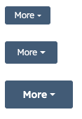 * `'secondary'` buttons with size set to `'xs'`, `'sm'`, and `'md'` respectively:
 * `'transparent'` buttons with size set to `'sm'` and `'md'` respectively:
 ## Related components
* [CrmActionLink](/apps/developer-platform/add-features/ui-extensions/ui-components/crm-action-components/crm-action-link)
* [CrmCardActions](/apps/developer-platform/add-features/ui-extensions/ui-components/crm-action-components/crm-card-actions)
* [Button](/apps/developer-platform/add-features/ui-extensions/ui-components/standard-components/button)
## Related components
* [CrmActionLink](/apps/developer-platform/add-features/ui-extensions/ui-components/crm-action-components/crm-action-link)
* [CrmCardActions](/apps/developer-platform/add-features/ui-extensions/ui-components/crm-action-components/crm-card-actions)
* [Button](/apps/developer-platform/add-features/ui-extensions/ui-components/standard-components/button)