> ## Documentation Index
> Fetch the complete documentation index at: https://developers.hubspot.com/docs/llms.txt
> Use this file to discover all available pages before exploring further.
---
id: 1b812bc4-8816-4c14-a037-a6e54a4eda22
---
# Flex
> Learn about the Flex component for configuring UI extension layout.
export const ComponentProp = ({name, required, type, description, defaultValue, seeItems}) => {
const renderSeeItems = () => {
if (!seeItems || seeItems.length === 0) {
return null;
}
if (seeItems.length === 1) {
return
See: {seeItems[0]}
;
}
return
See:
{seeItems.map((item, index) => - {item}
)}
{name}
{required && <> Required}
|
{type}
{defaultValue &&
Default: {defaultValue}
}
|
{description}
{renderSeeItems()}
|
;
};
export const ComponentProps = ({children}) => {
return
| Prop |
Type |
Description |
{children}
;
};
export const Tag = ({children, type = 'default', className = ''}) => {
return
{children}
;
};
The `Flex` component renders an empty `div` container set to `display=flex`. When wrapped around other components, it enables those child components to be arranged using props. `Flex` can contain other `Flex` or `Box` components.
 ```jsx theme={null}
import { Flex, Tile } from "@hubspot/ui-extensions";
const Extension = () => {
return (
Left
Right
Bottom
);
};
```
## Props
```jsx theme={null}
import { Flex, Tile } from "@hubspot/ui-extensions";
const Extension = () => {
return (
Left
Right
Bottom
);
};
```
## Props
"baseline" | "center" | "end" | "start" | "stretch"} description={<>Distributes components along the cross-axis using the available free space.} defaultValue={<>"stretch"} />
"baseline" | "center" | "end" | "start" | "stretch"} description={<>Distributes a child component along the cross-axis using the available free space. Use this prop for nested Flex and Box components to align them differently from other child components in the Flex group.} />
ReactNode} description={<>Sets the content that will render inside the component. This prop is passed implicitly by providing sub-components.} />
"column" | "row"} description={<>Arranges the components horizontally or vertically by setting the main axis.} defaultValue={<>"row"} />
"extra-large" | "extra-small" | "flush" | "large" | "lg" | "md" | "medium" | "sm" | "small" | "xl" | "xs"} description={<>Sets the spacing between components.} defaultValue={<>"flush"} />
"around" | "between" | "center" | "end" | "start"} description={<>Distributes components along the main axis using the available free space.} defaultValue={<>"start"} />
string} description={<>Used by findByTestId() to locate this component in tests.} seeItems={[<>Testing utilities reference]} />
"nowrap" | "wrap" | false | true} description={<>Whether components will wrap rather than trying to fit on one line.} defaultValue={<>"nowrap"} />
## Usage examples
### Horizontal layout
To arrange components horizontally, set `direction` to `row`. Then, use `justify` to configure the horizontal distribution. By default, components will stretch across the container if `justify` is not specified.
|
justify=\{'between'}
|
|
|
justify=\{'around'}
|
|
|
justify=\{'start'}
|
|

|
justify=\{'center'}
|
|
|
justify=\{'end'}
|
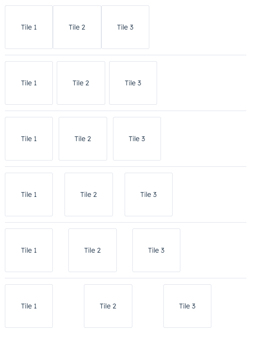
### Wrap
By default, components in a `row` will be arranged on one line when possible. Use the `wrap` prop to wrap components onto new lines when needed.
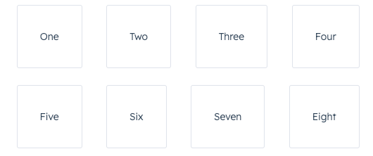 ```jsx theme={null}
One
Two
Three
Four
Five
Six
Seven
Eight
;
```
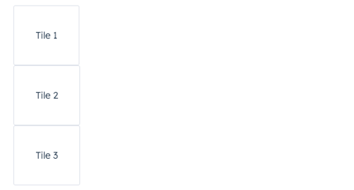
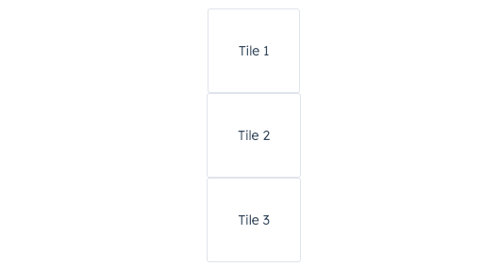
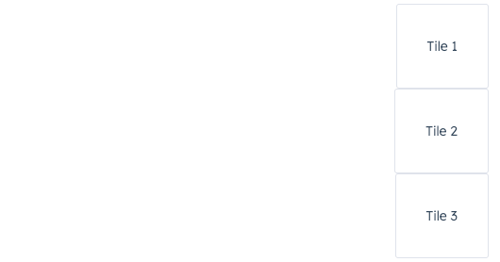
### Vertical layout
To arrange components vertically, set direction to `column`, then use the `align` prop to distribute them. By default, components will stretch across the extension container width when `align` is not specified.
```jsx theme={null}
One
Two
Three
Four
Five
Six
Seven
Eight
;
```
### Vertical layout
To arrange components vertically, set direction to `column`, then use the `align` prop to distribute them. By default, components will stretch across the extension container width when `align` is not specified.
|
align=\{'start'}
|
|
|
align=\{'center'}
|
|
|
align=\{'end'}
|
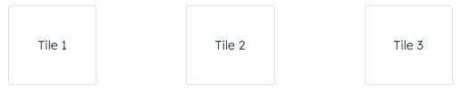
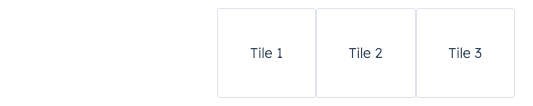
### Spacing
In the `Flex` component, you can use the `gap` prop to apply even spacing between the tiles. This prop will apply spacing equally for both `row` and `column` directions.
 ```jsx theme={null}
Tile 1
Tile 2
Tile 3
;
```
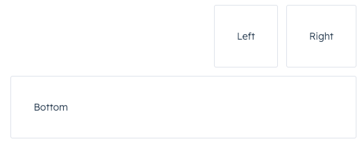
### Using Flex in Flex
You can wrap child `Flex` components with `Flex` to set more specific rules for individual components. A child `Flex` component will not inherit props specified in the parent `Flex` component, so you'll need to repeat any props you've previously defined to maintain them.
```jsx theme={null}
Left
Right
Bottom
;
```
## Related components
* [Tile](/apps/developer-platform/add-features/ui-extensions/ui-components/standard-components/tile)
* [Box](/apps/developer-platform/add-features/ui-extensions/ui-components/standard-components/box)
* [Divider](/apps/developer-platform/add-features/ui-extensions/ui-components/standard-components/divider)
* [Inline](/apps/developer-platform/add-features/ui-extensions/ui-components/standard-components/inline)
```jsx theme={null}
Tile 1
Tile 2
Tile 3
;
```
### Using Flex in Flex
You can wrap child `Flex` components with `Flex` to set more specific rules for individual components. A child `Flex` component will not inherit props specified in the parent `Flex` component, so you'll need to repeat any props you've previously defined to maintain them.
```jsx theme={null}
Left
Right
Bottom
;
```
## Related components
* [Tile](/apps/developer-platform/add-features/ui-extensions/ui-components/standard-components/tile)
* [Box](/apps/developer-platform/add-features/ui-extensions/ui-components/standard-components/box)
* [Divider](/apps/developer-platform/add-features/ui-extensions/ui-components/standard-components/divider)
* [Inline](/apps/developer-platform/add-features/ui-extensions/ui-components/standard-components/inline)