> ## Documentation Index
> Fetch the complete documentation index at: https://developers.hubspot.com/docs/llms.txt
> Use this file to discover all available pages before exploring further.
---
id: 3a106f78-b854-427c-9cda-2e13a4a4a297
---
# Form
> Learn about the Form component for use in UI extensions.
The `Form` component renders a form that can contain other subcomponents, such as [Input](/apps/developer-platform/add-features/ui-extensions/ui-components/standard-components/input), [Select](/apps/developer-platform/add-features/ui-extensions/ui-components/standard-components/select), and [Button](/apps/developer-platform/add-features/ui-extensions/ui-components/standard-components/button). Use this component to enable users to submit data to HubSpot or an external system.
Below, learn how to implement a form in a UI extension. For guidance on form design, check out the [Form design patterns](/apps/developer-platform/add-features/ui-extensions/ui-components/patterns/forms).
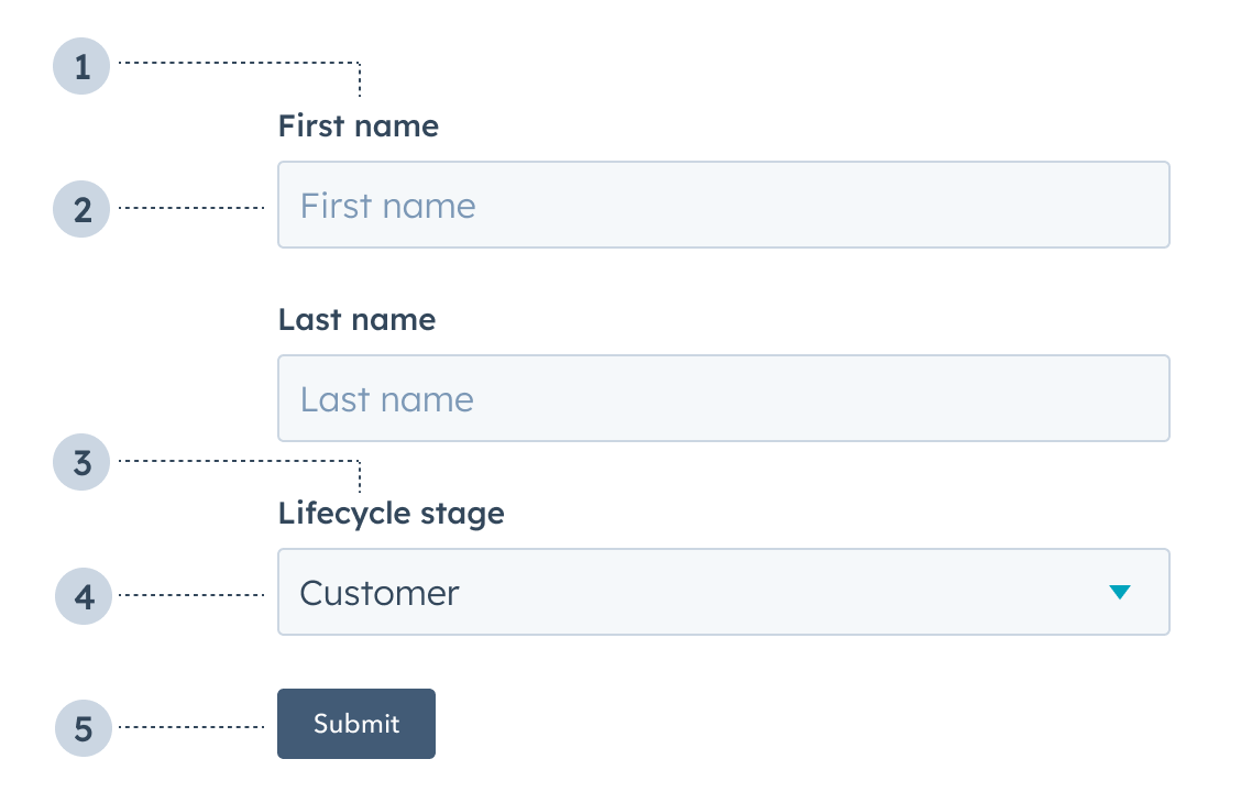 1. **Label:** the input label.
2. **Text input:** an [Input](/apps/developer-platform/add-features/ui-extensions/ui-components/standard-components/input) component with a placeholder value of *First name*.
3. **Label:** the select input label.
4. **Select input:** a [Select](/apps/developer-platform/add-features/ui-extensions/ui-components/standard-components/select) component with value of *Customer*.
5. **Button:** a [Button](/apps/developer-platform/add-features/ui-extensions/ui-components/standard-components/button) component to submit the form's information.
```jsx theme={null}
import { Form, Input, Button } from "@hubspot/ui-extensions";
const Extension = () => {
return (
);
};
```
## Props
| **Prop** | **Type** | **Description** |
| -------------- | --------------------------- | --------------------------------------------------------------------------------------------------------------------------------------------------------------------------------------------------------------------------------------------------------------- |
| `autoComplete` | `'on'` (default) \| `'off'` | Set this field to `'off'` to prevent autocompletion software (e.g., browser, password managers) from auto-filling form fields. Based on the [autocomplete HTML attribute](https://developer.mozilla.org/en-US/docs/Web/HTML/Reference/Attributes/autocomplete). |
| `onSubmit` | Function | The function that is called when the form is submitted. It will receive a `RemoteEvent` as an argument and its return value will be ignored. |
## Usage examples
* A form to submit customer information to an external database.
* A form to place a product order on behalf of a customer.
## Guidelines
* **DO:** include text inputs when a user should be able to submit any value.
* **DO:** include select inputs when a user should only be able to select from a set of values.
* **DO:** include descriptions and placeholder text to provide context to users.
* **DO:** always position the submit button at the bottom of the form.
* **DON'T:** include a form without a submit button.
## Related components
* [Button](/apps/developer-platform/add-features/ui-extensions/ui-components/standard-components/button)
* [DateInput](/apps/developer-platform/add-features/ui-extensions/ui-components/standard-components/date-input)
* [Input](/apps/developer-platform/add-features/ui-extensions/ui-components/standard-components/input)
* [MultiSelect](/apps/developer-platform/add-features/ui-extensions/ui-components/standard-components/multi-select)
* [NumberInput](/apps/developer-platform/add-features/ui-extensions/ui-components/standard-components/number-input)
* [Select](/apps/developer-platform/add-features/ui-extensions/ui-components/standard-components/select)
1. **Label:** the input label.
2. **Text input:** an [Input](/apps/developer-platform/add-features/ui-extensions/ui-components/standard-components/input) component with a placeholder value of *First name*.
3. **Label:** the select input label.
4. **Select input:** a [Select](/apps/developer-platform/add-features/ui-extensions/ui-components/standard-components/select) component with value of *Customer*.
5. **Button:** a [Button](/apps/developer-platform/add-features/ui-extensions/ui-components/standard-components/button) component to submit the form's information.
```jsx theme={null}
import { Form, Input, Button } from "@hubspot/ui-extensions";
const Extension = () => {
return (
);
};
```
## Props
| **Prop** | **Type** | **Description** |
| -------------- | --------------------------- | --------------------------------------------------------------------------------------------------------------------------------------------------------------------------------------------------------------------------------------------------------------- |
| `autoComplete` | `'on'` (default) \| `'off'` | Set this field to `'off'` to prevent autocompletion software (e.g., browser, password managers) from auto-filling form fields. Based on the [autocomplete HTML attribute](https://developer.mozilla.org/en-US/docs/Web/HTML/Reference/Attributes/autocomplete). |
| `onSubmit` | Function | The function that is called when the form is submitted. It will receive a `RemoteEvent` as an argument and its return value will be ignored. |
## Usage examples
* A form to submit customer information to an external database.
* A form to place a product order on behalf of a customer.
## Guidelines
* **DO:** include text inputs when a user should be able to submit any value.
* **DO:** include select inputs when a user should only be able to select from a set of values.
* **DO:** include descriptions and placeholder text to provide context to users.
* **DO:** always position the submit button at the bottom of the form.
* **DON'T:** include a form without a submit button.
## Related components
* [Button](/apps/developer-platform/add-features/ui-extensions/ui-components/standard-components/button)
* [DateInput](/apps/developer-platform/add-features/ui-extensions/ui-components/standard-components/date-input)
* [Input](/apps/developer-platform/add-features/ui-extensions/ui-components/standard-components/input)
* [MultiSelect](/apps/developer-platform/add-features/ui-extensions/ui-components/standard-components/multi-select)
* [NumberInput](/apps/developer-platform/add-features/ui-extensions/ui-components/standard-components/number-input)
* [Select](/apps/developer-platform/add-features/ui-extensions/ui-components/standard-components/select)