> ## Documentation Index
> Fetch the complete documentation index at: https://developers.hubspot.com/docs/llms.txt
> Use this file to discover all available pages before exploring further.
---
id: 003c2728-29ea-4f3a-8cc9-f3fe8714afea
---
# Inline | UI components
> Learn about the Inline component for UI extension layout management.
The `Inline` component uses flexbox styling to organize child components in a horizontal row. Similar to `Flex` and `Box`, use `Inline` to [manage the layout](/apps/developer-platform/add-features/ui-extensions/ui-components/manage-ui-extension-layout) of a UI extension.
```jsx theme={null}
import { Inline, Input, Select, Button, hubspot } from "@hubspot/ui-extensions";
hubspot.extend(() => );
function Extension() {
return (
<>
);
}
```
## Props
| Prop | Type | Description |
| --------- | ----------------------------------------------------------------------------------------------------------------------------------------- | --------------------------------------------------------------------------- |
| `align` | `'start'` \| `'center'` \| `'end'` \| `'baseline'` \| `'stretch'` (default) | Distributes components along the cross-axis using the available free space. |
| `gap` | `'flush'` (default) \| `'extra-small'`, `'xs'` \| `'small'`, `'sm'` \| `'medium'`, `'md'` \| `'large'`, `'lg'` \| `'extra-large'`, `'xl'` | The amount of spacing between components. |
| `justify` | `'start'` (default) \| `'center'` \| `'end'` \| `'around'` \| `'between'` | Distributes components along the main axis using the available free space. |
## Related components
* [Flex](/apps/developer-platform/add-features/ui-extensions/ui-components/standard-components/flex)
* [Divider](/apps/developer-platform/add-features/ui-extensions/ui-components/standard-components/divider)
* [Tile](/apps/developer-platform/add-features/ui-extensions/ui-components/standard-components/tile)
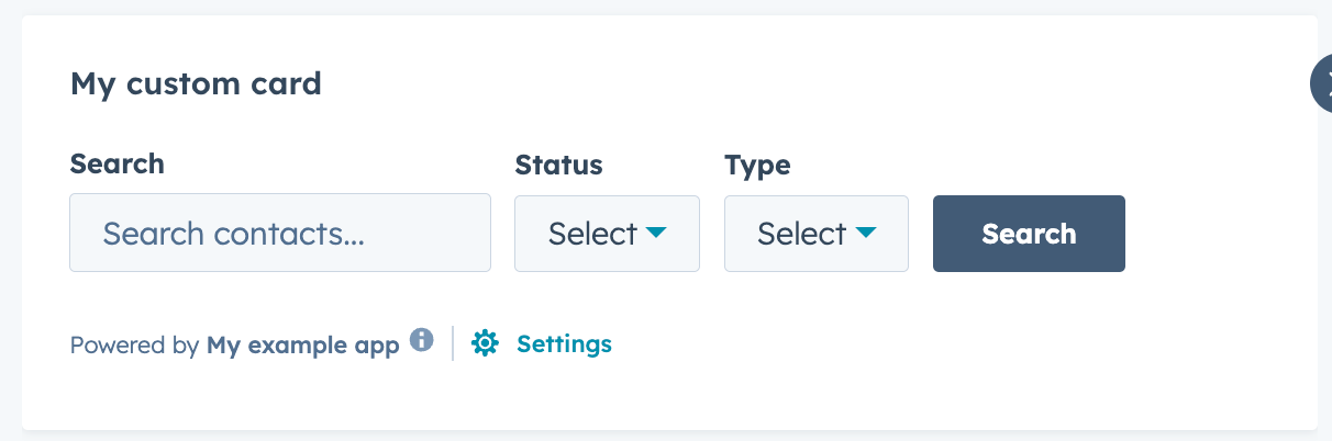 ```jsx theme={null}
import { Inline, Input, Select, Button, hubspot } from "@hubspot/ui-extensions";
hubspot.extend(() =>
```jsx theme={null}
import { Inline, Input, Select, Button, hubspot } from "@hubspot/ui-extensions";
hubspot.extend(() =>