> ## Documentation Index
> Fetch the complete documentation index at: https://developers.hubspot.com/docs/llms.txt
> Use this file to discover all available pages before exploring further.
---
id: 48c0f0d9-d3e1-41e7-9354-a2462a4288f8
---
# Link
> Learn about the link component for use in UI extensions.
The `Link` component renders a clickable hyperlink. Use links to direct users to a web page, another part of the HubSpot app, or use them as buttons.
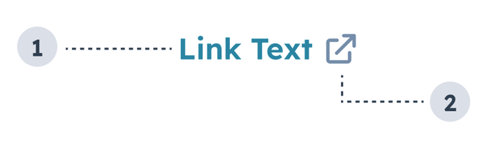
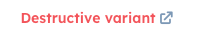
1. **Link text:** text that describes where the link leads.
2. **External link** **icon**: included when setting `external` to `true`. and indicates that the link will open in a new tab. Automatically included when the link leads to a page outside of the HubSpot app.
```jsx theme={null}
import { Link } from "@hubspot/ui-extensions";
const Extension = () => {
return (
Wikipedia
);
};
```
## Props
| Prop | Type | Description |
| ---------------- | ----------------------------------------------------------------- | ----------------------------------------------------------------------------------------------------------------------------------------------------------------------------------------------------------------------------------------------------------------------------------------------------------------------------------------------------------------------------------------------------------------------------------------------------------------------------------------------------- |
| `href` | String \| Object | Sets the link's URL and open behavior. Can be set to a URL string or an object with the following fields:
`url` (string): the URL that will open on click.
`external` (boolean, optional): set to `true` to open the URL in a new tab and display an external link icon. By default:
Links to HubSpot app pages will open in the same tab and will not include an icon.
Links to non-HubSpot app pages will open in a new tab and include the icon.
|
| `onClick` | `() => void` | A function that is invoked when the link is clicked. The function receives no arguments and its return value is ignored. |
| `overlay` | Object | Include a [Modal](/apps/developer-platform/add-features/ui-extensions/ui-components/standard-components/modal) or [Panel](/apps/developer-platform/add-features/ui-extensions/ui-components/standard-components/panel) component in this object to open it as an overlay on click. Learn more about [using overlays](/apps/developer-platform/add-features/ui-extensions/ui-extensions-sdk#open-overlays). |
| `preventDefault` | Boolean | When set to `true`, `event.preventDefault()` will be invoked before the `onClick` function is called, preventing automatic navigation to the href URL. |
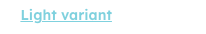
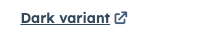
| `variant` | `'primary'` (default) \| `'light'` \| `'dark'` \| `'destructive'` | The color of the link. See the [variants section](#variants) for more information. |
## Variants
Using the `variant` prop, you can set the following styling:
* `'primary'`: the default blue (`#0091ae`).
* `'light'`: a white link that turns to a lighter shade of blue on hover (`#7fd1de`).
* `'dark'`: a darker shade of blue (`#33475b`).
* `'destructive'`: a red link (`#f2545b`).
## Usage examples
* Use the default `'primary'` variant when you want to link to another page or contact record in HubSpot.
* Use the `'light'` variant when you want to include a link on a dark background.
* Use the `'dark'` variant to include a link in an alert.
* Use the `'destructive'` variant when the link results in an action that can't be undone by the user, such as deleting contact property information.
## Guidelines
* **DO:** space out links so that users can tell when they'll be navigation to a different place.
* **DO:** make link text concise and contextual.
* **DO:** use the `'destructive'` variant sparingly and only when the action can't be undone.
* **DO:** always open links to pages outside of the HubSpot app in a new tab (`external: true`).
* **DON'T:** crowd multiple links together.
* **DON'T:** use the `'dark'` variant outside of alerts.
## Related components
* [Heading](/apps/developer-platform/add-features/ui-extensions/ui-components/standard-components/heading)
* [Text](/apps/developer-platform/add-features/ui-extensions/ui-components/standard-components/text)
* [Image](/apps/developer-platform/add-features/ui-extensions/ui-components/standard-components/image)
 1. **Link text:** text that describes where the link leads.
2. **External link** **icon**: included when setting `external` to `true`. and indicates that the link will open in a new tab. Automatically included when the link leads to a page outside of the HubSpot app.
```jsx theme={null}
import { Link } from "@hubspot/ui-extensions";
const Extension = () => {
return (
Wikipedia
);
};
```
## Props
| Prop | Type | Description |
| ---------------- | ----------------------------------------------------------------- | ----------------------------------------------------------------------------------------------------------------------------------------------------------------------------------------------------------------------------------------------------------------------------------------------------------------------------------------------------------------------------------------------------------------------------------------------------------------------------------------------------- |
| `href` | String \| Object | Sets the link's URL and open behavior. Can be set to a URL string or an object with the following fields:
1. **Link text:** text that describes where the link leads.
2. **External link** **icon**: included when setting `external` to `true`. and indicates that the link will open in a new tab. Automatically included when the link leads to a page outside of the HubSpot app.
```jsx theme={null}
import { Link } from "@hubspot/ui-extensions";
const Extension = () => {
return (
Wikipedia
);
};
```
## Props
| Prop | Type | Description |
| ---------------- | ----------------------------------------------------------------- | ----------------------------------------------------------------------------------------------------------------------------------------------------------------------------------------------------------------------------------------------------------------------------------------------------------------------------------------------------------------------------------------------------------------------------------------------------------------------------------------------------- |
| `href` | String \| Object | Sets the link's URL and open behavior. Can be set to a URL string or an object with the following fields: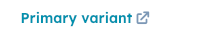 * `'light'`: a white link that turns to a lighter shade of blue on hover (`#7fd1de`).
 * `'dark'`: a darker shade of blue (`#33475b`).
 * `'destructive'`: a red link (`#f2545b`).
 ## Usage examples
* Use the default `'primary'` variant when you want to link to another page or contact record in HubSpot.
* Use the `'light'` variant when you want to include a link on a dark background.
* Use the `'dark'` variant to include a link in an alert.
* Use the `'destructive'` variant when the link results in an action that can't be undone by the user, such as deleting contact property information.
## Guidelines
* **DO:** space out links so that users can tell when they'll be navigation to a different place.
* **DO:** make link text concise and contextual.
* **DO:** use the `'destructive'` variant sparingly and only when the action can't be undone.
* **DO:** always open links to pages outside of the HubSpot app in a new tab (`external: true`).
* **DON'T:** crowd multiple links together.
* **DON'T:** use the `'dark'` variant outside of alerts.
## Related components
* [Heading](/apps/developer-platform/add-features/ui-extensions/ui-components/standard-components/heading)
* [Text](/apps/developer-platform/add-features/ui-extensions/ui-components/standard-components/text)
* [Image](/apps/developer-platform/add-features/ui-extensions/ui-components/standard-components/image)
## Usage examples
* Use the default `'primary'` variant when you want to link to another page or contact record in HubSpot.
* Use the `'light'` variant when you want to include a link on a dark background.
* Use the `'dark'` variant to include a link in an alert.
* Use the `'destructive'` variant when the link results in an action that can't be undone by the user, such as deleting contact property information.
## Guidelines
* **DO:** space out links so that users can tell when they'll be navigation to a different place.
* **DO:** make link text concise and contextual.
* **DO:** use the `'destructive'` variant sparingly and only when the action can't be undone.
* **DO:** always open links to pages outside of the HubSpot app in a new tab (`external: true`).
* **DON'T:** crowd multiple links together.
* **DON'T:** use the `'dark'` variant outside of alerts.
## Related components
* [Heading](/apps/developer-platform/add-features/ui-extensions/ui-components/standard-components/heading)
* [Text](/apps/developer-platform/add-features/ui-extensions/ui-components/standard-components/text)
* [Image](/apps/developer-platform/add-features/ui-extensions/ui-components/standard-components/image)