> ## Documentation Index
> Fetch the complete documentation index at: https://developers.hubspot.com/docs/llms.txt
> Use this file to discover all available pages before exploring further.

---
id: 50f2b480-1b35-493a-95ba-beff1767bd9f
---

# List

> Learn about the List component for use in UI extensions.

export const ComponentProp = ({name, required, type, description, defaultValue, seeItems}) => {
  const renderSeeItems = () => {
    if (!seeItems || seeItems.length === 0) {
      return null;
    }
    if (seeItems.length === 1) {
      return <div className="component-prop-see-wrapper">
          <strong>See:</strong> {seeItems[0]}
        </div>;
    }
    return <div className="component-prop-see-wrapper">
        See:
        <ul>
          {seeItems.map((item, index) => <li key={index}>{item}</li>)}
        </ul>
      </div>;
  };
  return <tr>
      <td>
        <code>{name}</code>
        {required && <> <Tag type="error">Required</Tag></>}
      </td>
      <td>
        {type}
        {defaultValue && <div className="component-prop-default-value-wrapper">
            <strong>Default:</strong> {defaultValue}
          </div>}
      </td>
      <td>
        {description}
        {renderSeeItems()}
      </td>
    </tr>;
};

export const ComponentProps = ({children}) => {
  return <div className="component-props">
      <table>
        <thead>
          <tr>
            <th>Prop</th>
            <th>Type</th>
            <th>Description</th>
          </tr>
        </thead>
        <tbody>{children}</tbody>
      </table>
    </div>;
};

export const Tag = ({children, type = 'default', className = ''}) => {
  return <span className={`tag tag-${type} ${className}`.trim()}>
      {children}
    </span>;
};

The `List` component renders a list of items. Each item in `List` will be wrapped in `<li>` tags. A list can be styled as inline, ordered, or unordered with the `variant` prop.

<Frame>
  <img src="https://www.hubspot.com/hubfs/Knowledge_Base_2023_2024/ui-components-list-example.png" alt="ui-components-list-example" />
</Frame>

```jsx theme={null}
import { List } from '@hubspot/ui-extensions';

const Extension() {
  return (
    <List variant="unordered-styled">
      <Link href="www.hubspot.com">List item 1</Link>
      <Link href="www.developers.hubspot.com">List item 2</Link>
      <Link href="www.knowledge.hubspot.com">List item 3</Link>
    </List>
   );
}
```

## Props

<ComponentProps autoGenerated componentName="List">
  <ComponentProp name="children" required={true} type={<><code>ReactNode</code></>} description={<>The content of the list. Each child will be wrapped in an <code>li</code> tag.</>} />

  <ComponentProp name="testId" required={false} type={<><code>string</code></>} description={<>Used by <code>findByTestId()</code> to locate this component in tests.</>} seeItems={[<><a href="https://developers.hubspot.com/docs/apps/developer-platform/add-features/ui-extensions/tools/testing/reference#findbytestid">Testing utilities reference</a></>]} />

  <ComponentProp name="variant" required={false} type={<><code>"inline-divided"</code> | <code>"inline"</code> | <code>"ordered-styled"</code> | <code>"ordered"</code> | <code>"unordered-styled"</code> | <code>"unordered"</code></>} description={<>The type of list to render.</>} defaultValue={<><code>"unordered"</code></>} />
</ComponentProps>

## Variants

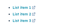
By default, lists will be configured as vertically stacked list items without bullets. To customize the styling, use the `variant` prop, as shown below.

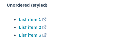
To create a bulleted unordered list:

<Frame>
  <img src="https://www.hubspot.com/hubfs/Knowledge_Base_2023_2024/ui-components-list-variants_2.png" alt="ui-components-list-variants_2" />
</Frame>

```jsx theme={null}
<List variant="unordered-styled">
  <Link href="www.hubspot.com">List item 1</Link>
  <Link href="www.developers.hubspot.com">List item 2</Link>
  <Link href="www.knowledge.hubspot.com">List item 3</Link>
</List>;
```

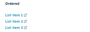
To create a numbered list without styling:

<Frame>
  <img src="https://www.hubspot.com/hubfs/Knowledge_Base_2023_2024/ui-components-list-variants_3.png" alt="ui-components-list-variants_3" />
</Frame>

```jsx theme={null}
<List variant="ordered">
  <Link href="www.hubspot.com">List item 1</Link>
  <Link href="www.developers.hubspot.com">List item 2</Link>
  <Link href="www.knowledge.hubspot.com">List item 3</Link>
</List>;
```

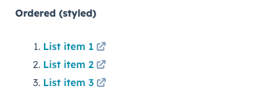
To create a numbered list with styling:

<Frame>
  <img src="https://www.hubspot.com/hubfs/Knowledge_Base_2023_2024/ui-components-list-variants_4.png" alt="ui-components-list-variants_4" />
</Frame>

```jsx theme={null}
<List variant="ordered-styled">
  <Link href="www.hubspot.com">List item 1</Link>
  <Link href="www.developers.hubspot.com">List item 2</Link>
  <Link href="www.knowledge.hubspot.com">List item 3</Link>
</List>;
```

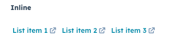
To stack list items horizontally:

<Frame>
  <img src="https://www.hubspot.com/hubfs/Knowledge_Base_2023_2024/ui-components-list-variants_5.png" alt="ui-components-list-variants_5" />
</Frame>

```jsx theme={null}
<List variant="inline">
  <Link href="www.hubspot.com">List item 1</Link>
  <Link href="www.developers.hubspot.com">List item 2</Link>
  <Link href="www.knowledge.hubspot.com">List item 3</Link>
</List>;
```

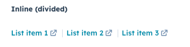
To stack list items horizontally with a divider between each item:

<Frame>
  <img src="https://www.hubspot.com/hubfs/Knowledge_Base_2023_2024/ui-components-list-variants_6.png" alt="ui-components-list-variants_6" />
</Frame>

```jsx theme={null}
<List variant="inline-divided">
  <Link href="www.hubspot.com">List item 1</Link>
  <Link href="www.developers.hubspot.com">List item 2</Link>
  <Link href="www.knowledge.hubspot.com">List item 3</Link>
</List>;
```

## Related components

* [Text](/apps/developer-platform/add-features/ui-extensions/ui-components/standard-components/text)
* [Accordion](/apps/developer-platform/add-features/ui-extensions/ui-components/standard-components/accordion)
* [DescriptionList](/apps/developer-platform/add-features/ui-extensions/ui-components/standard-components/description-list)
