> ## Documentation Index
> Fetch the complete documentation index at: https://developers.hubspot.com/docs/llms.txt
> Use this file to discover all available pages before exploring further.
---
id: f1cf46cb-c8fc-4cad-aa6d-610806f733de
---
# ProgressBar
> Learn about the ProgressBar component for use in UI extensions.
The `ProgressBar` component renders a visual indicator showing a numeric and/or percentage-based representation of progress. The percentage is calculated based on the maximum possible value specified in the component.
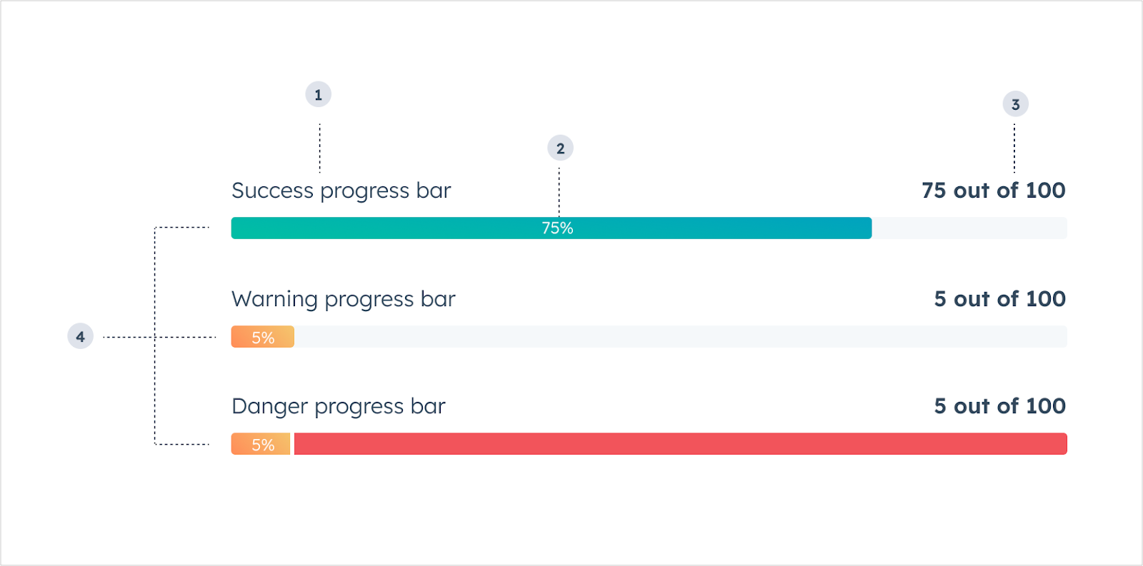 1. **Title:** the text that displays above the bar to describe the data it represents.
2. **Completion percentage:** the percent value of how much progress has been made.
3. **Value description:** the text that describes the current state of the bar's value.
4. **Variant:** the color of the progress bar.
```jsx theme={null}
import { ProgressBar } from "@hubspot/ui-extensions";
const Extension = () => {
return ;
};
```
## Props
| Prop | Type | Description |
| ------------------ | -------------------------------------------------- | -------------------------------------------------------------------------------------------------- |
| `aria-label` | String | The accessibility label. |
| `maxValue` | Number | The maximum value of the progress bar. Default is `100`. |
| `showPercentage` | Boolean | When set to `true`, the progress bar will display the completion percentage. Default is `false`. |
| `title` | String | The text that displays above the progress bar. |
| `value` | Number | The number representing the progress so far. Default is `0`. |
| `valueDescription` | String | The text that explains the current state of the `value` property. For example, `"150 out of 250"`. |
| `variant` | `'success'` (default) \| `'warning'` \| `'danger'` | The color to indicate progress sentiment. |
## Variants
Using the variant prop, you can set the following progress bar colors:
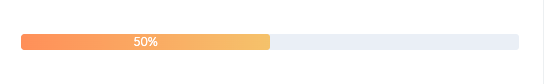
* `'success'`: a green bar to indicate movement towards a positive goal or outcome.
1. **Title:** the text that displays above the bar to describe the data it represents.
2. **Completion percentage:** the percent value of how much progress has been made.
3. **Value description:** the text that describes the current state of the bar's value.
4. **Variant:** the color of the progress bar.
```jsx theme={null}
import { ProgressBar } from "@hubspot/ui-extensions";
const Extension = () => {
return ;
};
```
## Props
| Prop | Type | Description |
| ------------------ | -------------------------------------------------- | -------------------------------------------------------------------------------------------------- |
| `aria-label` | String | The accessibility label. |
| `maxValue` | Number | The maximum value of the progress bar. Default is `100`. |
| `showPercentage` | Boolean | When set to `true`, the progress bar will display the completion percentage. Default is `false`. |
| `title` | String | The text that displays above the progress bar. |
| `value` | Number | The number representing the progress so far. Default is `0`. |
| `valueDescription` | String | The text that explains the current state of the `value` property. For example, `"150 out of 250"`. |
| `variant` | `'success'` (default) \| `'warning'` \| `'danger'` | The color to indicate progress sentiment. |
## Variants
Using the variant prop, you can set the following progress bar colors:
* `'success'`: a green bar to indicate movement towards a positive goal or outcome.
 * `'warning'`: a yellow bar to indicate movement towards a negative outcome or limitation.
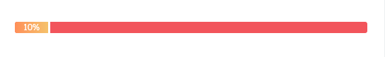
 * `'danger'`: a red bar to indicate movement towards an extremely negative outcome or when a limitation has been reached.
 ## Usage examples
* Evaluating the sale of products against a quota or goal.
* Communicating the stage progress of a deal or ticket.
* Monitoring the number of support calls or tickets per customer.
## Guidelines
* **DO:** use the `showPercentage` prop to give the user more information about the status of the progress.
* **DON'T:** use more than 3-4 progress bars in a single card.
## Related components
* [StepIndicator](/apps/developer-platform/add-features/ui-extensions/ui-components/standard-components/step-indicator)
* [LoadingSpinner](/apps/developer-platform/add-features/ui-extensions/ui-components/standard-components/loading-spinner)
* [Statistics](/apps/developer-platform/add-features/ui-extensions/ui-components/standard-components/statistics)
## Usage examples
* Evaluating the sale of products against a quota or goal.
* Communicating the stage progress of a deal or ticket.
* Monitoring the number of support calls or tickets per customer.
## Guidelines
* **DO:** use the `showPercentage` prop to give the user more information about the status of the progress.
* **DON'T:** use more than 3-4 progress bars in a single card.
## Related components
* [StepIndicator](/apps/developer-platform/add-features/ui-extensions/ui-components/standard-components/step-indicator)
* [LoadingSpinner](/apps/developer-platform/add-features/ui-extensions/ui-components/standard-components/loading-spinner)
* [Statistics](/apps/developer-platform/add-features/ui-extensions/ui-components/standard-components/statistics)