> ## Documentation Index
> Fetch the complete documentation index at: https://developers.hubspot.com/docs/llms.txt
> Use this file to discover all available pages before exploring further.
---
id: f30fe603-7ca9-4a68-a659-8d5eea97bd64
---
# ScoreCircle
> Learn about the ScoreCircle component for use in UI extensions.
export const ComponentProp = ({name, required, type, description, defaultValue, seeItems}) => {
const renderSeeItems = () => {
if (!seeItems || seeItems.length === 0) {
return null;
}
if (seeItems.length === 1) {
return
See: {seeItems[0]}
;
}
return
See:
{seeItems.map((item, index) => - {item}
)}
{name}
{required && <> Required}
|
{type}
{defaultValue &&
Default: {defaultValue}
}
|
{description}
{renderSeeItems()}
|
;
};
export const ComponentProps = ({children}) => {
return
| Prop |
Type |
Description |
{children}
;
};
export const Tag = ({children, type = 'default', className = ''}) => {
return
{children}
;
};
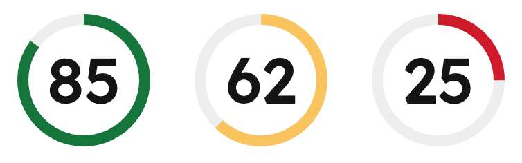
The `ScoreCircle` component displays a score value (0-100) as a circular progress indicator with color-coded status. Color is automatically applied based on the [score value](#score-values).
Use this component to provide data visualization for use cases such as:
* Completion percentages for tasks or projects.
* Quality scores or performance metrics.
* Health scores or ratings.
 ```jsx theme={null}
import { ScoreCircle, Flex } from '@hubspot/ui-extensions';
hubspot.extend(() => (
));
```
## Props
```jsx theme={null}
import { ScoreCircle, Flex } from '@hubspot/ui-extensions';
hubspot.extend(() => (
));
```
## Props
number} description={<>The score value to display. Must be a number between 0 and 100. Decimal values are automatically rounded down to the nearest integer.} />
## Score values
The component automatically validates score values and applies color-coded statuses based on the score value:
* **Success (green):** score >= 66
* **Warning (yellow):** score >= 33 and \< 66
* **Alert (red):** score \< 33
The component includes automatic handling for invalid scores:
* If the score is less than 0 or greater than 100, an error is logged and the component displays `–` instead of the score.
* If the score is a decimal value, it is automatically rounded down to the nearest integer and a warning is logged.
## Accessibility
The component includes the following accessibility features:
* Uses the `meter` [ARIA role](https://developer.mozilla.org/en-US/docs/Web/Accessibility/ARIA/Reference/Roles/meter_role) to indicate a scalar measurement.
* Provides `aria-valuenow`, `aria-valuemin`, and `aria-valuemax` attributes for screen readers.
* Includes an accessible label describing the score value or error state.
## Guidelines
* **DO:** provide context around the score with additional text or labels.
* **DO:** use the automatic color coding to communicate status at a glance.
* **DON'T:** use `ScoreCircle` for values outside the 0-100 range.
## Related components
* [Statistics](/apps/developer-platform/add-features/ui-extensions/ui-components/standard-components/statistics)
* [ProgressBar](/apps/developer-platform/add-features/ui-extensions/ui-components/standard-components/progress-bar)
* [Text](/apps/developer-platform/add-features/ui-extensions/ui-components/standard-components/text)