> ## Documentation Index
> Fetch the complete documentation index at: https://developers.hubspot.com/docs/llms.txt
> Use this file to discover all available pages before exploring further.

---
id: dc138ffc-7c3f-4d42-b77d-2b90071142eb
---

# SearchInput | UI components

> Learn about the SearchInput component for enabling search in UI extensions.

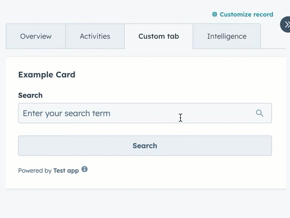
The `SearchInput` component renders an input field that enables users to search. The component doesn't provide search functionality out of the box, but includes props for managing input state and validation.

<div style={{ maxWidth: '390px', margin: '0 auto' }}>
  <Frame>
    <img src="https://developers.hubspot.com/hubfs/Knowledge_Base_2023-24-25/ui-extensions/ui-extension-component-searchinput-example.gif" alt="ui-extension-components-date-input" />
  </Frame>
</div>

```jsx theme={null}
import React, { useState } from "react";
import { Button, Flex, Form, SearchInput, Text, hubspot } from "@hubspot/ui-extensions";

hubspot.extend(({ actions }) => <Extension sendAlert={actions.addAlert} />);

const Extension = ({ sendAlert }) => {
  const [searchValue, setSearchValue] = useState("");

  const handleSubmit = formData => {
    const searchTerm = formData.targetValue.search;
    sendAlert({
      message: `You searched for: "${searchTerm}"`,
      type: "success",
    });
  };

  return (
    <Form onSubmit={handleSubmit}>
      <Flex direction="column" gap="md">
        <SearchInput
          name="search"
          label="Search"
          placeholder="Enter your search term"
          value={searchValue}
          onChange={value => setSearchValue(value)}
        />
        <Button type="submit">Search</Button>
        {searchValue && <Text>Current search: {searchValue}</Text>}
      </Flex>
    </Form>
  );
};
```

## Props

| Prop                   | Type                                | Description                                                                                                                                                                       |
| ---------------------- | ----------------------------------- | --------------------------------------------------------------------------------------------------------------------------------------------------------------------------------- |
| `clearable`            | Boolean                             | When set to `true`, shows a clear button to clear the input. Default is `true`.                                                                                                   |
| `description`          | String                              | Instructional message to help understand the purpose of the input.                                                                                                                |
| `error`                | Boolean                             | When set to `true`, renders the error state and shows `validationMessage` as an error.                                                                                            |
| `getValidationMessage` | `(value: string) => string \| null` | Called to validate the input value and display a validation message. Depending on the width and length of message, the message display may appear above or inline with the input. |
| `label`                | String                              | The label text to display for the input.                                                                                                                                          |
| `name`                 | String                              | The unique identifier for the input.                                                                                                                                              |
| `onBlur`               | `(value: string) => void`           | A function that is called when the field loses focus.                                                                                                                             |
| `onChange`             | `(value: string) => void`           | A callback function that is invoked when the input value changes.                                                                                                                 |
| `onFocus`              | `(value: string) => void`           | A function that is called when the field gets focused.                                                                                                                            |
| `onInput`              | `(value: string) => void`           | A callback function that is invoked every time the field is edited by the user.                                                                                                   |
| `placeholder`          | String                              | Text that appears in the input when it has no value set.                                                                                                                          |
| `readOnly`             | Boolean                             | When set to `true`, the field is not editable.                                                                                                                                    |
| `required`             | Boolean                             | When set to `true`, displays a required field indicator.                                                                                                                          |
| `tooltip`              | String                              | Text that will appear in a tooltip on hover next to the input label.                                                                                                              |
| `validationMessage`    | String                              | The text to show under the input for error or success validations. Will appear below the input. Learn more about [validation messages](#validation-messages).                     |
| `value`                | String                              | The value of the input.                                                                                                                                                           |
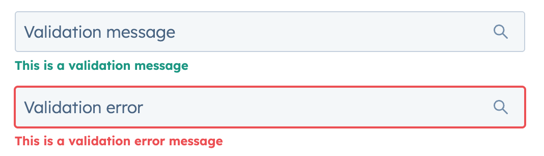
## Validation messages

Using the `validationMessage` and `getValidationMessage` props, you can implement validation into the search input. By default, `validationMessage` will render as a green success message. When the `error` prop is `true`, the message will render as red and the search input will include a red border.

<div style={{ maxWidth: '390px', margin: '0 auto' }}>
  <Frame>
    <img
      src="https://www.hubspot.com/hubfs/Knowledge_Base_2023-24-25/ui-extensions/ui-extension-searchinput-component-validation-messages.png"
      alt="SearchInput validation messages and
errors"
    />
  </Frame>
</div>

```jsx theme={null}
<>
  <SearchInput
    name="validation-message"
    placeholder="Validation message"
    validationMessage="This is a validation message"
  />
  <SearchInput
    name="validation-error"
    placeholder="Validation error"
    validationMessage="This is a validation error message"
    error
  />
</>;
```

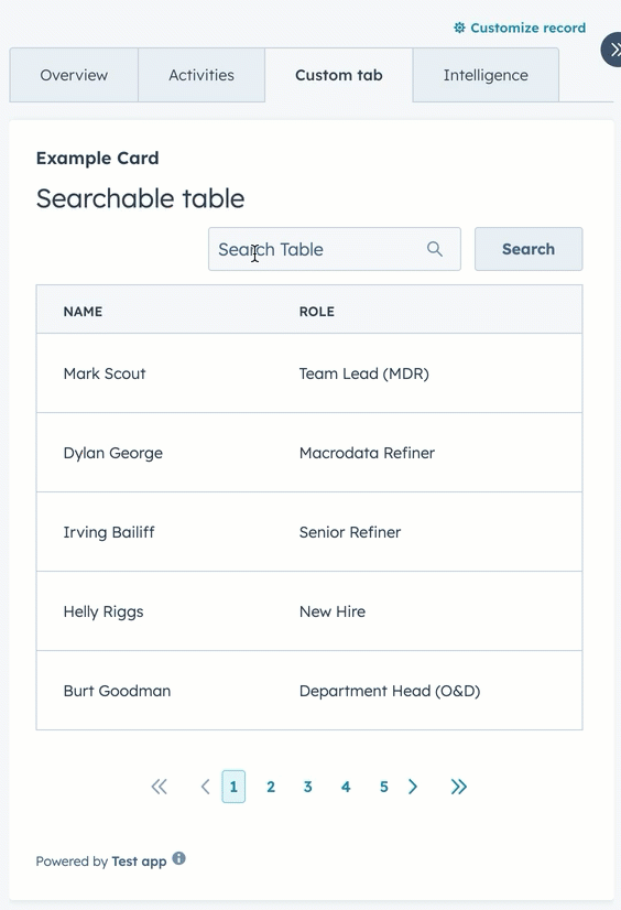
## Table search example

The example below creates a searchable table.

<div style={{ maxWidth: '390px', margin: '0 auto' }}>
  <Frame>
    <img
      src="https://developers.hubspot.com/hubfs/Knowledge_Base_2023-24-25/ui-extensions/ui-extension-searchinput-table-form-example.gif"
      alt="Using a SearchInput component to search through table
data"
    />
  </Frame>
</div>

```jsx theme={null}
import React, { useState } from "react";
import {
  Button,
  Divider,
  Form,
  Heading,
  Table,
  TableHead,
  TableHeader,
  TableRow,
  TableBody,
  TableCell,
  Flex,
  SearchInput,
  hubspot,
} from "@hubspot/ui-extensions";

hubspot.extend(({ actions }) => <Extension sendAlert={actions.addAlert} />);

const Extension = ({ sendAlert }) => {
  const tableData = [
    { name: "Mark Scout", role: "Team Lead (MDR)" },
    { name: "Dylan George", role: "Macrodata Refiner" },
    { name: "Irving Bailiff", role: "Senior Refiner" },
    { name: "Helly Riggs", role: "New Hire" },
    { name: "Burt Goodman", role: "Department Head (O&D)" },
  ];

  const [filteredData, setFilteredData] = useState(tableData);

  const handleSubmit = e => {
    const searchTerm = e.targetValue.searchInput;
    sendAlert({ message: `You've searched for: ${searchTerm}` });
  };

  const searchTable = e => {
    const searchTerm = e.targetValue.searchInput;
    // Filter the table data based on search term
    const filtered = tableData.filter(
      item =>
        item.name.toLowerCase().includes(searchTerm.toLowerCase()) ||
        item.role.toLowerCase().includes(searchTerm.toLowerCase())
    );

    setFilteredData(filtered);
    sendAlert({
      message: `Searched for: ${searchTerm}. Found ${filtered.length} result(s).`,
    });
  };

  return (
    <>
      <Form onSubmit={searchTable}>
        <Flex direction="column" gap="sm">
          <Heading>Searchable table</Heading>
          <Flex direction="row" gap="sm" alignSelf="end" align="end" justify="end">
            <SearchInput name="searchInput" placeholder="Search Table" />
            <Button type="submit">Search</Button>
          </Flex>
          <Table bordered={true} paginated={true} pageCount="5" limit={10}>
            <TableHead>
              <TableRow>
                <TableHeader width="min">Name</TableHeader>
                <TableHeader width="min">Role</TableHeader>
              </TableRow>
            </TableHead>
            <TableBody>
              {filteredData.map((item, index) => (
                <TableRow key={index}>
                  <TableCell width="min">{item.name}</TableCell>
                  <TableCell width="min">{item.role}</TableCell>
                </TableRow>
              ))}
            </TableBody>
          </Table>
        </Flex>
      </Form>
    </>
  );
};
```

## Related components

* [Form](/apps/developer-platform/add-features/ui-extensions/ui-components/standard-components/form)
* [DateInput](/apps/developer-platform/add-features/ui-extensions/ui-components/standard-components/date-input)
* [NumberInput](/apps/developer-platform/add-features/ui-extensions/ui-components/standard-components/number-input)
