;
};
Use the `Spacer` component to add vertical space between components. This component is intended for one-off use in situations where other layout components like [Flex](/apps/developer-platform/add-features/ui-extensions/ui-components/standard-components/flex) don't fully provide the spacing you need. You can use this component in tandem with the [AutoGrid](/apps/developer-platform/add-features/ui-extensions/ui-components/standard-components/autogrid), [Flex](/apps/developer-platform/add-features/ui-extensions/ui-components/standard-components/flex), [Box](/apps/developer-platform/add-features/ui-extensions/ui-components/standard-components/box), and [Inline](/apps/developer-platform/add-features/ui-extensions/ui-components/standard-components/inline) components to [manage extension layout](/apps/developer-platform/add-features/ui-extensions/ui-components/manage-ui-extension-layout).
For consistent spacing between multiple components, use the [Flex](/apps/developer-platform/add-features/ui-extensions/ui-components/standard-components/flex) component with the `direction="column"` and the `gap` props instead. Flex automatically applies uniform spacing between children, which makes layout easier to maintain.
```jsx wrap theme={null}
import { Button, Spacer, Text } from '@hubspot/ui-extensions';
hubspot.extend(() => );
const Extension = () => {
return (
<>
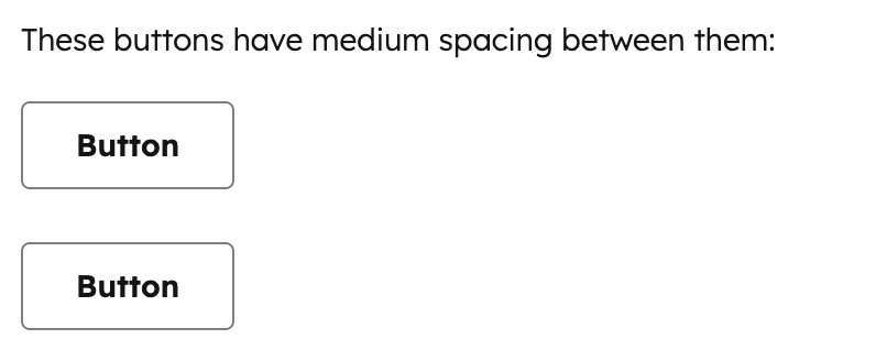
These buttons have medium spacing between them:
);
};
```
## Props
"extra-large" | "extra-small" | "large" | "medium" | "small"} description={<>The amount of vertical space to render.} defaultValue={<>"small"} />
string} description={<>Used by findByTestId() to locate this component in tests.} seeItems={[<>Testing utilities reference]} />
## Distances
The `size` prop controls how much vertical space is rendered. Each size maps to a consistent spacing value from the HubSpot design system:
* `extra-small`: minimal spacing for tightly grouped elements.
* `small`: default spacing suitable for most use cases.
* `medium`: moderate spacing for separating related content sections.
* `large`: generous spacing for creating clear visual breaks.
* `extra-large`: maximum spacing for major section divisions.
## Spacer vs. Flex
For most layouts, you should use [Flex](/apps/developer-platform/add-features/ui-extensions/ui-components/standard-components/flex) with `direction="column"` and a `gap` value instead of `Spacer`, as it provides uniform spacing between all children without needing to manually insert `Spacer` components.
```jsx wrap theme={null}
import { Flex, Text } from '@hubspot/ui-extensions';
const Extension = () => {
return (
First sectionSecond sectionThird section
);
};
```
Use `Spacer` for situations where you need non-uniform spacing or a one-off adjustment:
```jsx highlight={8} wrap theme={null}
import { Flex, Text, Spacer } from '@hubspot/ui-extensions';
const Extension = () => {
return (
First sectionSecond sectionFinal section with extra space above
);
};
```
## Guidelines
* **DO:** use `Spacer` for one-off vertical spacing adjustments where you need different spacing at a specific point.
* **DO:** use the smallest `Spacer` size that creates adequate visual separation.
* **DON'T:** use multiple `Spacer` components when `Flex` with `gap` would achieve the same result more cleanly.
* **DON'T:** use `Spacer` for horizontal spacing. Use `Flex` with `direction="row"` and `gap` instead.
* **DON'T:** use `Spacer` when a `Divider` would better communicate the separation between sections.
## Related components
* [AutoGrid](/apps/developer-platform/add-features/ui-extensions/ui-components/standard-components/autogrid)
* [Flex](/apps/developer-platform/add-features/ui-extensions/ui-components/standard-components/flex)
* [Box](/apps/developer-platform/add-features/ui-extensions/ui-components/standard-components/box)
* [Divider](/apps/developer-platform/add-features/ui-extensions/ui-components/standard-components/divider)
* [Inline](/apps/developer-platform/add-features/ui-extensions/ui-components/standard-components/inline)
 ```jsx wrap theme={null}
import { Button, Spacer, Text } from '@hubspot/ui-extensions';
hubspot.extend(() =>
```jsx wrap theme={null}
import { Button, Spacer, Text } from '@hubspot/ui-extensions';
hubspot.extend(() =>