> ## Documentation Index
> Fetch the complete documentation index at: https://developers.hubspot.com/docs/llms.txt
> Use this file to discover all available pages before exploring further.
---
id: ffb93cdf-50bd-4a03-b028-568b6f5f1b16
---
# StepIndicator
> Learn about the StepIndicator component for use in UI extensions.
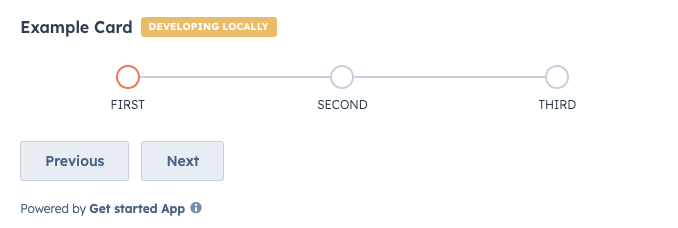
The `StepIndicator` component renders an indicator to show the current step of a multi-step process.
```jsx theme={null}
import { Flex, Box, StepIndicator, Button } from "@hubspot/ui-extensions";
hubspot.extend(() => );
function Extension() {
const [currentStep, setCurrentStep] = useState(0);
return (
);
}
```
## Props
| Prop | Type | Description |
| ------------- | ----------------------------------------------------------------------------------------------------------------------------- | ------------------------------------------------------------------------------------------------------------------------------------------------------------------------------------------------------------ |
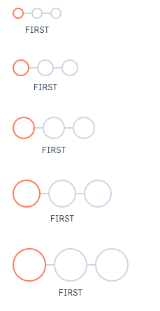
| `circleSize` | `'xs'`, `'extra-small'`, \| `'sm'`, `'small'` (default) \| `'md'`, `'medium'` \| `'lg'`, `'large'` \| `'xl'`, `'extra-large'` | The size of the indicator circles. See the [variants section](#variants) for examples of sizing. |
| `currentStep` | Number | The currently active step. Steps are zero-based, meaning the first step is assigned `0`. |
| `direction` | `'horizontal'` (default) \| `'vertical'` | The orientation of the indicator. |
| `onClick` | `(stepIndex: number) => void` | A function that is invoked when a step in the indicator is clicked. The function receives the current step index as an argument (zero-based). Use this to update the currently active step. |
| `stepNames` | Array | An array containing the name of each step. |
| `variant` | `'flush'` \| `'default'` (default) \| `'compact'` | Sets component spacing.
`compact`: only shows the title of the currently active step.
`flush`: only shows the title of the currently active step and removes left and right margin.
|
## Variants
By default, the step indicator will be laid out horizontally, but you can use the `direction` prop to set the orientation to `vertical` instead.
In addition, you can set the size of the step circles using the `circleSize` prop, ranging from `'xs'`/`'extra-small'` to `'xl'`/`'extra-large'`.
## Related components
* [ProgressBar](/apps/developer-platform/add-features/ui-extensions/ui-components/standard-components/progress-bar)
* [LoadingSpinner](/apps/developer-platform/add-features/ui-extensions/ui-components/standard-components/loading-spinner)
* [Toggle](/apps/developer-platform/add-features/ui-extensions/ui-components/standard-components/toggle)
 ```jsx theme={null}
import { Flex, Box, StepIndicator, Button } from "@hubspot/ui-extensions";
hubspot.extend(() =>
```jsx theme={null}
import { Flex, Box, StepIndicator, Button } from "@hubspot/ui-extensions";
hubspot.extend(() => 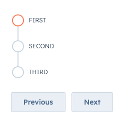 In addition, you can set the size of the step circles using the `circleSize` prop, ranging from `'xs'`/`'extra-small'` to `'xl'`/`'extra-large'`.
 ## Related components
* [ProgressBar](/apps/developer-platform/add-features/ui-extensions/ui-components/standard-components/progress-bar)
* [LoadingSpinner](/apps/developer-platform/add-features/ui-extensions/ui-components/standard-components/loading-spinner)
* [Toggle](/apps/developer-platform/add-features/ui-extensions/ui-components/standard-components/toggle)
## Related components
* [ProgressBar](/apps/developer-platform/add-features/ui-extensions/ui-components/standard-components/progress-bar)
* [LoadingSpinner](/apps/developer-platform/add-features/ui-extensions/ui-components/standard-components/loading-spinner)
* [Toggle](/apps/developer-platform/add-features/ui-extensions/ui-components/standard-components/toggle)