> ## Documentation Index
> Fetch the complete documentation index at: https://developers.hubspot.com/docs/llms.txt
> Use this file to discover all available pages before exploring further.
---
id: aa7ceefe-2414-4847-a41a-4971a6a81622
---
# Table | UI components
> Learn about the Table component for use in UI extensions.
The `Table` component renders a table for displaying and organizing data.
Below, learn how to implement buttons in a UI extension. For guidance on table design, check out the [Table design patterns](/apps/developer-platform/add-features/ui-extensions/ui-components/patterns/tables).
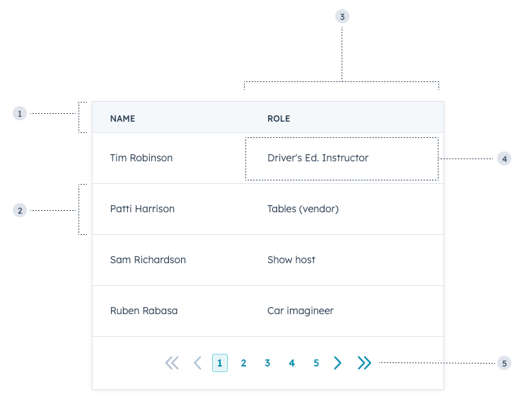
To format the table, you can use the following subcomponents:
* `TableHead`: the header section of the table containing column labels.
* `TableRow`: individual table rows.
* `TableHeader`: cells containing bolded column labels.
* `TableBody`: container for the main table contents (rows and cells).
* `TableCell`: individual cells within the main body.
* `TableFooter`: a row at the bottom of the table, typically to summarize the columns.
 ```jsx theme={null}
import { Table, TableHead, TableRow, TableHeader, TableBody, TableCell } from "@hubspot/ui-extensions";
const Extension = () => {
return (
```jsx theme={null}
import { Table, TableHead, TableRow, TableHeader, TableBody, TableCell } from "@hubspot/ui-extensions";
const Extension = () => {
return (
Name
Role
Tim Robinson
Driver's Ed. Instructor
Patti Harrison
Tables (vendor)
Sam Richardson
Show host
Ruben Rabasa
Car imagineer
);
};
```
## Props
**`` props**
| Prop | Type | Description |
| ----------- | ----------------------------------------------- | ---------------------------------------------------------------------------------------------------------------------------------------------------------------- |
| `bordered` | Boolean | When set to `false`, the table will not include borders. Default is `true`. |
| `density` | `default` (default) \| `condensed` \| `compact` | Use `condensed` to reduce the padding in Table rows; use `compact` to display minimal padding for readability. |
| `flush` | Boolean | When set to `true`, the table will not include bottom margin. Default is `false`. |
| `paginated` | Boolean | When set to `true`, the table will include pagination navigation. Default is `false`.See the [paginated tables](#paginated-tables) section for pagination props. |
**`` props**
| Prop | Type | Description |
| --------------- | ------------------------------------------------------------------ | ---------------------------------------------------------------------------------------------------------------------------------------------------------------------------------------------------------------------------------------------------------------------------------------------------------------------------------------------------------------------------------------------------------------------------- |
| `align` | `'center'` \| `'left'` \| `'right'` | Sets the alignment of a table header. |
| `sortDirection` | `'none'` (default) \| `'ascending'` \| `'descending'` \| `'never'` | A visual indicator of the current direction in which the column is sorted. Does not modify the table data. See the [sortable tables](#sortable-tables) section for more sorting props. |
| `width` | Number \| `'min'` \| `'max'` \| `'auto'` | Sets the width of a table header.- `min`: the content will only be as wide as required, overflowing if the content is wider than the table. A horizontal scrollbar will appear when there is overflow.
- `max`: the content will expand to occupy the maximum available width without overflowing.
- `auto`: the content will adjust its width based on the available space without overflowing.
|
**`` props**
| Prop | Type | Description |
| --------- | ---------------------------------------- | -------------------------------------------------------------------------------------------------------------------------------------------------------------------------------------------------------------------------------------------------------------------------------------------------------------------------------------------------------------------------------------------------------------------------- |
| `align` | `'center'` \| `'left'` \| `'right'` | Sets the alignment of a table cell. |
| `colSpan` | Number | Sets the number of columns a cell should span. |
| `width` | Number \| `'min'` \| `'max'` \| `'auto'` | Sets the width of a table cell.- `min`: the content will only be as wide as required, overflowing if the content is wider than the table. A horizontal scrollbar will appear when there is overflow.
- `max`: the content will expand to occupy the maximum available width without overflowing.
- `auto`: the content will adjust its width based on the available space without overflowing.
|
## Paginated tables
To include paginated navigation below a table, set the `Table` prop `paginated` to `true`.
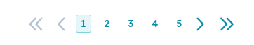 You'll then include the following props to further configure pagination:
| Prop | Type | Description |
| ----------------------- | ---------------------------- | -------------------------------------------------------------------------------------------------------------------------------------------------------- |
| `maxVisiblePageButtons` | Number | The maximum number of page buttons to display. |
| `onPageChange` | (pagenumber: number) => void | A function that is invoked when the page pagination button is clicked. It receives the new page number as an argument. |
| `page` | Number | Denotes the current page number. |
| `pageCount` | Number | The total number of pages available. |
| `showButtonLabels` | Boolean | When set to `false`, hides the text labels for First/Prev/Next buttons. The button labels will still be accessible to screen readers. Default is `true`. |
| `showFirstLastButtons` | Boolean | When set to `true`, displays the First/Last page buttons. Default is `false`. |
## Sortable tables
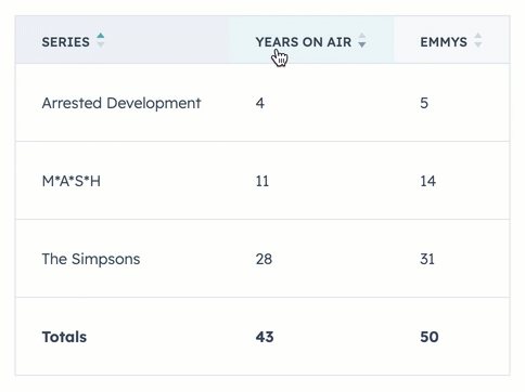
To add sorting functionality to a table, you can include the `sortDirection` and `onSortChange` props in the table's `TableHeader` components. To enable table data to dynamically reorder based on user input, you'll need to store your table data in variables rather than hard coding it into table cells. Below is an example of a sortable table with a static table footer.
You'll then include the following props to further configure pagination:
| Prop | Type | Description |
| ----------------------- | ---------------------------- | -------------------------------------------------------------------------------------------------------------------------------------------------------- |
| `maxVisiblePageButtons` | Number | The maximum number of page buttons to display. |
| `onPageChange` | (pagenumber: number) => void | A function that is invoked when the page pagination button is clicked. It receives the new page number as an argument. |
| `page` | Number | Denotes the current page number. |
| `pageCount` | Number | The total number of pages available. |
| `showButtonLabels` | Boolean | When set to `false`, hides the text labels for First/Prev/Next buttons. The button labels will still be accessible to screen readers. Default is `true`. |
| `showFirstLastButtons` | Boolean | When set to `true`, displays the First/Last page buttons. Default is `false`. |
## Sortable tables
To add sorting functionality to a table, you can include the `sortDirection` and `onSortChange` props in the table's `TableHeader` components. To enable table data to dynamically reorder based on user input, you'll need to store your table data in variables rather than hard coding it into table cells. Below is an example of a sortable table with a static table footer.
 ```jsx theme={null}
import React, { useState } from "react";
import { Table, TableHead, TableRow, TableHeader, TableBody, TableCell, TableFooter } from "@hubspot/ui-extensions";
import { hubspot } from "@hubspot/ui-extensions";
hubspot.extend(() => );
const ORIGINAL_DATA = [
{
name: "The Simpsons",
yearsOnAir: 28,
emmys: 31,
},
{
name: "M*A*S*H",
yearsOnAir: 11,
emmys: 14,
},
{
name: "Arrested Development",
yearsOnAir: 4,
emmys: 5,
},
];
// Initial sort state: all columns are sortable but unsorted
const DEFAULT_SORT_STATE = {
name: "none",
yearsOnAir: "none",
emmys: "none",
};
function Extension() {
const [data, setData] = useState(ORIGINAL_DATA);
const [sortState, setSortState] = useState({ ...DEFAULT_SORT_STATE });
function handleOnSort(fieldName, sortDirection) {
const dataClone = [...data];
dataClone.sort((entry1, entry2) => {
if (sortDirection === "ascending") {
return entry1[fieldName] < entry2[fieldName] ? -1 : 1;
}
return entry2[fieldName] < entry1[fieldName] ? -1 : 1;
});
setSortState({ ...DEFAULT_SORT_STATE, [fieldName]: sortDirection });
setData(dataClone);
}
return (
```jsx theme={null}
import React, { useState } from "react";
import { Table, TableHead, TableRow, TableHeader, TableBody, TableCell, TableFooter } from "@hubspot/ui-extensions";
import { hubspot } from "@hubspot/ui-extensions";
hubspot.extend(() => );
const ORIGINAL_DATA = [
{
name: "The Simpsons",
yearsOnAir: 28,
emmys: 31,
},
{
name: "M*A*S*H",
yearsOnAir: 11,
emmys: 14,
},
{
name: "Arrested Development",
yearsOnAir: 4,
emmys: 5,
},
];
// Initial sort state: all columns are sortable but unsorted
const DEFAULT_SORT_STATE = {
name: "none",
yearsOnAir: "none",
emmys: "none",
};
function Extension() {
const [data, setData] = useState(ORIGINAL_DATA);
const [sortState, setSortState] = useState({ ...DEFAULT_SORT_STATE });
function handleOnSort(fieldName, sortDirection) {
const dataClone = [...data];
dataClone.sort((entry1, entry2) => {
if (sortDirection === "ascending") {
return entry1[fieldName] < entry2[fieldName] ? -1 : 1;
}
return entry2[fieldName] < entry1[fieldName] ? -1 : 1;
});
setSortState({ ...DEFAULT_SORT_STATE, [fieldName]: sortDirection });
setData(dataClone);
}
return (
handleOnSort("name", sortDirection)}>
Series
handleOnSort("yearsOnAir", sortDirection)}>
Years on air
handleOnSort("emmys", sortDirection)}>
Emmys
{data.map(({ name, yearsOnAir, emmys }) => {
return (
{name}
{yearsOnAir}
{emmys}
);
})}
Totals
43
50
);
}
```
| Prop | Type | Description |
| --------------- | -------------------------------------------------------- | -------------------------------------------------------------------------------------------------------------------------------------------------- |
| `disabled` | Boolean | When set to `true`, users cannot change the sort ordering. It has no effect if `sortDirection` is set to `never` or undefined. Default is `false`. |
| `onSortChange` | `(value: "none" \| "ascending" \| "descending") => void` | A function that will be invoked when the header is clicked. It receives a `sortDirection` as an argument (cannot be none or a null value). |
| `sortDirection` | `'none'` (default) \| `'ascending'` \| `'descending'` | Visually indicates with an arrow which way the rows are sorted. |
## Usage examples
* A client list containing names, phone numbers, job positions, and email addresses that salespeople can use to prioritize outreach.
* A summary table of the deals closed last quarter.
## Guidelines
* **DO:** keep text within data cells clear and concise for easier scanning.
* **DO:** always include a table header row to label columns.
* **DO:** limit the use of links in table cells.
* **DON'T:** use multiple tables on one screen when possible.
* **DON'T:** render a blank table if there's no potential for no data to display, such as with search or filters. Instead, use the [EmptyState component](/apps/developer-platform/add-features/ui-extensions/ui-components/standard-components/empty-state) when there are no results to display.
## Related components
* [DescriptionList](/apps/developer-platform/add-features/ui-extensions/ui-components/standard-components/description-list)
* [Statistics](/apps/developer-platform/add-features/ui-extensions/ui-components/standard-components/statistics)
* [CrmPropertyList](/apps/developer-platform/add-features/ui-extensions/ui-components/crm-data-components/crm-property-list)