> ## Documentation Index
> Fetch the complete documentation index at: https://developers.hubspot.com/docs/llms.txt
> Use this file to discover all available pages before exploring further.
---
id: 1a36314a-ef74-466f-a674-db023a0f5e43
---
# Tabs | UI components
> Learn about the Tabs component for use in UI extensions.
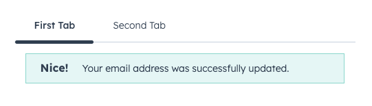
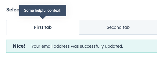
The `Tabs` component allows you to group related content into clickable tabs, with each `Tab` child component creating a new tab. Options are provided for visual variants, tooltip configuration, and more.
```jsx theme={null}
import { Alert, Tabs, Tab } from "@hubspot/ui-extensions";
// `defaultSelected` sets the initial tab,
// user controls changing tabs via clicking
const Extension = () => {
return (
Your email address was successfully updated.
Tab 2's content
);
};
```
## Props
**`` props**
| Prop | Type | Description |
| ------------------ | ---------------------------------------- | ------------------------------------------------------------------------------------------------------------------ |
| `defaultSelected` | String \| Number | The ID of the tab to display by default (as set by the `Tab`'s `tabId` prop). |
| `fill` | Boolean | Whether the tabs should fill the available space. |
| `onSelectedChange` | `(selectedId: string \| number) => void` | A function that gets invoked when the selected tab changes. |
| `selected` | String \| Number | The currently selected tab ID, for [controlling the component via React state](#controlling-tabs-via-react-state). |
| `variant` | `default` \| `enclosed` | Visual style of the tabs. See [variants](#variants) for more information. |
**`` props**
| Prop | Type | Description |
| ------------------ | --------------------------------------------------- | -------------------------------------------------------------------------------------------------- |
| `disabled` | Boolean | Whether the tab should be disabled. When set to `false`, tab will be greyed out and not clickable. |
| `tabId` | String \| Number | The tab's unique identifier. |
| `title` | String | The tab's title text. |
| `tooltip` | String | The text that appears in a tooltip on hover. Learn more about [tooltips](#tooltips). |
| `tooltipPlacement` | `top` (default) \| `bottom` \| `left` \| `right` \| | Where the [tooltip](#tooltips) should appear, relative to the tab. |
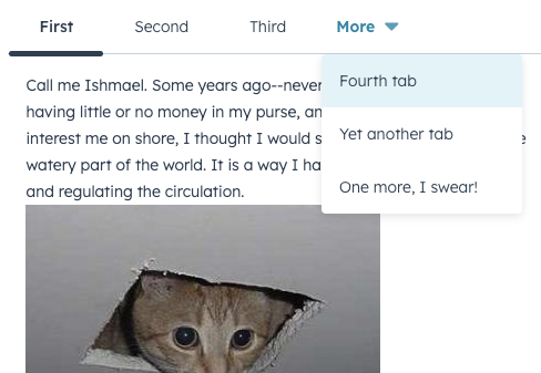
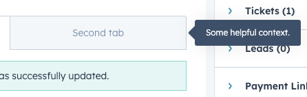
Once there are enough tabs to exceed the width of the container, HubSpot will automatically put overflowing tabs into a *More* dropdown menu, which users can click to select from the remaining tabs.
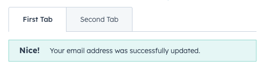
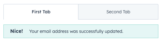
## Variants
The `variant` prop provides two options for tab styling: `default` and `enclosed`.
```jsx highlight={2} theme={null}
Your email address was successfully updated.
Tab 2's content
```
```jsx highlight={2} theme={null}
Your email address was successfully updated.
Tab 2's content
```
You can also set the `fill` prop to `true` to configure the tabs to take up the full width of the container.
```jsx highlight={3} theme={null}
Your email address was successfully updated.
Tab 2's content
```
## Tooltips
Use the `tooltip` prop to add tooltips to tabs on hover. By default, the tooltip will appear above the tab, but you can use the `tooltipPlacement` prop to configure it further.
```jsx highlight={3} theme={null}
Your email address was successfully updated.
Tab 2's content
```
```jsx highlight={3-4} theme={null}
Your email address was successfully updated.
Tab 2's content
```
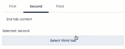
## Controlling tabs via React state
In addition to being able to switch tabs by clicking on each tab, you can also control tab select via React state using the `selected` and `onSelectedChange` props.
```jsx theme={null}
import React, { useState } from "react";
import { Tabs, Tab, Button, Text } from "@hubspot/ui-extensions";
// Uses `selected` and `onSelectedChange` props to handle updates
const BasicExtension = () => {
const [selected, setSelected] = useState("second");
return (
<>
1st tab content
2nd tab content3rd tab contentSelected: {selected}
);
};
```
 ## Variants
The `variant` prop provides two options for tab styling: `default` and `enclosed`.
## Variants
The `variant` prop provides two options for tab styling: `default` and `enclosed`.
 ```jsx highlight={2} theme={null}
 ```jsx highlight={2} theme={null}
 ```jsx highlight={3} theme={null}
 ```jsx highlight={3} theme={null}
 ```jsx highlight={3-4} theme={null}
 ```jsx theme={null}
import React, { useState } from "react";
import { Tabs, Tab, Button, Text } from "@hubspot/ui-extensions";
// Uses `selected` and `onSelectedChange` props to handle updates
const BasicExtension = () => {
const [selected, setSelected] = useState("second");
return (
<>
```jsx theme={null}
import React, { useState } from "react";
import { Tabs, Tab, Button, Text } from "@hubspot/ui-extensions";
// Uses `selected` and `onSelectedChange` props to handle updates
const BasicExtension = () => {
const [selected, setSelected] = useState("second");
return (
<>