> ## Documentation Index
> Fetch the complete documentation index at: https://developers.hubspot.com/docs/llms.txt
> Use this file to discover all available pages before exploring further.
---
id: a45cbf82-9724-4372-aac9-c80623a16ba0
---
# Tile
> Learn about the Tile component for use in UI extensions.
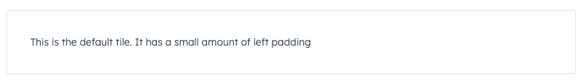
The `Tile` component renders a square tile that can contain other components. Use this component to create groups of related components.
 ```jsx theme={null}
import { Tile, Text } from "@hubspot/ui-extensions";
const Extension = () => {
return (
<>
This is the default tile. It has a small amount of left padding
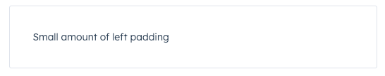
This is a compact tile. It reduces the amount of padding within.
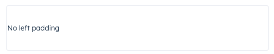
This is a flush tile. It has no left padding
);
};
```
## Props
| Prop | Type | Description |
| --------- | ------- | ---------------------------------------------------------------------------------------------- |
| `compact` | Boolean | When set to `true`, reduces the amount of padding in the tile. Default is `false`. |
| `flush` | Boolean | When set to `true`, removes left and right padding from the tile contents. Default is `false`. |
## Variants
Using the `flush` prop, you can remove left and right padding from the tile contents.
* `flush={false}` (default)
```jsx theme={null}
import { Tile, Text } from "@hubspot/ui-extensions";
const Extension = () => {
return (
<>
This is the default tile. It has a small amount of left padding
This is a compact tile. It reduces the amount of padding within.
This is a flush tile. It has no left padding
);
};
```
## Props
| Prop | Type | Description |
| --------- | ------- | ---------------------------------------------------------------------------------------------- |
| `compact` | Boolean | When set to `true`, reduces the amount of padding in the tile. Default is `false`. |
| `flush` | Boolean | When set to `true`, removes left and right padding from the tile contents. Default is `false`. |
## Variants
Using the `flush` prop, you can remove left and right padding from the tile contents.
* `flush={false}` (default)
 * `flush={true}`
 ## Usage examples
* Group a form and its inputs together.
* Group a bulleted text summary and statistics components together.
## Related components
* [Box](/apps/developer-platform/add-features/ui-extensions/ui-components/standard-components/box)
* [Divider](/apps/developer-platform/add-features/ui-extensions/ui-components/standard-components/divider)
* [Accordion](/apps/developer-platform/add-features/ui-extensions/ui-components/standard-components/accordion)
## Usage examples
* Group a form and its inputs together.
* Group a bulleted text summary and statistics components together.
## Related components
* [Box](/apps/developer-platform/add-features/ui-extensions/ui-components/standard-components/box)
* [Divider](/apps/developer-platform/add-features/ui-extensions/ui-components/standard-components/divider)
* [Accordion](/apps/developer-platform/add-features/ui-extensions/ui-components/standard-components/accordion)