> ## Documentation Index
> Fetch the complete documentation index at: https://developers.hubspot.com/docs/llms.txt
> Use this file to discover all available pages before exploring further.
---
id: 76da8535-9e14-453a-8187-68632375309b
---
# TimeInput | UI components
> Learn about the TimeInput component for use in UI extensions.
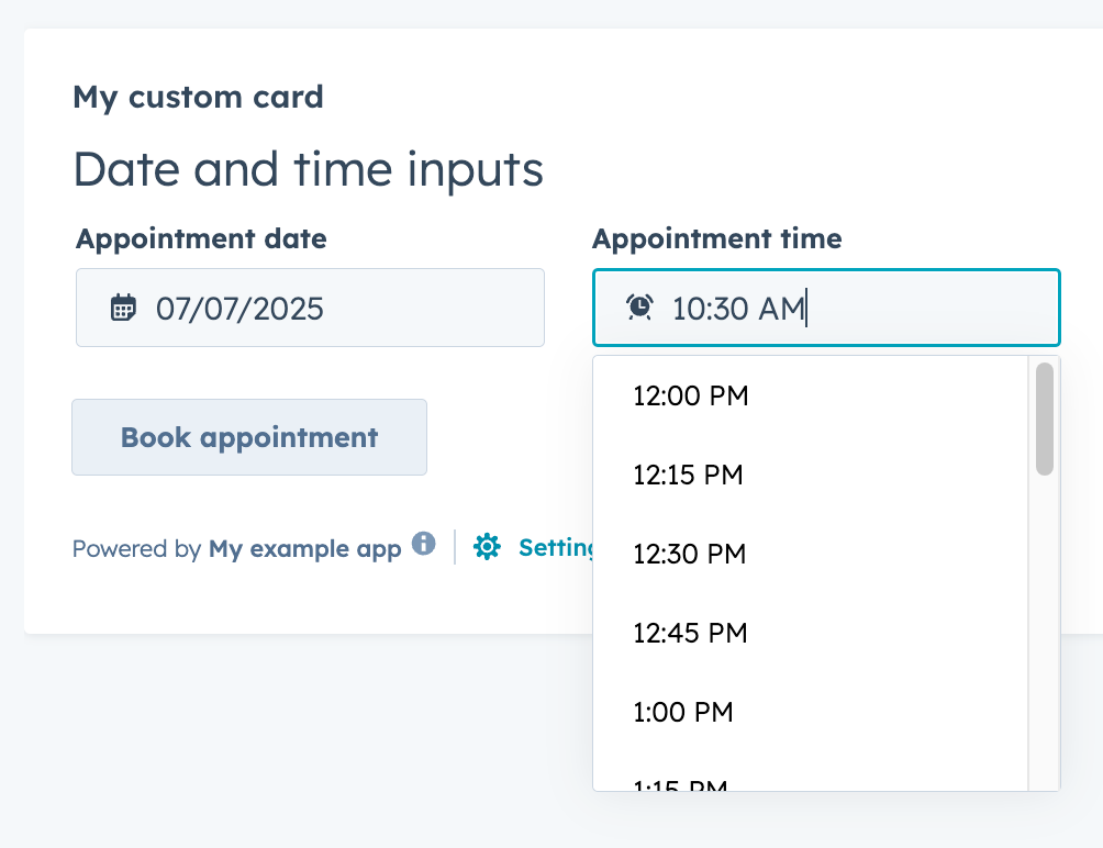
The `TimeInput` component renders an input field where a user can select a time of day. Includes options for customizing the selectable time range, timezone display, and more.
Below is an example of using both `TimeInput` and `DateInput` together to allow users to schedule appoints by date and time. Note the `setValidAppointmentTimes` logic to set the available time ranges based on the selected date.
 ```jsx theme={null}
import React, { useState } from "react";
import { Button, DateInput, Flex, Form, Heading, TimeInput, hubspot } from "@hubspot/ui-extensions";
hubspot.extend(() => );
function Extension() {
const [dateRange] = useState({
start: { year: 2025, month: 6, date: 7 },
end: { year: 2025, month: 6, date: 11 },
});
const [timeRange, setTimeRange] = useState({
start: { hours: 7, minutes: 15 },
end: { hours: 16, minutes: 0 },
});
const [selectedDate, setSelectedDate] = useState({ year: 2025, month: 6, date: 9 });
const [selectedTime, setSelectedTime] = useState({ hours: 10, minutes: 30 });
const areDatesEqual = (firstDate, secondDate) => {
return (
firstDate.date === secondDate.date && firstDate.month === secondDate.month && firstDate.year === secondDate.year
);
};
const setValidAppointmentTimes = date => {
console.log({ date });
console.log({ dateRangeStart: dateRange.start });
// Rudimentary "don't allow early on Monday and late on Friday" logic
if (areDatesEqual(date, dateRange.start)) {
console.log("selected start of date range");
setTimeRange({ start: { hours: 12, minutes: 0 }, end: { hours: 16, minutes: 30 } });
} else if (areDatesEqual(date, dateRange.end)) {
console.log("selected end of date range");
setTimeRange({ start: { hours: 8, minutes: 15 }, end: { hours: 12, minutes: 0 } });
} else {
console.log("selected another date");
setTimeRange({ start: { hours: 8, minutes: 15 }, end: { hours: 16, minutes: 30 } });
}
};
return (
<>
);
}
```
## Props
| Prop | Type | Description |
| ------------------- | ------------------------------------------- | --------------------------------------------------------------------------------------------------------------------------------------------------------------------------------------------------------------------------------------------------------- |
| `defaultValue` | Object | The default time value. Uses the same format as the `value` field. |
| `description` | String | Text that describes the field's purpose. |
| `error` | Boolean | When set to `true`, `validationMessage` is displayed as an error message if provided. The input will also render its error state to let the user know there's an error. If left `false` (default), `validationMessage` is displayed as a success message. |
| `interval` | Number | Sets the interval (in minutes) between the dropdown options. |
| `label` | String | The text that displays above the input. |
| `max` | Object | A Sets the latest valid time available. |
| `min` | Object | Sets the earliest valid time available. |
| `name` | String | The input's unique identifier. |
| `onBlur` | `(value: TimeInputEventsPayload) => void` | A function that is called and passes the value when the field loses focus. |
| `onChange` | `(checked: boolean, value: string) => void` | A callback function that is invoked when the value is committed. Currently, this occurs on `onBlur` of the input and when the user submits the form. |
| `onFocus` | `(value: TimeInputEventsPayload) => void` | A function that is called and passed the value when the field gets focused. |
| `readOnly` | Boolean | When set to `true`, the input cannot be edited. |
| `required` | Boolean | When set to `true`, displays a required field indicator. |
| `timezone` | `'userTz'` (default) \| `'portalTz'` | Sets the timezone that the component will use to calculate valid times.
```jsx theme={null}
import React, { useState } from "react";
import { Button, DateInput, Flex, Form, Heading, TimeInput, hubspot } from "@hubspot/ui-extensions";
hubspot.extend(() => );
function Extension() {
const [dateRange] = useState({
start: { year: 2025, month: 6, date: 7 },
end: { year: 2025, month: 6, date: 11 },
});
const [timeRange, setTimeRange] = useState({
start: { hours: 7, minutes: 15 },
end: { hours: 16, minutes: 0 },
});
const [selectedDate, setSelectedDate] = useState({ year: 2025, month: 6, date: 9 });
const [selectedTime, setSelectedTime] = useState({ hours: 10, minutes: 30 });
const areDatesEqual = (firstDate, secondDate) => {
return (
firstDate.date === secondDate.date && firstDate.month === secondDate.month && firstDate.year === secondDate.year
);
};
const setValidAppointmentTimes = date => {
console.log({ date });
console.log({ dateRangeStart: dateRange.start });
// Rudimentary "don't allow early on Monday and late on Friday" logic
if (areDatesEqual(date, dateRange.start)) {
console.log("selected start of date range");
setTimeRange({ start: { hours: 12, minutes: 0 }, end: { hours: 16, minutes: 30 } });
} else if (areDatesEqual(date, dateRange.end)) {
console.log("selected end of date range");
setTimeRange({ start: { hours: 8, minutes: 15 }, end: { hours: 12, minutes: 0 } });
} else {
console.log("selected another date");
setTimeRange({ start: { hours: 8, minutes: 15 }, end: { hours: 16, minutes: 30 } });
}
};
return (
<>
);
}
```
## Props
| Prop | Type | Description |
| ------------------- | ------------------------------------------- | --------------------------------------------------------------------------------------------------------------------------------------------------------------------------------------------------------------------------------------------------------- |
| `defaultValue` | Object | The default time value. Uses the same format as the `value` field. |
| `description` | String | Text that describes the field's purpose. |
| `error` | Boolean | When set to `true`, `validationMessage` is displayed as an error message if provided. The input will also render its error state to let the user know there's an error. If left `false` (default), `validationMessage` is displayed as a success message. |
| `interval` | Number | Sets the interval (in minutes) between the dropdown options. |
| `label` | String | The text that displays above the input. |
| `max` | Object | A Sets the latest valid time available. |
| `min` | Object | Sets the earliest valid time available. |
| `name` | String | The input's unique identifier. |
| `onBlur` | `(value: TimeInputEventsPayload) => void` | A function that is called and passes the value when the field loses focus. |
| `onChange` | `(checked: boolean, value: string) => void` | A callback function that is invoked when the value is committed. Currently, this occurs on `onBlur` of the input and when the user submits the form. |
| `onFocus` | `(value: TimeInputEventsPayload) => void` | A function that is called and passed the value when the field gets focused. |
| `readOnly` | Boolean | When set to `true`, the input cannot be edited. |
| `required` | Boolean | When set to `true`, displays a required field indicator. |
| `timezone` | `'userTz'` (default) \| `'portalTz'` | Sets the timezone that the component will use to calculate valid times.- `userTz` (default): the user's time zone.
- `portalTz`: the account's default time zone.
|
| `tooltip` | String | The text that displays in a tooltip next to the label. |
| `validationMessage` | String | The text to display if the input has an error. |
| `value` | Object | The value of the input. |
## Related components
* [Form](/apps/developer-platform/add-features/ui-extensions/ui-components/standard-components/form)
* [DateInput](/apps/developer-platform/add-features/ui-extensions/ui-components/standard-components/date-input)
* [NumberInput](/apps/developer-platform/add-features/ui-extensions/ui-components/standard-components/number-input)