> ## Documentation Index
> Fetch the complete documentation index at: https://developers.hubspot.com/docs/llms.txt
> Use this file to discover all available pages before exploring further.
---
id: a0904a1e-484f-4ede-85e9-d936bbf6db2c
---
# ToggleGroup
> Learn about the ToggleGroup component for use in UI extensions.
The `ToggleGroup` component renders a list of selectable options, either in radio button or checkbox form.
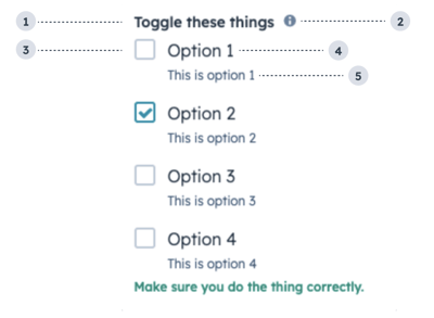 1. **Group label:** the text that displays above the group of checkboxes.
2. **Tooltip:** on hover, displays additional information about the field.
3. **Unchecked checkbox:** an unselected checkbox.
4. **Option label:** the text that displays next to the checkbox.
5. **Option description:** the text that displays below the option label to describe the option.
```jsx theme={null}
import { ToggleGroup } from "@hubspot/ui-extensions";
const options = [1, 2, 3, 4].map(n => ({
label: `Option ${n}`,
value: `${n}`,
initialIsChecked: n === 2,
readonly: false,
description: `This is option ${n}`,
}));
const Extension = () => {
return (
);
};
```
## Props
| Prop | Type | Description |
| ------------------- | ------------------------------------------------- | ---------------------------------------------------------------------------------------------------------------------------------------------------------------------------------------------------------------------------------------------- |
| `error` | Boolean | When set to true, `validationMessage` is displayed as an error message if provided. The input will also render its error state to let the user know there is an error. If left `false`, `validationMessage` is displayed as a success message. |
| `inline` | Boolean | When set to `true`, stacks the options horizontally. Default is `false`. |
| `label` | String | The text that displays above the toggles. |
| `name` | String | The input's unique identifier. |
| `onChange` | (checked: boolean) => void | A function that is invoked when the toggle is clicked. |
| `options` | Array | An array of options to display in the group. Each object in the array contains:
1. **Group label:** the text that displays above the group of checkboxes.
2. **Tooltip:** on hover, displays additional information about the field.
3. **Unchecked checkbox:** an unselected checkbox.
4. **Option label:** the text that displays next to the checkbox.
5. **Option description:** the text that displays below the option label to describe the option.
```jsx theme={null}
import { ToggleGroup } from "@hubspot/ui-extensions";
const options = [1, 2, 3, 4].map(n => ({
label: `Option ${n}`,
value: `${n}`,
initialIsChecked: n === 2,
readonly: false,
description: `This is option ${n}`,
}));
const Extension = () => {
return (
);
};
```
## Props
| Prop | Type | Description |
| ------------------- | ------------------------------------------------- | ---------------------------------------------------------------------------------------------------------------------------------------------------------------------------------------------------------------------------------------------- |
| `error` | Boolean | When set to true, `validationMessage` is displayed as an error message if provided. The input will also render its error state to let the user know there is an error. If left `false`, `validationMessage` is displayed as a success message. |
| `inline` | Boolean | When set to `true`, stacks the options horizontally. Default is `false`. |
| `label` | String | The text that displays above the toggles. |
| `name` | String | The input's unique identifier. |
| `onChange` | (checked: boolean) => void | A function that is invoked when the toggle is clicked. |
| `options` | Array | An array of options to display in the group. Each object in the array contains:- `label` (string)
- `value` (string)
- `initialIsChecked` (boolean)
- `readonly` (boolean)
- `description` (string)
|
| `readonly` | Boolean | When set to `true`, users will not be able to select the toggle. Default is `false`. |
| `required` | Boolean | When set to `true`, displays a required indicator next to the toggle group. Default is `false`. |
| `toggleType` | `'radioButtonList'` \| `'checkboxList'` (default) | The type of toggle, whether checkboxes or radio buttons. Radio buttons only allow one option to be selected. |
| `tooltip` | String | Text that will appear in a tooltip next to the toggle group label. |
| `validationMessage` | String | The text to display if the input has an error. |
| `value` | String | The value of the toggle group.- Accepts a string when `toggleType` is `radioButtonList`.
- Accepts an array when `toggleType` is `checkboxList`.
|
| `variant` | `'default'` (default) \| `'small'` | The size of the toggle. |
## Variants
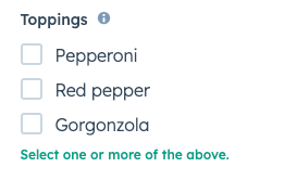
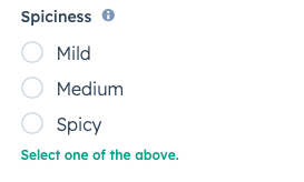
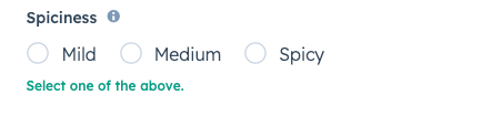
By default, the toggle group will render as a vertical list of checkboxes. Using the `toggleType` prop, you can set the options to display as checkboxes or radio buttons. You can also use the `inline` prop to stack options horizontally.
 `toggleType='checkboxList'` (default)
 `toggleType='radioButtonList'`
 `inline={true}`
## Usage examples
* A radio button list to enable salespeople to select one of four sales packages for a new customer.
* A checkbox list to enable customer support reps to select several options of swag to send to a delightful customer.
## Guidelines
* **DO:** use this component when the user has a small selection of items to choose from. For longer lists of options, consider using the [Select component](/apps/developer-platform/add-features/ui-extensions/ui-components/standard-components/select) instead.
* **DO:** keep label options concise when possible.
* **DON'T:** use toggle groups to display long lists of options.
## Related components
* [Checkbox](/apps/developer-platform/add-features/ui-extensions/ui-components/standard-components/checkbox)
* [RadioButton](/apps/developer-platform/add-features/ui-extensions/ui-components/standard-components/radio-button)
* [Toggle](/apps/developer-platform/add-features/ui-extensions/ui-components/standard-components/toggle)
`inline={true}`
## Usage examples
* A radio button list to enable salespeople to select one of four sales packages for a new customer.
* A checkbox list to enable customer support reps to select several options of swag to send to a delightful customer.
## Guidelines
* **DO:** use this component when the user has a small selection of items to choose from. For longer lists of options, consider using the [Select component](/apps/developer-platform/add-features/ui-extensions/ui-components/standard-components/select) instead.
* **DO:** keep label options concise when possible.
* **DON'T:** use toggle groups to display long lists of options.
## Related components
* [Checkbox](/apps/developer-platform/add-features/ui-extensions/ui-components/standard-components/checkbox)
* [RadioButton](/apps/developer-platform/add-features/ui-extensions/ui-components/standard-components/radio-button)
* [Toggle](/apps/developer-platform/add-features/ui-extensions/ui-components/standard-components/toggle)