> ## Documentation Index
> Fetch the complete documentation index at: https://developers.hubspot.com/docs/llms.txt
> Use this file to discover all available pages before exploring further.
---
id: 1847c5ba-176a-432c-a7f5-d92ee51020e0
---
# Tooltip | UI components
> Learn about the Tooltip component for use in UI extensions.
The `Tooltip` component renders a tooltip when hovering over other UI components to provide users with additional context. This component can be inserted via the `overlay` prop in [Button](/apps/developer-platform/add-features/ui-extensions/ui-components/standard-components/button), [Image](/apps/developer-platform/add-features/ui-extensions/ui-components/standard-components/image), [Link](/apps/developer-platform/add-features/ui-extensions/ui-components/standard-components/link), [LoadingButton](/apps/developer-platform/add-features/ui-extensions/ui-components/standard-components/loading-button), and [Tag](/apps/developer-platform/add-features/ui-extensions/ui-components/standard-components/tag) components.
```jsx theme={null}
import { Button, Tooltip } from "@hubspot/ui-extensions";
function ToolTipExample() {
return ;
}
```
## Props
| Prop | Type | Description |
| ----------- | -------------------------------------------------------- | -------------------------------------------------------------------------------------- |
| `placement` | `'top'` (default) \| `'bottom'` \| `'left'` \| `'right'` | The position where the tooltip will be displayed, relative to the parent UI component. |
## Placement
Using the `placement` prop, you can set where the tooltip will appear relative to the parent UI component (default is `top`). Below is an example of each `placement` value.
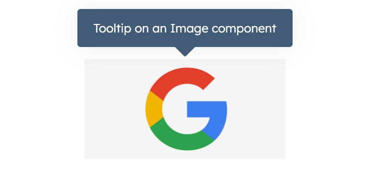
```jsx theme={null}
Tooltip on an Image component}
/>;
```
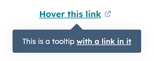
```jsx theme={null}
This is a tooltip with a link in it
}
>
Hover this link
;
```
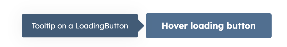
```jsx theme={null}
Tooltip on a LoadingButton} variant="primary">
Hover loading button
;
```
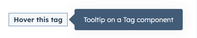
```jsx theme={null}
Tooltip on a Tag component} format={{ variant: "success" }}>
Hover this tag
;
```
## Related components
* [Panel](/apps/developer-platform/add-features/ui-extensions/ui-components/standard-components/panel)
* [Modal](/apps/developer-platform/add-features/ui-extensions/ui-components/standard-components/modal)
* [Icon](/apps/developer-platform/add-features/ui-extensions/ui-components/standard-components/icon)