> ## Documentation Index
> Fetch the complete documentation index at: https://developers.hubspot.com/docs/llms.txt
> Use this file to discover all available pages before exploring further.
---
id: 9d5e727e-922b-4d00-8df1-677500b5fbd9
---
# Actions
> Reference information for actions provided by the UI extensions SDK.
export const Tag = ({children, type = 'default', className = ''}) => {
return
{children}
;
};
Actions are functions provided by the UI extensions SDK that your extension can call to interact with HubSpot. Calling an action triggers behavior in HubSpot, such as displaying an alert banner, reloading the page, or opening a modal.
You can access actions using either a props-based approach or a hook-based approach:
* **Props-based approach:** destructure `actions` from the callback passed to `hubspot.extend()`, then pass it to your component as a prop.
* **Hook-based approach:** call the [`useExtensionActions`](/apps/developer-platform/add-features/ui-extensions/ui-extensions-sdk/hooks#useextensionactions) hook directly within your component.
The actions available depend on where your extension is loaded. [Universal actions](#universal-actions) work in all extension points. [CRM property actions](#crm-property-actions) are only available in CRM record extension points.
Note that some UI components include a set of actions separate from the SDK actions below, such as the [CRM action components](/apps/developer-platform/add-features/ui-extensions/ui-components/crm-data-components/overview).
Both approaches to access actions provide identical functionality, so the choice is a matter of preference. As a general guideline:
* **Hook-based approach:** cleaner component APIs, no prop drilling.
* **Props-based approach:** explicit dependency injection.
Either way, the data is the same, as shown in the code example below.
```tsx expandable theme={null}
// Props-based approach - destructure context/actions and pass as props
hubspot.extend(({ context, actions }) => (
));
function MyExtension({ context, actions }) {
return (
);
}
// Hook-based approach - call hooks directly in your component
hubspot.extend(() => );
function MyExtension() {
const { actions, context } = useExtensionApi<'crm.record.tab'>();
return (
);
}
```
## Universal actions
**Universal actions**
Supported in all extension points: `settings`, `home`, `crm.record.tab`, `crm.record.sidebar`, `crm.preview`, `helpdesk.sidebar`
| Action | Description |
| ------------------------------------------------ | ---------------------------------- |
| [`addAlert`](#display-alert-banners) | Display alert banners to the user. |
| [`reloadPage`](#reload-page) | Reload the current page. |
| [`copyTextToClipboard`](#copy-text-to-clipboard) | Copy text to the user's clipboard. |
| [`closeOverlay`](#open-overlays) | Close an open overlay or modal. |
| [`openIframeModal`](#open-an-iframe-in-a-modal) | Open an iframe in a modal window. |
### Display alert banners
Use the `addAlert` method to send alert banners as a feedback for any actions to indicate success or failure. `addAlert` is a part of the `actions` object that can be passed to extension via `hubspot.extend`. If you instead want to render an alert within a card, check out the [Alert component](/apps/developer-platform/add-features/ui-extensions/ui-components/standard-components/alert).
For example, the code below results in an app card that displays a success alert after fetching data from an external source. Note that the `addAlert` action is passed into `hubspot.extend()` and the `Extension` component, then is triggered when the `hubspot.fetch()` function successfully executes.
```jsx highlight={5, 7,27-31,38-42 } theme={null}
import React, { useState } from "react";
import { Text, Button, LoadingSpinner } from "@hubspot/ui-extensions";
import { hubspot } from "@hubspot/ui-extensions";
hubspot.extend(({actions}) => );
const Extension = ({ addAlert }) => {
const [totalUsers, setTotalUsers] = useState(null);
const [loading, setLoading] = useState(false);
const [error, setError] = useState(null);
const fetchUserData = async () => {
try {
setLoading(true);
setError(null);
const response = await hubspot.fetch('https://myExternalData.com/api/data');
if (!response.ok) {
throw new Error(`HTTP error! status: ${response.status}`);
}
const result = await response.json();
setTotalUsers(result.stats.totalUsers);
// Show success alert banner
addAlert({
title: "Data fetched successfully",
message: `Retrieved total users from API`,
type: "success"
});
} catch (err) {
setError(err.message);
console.error('Error fetching data:', err);
// Show error alert banner
addAlert({
title: "Data Fetch Failed",
message: `Failed to retrieve data: ${err.message}`,
type: "danger"
});
} finally {
setLoading(false);
}
};
if (loading) {
return (
<>
Fetching user data...
);
}
return (
<>
Click the button to fetch the total number of registered users from the API.
{totalUsers !== null && (
Number of users: {totalUsers}
)}
);
};
```
| Prop | Type | Description |
| --------- | ------------------------------------------------------------------------- | ---------------------------------------------------------------------------------------------------------------------------------------------------------------------------------------------------------------------------------------------------------------------------------------------------------------------------------- |
| `title` | String | The bolded text of the alert. |
| `message` | String | The main alert text. |
| `type` | `'info'` (default) \| `'tip'` \| `'success'` \| `'warning'` \| `'danger'` | The color of the alert.
`info`: a blue alert to provide general information.
`success`: a green alert indicating a positive outcome.
`warning`: a yellow alert indicating caution.
`danger`: a red alert indicating a negative outcome.
`tip`: a white alert to provide guidance.
|
### Reload page
Use the `reloadPage` action to reload the current page. This action can be accessed through the actions argument (`actions.reloadPage`).
```jsx theme={null}
import { Button, hubspot } from "@hubspot/ui-extensions";
hubspot.extend(({ actions }) => );
function Extension({ actions }) {
return (
);
}
```
### Copy text to clipboard
Use the `copyTextToClipboard` action to copy text to your clipboard. This action can be accessed through the actions argument (`actions.copyTextToClipboard`) and returns a promise that resolves once the system clipboard has been updated. Its functionality is provided by the [Clipboard: writeText() method](https://developer.mozilla.org/en-US/docs/Web/API/Clipboard/writeText) and follows the same requirements.
This action only works after the user has interacted with the page after loading ([transient activation](https://developer.mozilla.org/en-US/docs/Web/Security/Defenses/User_activation#transient_activation)).
```jsx theme={null}
import React from "react";
import { Button, Flex, hubspot, TextArea } from "@hubspot/ui-extensions";
hubspot.extend(({ actions }) => );
function Extension({ actions }) {
const textToCopy = `Copy me!`;
// Use copy action on event handler
async function handleOnClick() {
try {
// The function is async, make sure to await it.
await actions.copyTextToClipboard(textToCopy);
actions.addAlert({
type: "success",
message: "Text copied to clipboard.",
});
} catch (error) {
// User error handling. copyTextToClipboard can fail with a `notAllowed` error.
console.log(error);
actions.addAlert({
type: "warning",
message: "Couldn't copy text.",
});
}
}
return (
);
}
```
This action should be run by explicit user interaction, otherwise the action will fail by running before the page has rendered. For example, the following implementation would fail:
```jsx theme={null}
function CopyButtonBadExample({ actions }) {
const textToCopyWithoutUserPermission = `Please don't try this, it will fail`;
useEffect(() => {
/**
* Don't run copyTextToClipboard without explicit interaction.
* This will fail because the action will run before the page
* has rendered.
*/
async function badStuff() {
try {
await actions.copyTextToClipboard(textToCopyWithoutUserPermission);
actions.addAlert({
type: 'success',
message: 'text copied to clipboard',
});
} catch (error) {
console.log(error);
actions.addAlert({
type: 'warning',
message: "can't copy value",
});
}
}
badStuff();
}, []);
```
### Open overlays
To add another layer of UI to your extension, you can include overlays using the [Modal](/apps/developer-platform/add-features/ui-extensions/ui-components/standard-components/modal) and [Panel](/apps/developer-platform/add-features/ui-extensions/ui-components/standard-components/panel) components.
* `Modal`: a pop-up dialog box best suited for short messages and action confirmations. A `'danger'` variant is included for destructive actions, such as deleting a contact.
* `Panel`: a slide-out sidebar best suited for longer, compartmentalized tasks that users might need to perform, such as multi-step forms. Includes a `'modal'` variant to obscure page content outside of the panel to focus the user on the panel task.
To add either type of overlay to an extension:
* Add the `overlay` prop to a [Button](/apps/developer-platform/add-features/ui-extensions/ui-components/standard-components/button), [LoadingButton](/apps/developer-platform/add-features/ui-extensions/ui-components/standard-components/loading-button), [Link](/apps/developer-platform/add-features/ui-extensions/ui-components/standard-components/link), [Tag](/apps/developer-platform/add-features/ui-extensions/ui-components/standard-components/tag), or [Image](/apps/developer-platform/add-features/ui-extensions/ui-components/standard-components/image) component.
* Add the `Modal` or `Panel` component into the `overlay` prop.
```jsx expandable theme={null}
import { Button, Panel, PanelSection, PanelBody, PanelFooter, Text, hubspot } from "@hubspot/ui-extensions";
hubspot.extend(({ actions }) => );
const OverlayExampleCard = ({ actions }) => {
return (
<>
);
};
```
```jsx expandable theme={null}
import { Button, Modal, ModalBody, ModalFooter, Text, hubspot } from "@hubspot/ui-extensions";
hubspot.extend(({ actions }) => );
const OverlayExampleCard = ({ actions }) => {
return (
<>
);
};
```
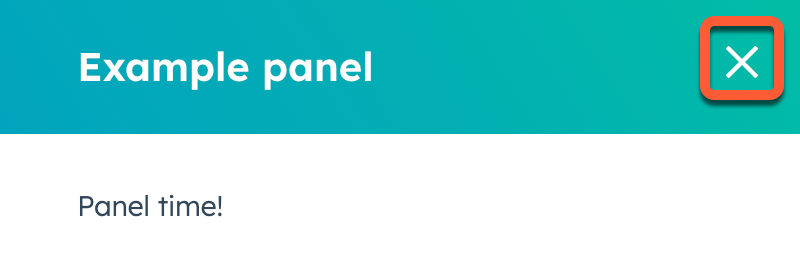
By default, overlays include a close button in the top right, as shown in the example below.
* Only one `Modal` can be open at a time per extension. Opening a `Modal` when another one is already open will cause the first one to close.
* A `Modal` can be opened from a `Panel`, but a `Panel` can't be opened from a `Modal`.
### Open an iframe in a modal
Use the `openIframeModal` action to open an iframe in a modal window. This action accepts two arguments: a payload object that describes the modal, and an optional callback function that runs when the modal is closed.
The payload object for `openIframeModal` includes the following fields:
| Field | Type | Description |
| -------- | --------------------------------------- | ------------------------------------------------------------------- |
| `uri` | String Required | The URL to load in the iframe. |
| `height` | Number Required | The height of the modal in pixels. |
| `width` | Number Required | The width of the modal in pixels. |
| `title` | String | The title displayed at the top of the modal. |
| `flush` | Boolean | When `true`, removes the default padding around the iframe content. |
For example, the following code would result in an extension that opens an iframe on button click. The iframe is configured to contain the Wikipedia homepage with a height and width of 1000px and no padding. Upon closing the modal, a message will be logged to the console.
```jsx expandable wrap theme={null}
import { Link, Button, Text, Box, Flex, hubspot } from "@hubspot/ui-extensions";
hubspot.extend(({ actions }) => );
const Extension = ({ openIframe }) => {
const handleClick = () => {
openIframe(
{
uri: "https://wikipedia.org/",
height: 1000,
width: 1000,
title: "Wikipedia in an iframe",
flush: true,
},
() => console.log("This message will display upon closing the modal.")
);
};
return (
<>
Clicking the button will open a modal dialog with an iframe that displays the content at the provided URL. Get
more info on how to do this:
here
);
};
```
When the user completes an action inside the iframe, the modal should close returning the user to the main page. To close the modal, the integration can use `window.postMessage` to signal that the user is done. The following messages are accepted:
* `{"action": "DONE"}`: the user has successfully completed the action.
* `{"action": "CANCEL"}`: the user has canceled the action.
```json theme={null}
window.top.postMessage(JSON.stringify({"action": "DONE"}), "*");
```
**Note:** The domain where the action originates must match the domain of the `uri` you passed into the `openIframeModal` action. If the domains do not match, the message will be ignored.
## CRM property actions
**CRM property actions**
Only available in `crm.record.tab`, `crm.record.sidebar`, `crm.preview`, `helpdesk.sidebar`
| Action | Description |
| ----------------------------------------------------------- | -------------------------------------------------- |
| [`fetchCrmObjectProperties`](#fetch-crm-property-data) | Fetch property values from the current CRM record. |
| [`refreshObjectProperties`](#refresh-crm-record-properties) | Refresh CRM record properties on the page. |
| [`onCrmPropertiesUpdate`](#listen-for-property-updates) | Listen for updates to CRM record properties. |
While there isn't a dedicated UI component for uploading files, learn about options for [uploading files](#upload-files) in UI extensions.
### Fetch CRM property data
There are multiple ways to fetch CRM property data via the SDK:
* The [`useCrmProperties`](/apps/developer-platform/add-features/ui-extensions/ui-extensions-sdk/hooks#usecrmproperties) hook, which fetches properties from the current CRM record.
* The `fetchCrmObjectProperties` action, which fetches property data client-side at extension load time. This method is described below.
* `propertiesToSend`, which can be included in your `hubspot.fetch()` functions to fetch property data on the back-end at function invocation time.
* Use GraphQL to query CRM data through the `/collector/graphql` endpoint. Learn more about [querying CRM data using GraphQL](/cms/start-building/features/data-driven-content/graphql/query-hubspot-data-using-graphql#query-hubspot-data-using-graphql).
To make GraphQL requests, your app must include the following scopes:
* `collector.graphql_schema.read`
* `collector.graphql_query.execute`
**fetchCrmObjectProperties**
While this method is still supported, you may want to switch to using the [`useCrmProperties`](/apps/developer-platform/add-features/ui-extensions/ui-extensions-sdk/hooks#usecrmproperties) hook instead
Using the `fetchCrmObjectProperties` method, you can get property values from the currently displaying CRM record without having to use HubSpot's APIs. This method is a part of the `actions` object that can be passed to the extension via `hubspot.extend`. You'll first need to add the object to `objectTypes` inside the card's `.json` config file. The objects you specify in `objectTypes` will also set which CRM objects will display the extension.
```jsx theme={null}
hubspot.extend(({ actions }) => );
const HelloWorld = ({ fetchProperties }) => {
const [firstName, setFirstName] = useState("");
const [lastName, setLastName] = useState("");
useEffect(() => {
fetchProperties(["firstname", "lastname"]).then(properties => {
setFirstName(properties.firstname);
setLastName(properties.lastname);
});
}, [fetchProperties]);
return (
Hello {firstName} {lastName}
);
};
```
You can specify individual properties or fetch all properties with an asterisk:
```jsx wrap theme={null}
fetchCrmObjectProperties("*").then(properties => console.log(properties));
```
The response for `fetchCrmObjectProperties` is formatted as:
```json theme={null}
{
"property1Name": "property1Value",
"property2Name": "property2Value"
}
```
`fetchCrmObjectProperties` returns raw property values. To apply HubSpot's display formatting to these values (for example, resolving enumeration values to their display labels), pass the results to the [`formatCrmProperties`](/apps/developer-platform/add-features/ui-extensions/ui-extensions-sdk/utilities) utility.
### Refresh properties on the CRM record
Use `refreshObjectProperties` to refresh the property data on the CRM record, and any CRM data components on the record without needing to refresh the page. This includes [cards added to the record through HubSpot's UI](https://knowledge.hubspot.com/object-settings/customize-records#manage-cards-in-the-middle-column). This method will work for the CRM objects that you include in the extension's `.json` file in the `objectTypes` array.
This method will not refresh property values in app cards that are fetched using HubSpot's APIs. Only HubSpot's built-in property fields and properties in CRM data components will be refreshed.
```jsx theme={null}
import React, { useState } from 'react';
import {
Divider,
Button,
Input,
Flex,
hubspot
} from '@hubspot/ui-extensions';
hubspot.extend(({ actions }) => (
));
const Extension = ({
refreshObjectProperties,
}) => {
// Your extension logic goes here
// Refresh all properties of the object on the page
refreshObjectProperties();
return (
// Your extension body
);
};
```
### Listen for property updates
Use `onCrmPropertiesUpdate` to subscribe to changes made to properties on the CRM record and run `hubspot.fetch()` functions based on those changes. This only includes changes made from within the HubSpot UI, not property updates from outside the UI, such as via APIs. This action is intended to be used like a React hook.
The full API for this method is as follows:
```js theme={null}
export type onCrmPropertiesUpdateAction = (
properties: Array | '*',
callback: (
properties: Record,
error?: { message: string }
) => void
) => void;
```
As an example, the following function subscribes to updates made to the contact's first and last name properties, then logs those properties to the console.
```jsx theme={null}
onCrmPropertiesUpdate(["firstname", "lastname"], properties => console.log(properties));
```
You can subscribe to all properties by using an asterisk.
```jsx theme={null}
onCrmPropertiesUpdate("*", properties => console.log(properties));
```
To handle potential errors, pass the `error` argument to the callback.
```jsx theme={null}
onCrmPropertiesUpdate(['firstname','lastname'], (properties, error) => {
if(error) {
console.log(error.message}
}
else {
console.log(properties)
}
})
```
### Upload files
While there is no [UI component](/apps/developer-platform/add-features/ui-extensions/ui-components/overview) for uploading files, there are a few ways you can upload files:
* [Create a custom file type property](https://knowledge.hubspot.com/properties/create-and-edit-properties), then use a [CRM property list component](/apps/developer-platform/add-features/ui-extensions/ui-components/crm-data-components/crm-property-list) to display and manage the property from CRM records. You can upload up to 10 files per file property, and file uploaded via file properties have the same [size and type limitations](https://knowledge.hubspot.com/files/supported-file-types) as files uploaded to the file manager.
* Include an [iframe modal](#open-an-iframe-in-a-modal) in the extension that loads an upload page, then upload files through the iframe.
.png) For example, the code below results in an app card that displays a success alert after fetching data from an external source. Note that the `addAlert` action is passed into `hubspot.extend()` and the `Extension` component, then is triggered when the `hubspot.fetch()` function successfully executes.
```jsx highlight={5, 7,27-31,38-42 } theme={null}
import React, { useState } from "react";
import { Text, Button, LoadingSpinner } from "@hubspot/ui-extensions";
import { hubspot } from "@hubspot/ui-extensions";
hubspot.extend(({actions}) =>
For example, the code below results in an app card that displays a success alert after fetching data from an external source. Note that the `addAlert` action is passed into `hubspot.extend()` and the `Extension` component, then is triggered when the `hubspot.fetch()` function successfully executes.
```jsx highlight={5, 7,27-31,38-42 } theme={null}
import React, { useState } from "react";
import { Text, Button, LoadingSpinner } from "@hubspot/ui-extensions";
import { hubspot } from "@hubspot/ui-extensions";
hubspot.extend(({actions}) =>  ```jsx expandable theme={null}
import { Button, Panel, PanelSection, PanelBody, PanelFooter, Text, hubspot } from "@hubspot/ui-extensions";
hubspot.extend(({ actions }) =>
```jsx expandable theme={null}
import { Button, Panel, PanelSection, PanelBody, PanelFooter, Text, hubspot } from "@hubspot/ui-extensions";
hubspot.extend(({ actions }) => .gif) ```jsx expandable theme={null}
import { Button, Modal, ModalBody, ModalFooter, Text, hubspot } from "@hubspot/ui-extensions";
hubspot.extend(({ actions }) =>
```jsx expandable theme={null}
import { Button, Modal, ModalBody, ModalFooter, Text, hubspot } from "@hubspot/ui-extensions";
hubspot.extend(({ actions }) =>