How versioning works
HubSpot’s existing default modules are treated asv0 modules, while new versions are released started at v1. For compatibility, HubSpot automatically maps v0 fields to v1 fields, which means that references to module fields are forward compatible. However, field references are not backwards compatible, meaning that v1 field references won’t map to v0 fields.
To account for changes in an module’s HTML, CSS, and JavaScript, you can use conditional statements to configure it depending on the account’s available versions.
To add add a conditional statement, use get_asset_version("@hubspot/module-name") within an HTML, CSS, or JavaScript file. The module’s version will be returned as a string, enabling you to configure module options based on the returned version.
{% if get_asset_version("@hubspot/module-name") == "1" %}
hr {
border-bottom-width: 5px;
}
{% endif %}
Specifying versions in themes
When developing a theme, you can specify which module versions that you want to support within thetheme.json file. When a version is specified, content editors will only allow access to that version in the editor, and the template will render that version accordingly. On upload via the CLI, or when making changes in the design manager, specified module versions will be validated to ensure validity of the modules and their version definitions.
Please note:This feature is not available for child themes. Instead, child themes will inherit module versions based on the parent theme when provided.
theme.json by including a pinned_module_versions object. For each module, you can specify a version or a range of versions.
For example, the code below would result in the theme allowing access to either v0 or v1 of the divider module, but only v1 of the search input module.
"pinned_module_versions": {
"@hubspot/divider": "0-1",
"@hubspot/search_input": "0"
}
pinned_module_versions object will not be restricted to a particular version. In addition, you shouldn’t specify versions of default modules that don’t currently support versioning, and you can only specify versions that are available (e.g. you can’t specify 2 for a module that doesn’t have a v2).
Learn more about submitting to HubSpot’s Template Marketplace.
Manage an account’s module versions
In an account’s Themes & Modules settings (Settings >** Content** > Themes & Modules) users can opt into new module versions, revert modules updated within the past 30 days, and view the version information for all default modules.Update a module’s version
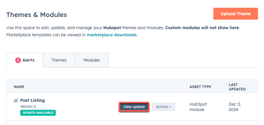
To opt into a new version of a module:- In your HubSpot account, click the settings icon in the top navigation bar.
- In the left sidebar menu, navigate to Content > Themes & Modules.
- On the Alerts tab, the latest updates for default modules will appear with an Update Available tag. Click View update next to a module to view more details about the update.
- In the panel, review the changes. The panel will include a high-level summary of the update, along with a detailed breakdown of the changes and the assets that will be affected.
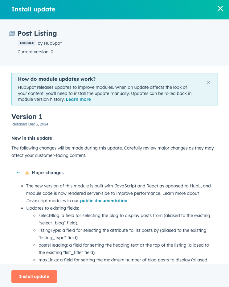
- To update the module, click Install update. Then, in the dialog box, click Confirm update. Note that it can take up to 10 minutes for pages and templates to reflect the updated module.
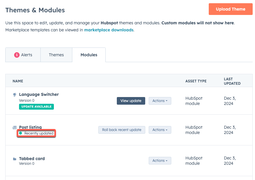
Revert an updated module
Within 30 days of updating a module, you can revert it to a previous version if needed:- On the Modules tab, next to the module that you want to revert, click Roll back recent update.

- In the panel, review the module’s version history, then click Roll back this update.
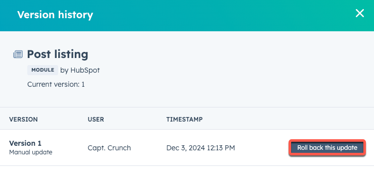
- Review the information in the right sidebar to confirm that you’d like to roll back the update, then click Roll back.
- In the dialog box, click Confirm.
Modules with version support
Below, learn more about the modules that currently support versioning.Divider
A new version of the default divider module has been released to accounts created after August 25th, 2022 (changelog announcement). This version update impacts the following module files:fields.jsonmodule.html
v1 version updates in each file, along with the original v0 version for comparison.
v1
- All fields that were previously in the Content tab have been moved to the Styles tab.
- The following fields have moved, but HubSpot automatically links the previous references to the new field names, so you don’t need to make any manual updates:
- The
heightfield has been moved tostyles.line.thickness. - The
widthfield has been moved tostyles.size.width. - The
colorfield has been moved tostyles.line.color. - The
linetype field has been moved tostyles.line.style.
- The
- The
alignmentfield, which was previously a choice field, has been replaced by a new field type of Alignment, and can be accessed understyles.alignment.alignment. - The
paddingfield, which was previously a number field, has been replaced by a new field type of Spacing, and can be accessed understyles.spacing.spacing. - The
show_paddingfield has been removed.
- v1 fields.json
- v1 module.html
[
{
"label": "Styles",
"name": "styles",
"type": "group",
"tab": "STYLE",
"children": [
{
"label": "Line",
"name": "line",
"type": "group",
"children": [
{
"label": "Color",
"name": "color",
"type": "color",
"required": true,
"aliases": ["color"],
"default": {
"color": "#000000",
"opacity": 100
}
},
{
"label": "Style",
"name": "style",
"type": "choice",
"choices": [
["solid", "Solid"],
["dotted", "Dotted"],
["dashed", "Dashed"]
],
"display": "select",
"required": true,
"aliases": ["line_type"],
"default": "solid"
},
{
"label": "Thickness",
"name": "thickness",
"type": "number",
"display": "text",
"max": 10,
"min": 1,
"required": true,
"step": 1,
"default": 1,
"aliases": ["height"],
"suffix": "px"
}]
},
{
"label": "Size",
"name": "size",
"type": "group",
"children": [
{
"label": "Width",
"name": "width",
"id": "styles.size.width",
"type": "number",
"help_text": "Percentage of the area the divider is placed into.",
"max": 100,
"min": 1,
"required": true,
"step": 1,
"suffix": "%",
"aliases": ["width"],
"default": 50
}]
},
{
"label": "Alignment",
"name": "alignment",
"type": "group",
"visibility":{
"controlling_field": "styles.size.width",
"controlling_value_regex": "100",
"operator": "NOT_EQUAL"
},
"children": [
{
"label": "Alignment",
"name": "alignment",
"type": "alignment",
"default":{
"horizontal_align": "CENTER"
},
"alignment_direction": "HORIZONTAL"
}]
},
{
"label": "Spacing",
"name": "spacing",
"type": "group",
"children": [
{
"label": "Spacing",
"name": "spacing",
"type": "spacing",
"visibility":{
"hidden_subfields":{"padding": true}
},
"default":
{
"margin":{
"top":{
"value": "10",
"units": "px"
},
"bottom":{
"value": "10",
"units": "px"
}
}
}
}]
}]
}]
{% require_css %}
<style>
{% scope_css %}
hr {
border: 0 none;
border-bottom-width: {{ module.styles.line.thickness ~ "px" }};
border-bottom-style: {{ module.styles.line.style }};
border-bottom-color: rgba({{ module.styles.line.color.color|convert_rgb }}, {{ module.styles.line.color.opacity / 100 }});
margin-left: {{ "auto" if (module.styles.alignment.alignment.horizontal_align == "CENTER" or module.styles.alignment.alignment.horizontal_align == "RIGHT") else "0" }};
margin-right: {{ "auto" if (module.styles.alignment.alignment.horizontal_align == "CENTER" or module.styles.alignment.alignment.horizontal_align == "LEFT") else "0" }};
{% if module.styles.spacing.spacing.css %}
{{ module.styles.spacing.spacing.css }}
{% endif %}
width: {{ module.styles.size.width ~ "%" }};
}
{% end_scope_css %}
</style>
{% end_require_css %}
<hr />
v0
- v0 fields.json
- v0 module.html
[
{
"label": "Height",
"name": "height",
"id": "f25c7200-c134-2cd0-ebac-2f2e7152c0a9",
"type": "number",
"display": "text",
"max": 8,
"min": 1,
"required": true,
"step": 1,
"suffix": "px",
"default": 1
},
{
"label": "Width",
"name": "width",
"id": "69957b03-2442-9cc8-3666-c67e96f37645",
"type": "number",
"help_text": "Percentage of the area the divider is placed into.",
"display": "slider",
"max": 100,
"min": 1,
"required": true,
"step": 1,
"suffix": "%",
"default": 50
},
{
"label": "Color",
"name": "color",
"id": "a3f3e26c-5bca-611e-ea99-c91d4f1c88bb",
"type": "color",
"required": true,
"default": {
"color": "#000000",
"opacity": 100
}
},
{
"label": "Line type",
"name": "line_type",
"id": "5dfe1bf6-99b3-5339-3a05-db1aee413317",
"type": "choice",
"choices": [
["solid", "Solid"],
["dotted", "Dotted"],
["dashed", "Dashed"]
],
"display": "select",
"required": true,
"default": "solid"
},
{
"label": "Alignment",
"name": "alignment",
"id": "2919e8d6-68f4-9cfc-5253-8e36d3f54807",
"type": "choice",
"choices": [
["left", "Left"],
["center", "Center"],
["right", "Right"]
],
"display": "select",
"required": true,
"default": "center"
},
{
"label": "Show padding?",
"name": "show_padding",
"id": "c2849a01-3d7b-a5b7-8d80-969f2a3e65f0",
"type": "boolean",
"default": false
},
{
"label": "Padding",
"name": "padding",
"id": "14154310-667e-8128-0394-96c83342c964",
"type": "number",
"inline_help_text": "Max of 20 pixels",
"visibility": {
"controlling_field": "c2849a01-3d7b-a5b7-8d80-969f2a3e65f0",
"controlling_value_regex": "true",
"operator": "EQUAL"
},
"display": "text",
"max": 20,
"min": 1,
"required": true,
"step": 1,
"suffix": "px",
"default": 5
}
]
{% macro buildStyles() %}
width: {{ module.width ~ "%" }};
border: 0 none;
border-bottom-width: {{ module.height ~ "px" }};
border-bottom-style: {{module.line_type }};
border-bottom-color: rgba({{ module.color.color|convert_rgb
}},{{ module.color.opacity / 100 }});
margin-left: {{ "auto" if (
module.alignment == "center" or
module.alignment == "right") else "0"}};
margin-right: {{"auto" if (
module.alignment == "center" or
module.alignment == "left") else "0"
}};
margin-top: {{ module.padding ~ "px" if module.show_padding
else "0" }};
margin-bottom: {{ module.padding ~ "px" if module.show_padding else
"0"
}};
{% endmacro %}
<hr style="{{ buildStyles() }}" />
Language switcher
A new version of the language switcher module has been released.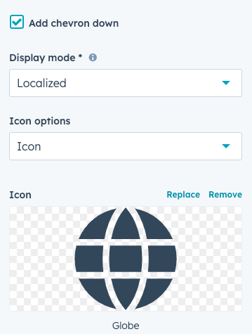
meta.jsonfields.jsonmodule.htmlmodule.cssmodule.js
v1 version updates in each file, along with the original v0 version for comparison.
v1
Aplaceholder field has been added with the following options:
show_module_icon(boolean): when set tofalse, no icon will appear.title(string): the placeholder title.description(string): the placeholder descriptive text.
- v1 meta.json
- v1 fields.json
- v1 module.html
- v1 module.css
- v1 module.js
{
"label": "Language Switcher",
"host_template_types": ["PAGE", "BLOG_POST", "BLOG_LISTING"],
"icon": "../img/icon/edited-language.svg",
"extra_classes": "widget-type-language_switcher",
"smart_type": "NOT_SMART",
"master_language": "en",
"placeholder": {
"show_module_icon": true,
"title": "No language variant setup",
"description": "This page does not have a language variant setup."
},
"categories": ["functionality"],
"content_tags": [
{
"name": "OTHER_INDUSTRY",
"source": "MARKETPLACE"
},
{
"name": "COMPATIBLE_PAGE",
"source": "MARKETPLACE"
}
],
"editable_contexts": ["TEMPLATE"]
}
[
{
"label": "Add chevron down",
"name": "add_chevron_down",
"type": "boolean",
"default": true
},
{
"label": "Display mode",
"name": "display_mode",
"type": "choice",
"help_text": "Allows you to choose in which language the languages of your pages are displayed on your website. <a href="
https: //knowledge.hubspot.com/website-pages/create-pages-in-multiple-languages#add-a-language-switcher-to-your-template" target='blank' rel='noopener noreferrer'>Learn more</a>",
"choices": [
["pagelang", "Page language"],
["localized", "Localized"],
["hybrid", "Hybrid"]
],
"display": "select",
"placeholder": "Search",
"required": true,
"default": "localized"
},
{
"label": "Icon options",
"name": "icon_options",
"type": "choice",
"choices": [
["none", "None"],
["icon", "Icon"],
["custom_icon", "Custom icon"]
],
"display": "select",
"placeholder": "",
"default": "icon"
},
{
"label": "Icon",
"name": "icon",
"type": "icon",
"visibility":
{
"controlling_field_path": "icon_options",
"controlling_value_regex": "icon",
"operator": "EQUAL"
},
"default":
{
"name": "globe",
"type": "SOLID",
"unicode": "f0ac"
}
},
{
"label": "Custom Icon",
"name": "custom_icon",
"type": "image",
"visibility":{
"controlling_field_path": "icon_options",
"controlling_value_regex": "custom_icon",
"operator": "EQUAL"
},
"resizable": false,
"responsive": false,
"show_loading": true,
"default":{
"size_type": "auto",
"src": "",
"alt": null,
"loading": "lazy"
}
},
{
"label": "Styles",
"name": "styles",
"type": "group",
"tab": "STYLE",
"children": [
{
"label": "Button",
"name": "group_button",
"type": "group",
"children": [
{
"label": "Icon",
"name": "group_icon",
"type": "group",
"children": [
{
"label": "Size",
"name": "size",
"type": "number",
"display": "text",
"max": 100,
"min": 1,
"step": 1,
"suffix": "px",
"default": 22
},
{
"label": "Spacing",
"name": "spacing",
"type": "number",
"help_text": "Spacing between the icon and button text.",
"display": "text",
"max": 100,
"step": 1,
"suffix": "px",
"default": 15
},
{
"label": "Color",
"name": "color",
"type": "color",
"visibility":
{
"controlling_field_path": "icon_options",
"controlling_value_regex": "icon",
"operator": "EQUAL"
},
"default":
{
"color": "#000000",
"opacity": 100
}
}]
},
{
"label": "Chevron",
"name": "group_chevron",
"type": "group",
"visibility":
{
"controlling_field_path": "add_chevron_down",
"controlling_value_regex": "true",
"operator": "EQUAL"
},
"children": [
{
"label": "Size",
"name": "size",
"type": "number",
"help_text": "Size of the chevron icon.",
"display": "text",
"max": 100,
"min": 1,
"step": 1,
"suffix": "px",
"default": 13
},
{
"label": "Spacing",
"name": "spacing",
"type": "number",
"help_text": "Spacing between the chevron and button text.",
"display": "text",
"max": 100,
"step": 1,
"suffix": "px",
"default": 15
},
{
"label": "Color",
"name": "color",
"type": "color",
"default":
{
"color": "#000000",
"opacity": 100
}
}],
"default":
{}
},
{
"label": "Text",
"name": "group_text",
"type": "group",
"children": [
{
"label": "Font",
"name": "font",
"type": "font",
"default":
{
"size_unit": "px"
}
},
{
"label": "Transform",
"name": "transform",
"type": "choice",
"choices": [
["capitalize", "Capitalize"],
["uppercase", "Uppercase"],
["lowercase", "Lowercase"]
],
"display": "select",
"placeholder": "None"
}]
},
{
"label": "Background",
"name": "group_background",
"type": "group",
"children": [
{
"label": "Color",
"name": "color",
"type": "color"
}]
},
{
"label": "Border",
"name": "group_border",
"type": "group",
"children": [
{
"label": "Border",
"name": "border",
"type": "border"
}]
},
{
"label": "Corner",
"name": "group_corner",
"type": "group",
"children": [
{
"label": "Radius",
"name": "radius",
"type": "number",
"display": "text",
"max": 100,
"min": 0,
"step": 1,
"suffix": "px"
}]
},
{
"label": "Spacing",
"name": "group_spacing",
"type": "group",
"children": [
{
"label": "Spacing",
"name": "spacing",
"type": "spacing"
}]
},
{
"label": "Hover",
"name": "group_hover",
"type": "group",
"children": [
{
"label": "Icon",
"name": "group_icon",
"type": "group",
"children": [
{
"label": "Color",
"name": "color",
"type": "color",
"visibility":
{
"controlling_field_path": "icon_options",
"controlling_value_regex": "icon",
"operator": "EQUAL"
}
}]
},
{
"label": "Chevron",
"name": "group_chevron",
"type": "group",
"children": [
{
"label": "Color",
"name": "color",
"type": "color",
"visibility":
{
"controlling_field_path": "add_chevron_down",
"controlling_value_regex": "true",
"operator": "EQUAL"
}
}],
"default":
{}
},
{
"label": "Text",
"name": "group_text",
"type": "group",
"children": [
{
"label": "Font",
"name": "font",
"type": "font",
"visibility":
{
"hidden_subfields":
{
"size": true,
"font": true
}
}
}]
},
{
"label": "Background",
"name": "group_background",
"type": "group",
"children": [
{
"label": "Color",
"name": "color",
"type": "color"
}]
},
{
"label": "Border",
"name": "group_border",
"type": "group",
"children": [
{
"label": "Border",
"name": "border",
"type": "border"
}]
}]
},
{
"label": "Alignment",
"name": "group_alignment",
"type": "group",
"children": [
{
"label": "Alignment",
"name": "alignment",
"type": "alignment",
"alignment_direction": "HORIZONTAL",
"default":
{
"horizontal_align": "CENTER"
}
}]
}]
},
{
"label": "Dropdown",
"name": "group_dropdown",
"type": "group",
"children": [
{
"label": "Text",
"name": "group_text",
"type": "group",
"children": [
{
"label": "Font",
"name": "font",
"type": "font",
"default":
{
"size_unit": "px"
}
},
{
"label": "Transform",
"name": "transform",
"type": "choice",
"choices": [
["capitalize", "Capitalize"],
["uppercase", "Uppercase"],
["lowercase", "Lowercase"]
],
"display": "select",
"placeholder": "None"
}]
},
{
"label": "Background",
"name": "group_background",
"type": "group",
"children": [
{
"label": "Color",
"name": "color",
"type": "color"
}]
},
{
"label": "Border",
"name": "group_border",
"type": "group",
"children": [
{
"label": "Border",
"name": "border",
"type": "border",
"default":{
"top": {
"width":{
"value": 1,
"units": "px"
},
"opacity": 100,
"style": "solid",
"color": "#000000"
},
"bottom": {
"width":{
"value": 1,
"units": "px"
},
"opacity": 100,
"style": "solid",
"color": "#000000"
},
"left": {
"width":{
"value": 1,
"units": "px"
},
"opacity": 100,
"style": "solid",
"color": "#000000"
},
"right": {
"width":{
"value": 1,
"units": "px"
},
"opacity": 100,
"style": "solid",
"color": "#000000"
}
}
}]
},
{
"label": "Box shadow",
"name": "group_box_shadow",
"type": "group",
"children": [
{
"label": "Add box shadow",
"name": "add_box_shadow",
"type": "boolean",
"default": false
},
{
"label": "Offset x",
"name": "offset_x",
"type": "number",
"help_text": "Specifies the horizontal position of the shadow. Negative values shift the shadow left. Positive values shift the shadow right.",
"visibility":{
"controlling_field_path": "styles.group_dropdown.group_box_shadow.add_box_shadow",
"controlling_value_regex": "true",
"operator": "EQUAL"
},
"display": "text",
"max": 100,
"min": -100,
"step": 1,
"default": 2
},
{
"label": "Offset y",
"name": "offset_y",
"type": "number",
"help_text": "Specifies the vertical position of the shadow. Negative values shift the shadow up. Positive values shift the shadow down.",
"visibility":{
"controlling_field_path": "styles.group_dropdown.group_box_shadow.add_box_shadow",
"controlling_value_regex": "true",
"operator": "EQUAL"
},
"display": "text",
"max": 100,
"min": -100,
"step": 1,
"default": 2
},
{
"label": "Blur radius",
"name": "blur_radius",
"type": "number",
"help_text": "Controls the blur of the shadow. A larger value makes the shadow bigger and lighter. Negative values are not allowed.",
"visibility":{
"controlling_field_path": "styles.group_dropdown.group_box_shadow.add_box_shadow",
"controlling_value_regex": "true",
"operator": "EQUAL"
},
"display": "text",
"max": 100,
"min": 0,
"step": 1,
"default": 6
},
{
"label": "Spread radius",
"name": "spread_radius",
"type": "number",
"help_text": "Adjusts the overall size of the shadow. Positive values will cause the shadow to expand. Negative values will cause the shadow to shrink.",
"visibility":{
"controlling_field_path": "styles.group_dropdown.group_box_shadow.add_box_shadow",
"controlling_value_regex": "true",
"operator": "EQUAL"
},
"display": "text",
"max": 100,
"min": -100,
"step": 1,
"default": 1
},
{
"label": "Color",
"name": "color",
"type": "color",
"help_text": "Controls the color of the shadow.",
"visibility":{
"controlling_field_path": "styles.group_dropdown.group_box_shadow.add_box_shadow",
"controlling_value_regex": "true",
"operator": "EQUAL"
},
"default":
{
"color": "#000000",
"opacity": 10
}
}],
"default":{}
},
{
"label": "Corner",
"name": "group_corner",
"type": "group",
"children": [
{
"label": "Radius",
"name": "radius",
"type": "number",
"display": "text",
"max": 100,
"min": 0,
"step": 1,
"suffix": "px"
}]
},
{
"label": "Spacing",
"name": "group_spacing",
"type": "group",
"children": [
{
"label": "Top margin",
"name": "margin",
"type": "number",
"help_text": "Adjusts the margin between the dropdown and the button.",
"display": "text",
"max": 100,
"step": 1,
"suffix": "px"
},
{
"label": "",
"name": "item_spacing",
"type": "spacing",
"visibility":
{
"hidden_subfields":
{
"margin": true
}
}
}]
},
{
"label": "Hover",
"name": "group_hover",
"type": "group",
"children": [
{
"label": "Text",
"name": "group_text",
"type": "group",
"children": [
{
"label": "Font",
"name": "font",
"type": "font",
"visibility":
{
"hidden_subfields":{
"size": true,
"font": true
}
}
}]
},
{
"label": "Background",
"name": "group_background",
"type": "group",
"children": [
{
"label": "Color",
"name": "color",
"type": "color"
}]
}]
},
{
"label": "Alignment",
"name": "group_alignment",
"type": "group",
"children": [
{
"label": "Alignment",
"name": "alignment",
"type": "alignment",
"alignment_direction": "HORIZONTAL",
"default": {"horizontal_align": "LEFT"}
}]
}]
}]
},
{
"label": "Default Text",
"name": "default_text",
"type": "group",
"locked": true,
"children": [
{
"label": "Select your language",
"name": "select_your_language",
"type": "text",
"locked": true,
"default": "Select your language"
}]
}
]
{# Language switcher - version 1 #} {% set button = module.styles.group_button
%} {% set menu = module.styles.group_dropdown %} {% set languages =
language_variants(module.display_mode) %} {% set activeLanguage =
languages|selectattr('isActive', true)|first %} {% macro build_module_styles()
%} {% require_css %}
<style>
{% scope_css %}
.hs-language-switcher {
text-align: {{ button.group_alignment.alignment.horizontal_align|lower }};
}
.hs-language-switcher__button {
{{ button.group_text.font.css }}
{% if button.group_text.transform %}
text-transform: {{ button.group_text.transform }};
{% endif %}
{% if button.group_background.color.color %}
background-color: rgba({{ button.group_background.color.color|convert_rgb }}, {{ button.group_background.color.opacity / 100 }});
{% endif %}
{{ button.group_border.border.css }}
{% if button.group_corner.radius %}
border-radius: {{ button.group_corner.radius ~ 'px' }};
{% endif %}
{% if
button.group_spacing.spacing.padding.left.value
or button.group_spacing.spacing.padding.right.value
or button.group_spacing.spacing.padding.top.value
or button.group_spacing.spacing.padding.bottom.value
%}
padding-left: {{ button.group_spacing.spacing.padding.left.value|default(0, true) ~ "px" }};
padding-bottom: {{ button.group_spacing.spacing.padding.bottom.value|default(0, true) ~ "px" }};
padding-top: {{ button.group_spacing.spacing.padding.top.value|default(0, true) ~ "px" }};
padding-right: {{ button.group_spacing.spacing.padding.right.value|default(0, true) ~ "px" }};
{% endif %}
}
.hs-language-switcher__inner-wrapper {
margin-top: {{ button.group_spacing.spacing.margin.top.value|default(0, true) ~ "px"}};
margin-bottom: {{ button.group_spacing.spacing.margin.bottom.value|default(0, true) ~ "px" }};
}
.hs-language-switcher__button:hover,
.hs-language-switcher.menu-open .hs-language-switcher__button {
{{ button.group_hover.group_text.font.css }}
{% if button.group_hover.group_background.color.color %}
background-color: rgba({{ button.group_hover.group_background.color.color|convert_rgb }}, {{ button.group_hover.group_background.color.opacity / 100 }});
{% endif %}
{{ button.group_hover.group_border.border.css }}
}
{% if module.add_chevron_down %}
.hs-language-switcher__icon--dropdown {
margin-left: {{ button.group_chevron.spacing ~ "px" }};
margin-right: 0;
display: block;
width: {{ button.group_chevron.size ~ "px" }};
height: auto;
fill: rgba({{ button.group_chevron.color.color|convert_rgb }}, {{ button.group_chevron.color.opacity / 100 }});
transition: transform .2s ease;
}
.hs-language-switcher__icon--dropdown.active {
transform: rotate(180deg);
}
{% if button.group_hover.group_chevron.color.color %}
.hs-language-switcher__button:hover .hs-language-switcher__icon--dropdown {
fill: rgba({{ button.group_hover.group_chevron.color.color|convert_rgb }}, {{ button.group_hover.group_chevron.color.opacity / 100 }});
}
{% endif %}
{% endif %}
{% if module.icon_options == "custom_icon" and module.custom_icon.src %}
.hs-language-switcher__icon--custom {
width: {{ button.group_icon.size ~ "px" }};
max-width: 40px;
height: auto;
margin-right: {{ button.group_icon.spacing ~ "px" }};
}
{% endif %}
{% if (module.icon_options == "icon" and module.icon) or (module.icon_options == "custom_icon" and module.custom_icon.src )%}
.hs-language-switcher__icon {
display: flex;
height: auto;
width: {{ button.group_icon.size ~ "px" }};
fill: rgba({{ button.group_icon.color.color|convert_rgb }}, {{ button.group_icon.color.opacity / 100 }});
margin-right: {{ button.group_icon.spacing ~ "px" }};
}
.hs-language-switcher__inner-wrapper:hover .hs-language-switcher__icon,
.hs-language-switcher.menu-open .hs-language-switcher__icon {
{% if button.group_hover.group_icon.color.color %}
fill: rgba({{ button.group_hover.group_icon.color.color|convert_rgb }}, {{ button.group_hover.group_icon.color.opacity / 100 }});
{% endif %}
}
{% endif %}
{# Menu Options #}
.hs-language-switcher__menu {
{% if menu.group_background.color.color %}
background-color: rgba({{ menu.group_background.color.color|convert_rgb }}, {{ menu.group_background.color.opacity / 100 }});
{% endif %}
{{ menu.group_border.border.css }}
{% if menu.group_box_shadow.add_box_shadow %}
box-shadow: {{ menu.group_box_shadow.offset_x ~ "px" }} {{ menu.group_box_shadow.offset_y ~ "px" }} {{ menu.group_box_shadow.blur_radius ~ "px" }} {{ menu.group_box_shadow.spread_radius ~ "px" }} rgba({{ menu.group_box_shadow.color.color|convert_rgb }}, {{ menu.group_box_shadow.color.opacity / 100 }});
{% endif %}
{% if menu.group_corner.radius %}
border-radius: {{ menu.group_corner.radius ~ 'px' }};
{% endif %}
margin-top: {{ menu.group_spacing.margin }}px;
{% if menu.group_alignment.alignment.horizontal_align == "RIGHT" %}
right: 0;
{% elif menu.group_alignment.alignment.horizontal_align == "CENTER" %}
left: 50%;
transform: translateX(-50%);
{% else %}
left: 0;
{% endif %}
}
.hs-language-switcher__item {
{% if menu.group_spacing.item_spacing.css %}
{{ menu.group_spacing.item_spacing.css }}
{% endif %}
}
.hs-language-switcher__item a {
text-align: {{ menu.group_alignment.alignment.horizontal_align|lower }};
{{ menu.group_text.font.css }}
{% if menu.group_text.transform %}
text-transform: {{ menu.group_text.transform }};
{% endif %}
}
.hs-language-switcher__item:focus,
.hs-language-switcher__item.active,
.hs-language-switcher__menu.mousemove .hs-language-switcher__item:hover {
{% if menu.group_hover.group_background.color.color %}
background: rgba({{ menu.group_hover.group_background.color.color|convert_rgb }}, {{ menu.group_hover.group_background.color.opacity / 100 }});
{% endif %}
}
.hs-language-switcher__item:focus a,
.hs-language-switcher__item.active a,
.hs-language-switcher__menu.mousemove .hs-language-switcher__item:hover a {
{{ menu.group_hover.group_text.font.css }}
}
{% end_scope_css %}
</style>
{% end_require_css %}
{% endmacro %}
{% macro build_custom_icon() %}
{% set sizeAttrs =
'width="{{ button.group_icon.size }}"
height="{{
button.group_icon.size }}"' %}
{% set image_src =
resize_image_url(module.custom_icon.src, 0, 0, 50) %}
{% set loadingAttr =
module.custom_icon.loading != 'disabled' ? 'loading="{{
module.custom_icon.loading }}"' : '' %}
<img
class="hs-language-switcher__icon--custom"
src="{{ image_src }}"
alt="{{ module.custom_icon.alt }}"
{{loadingAttr}}
{{sizeAttrs}}
/>
{% endmacro %} {% macro build_chevron_down() %}
<svg
version="1.0"
xmlns="http://www.w3.org/2000/svg"
viewBox="0 0 448 512"
class="hs-language-switcher__icon--dropdown"
aria-hidden="true"
>
<g>
<path
d="M207.029 381.476L12.686 187.132c-9.373-9.373-9.373-24.569 0-33.941l22.667-22.667c9.357-9.357 24.522-9.375 33.901-.04L224 284.505l154.745-154.021c9.379-9.335 24.544-9.317 33.901.04l22.667 22.667c9.373 9.373 9.373 24.569 0 33.941L240.971 381.476c-9.373 9.372-24.569 9.372-33.942 0z"
></path>
</g>
</svg>
{% endmacro %} {# When page is first created, languages will be null. After the
language for the page is set, languages will contain one language, so both
checks are required #} {% if is_in_editor && (!languages || languages|length <=
1) %} {% editor_placeholder %} {% elif languages|length >= 2 %} {{-
build_module_styles() -}}
<nav
class="hs-language-switcher"
aria-label="{{ module.default_text.select_your_language }}"
>
<div class="hs-language-switcher__inner-wrapper">
<button
class="hs-language-switcher__button"
aria-label="{{ activeLanguage.languageDisplayName }}"
aria-expanded="false"
>
<span aria-hidden="true" class="hs-language-switcher__label">
{% if module.icon_options == "icon" && module.icon %}
{% icon extra_classes='hs-language-switcher__icon'
name='{{ module.icon.name }}'
purpose='decorative' style='{{ module.icon.type }}'
title='{{module.icon.name }}'
unicode='{{ module.icon.unicode }}'
%}
{% elif module.icon_options == "custom_icon" && module.custom_icon.src %}
{{ build_custom_icon() }}
{% endif %}
<span class="hs-language-switcher__current-language">
{{ activeLanguage.languageDisplayName}}
</span>
{{ build_chevron_down() if module.add_chevron_down }}
</span>
</button>
<ul class="hs-language-switcher__menu" role="menu">
{% for language in languages %}
<li class="hs-language-switcher__item" role="menuitem">
<a
lang="{{ language.languageCode }}"
hreflang="{{ language.languageCode }}"
href="{{ language.localizedUrl }}"
data-value="{{ language.languageDisplayName }}"
>
{{ language.languageDisplayName }}
</a>
</li>
{% endfor %}
</ul>
</div>
</nav>
{% endif %}
.hs-language-switcher {
display: block;
}
.hs-language-switcher__inner-wrapper {
position: relative;
display: inline-block;
}
/* Button */
.hs-language-switcher__button {
cursor: pointer;
}
.hs-language-switcher__label {
display: flex;
align-items: center;
font-size: 1em;
line-height: 1;
}
.hs-language-switcher__icon {
height: 20px;
width: 20px;
}
/* Menu */
.hs-language-switcher__menu {
position: absolute;
top: 100%;
display: none;
overflow: hidden;
box-sizing: border-box;
min-width: 100%;
padding: 0;
margin: 0;
background: #fff;
list-style-type: none;
white-space: nowrap;
}
.hs-language-switcher__menu.visible {
display: block;
}
.hs-language-switcher__item {
width: 100%;
padding: 10px 20px;
margin: 0;
text-align: left;
}
.hs-language-switcher__item:focus,
.hs-language-switcher__item.active,
.hs-language-switcher__menu.mousemove .hs-language-switcher__item:hover {
background: #efefef;
}
.hs-language-switcher__item a {
display: block;
height: 100%;
color: #000;
text-decoration: none;
}
/* eslint-disable no-use-before-define */
const KEYS = {
SPACE: ' ',
ENTER: 'Enter',
TAB: 'Tab',
ESCAPE: 'Escape',
UP: 'Up', // IE11 & Edge 16 value for Arrow Up
ARROW_UP: 'ArrowUp',
DOWN: 'Down', // IE11 & Edge 16 value for Arrow Down
ARROW_DOWN: 'ArrowDown',
};
const HsLanguageSwitcher = (element) => {
const button = element.querySelector('.hs-language-switcher__button');
const menu = element.querySelector('.hs-language-switcher__menu');
const options = Array.from(menu.children);
const chevron = element.querySelector(
'.hs-language-switcher__icon--dropdown'
);
let selectedIndex = -1;
let optionMousemoveHandlers = [];
function onDocumentClick(e) {
const target = e.target;
if (element === target || !element.contains(target)) {
hideMenu();
}
}
function onKeyDown(e) {
menu.classList.remove('mousemove');
switch (e.key) {
case KEYS.SPACE:
case KEYS.ENTER:
if (selectedIndex >= 0) {
e.preventDefault();
const selectedOption = options[selectedIndex];
window.location.href = selectedOption.children[0].href;
}
break;
case KEYS.DOWN:
case KEYS.ARROW_DOWN:
e.preventDefault();
selectNextOption();
break;
case KEYS.UP:
case KEYS.ARROW_UP:
e.preventDefault();
selectPreviousOption();
break;
case KEYS.TAB:
case KEYS.ESCAPE:
hideMenu();
break;
default:
// nothing
}
}
function onOptionMousemove(index) {
menu.classList.add('mousemove');
selectedIndex = index;
updateSelectedOption();
}
function showMenu() {
selectedIndex = 0;
menu.classList.add('visible');
button.setAttribute('aria-expanded', true);
element.addEventListener('keydown', onKeyDown);
element.classList.add('menu-open');
options.forEach((option, index) => {
/*
* The mousemove handler has custom arguments, given via bind
* Bind returns a new instance of the function, so in order to remove the event listener handler from the element,
* the references must be stored in an array for removal later
*/
const handler = onOptionMousemove.bind(null, index);
optionMousemoveHandlers.push(handler);
option.addEventListener('mousemove', handler);
});
if (chevron) {
rotateChevron();
}
document.addEventListener('click', onDocumentClick);
updateSelectedOption();
}
function hideMenu() {
// Hide the dropdown
menu.classList.remove('visible');
button.setAttribute('aria-expanded', false);
element.classList.remove('menu-open');
options.forEach((option, index) => {
// Remove class for option background highlight
option.classList.remove('active');
// Remove mousemove event handlers stored in array
option.removeEventListener('mousemove', optionMousemoveHandlers[index]);
});
if (chevron) {
rotateChevron();
}
optionMousemoveHandlers = [];
element.removeEventListener('keydown', onKeyDown);
document.removeEventListener('click', onDocumentClick);
button.focus();
}
function toggleMenu() {
if (menu.classList.contains('visible')) {
hideMenu();
} else {
showMenu();
}
}
function selectNextOption() {
if (selectedIndex + 1 === options.length) {
selectedIndex = 0;
} else {
selectedIndex += 1;
}
updateSelectedOption();
}
function selectPreviousOption() {
if (selectedIndex - 1 < 0) {
selectedIndex = options.length - 1;
} else {
selectedIndex -= 1;
}
updateSelectedOption();
}
function updateSelectedOption() {
options.forEach((option, index) => {
if (index === selectedIndex) {
option.classList.add('active');
option.children[0].focus();
} else {
option.classList.remove('active');
}
});
}
function rotateChevron() {
chevron.classList.contains('active') ?
chevron.classList.remove('active') :
chevron.classList.add('active');
}
// Allows clicking & enter key to open the menu
button.addEventListener('click', () => {
toggleMenu();
});
// Allows the arrow down key to open the menu
button.addEventListener('keydown', (e) => {
if (e.key === KEYS.ARROW_DOWN) {
showMenu();
e.preventDefault(); // Prevent the page from scrolling down
e.stopPropagation(); // Prevent the wrapper element from handling this keydown after the menu opens
}
});
};
document.addEventListener('DOMContentLoaded', () => {
Array.from(document.querySelectorAll('.hs-language-switcher')).forEach(
(languageSwitcher) => HsLanguageSwitcher(languageSwitcher)
);
});
v0
- v0 meta.json
- v1 fields.json
- v1 module.html
{
"label": "Language Switcher",
"host_template_types": ["PAGE", "BLOG_POST", "BLOG_LISTING"],
"icon": "../img/icon/edited-language.svg",
"extra_classes": "widget-type-language_switcher",
"smart_type": "NOT_SMART",
"master_language": "en",
"categories": ["functionality"],
"content_tags": [
{
"name": "OTHER_INDUSTRY",
"source": "MARKETPLACE"
},
{
"name": "COMPATIBLE_PAGE",
"source": "MARKETPLACE"
}
],
"editable_contexts": ["TEMPLATE"]
}
[
{
"id": "2e71f343-859b-8c20-1f17-587a747ebc21",
"name": "display_mode",
"label": "Display mode",
"help_text": "The language of the text in the language switcher. PageLang means the names of languages will display in the language of the page the switcher is on. Localized means the name of each language will display in that language. Hybrid is a combination of the two.",
"sortable": false,
"required": true,
"locked": false,
"display": "select",
"placeholder": "Search",
"choices": [
["localized", "Localized"],
["pagelang", "PageLang"],
["hybrid", "Hybrid"]
],
"type": "choice",
"default": "localized"
}
]
{% language_switcher display_mode='{{ module.display_mode }}' %}
Post listing
A new version of the default post_listing module was released at the end of March 2024. The new version of this module is built with JavaScript and React as opposed to HubL, and module code is now rendered server-side to improve performance. It preserves all of the previous module fields while bringing in some modern styling options for the user with new fields for text and layout. Below, learn more about the newv1 version updates in each file, along with the original v0 version for comparison.
v1
Thefields.json is file replaced by fields.tsx.
The new version of the module includes all existing module fields.
selectBlog: a field for selecting the blog to display posts from (aliased to the existingselect_blogfield).listingType: a field for selecting the attribute to list posts by (aliased to the existinglisting_typefield).postsHeading: a field for setting the heading text at the top of the listing (aliased to the existinglist_titlefield).maxLinks: a field for setting the maximum number of blog posts to display (aliased to the existingmax_linksfield).
- A
displayForEachListItemchoice field has been added to enable selecting the elements that will display for each blog post, including:- Featured image (
image) - Post title (
title) - Author name (
authorName) - Publish date (
publishDate)
- Featured image (
- A
headingLevelchoice field has been added to enable selecting thepostsHeadinglevel (h1-h6).
- Layout styling: a
groupLayoutfield group contains astylechoice field for selecting whether the posts will display as rows or 2-column tiles. - Heading styling: a
groupHeadingfield group contains afontfield for stylingpostsHeading. - Post title styling: a
groupTitlefield group containsfont,spacing, andhoverFontfields for styling post titles. - Author styling: a
groupAuthorfield group contains afontfield for styling the post author name text. - Publish date styling: a
groupPublishDatefield group contains afontfield for styling the publish date text. - Background styling: a background field group contains
backgroundColorandspacingfields to style the module background.
- v1 fields.jsx
- v1 module.css
import {
FieldGroup,
ModuleFields,
TextField,
FontField,
SpacingField,
BlogField,
ChoiceField,
NumberField,
} from '@hubspot/cms-components/fields';
import { Island } from '@hubspot/cms-components';
import blogIcon from './assets/blog.svg';
import StyledComponentsRegistry from '../../StyledComponentRegistry.jsx';
import PostListingIsland from './islands/PostListingIsland.js?island';
import { styled } from 'styled-components';
import { ModuleMeta } from '../../../types/modules.js';
import { StyleFields } from './types.js';
import { FontFieldType } from '@hubspot/cms-components/fields';
type HeadingLevel = 'h1' | 'h2' | 'h3' | 'h4' | 'h5' | 'h6';
interface FontProps {
$fontStyle: string;
$fontHoverStyle?: string;
}
const HeadingWrapper = styled.span<FontProps>`
${props => props.$fontStyle}
`;
interface BlogPostHeadingProps {
headingLevel: HeadingLevel;
postsHeading: string;
headingStyle: {
font: FontFieldType;
};
}
const BlogPostHeading = ({
headingLevel,
postsHeading,
headingStyle,
}: BlogPostHeadingProps) => {
const HeadingLevel = headingLevel;
return (
<HeadingLevel>
<HeadingWrapper $fontStyle={headingStyle.font.css}>
{postsHeading}
</HeadingWrapper>
</HeadingLevel>
);
};
function stripPublicFromUrl(signedUrl) {
if (signedUrl) {
return signedUrl.replace(/^public/, '');
}
}
interface ComponentProps {
hublData: string;
headingLevel: HeadingLevel;
postsHeading: string;
groupStyle: StyleFields;
displayForEachListItem: string[];
}
export function Component(props: ComponentProps) {
const {
hublData,
headingLevel,
postsHeading,
groupStyle,
displayForEachListItem,
} = props;
return (
<StyledComponentsRegistry>
<section>
<BlogPostHeading
headingLevel={headingLevel}
postsHeading={postsHeading}
headingStyle={groupStyle.groupHeading}
/>
<Island
wrapperTag="article"
groupStyle={groupStyle}
module={PostListingIsland}
layout={groupStyle.groupLayout.style}
signedUrl={stripPublicFromUrl(hublData)}
displayForEachListItem={displayForEachListItem}
headingLevel={headingLevel}
/>
</section>
</StyledComponentsRegistry>
);
}
export { fields } from './fields.jsx';
export const meta: ModuleMeta = {
label: 'Post listing',
host_template_types: ['BLOG_LISTING', 'BLOG_POST', 'PAGE'],
icon: blogIcon,
categories: ['blog'],
};
export { default as hublDataTemplate } from './hubl_data.hubl.html?raw';
.hsPostListingWrapper--tiles {
display: grid;
justify-content: center;
grid-template-columns: repeat(auto-fit, minmax(250px, calc(100% / 3 - 20px)));
gap: 20px;
}
.hsPostListingWrapper--minimal {
display: grid;
grid-template-columns: 1fr;
gap: 20px;
}
.hsPostListingHeading {
display: block;
}
.hsPostListing--image {
max-width: 250px;
}
.hsPostListingFeaturedImage {
height: 10rem;
max-height: 100%;
margin-bottom: 1rem;
}
.hsPostListingImage {
height: 100%;
width: 100%;
-o-object-fit: cover;
object-fit: cover;
}
.hsPostListingBody {
display: flex;
flex-direction: column;
}
.hsPostListingTitle {
display: block;
}
.hsPostListingAuthor {
display: block;
}
.hsPostListingPublishDate {
display: block;
}
.hsPostListingAuthorDate {
display: flex;
justify-content: space-between;
}
v0
- v0 meta.json
- v0 module.html
[
{
"id": "5c3b2c23-6585-a913-cabe-1d5ba025a1b9",
"name": "select_blog",
"label": "Select blog to display",
"help_text": "Default will use the current blog when used in a blog template or the primary blog when used elsewhere.",
"sortable": false,
"required": false,
"locked": false,
"type": "blog",
"default": null
},
{
"id": "f245b59c-d2ea-08ab-a40a-e545bc71d2cf",
"name": "listing_type",
"label": "List blog posts by",
"sortable": false,
"required": true,
"locked": false,
"display": "select",
"placeholder": "Search",
"choices": [
["recent", "Most recent"],
["popular_all_time", "Most popular - all time"],
["popular_past_year", "Most popular - past year"],
["popular_past_six_months", "Most popular - past six months"],
["popular_past_month", "Most popular - past month"]
],
"type": "choice",
"default": "recent"
},
{
"id": "643831b9-0aa6-a0ef-f3db-b5a71143168e",
"name": "list_title",
"label": "List title to display",
"sortable": false,
"required": false,
"locked": false,
"validation_regex": "",
"allow_new_line": false,
"show_emoji_picker": false,
"type": "text",
"default": "Recent Posts"
},
{
"id": "1417ad86-21ca-17b6-09a8-65ca54def75b",
"name": "max_links",
"label": "Maximum blog posts to list",
"sortable": false,
"required": false,
"locked": false,
"display": "text",
"min": 1,
"step": 1,
"type": "number",
"default": 5
}
]
{% if module.select_blog is number %}
{% set select_blog = module.select_blog %}
{% else %}
{% set select_blog = 'default' %}
{% endif %}
{% post_listing
select_blog='{{ select_blog }}',
listing_type='{{module.listing_type}}',
list_title='{{ module.list_title }}',
max_links={{ module.max_links }}
%}
Search input
A new version of the default search input module has been released. This version update impacts the following module files:fields.jsonmodule.htmlmodule.cssmodule.js
v1 version updates in each file, along with the original v0 version for comparison.
v1
Existing fields- The
field_labelandplaceholdertext fields have been moved into thesearchgroup. - The
include_search_buttontoggle has been removed. - The
content_typesgroup has been moved into theresultsgroup.
- A
buttongroup has been added, which enables controls for:icon: the search button’s icon.button_label: the search button’s text label.
- A
resultsgroup has been added, which enables controls for:use_custom_search_results_template: toggle to choose which template is used for the search results page.path_id: the ID of the page that will be used for search results. The referenced page must contain the search results module.
- A
default_textgroup has been added, which allows for the translation of default content.
container: fields for styling the module container’s background color, border radius, and spacing.field_label: fields for styling the module’s label font and spacing.input: fields for styling the search input’s font, spacing, background color, border, and corner radius.button: fields for styling the button’s font, background color, border, corner radius, and spacing. Also includes options for hover styling and button positioning.autosuggest_results: fields for styling the auto-suggested results box’s background color, border, border radius, spacing, header font, suggestion link font, hover font, and hover background color.
- v1 fields.json
- v1 module.html
- v1 module.css
- v1 module.js
[
{
"label": "Search input field",
"name": "input",
"type": "group",
"children": [
{
"label": "Label text",
"name": "field_label",
"type": "text",
"aliases": [
"field_label"
]
},
{
"label": "Placeholder text",
"name": "placeholder",
"type": "text",
"aliases": [
"placeholder"
],
"default": "Search"
}
]
},
{
"label": "Button",
"name": "button",
"type": "group",
"children": [
{
"label": "Icon",
"name": "icon",
"type": "icon",
"default": {
"name": "search",
"unicode": "f002",
"type": "SOLID"
}
},
{
"label": "Button text",
"name": "button_label",
"type": "text"
}
]
},
{
"label": "Results",
"name": "results",
"type": "group",
"children": [
{
"label": "Use custom search results page",
"name": "use_custom_search_results_template",
"id": "results.user_custom_search_results_template",
"type": "boolean",
"display": "toggle",
"inline_help_text": "Turn this setting on to use a custom search results page instead of the default global search results page.",
"default": false
},
{
"label": "Search results page",
"name": "path_id",
"type": "page",
"visibility": {
"operator": "EQUAL",
"controlling_field": "results.user_custom_search_results_template",
"controlling_value_regex": "true"
},
"inline_help_text": "This is where people will go when they click to search their search term. Make sure to choose a page that contains the search results module."
},
{
"label": "Search results include",
"name": "content_types",
"type": "group",
"children": [
{
"label": "Website pages",
"name": "website_pages",
"type": "boolean",
"visibility": {
"access": {
"operator": "HAS_ALL",
"scopes": [
"sitepages-access"
]
},
"operator": "NOT_EMPTY"
},
"display": "checkbox",
"aliases": [
"content_types.website_pages"
],
"default": true
},
{
"label": "Landing pages",
"name": "landing_pages",
"type": "boolean",
"display": "checkbox",
"aliases": [
"content_types.landing_pages"
],
"default": false
},
{
"label": "Blog posts",
"name": "blog_posts",
"type": "boolean",
"display": "checkbox",
"aliases": [
"content_types.blog_posts"
],
"default": true
},
{
"label": "Knowledge articles",
"name": "knowledge_articles",
"type": "boolean",
"visibility": {
"access": {
"operator": "HAS_ALL",
"scopes": [
"service-knowledge-access"
]
}
},
"display": "checkbox",
"aliases": [
"content_types.knowledge_articles"
],
"default": false
}
],
"default": {
"use_custom_search_results_template": false
}
}
]
},
{
"label": "Default text",
"name": "default_text",
"type": "group",
"children": [
{
"label": "Autosuggest results message",
"name": "autosuggest_results_message",
"type": "text",
"default": "Results for “[[search_term]]”"
},
{
"label": "Autosuggest no results message",
"name": "autosuggest_no_results_message",
"type": "text",
"default": "There are no autosuggest results for “[[search_term]]”"
},
{
"label": "Screen reader empty search field message",
"name": "sr_empty_search_field_message",
"type": "text",
"default": "There are no suggestions because the search field is empty."
},
{
"label": "Screen reader autosuggest results message",
"name": "sr_autosuggest_results_message",
"type": "text",
"default": "There are currently [[number_of_results]] auto-suggested results for [[search_term]]. Navigate to the results list by pressing the down arrow key, or press return to search for all results."
},
{
"label": "Screen reader search field aria-label",
"name": "sr_search_field_aria_label",
"type": "text",
"default": "This is a search field with an auto-suggest feature attached."
},
{
"label": "Screen reader search button aria-label",
"name": "sr_search_button_aria_label",
"type": "text",
"default": "Search"
},
{
"label": "Auto suggest results for example search term",
"name": "as_example_search_results",
"type": "text",
"default": "Results for “example search term”"
},
{
"label": "Auto suggest line 1 for example search term",
"name": "as_example_line_1",
"type": "text",
"default": "This is where suggested results appear as your visitor types their search term"
},
{
"label": "Auto suggest line 2 for example search term",
"name": "as_example_line_2",
"type": "text",
"default": "Here's another suggested search result"
},
{
"label": "Auto suggest line 3 for example search term",
"name": "as_example_line_3",
"type": "text",
"default": "Configure the type of content that appears in your search results using the “search results include” option"
}
],
"locked": true
},
{
"label": "Styles",
"name": "styles",
"type": "group",
"tab": "STYLE",
"children": [
{
"label": "Container",
"name": "container",
"type": "group",
"children": [
{
"label": "Background color",
"name": "color",
"type": "color"
},
{
"label": "Corner",
"name": "radius",
"type": "number",
"display": "text",
"max": 100,
"step": 1,
"suffix": "px"
},
{
"label": "Spacing",
"name": "spacing",
"type": "group",
"children": [
{
"label": "Spacing",
"name": "spacing",
"type": "spacing"
}
]
}
]
},
{
"label": "Label",
"name": "field_label",
"type": "group",
"children": [
{
"label": "Text",
"name": "text",
"type": "group",
"children": [
{
"label": "Font",
"name": "font",
"type": "font",
"default": {
"size_unit": "px"
}
}
]
},
{
"label": "Spacing",
"name": "spacing",
"type": "group",
"children": [
{
"label": "Spacing",
"name": "spacing",
"type": "spacing"
}
]
}
]
},
{
"label": "Field",
"name": "input",
"type": "group",
"children": [
{
"label": "Text",
"name": "text",
"type": "group",
"children": [
{
"label": "Font",
"name": "font",
"type": "font",
"default": {
"size_unit": "px"
}
}
]
},
{
"label": "Spacing",
"name": "spacing",
"type": "group",
"children": [
{
"label": "Spacing",
"name": "spacing",
"type": "spacing"
}
]
},
{
"label": "Background",
"name": "background",
"type": "group",
"children": [
{
"label": "Color",
"name": "color",
"type": "color"
}
]
},
{
"label": "Border",
"name": "border",
"type": "group",
"children": [
{
"label": "Border",
"name": "border",
"type": "border"
}
]
},
{
"label": "Corner",
"name": "corner",
"type": "group",
"children": [
{
"label": "Radius",
"name": "radius",
"type": "number",
"display": "text",
"max": 100,
"step": 1,
"suffix": "px"
}
]
}
]
},
{
"label": "Button",
"name": "button",
"type": "group",
"children": [
{
"label": "Text",
"name": "text",
"type": "group",
"children": [
{
"label": "Font",
"name": "font",
"type": "font",
"default": {
"size_unit": "px"
}
},
{
"label": "Transform",
"name": "transform",
"type": "choice",
"choices": [
[
"none",
"None"
],
[
"capitalize",
"Capitalize"
],
[
"uppercase",
"Uppercase"
],
[
"lowercase",
"Lowercase"
]
],
"display": "select"
}
]
},
{
"label": "Background",
"name": "background",
"type": "group",
"children": [
{
"label": "Color",
"name": "color",
"type": "color"
}
]
},
{
"label": "Border",
"name": "border",
"type": "group",
"children": [
{
"label": "Border",
"name": "border",
"type": "border"
}
]
},
{
"label": "Corner",
"name": "corner",
"type": "group",
"children": [
{
"label": "Radius",
"name": "radius",
"type": "number",
"display": "text",
"max": 100,
"step": 1,
"suffix": "px"
}
]
},
{
"label": "Spacing",
"name": "spacing",
"type": "group",
"children": [
{
"label": "Spacing",
"name": "spacing",
"type": "spacing"
}
]
},
{
"label": "Hover",
"name": "hover",
"type": "group",
"children": [
{
"label": "Text",
"name": "text",
"type": "group",
"children": [
{
"label": "Font",
"name": "font",
"type": "font",
"visibility": {
"hidden_subfields": {
"size": true
}
}
}
]
},
{
"label": "Background",
"name": "background",
"type": "group",
"children": [
{
"label": "Color",
"name": "color",
"type": "color"
}
]
},
{
"label": "Border",
"name": "border",
"type": "group",
"children": [
{
"label": "Border",
"name": "border",
"type": "border"
}
]
}
]
},
{
"label": "Position",
"name": "position",
"type": "group",
"children": [
{
"label": "Button position",
"name": "button_position",
"id": "button_position",
"type": "choice",
"choices": [
[
"inline",
"In line with search field"
],
[
"beneath",
"Beneath search field"
]
],
"display": "radio",
"default": "inline"
},
{
"label": "Button alignment",
"name": "button_alignment",
"type": "choice",
"visibility": {
"operator": "EQUAL",
"controlling_field": "button_position",
"controlling_value_regex": "beneath"
},
"choices": [
[
"left",
"Left"
],
[
"right",
"Right"
]
],
"display": "radio",
"default": "left"
}
]
}
]
},
{
"label": "Suggested results",
"name": "autosuggest_results",
"type": "group",
"children": [
{
"label": "Background",
"name": "background",
"type": "group",
"children": [
{
"label": "Color",
"name": "color",
"type": "color"
}
]
},
{
"label": "Border",
"name": "border",
"type": "group",
"children": [
{
"label": "Border",
"name": "border",
"type": "border"
}
]
},
{
"label": "Corner",
"name": "corner",
"type": "group",
"children": [
{
"label": "Radius",
"name": "radius",
"type": "number",
"display": "text",
"max": 100,
"step": 1,
"suffix": "px"
}
]
},
{
"label": "Spacing",
"name": "spacing",
"type": "group",
"children": [
{
"label": "Spacing",
"name": "spacing",
"type": "spacing"
}
]
},
{
"label": "Text",
"name": "text",
"type": "group",
"children": [
{
"label": "Header font",
"name": "header_font",
"type": "font",
"default": {
"size_unit": "px"
}
},
{
"label": "Suggestion font",
"name": "suggestion_font",
"type": "font",
"default": {
"size_unit": "px"
}
}
]
},
{
"label": "Hover",
"name": "hover",
"type": "group",
"children": [
{
"label": "Text",
"name": "text",
"type": "group",
"children": [
{
"label": "Font",
"name": "font",
"type": "font",
"visibility": {
"hidden_subfields": {
"size": true
}
}
}
]
},
{
"label": "Background",
"name": "background",
"type": "group",
"children": [
{
"label": "Color",
"name": "color",
"type": "color"
}
]
}
]
}
]
}
]
}
]
{% set hide_search_label = module.input.field_label is truthy ? false : true %}
{% set button_position_class = "hs-search-field__bar--button-" ~ module.styles.button.position.button_position %}
{% set button_alignment_class = module.styles.button.position.button_position == "beneath" ? "hs-search-field__bar--button-align-" ~ module.styles.button.position.button_alignment : "" %}
{% set has_search_icon = module.button.icon.name is truthy ? true : false %}
{% set show_suggest_in_editor_class = is_in_editor ? "hs-search-field--open": "" %}
{% set button_label_class = module.button.button_label is truthy ? "hs-search-field__button--labelled" : "" %}
{% set search_page = module.results.use_custom_search_results_template is truthy and module.results.path_id ? content_by_id(module.results.path_id).absolute_url : site_settings.content_search_results_page_path %}
{% unless (search_page is string_containing "//") %}
{% set search_page = "/" ~ search_page %}
{% endunless %}
{% set search_page = search_page|regex_replace("http:", "") %}
{% require_css %}
<style>
{% scope_css %}
.hs-search-field__bar > form {
{% if module.styles.container.color.color %}
background-color: {{ module.styles.container.color.css }};
{% endif %}
{% if module.styles.container.radius >= 0 %}
border-radius: {{ module.styles.container.radius ~ "px" }};
{% endif %}
{{ module.styles.container.spacing.spacing.css }}
}
.hs-search-field__bar > form > label {
{{ module.styles.field_label.spacing.spacing.css }}
{{ module.styles.field_label.text.font.css }}
}
.hs-search-field__bar > form > .hs-search-field__input {
{{ module.styles.input.spacing.spacing.css }}
{{ module.styles.input.text.font.css }}
{% if module.styles.input.background.color.css %}
background-color: {{ module.styles.input.background.color.css }};
{% endif %}
{{ module.styles.input.border.border.css }}
{% if !module.styles.input.border.border.css and module.styles.input.border.border %}
{% for side, border in module.styles.input.border.border.items() %}
border-{{ side }}: 1px {{ border.style }} {{ theme.colors.primary.color }};
{% endfor %}
{% endif %}
{% if module.styles.input.corner.radius >= 0 %}
border-radius: {{ module.styles.input.corner.radius ~ "px" }};
{% endif %}
}
.hs-search-field__button {
{% if module.styles.button.background.color.css %}
background-color: {{ module.styles.button.background.color.css }};
{% endif %}
{{ module.styles.button.border.border.css }}
{% if !module.styles.button.border.border.css and module.styles.button.border.border %}
{% for side, border in module.styles.button.border.border.items() %}
border-{{ side }}: 1px {{ border.style }} {{ theme.colors.primary.color }};
{% endfor %}
{% endif %}
{% if module.styles.button.corner.radius >= 0 %}
border-radius: {{ module.styles.button.corner.radius ~ "px" }};
{% endif %}
{{ module.styles.button.spacing.spacing.css }}
{{ module.styles.button.text.font.css }}
{% if module.styles.button.text.transform %}
text-transform: {{ module.styles.button.text.transform }};
{% endif %}
}
.hs-search-field__button:hover, .hs-search-field__button:focus {
{% if module.styles.button.hover.background.color.css %}
background-color: {{ module.styles.button.hover.background.color.css }};
{% endif %}
{{ module.styles.button.hover.text.font.css }}
{{ module.styles.button.hover.border.border.css }}
{% if !module.styles.button.hover.border.border.css and module.styles.button.hover.border.border %}
{% for side, border in module.styles.button.hover.border.border.items() %}
border-{{ side }}: 1px {{ border.style }} {{ theme.colors.primary.color }};
{% endfor %}
{% endif %}
}
{% if has_search_icon and module.styles.button.hover.text.font.color %}
.hs-search-field__button:hover svg,
.hs-search-field__button:focus svg {
fill: {{ module.styles.button.hover.text.font.color }};
}
{% endif %}
.hs-search-field__button:active {
{% if module.styles.button.hover.background.color.color %}
background-color: rgba({{ color_variant(module.styles.button.hover.background.color.color, 80)|convert_rgb }}, {{ module.styles.button.hover.background.color.opacity / 100 }});
{% endif %}
{{ module.styles.button.hover.border.border.css }}
{% if module.styles.button.hover.border.border %}
border-color: {{ color_variant(module.styles.button.hover.border.border.top.color, 80) }};
{% endif %}
{% if !module.styles.button.hover.border.border.css and module.styles.button.hover.border.border %}
{% for side, border in module.styles.button.hover.border.border.items() %}
border-{{ side }}: 1px {{ border.style }} {{ theme.colors.primary.color }};
{% endfor %}
{% endif %}
{% if module.styles.button.hover.text.font.color %}
color: {{ module.styles.button.hover.text.font.color }};
{% endif %}
{{ module.styles.button.hover.text.font.css }}
}
{% if has_search_icon and module.styles.button.hover.text.font.color %}
.hs-search-field__button:active svg {
fill: {{ module.styles.button.hover.text.font.color }};
}
{% endif %}
.hs-search-field--open .hs-search-field__suggestions {
{% if module.styles.autosuggest_results.background.color.css %}
background-color: {{ module.styles.autosuggest_results.background.color.css }};
{% endif %}
{{ module.styles.autosuggest_results.spacing.spacing.css }}
{{ module.styles.autosuggest_results.border.border.css }}
{% if !module.styles.autosuggest_results.border.border.css and module.styles.autosuggest_results.border.border %}
{% for side, border in module.styles.autosuggest_results.border.border.items() %}
border-{{ side }}: 1px {{ border.style }} {{ theme.colors.primary.color }};
{% endfor %}
{% endif %}
{% if module.styles.autosuggest_results.corner.radius >= 0 %}
border-radius: {{ module.styles.autosuggest_results.corner.radius ~ "px" }};
{% endif %}
{{ module.styles.autosuggest_results.text.header_font.css }}
}
.hs-search-field--open .hs-search-field__suggestions a {
{{ module.styles.autosuggest_results.text.suggestion_font.css }}
}
.hs-search-field--open .hs-search-field__suggestions a:hover {
{% if module.styles.autosuggest_results.hover.text.font.color %}
color: {{ module.styles.autosuggest_results.hover.text.font.color }};
{% endif %}
{{ module.styles.autosuggest_results.hover.text.suggestion_font.css }}
{% if module.styles.autosuggest_results.hover.background.color.color %}
background-color: rgba({{ color_variant(module.styles.autosuggest_results.hover.background.color.color, 80)|convert_rgb }}, {{ module.styles.autosuggest_results.hover.background.color.opacity / 100 }});
{% endif %}
}
{% end_scope_css %}
</style>
{% end_require_css %}
<div class="hs-search-field">
<div class="hs-search-field__bar {{ button_position_class }} {{ button_alignment_class }} {{ show_suggest_in_editor_class }}">
<form data-hs-do-not-collect="true" class="hs-search-field__form" action="{{ search_page }}">
<label class="hs-search-field__label {% if hide_search_label %}show-for-sr{% endif %}" for="{{ name ~ "-input" }}">{{ module.input.field_label or module.default_text.sr_search_field_aria_label }}</label>
<input
role="combobox"
aria-expanded="false"
aria-controls="autocomplete-results"
aria-label="{{ module.default_text.sr_search_field_aria_label }}"
type="search"
class="hs-search-field__input"
id="{{ name ~ "-input" }}"
name="q"
autocomplete="off"
aria-autocomplete="list"
placeholder="{{ module.input.placeholder }}">
{% if module.results.content_types.website_pages %}
<input type="hidden" name="type" value="SITE_PAGE">
{% endif %}
{% if module.results.content_types.landing_pages %}
<input type="hidden" name="type" value="LANDING_PAGE">
{% endif %}
{% if module.results.content_types.blog_posts %}
<input type="hidden" name="type" value="BLOG_POST">
<input type="hidden" name="type" value="LISTING_PAGE">
{% endif %}
{% if module.results.content_types.knowledge_articles %}
<input type="hidden" name="type" value="KNOWLEDGE_ARTICLE">
{% endif %}
<button class="hs-search-field__button {{ button_label_class }}" aria-label="{{ module.default_text.sr_search_button_aria_label }}">{% if has_search_icon %}
{% icon
name={{ module.button.icon.name }}
style={{ module.button.icon.type }}
unicode={{ module.button.icon.unicode }}
icon_set={{ module.button.icon.icon_set }}
%}
{% endif %} {{ module.button.button_label }}</button>
<div class="hs-search-field__suggestions-container {% if is_in_editor %} hs-editor-hide-until-active {% endif %}">
<ul
id="autocomplete-results"
role="listbox"
aria-label="term"
class="hs-search-field__suggestions">
{% if is_in_editor %}
<li role="option" tabindex="-1" aria-posinset="1" aria-setsize="3" class="results-for">{{ module.default_text.as_example_search_results }}</li>
<li role="option" aria-posinset="2" tabindex="1"><a href="#">{{ module.default_text.as_example_line_1 }}</a></li>
<li role="option" aria-posinset="3" tabindex="2"><a href="#">{{ module.default_text.as_example_line_2 }}</a></li>
<li role="option" aria-posinset="4" tabindex="3"><a href="#">{{ module.default_text.as_example_line_3 }}</a></li>
{% else %}
<li role="option" tabindex="-1" aria-posinset="1" aria-setsize="0" class="results-for show-for-sr">{{ module.default_text.sr_empty_search_field_message }}</li>
{% endif %}
</ul>
</div>
</form>
</div>
<div id="sr-messenger" class="hs-search-sr-message-container show-for-sr"
role="status"
aria-live="polite"
aria-atomic="true">
</div>
</div>
{% require_js position="head" %}
<script data-search_input-config="config_{{ name }}" type="application/json">
{
"autosuggest_results_message": "{{ module.default_text.autosuggest_results_message }}",
"autosuggest_no_results_message": "{{ module.default_text.autosuggest_no_results_message }}",
"sr_empty_search_field_message": "{{ module.default_text.sr_empty_search_field_message }}",
"sr_autosuggest_results_message": "{{ module.default_text.sr_autosuggest_results_message }}",
"sr_search_field_aria_label": "{{ module.default_text.sr_search_field_aria_label }}",
"sr_search_button_aria_label": "{{ module.default_text.sr_search_button_aria_label }}"
}
</script>
{% end_require_js %}
.hs-editor-hide-until-active {
display: none;
}
.inpage-editor-active-field .hs-editor-hide-until-active {
display: block;
}
.hs-search-field {
position: relative;
}
.hs-search-field__input {
box-sizing: border-box;
width: 100%;
flex: 1;
}
.hs-search-field__bar button svg {
height: 10px;
}
.hs-search-field__suggestions {
padding: 0;
margin: 0;
list-style: none;
}
.hs-search-field--open .hs-search-field__suggestions,
.inpage-editor-active-field .hs-search-field__suggestions {
position: absolute;
width: 100%;
border: 1px solid #cdcdcd;
background-color: #fff;
box-shadow: 1px 10px 16px -9px rgba(122, 122, 122, 0.75);
}
.hs-search-field__suggestions li {
display: block;
padding: 0;
margin: 0;
}
.hs-search-field__suggestions .results-for {
font-weight: bold;
}
.hs-search-field__suggestions a,
.hs-search-field__suggestions .results-for {
display: block;
padding: 0 10px;
line-height: 1.7rem;
}
.hs-search-field__suggestions a:hover,
.hs-search-field__suggestions a:focus {
background-color: rgba(0, 0, 0, 0.1);
outline: none;
}
.hs-search-field__input:focus {
outline-style: solid;
}
.hs-search-field__suggestions-container {
position: relative;
flex-basis: 100%;
}
.hs-search-field__form {
display: flex;
flex-wrap: wrap;
}
.hs-search-field__label {
flex-basis: 100%;
}
.hs-search-field__bar--button-beneath .hs-search-field__input {
flex-basis: 100%;
}
.hs-search-field__bar--button-beneath .hs-search-field__button {
margin-top: 0.725rem;
margin-right: 0.725rem;
}
.hs-search-field__bar--button-align-right .hs-search-field__button {
margin-right: 0;
margin-left: 0.725rem;
order: 2;
}
.hs-search-field__bar--button-beneath .hs-search-field__suggestions-container {
min-width: 75%;
flex-basis: auto;
flex-grow: 1;
}
.hs-search-field__button--labelled .hs_cos_wrapper_type_icon {
margin-right: 0.5rem;
}
/* stylelint-disable declaration-no-important */
.show-for-sr {
position: absolute !important;
overflow: hidden !important;
height: 1px !important;
width: 1px !important;
padding: 0 !important;
border: 0 !important;
clip: rect(0, 0, 0, 0) !important;
white-space: nowrap !important;
}
/* stylelint-enable declaration-no-important */
// This is a fallback config in the event that the module json config is not found in the DOM.
/* eslint-disable camelcase */
const DEFAULT_MODULE_CONFIG = Object.freeze({
autosuggest_results_message: 'Results for “[[search_term]]”',
sr_autosuggest_results_message:
'There are currently [[number_of_results]] auto-suggested results for [[search_term]].',
sr_search_field_aria_label:
'This is a search field with an auto-suggest feature attached.',
sr_search_button_aria_label: 'Search',
});
/* eslint-enable camelcase */
const SEARCH_URL_BASE = '/_hcms/v3/site-search/search';
// Add a variable so we can clear the autosuggest announcement timeout if the user keeps typing.
let srAnnounceTimeout;
/**
* Grab JSON configuration for the module from the HubL data.
*/
const getModuleConfig = (moduleName) => {
const configJSONScript = document.querySelector(
`[data-${moduleName}-config]`
);
if (configJSONScript) {
return JSON.parse(configJSONScript.textContent);
}
return DEFAULT_MODULE_CONFIG;
};
const moduleConfig = getModuleConfig('search_input');
const TYPEAHEAD_LIMIT = 3;
const KEYS = Object.freeze({
TAB: 'Tab',
ESC: 'Esc', // IE11 & Edge 16 value for Escape
ESCAPE: 'Escape',
UP: 'Up', // IE11 & Edge 16 value for Arrow Up
ARROW_UP: 'ArrowUp',
DOWN: 'Down', // IE11 & Edge 16 value for Arrow Down
ARROW_DOWN: 'ArrowDown',
});
const debounce = (func, wait) => {
let timer;
return (...args) => {
clearTimeout(timer);
timer = setTimeout(() => {
func.apply(this, args);
}, wait);
};
};
const emptySearchSuggestions = (suggestionsResponse, searchInputElements) => {
const { searchForm, searchSuggestions, searchInput, srMessageContainer } =
searchInputElements;
const { searchTerm } = suggestionsResponse;
const noSearchResultsMessage = searchTerm
? moduleConfig.autosuggest_no_results_message.replace(
'[[search_term]]',
searchTerm
)
: moduleConfig.sr_empty_search_field_message;
const emptyResultsItem = `<li role="option"
tabindex="-1"
aria-posinset="1"
aria-setsize="0"
class="results-for ${
!searchTerm ? 'show-for-sr' : ''
}">${noSearchResultsMessage}</li>`;
searchSuggestions.innerHTML = emptyResultsItem;
srMessageContainer.innerHTML = noSearchResultsMessage;
searchInput.focus();
searchForm.classList.remove('hs-search-field--open');
};
const trapFocus = (searchInputElements) => {
const { searchInput, searchSuggestions, searchInputContainer } =
searchInputElements;
const tabbable = [];
tabbable.push(searchInput);
const suggestions = searchSuggestions.querySelectorAll('a');
suggestions.forEach((suggestion) => tabbable.push(suggestion));
const firstTabbable = tabbable[0];
const lastTabbable = tabbable[tabbable.length - 1];
const tabResult = (e) => {
if (e.target === lastTabbable && !e.shiftKey) {
e.preventDefault();
firstTabbable.focus();
} else if (e.target === firstTabbable && e.shiftKey) {
e.preventDefault();
lastTabbable.focus();
}
};
const nextResult = (e) => {
e.preventDefault();
if (e.target === lastTabbable) {
firstTabbable.focus();
} else {
tabbable.forEach((el) => {
if (el === e.target) {
tabbable[tabbable.indexOf(el) + 1].focus();
}
});
}
};
const previousResult = (e) => {
e.preventDefault();
if (e.target === firstTabbable) {
lastTabbable.focus();
} else {
tabbable.forEach((el) => {
if (el === e.target) {
tabbable[tabbable.indexOf(el) - 1].focus();
}
});
}
};
searchInputContainer.removeEventListener('keydown', window.captureKeyDown);
window.captureKeyDown = (e) => {
switch (e.key) {
case KEYS.TAB:
tabResult(e);
break;
case KEYS.ESC:
case KEYS.ESCAPE:
emptySearchSuggestions({}, searchInputElements);
break;
case KEYS.UP:
case KEYS.ARROW_UP:
previousResult(e);
break;
case KEYS.DOWN:
case KEYS.ARROW_DOWN:
nextResult(e);
break;
default:
break;
}
};
searchInputContainer.addEventListener('keydown', window.captureKeyDown);
};
const announceSearchSuggestions = (suggestionsResponse, srMessageContainer) => {
const { results, searchTerm } = suggestionsResponse;
if (srMessageContainer) {
srMessageContainer.innerHTML = `${moduleConfig.sr_autosuggest_results_message
.replace('[[number_of_results]]', results.length)
.replace('[[search_term]]', searchTerm)}`;
}
};
const renderSearchSuggestions = (suggestionsResponse, searchInputElements) => {
const { searchSuggestions, srMessageContainer, searchInputContainer } =
searchInputElements;
const { results, searchTerm } = suggestionsResponse;
const searchResultsMessage = moduleConfig.autosuggest_results_message.replace(
'[[search_term]]',
searchTerm
);
const items = [
`<li role="option"
tabindex="-1"
aria-posinset="1"
aria-setsize="${results.length}"
class="results-for">${searchResultsMessage}</li>`,
...results.map((result, index) => {
return `<li role="option"
aria-posinset="${index + 2}"
tabindex="${index + 1}"><a href="https://developers.hubspot.com/docs${result.url}">${
result.title
}</a></li>`;
}),
];
emptySearchSuggestions({}, searchInputElements);
searchSuggestions.innerHTML = items.join('');
searchInputContainer.classList.add('hs-search-field--open');
srAnnounceTimeout = setTimeout(() => {
announceSearchSuggestions(suggestionsResponse, srMessageContainer);
}, 1500);
};
const getSearchSuggestions = (searchInputElements) => {
const { searchForm } = searchInputElements;
const data = new FormData(searchForm);
data.set('limit', TYPEAHEAD_LIMIT);
data.set('autocomplete', true);
data.set('analytics', true);
const queryString = new URLSearchParams(data).toString();
const searchUrl = `${SEARCH_URL_BASE}?${queryString}`;
const request = new XMLHttpRequest();
request.open('GET', searchUrl, true);
request.onload = function () {
if (request.status >= 200 && request.status < 400) {
const resultData = JSON.parse(request.responseText);
if (srAnnounceTimeout) {
clearTimeout(srAnnounceTimeout);
}
if (resultData.results.length > 0) {
renderSearchSuggestions(resultData, searchInputElements);
trapFocus(searchInputElements);
} else {
emptySearchSuggestions(resultData, searchInputElements);
}
} else {
console.error('Server reached, error retrieving results.'); // eslint-disable-line no-console
}
};
request.onerror = function () {
console.error('Could not reach the server.'); // eslint-disable-line no-console
};
request.send();
};
const initializeSearchInput = (searchInputContainer) => {
let searchTerm = '';
if (searchInputContainer.classList.contains('hs-search-field--initialized')) {
return;
}
searchInputContainer.classList.add('hs-search-field--initialized');
const searchForm = searchInputContainer.querySelector('form');
const searchInput = searchForm.querySelector('.hs-search-field__input');
const searchSuggestions = searchInputContainer.querySelector(
'.hs-search-field__suggestions'
);
const srMessageContainer = searchInputContainer.querySelector(
'.hs-search-sr-message-container'
);
const searchInputElements = {
searchInputContainer,
searchForm,
searchSuggestions,
srMessageContainer,
searchInput,
};
const isSearchTermPresent = debounce(() => {
searchTerm = searchInput.value;
if (searchTerm.length > 2) {
getSearchSuggestions(searchInputElements);
} else if (searchTerm.length === 0) {
emptySearchSuggestions({}, searchInputElements);
}
}, 250);
searchInput.addEventListener('input', () => {
if (searchTerm !== searchInput.value) {
isSearchTermPresent();
}
});
};
document.addEventListener('DOMContentLoaded', () => {
const searchInputContainers = document.querySelectorAll('.hs-search-field');
if (searchInputContainers.length > 0) {
searchInputContainers.forEach((searchInputContainer) => {
initializeSearchInput(searchInputContainer);
});
}
});
v0
- v0 fields.json
- v0 module.html
- v0 module.css
- v0 module.js
[
{
"id": "d7644a33-944a-3b21-7faa-133195962602",
"name": "field_label",
"label": "Label text",
"required": false,
"locked": false,
"validation_regex": "",
"allow_new_line": false,
"show_emoji_picker": false,
"type": "text",
"default": null
},
{
"id": "e75bef76-6568-6550-8840-1d97bfc93c0b",
"name": "placeholder",
"label": "Placeholder text",
"required": false,
"locked": false,
"validation_regex": "",
"allow_new_line": false,
"show_emoji_picker": false,
"type": "text",
"default": "Search"
},
{
"id": "132b5655-eccf-c251-9ed4-d04901e91987",
"name": "include_search_button",
"label": "Include search button",
"required": false,
"locked": false,
"type": "boolean",
"default": false
},
{
"id": "346180f5-0d36-e8df-aca9-a74bfa2d79a4",
"name": "content_types",
"label": "Search results include",
"required": false,
"locked": false,
"children": [
{
"id": "71d525ff-37c4-6c64-1f96-d99dbb529816",
"name": "website_pages",
"label": "Website pages",
"required": false,
"locked": false,
"visibility": {
"controlling_field": null,
"controlling_value_regex": null,
"operator": "NOT_EMPTY",
"access": {
"operator": "HAS_ALL",
"scopes": [
"sitepages-access"
]
},
"hidden_subfields": null
},
"type": "boolean",
"default": true
},
{
"id": "d6212113-19b5-c9b9-2f92-12dfc122d00c",
"name": "landing_pages",
"label": "Landing pages",
"required": false,
"locked": false,
"type": "boolean",
"default": false
},
{
"id": "7535615c-ed26-2e34-87ef-21c5c87ccbcb",
"name": "blog_posts",
"label": "Blog posts",
"required": false,
"locked": false,
"type": "boolean",
"default": true
},
{
"id": "307d0eed-0cf9-7465-5715-a75c378ec61f",
"name": "knowledge_articles",
"label": "Knowledge articles",
"required": false,
"locked": false,
"visibility": {
"controlling_field": null,
"controlling_value_regex": null,
"operator": null,
"access": {
"operator": "HAS_ALL",
"scopes": [
"service-knowledge-access"
]
},
"hidden_subfields": null
},
"type": "boolean",
"default": false
}
],
"type": "group",
"default": {
"website_pages": true,
"landing_pages": false,
"blog_posts": true,
"knowledge_articles": false
}
}
]
<div class="hs-search-field">
<div class="hs-search-field__bar">
<form data-hs-do-not-collect="true" action="/{{ site_settings.content_search_results_page_path }}">
{% if module.field_label %}
<label for="term">{{ module.field_label }}</label>
{% endif %}
<input type="text" class="hs-search-field__input" name="term" autocomplete="off" aria-label="{{ module.field_label || "Search" }}" placeholder="{{ module.placeholder }}">
{% if module.content_types.website_pages %}
<input type="hidden" name="type" value="SITE_PAGE">
{% endif %}
{% if module.content_types.landing_pages %}
<input type="hidden" name="type" value="LANDING_PAGE">
{% endif %}
{% if module.content_types.blog_posts %}
<input type="hidden" name="type" value="BLOG_POST">
<input type="hidden" name="type" value="LISTING_PAGE">
{% endif %}
{% if module.content_types.knowledge_articles %}
<input type="hidden" name="type" value="KNOWLEDGE_ARTICLE">
{% endif %}
{% if module.include_search_button %}
<button aria-label="Search">{% icon name="search" style="solid" %}</button>
{% endif %}
</form>
</div>
<ul class="hs-search-field__suggestions"></ul>
</div>
.hs-search-field {
position: relative;
}
.hs-search-field__input {
box-sizing: border-box;
width: 100%;
}
.hs-search-field__bar button svg {
height: 10px;
}
.hs-search-field__suggestions {
margin: 0;
padding: 0;
list-style: none;
}
.hs-search-field--open .hs-search-field__suggestions {
border: 1px solid #000;
}
.hs-search-field__suggestions li {
display: block;
margin: 0;
padding: 0;
}
.hs-search-field__suggestions #results-for {
font-weight: bold;
}
.hs-search-field__suggestions a,
.hs-search-field__suggestions #results-for {
display: block;
}
.hs-search-field__suggestions a:hover,
.hs-search-field__suggestions a:focus {
background-color: rgba(0, 0, 0, 0.1);
outline: none;
}
var hsSearch = function (_instance) {
var TYPEAHEAD_LIMIT = 3;
var KEYS = {
TAB: 'Tab',
ESC: 'Esc', // IE11 & Edge 16 value for Escape
ESCAPE: 'Escape',
UP: 'Up', // IE11 & Edge 16 value for Arrow Up
ARROW_UP: 'ArrowUp',
DOWN: 'Down', // IE11 & Edge 16 value for Arrow Down
ARROW_DOWN: 'ArrowDown',
};
var searchTerm = '',
searchForm = _instance,
searchField = _instance.querySelector('.hs-search-field__input'),
searchResults = _instance.querySelector('.hs-search-field__suggestions'),
searchOptions = function () {
var formParams = [];
var form = _instance.querySelector('form');
for (
var i = 0;
i < form.querySelectorAll('input[type=hidden]').length;
i++
) {
var e = form.querySelectorAll('input[type=hidden]')[i];
if (e.name !== 'limit') {
formParams.push(
encodeURIComponent(e.name) + '=' + encodeURIComponent(e.value)
);
}
}
var queryString = formParams.join('&');
return queryString;
};
var debounce = function (func, wait, immediate) {
var timeout;
return function () {
var context = this,
args = arguments;
var later = function () {
timeout = null;
if (!immediate) {
func.apply(context, args);
}
};
var callNow = immediate && !timeout;
clearTimeout(timeout);
timeout = setTimeout(later, wait || 200);
if (callNow) {
func.apply(context, args);
}
};
},
emptySearchResults = function () {
searchResults.innerHTML = '';
searchField.focus();
searchForm.classList.remove('hs-search-field--open');
},
fillSearchResults = function (response) {
var items = [];
items.push(
"<li id='results-for'>Results for \"" + response.searchTerm + '"</li>'
);
response.results.forEach(function (val, index) {
items.push(
"<li id='result" +
index +
"'><a href='" +
val.url +
"'>" +
val.title +
'</a></li>'
);
});
emptySearchResults();
searchResults.innerHTML = items.join('');
searchForm.classList.add('hs-search-field--open');
},
getSearchResults = function () {
var request = new XMLHttpRequest();
var requestUrl =
'/_hcms/search?&term=' +
encodeURIComponent(searchTerm) +
'&limit=' +
encodeURIComponent(TYPEAHEAD_LIMIT) +
'&autocomplete=true&analytics=true&' +
searchOptions();
request.open('GET', requestUrl, true);
request.onload = function () {
if (request.status >= 200 && request.status < 400) {
var data = JSON.parse(request.responseText);
if (data.total > 0) {
fillSearchResults(data);
trapFocus();
} else {
emptySearchResults();
}
} else {
console.error('Server reached, error retrieving results.');
}
};
request.onerror = function () {
console.error('Could not reach the server.');
};
request.send();
},
trapFocus = function () {
var tabbable = [];
tabbable.push(searchField);
var tabbables = searchResults.getElementsByTagName('A');
for (var i = 0; i < tabbables.length; i++) {
tabbable.push(tabbables[i]);
}
var firstTabbable = tabbable[0],
lastTabbable = tabbable[tabbable.length - 1];
var tabResult = function (e) {
if (e.target == lastTabbable && !e.shiftKey) {
e.preventDefault();
firstTabbable.focus();
} else if (e.target == firstTabbable && e.shiftKey) {
e.preventDefault();
lastTabbable.focus();
}
},
nextResult = function (e) {
e.preventDefault();
if (e.target == lastTabbable) {
firstTabbable.focus();
} else {
tabbable.forEach(function (el) {
if (el == e.target) {
tabbable[tabbable.indexOf(el) + 1].focus();
}
});
}
},
lastResult = function (e) {
e.preventDefault();
if (e.target == firstTabbable) {
lastTabbable.focus();
} else {
tabbable.forEach(function (el) {
if (el == e.target) {
tabbable[tabbable.indexOf(el) - 1].focus();
}
});
}
};
searchForm.addEventListener('keydown', function (e) {
switch (e.key) {
case KEYS.TAB:
tabResult(e);
break;
case KEYS.ESC:
case KEYS.ESCAPE:
emptySearchResults();
break;
case KEYS.UP:
case KEYS.ARROW_UP:
lastResult(e);
break;
case KEYS.DOWN:
case KEYS.ARROW_DOWN:
nextResult(e);
break;
}
});
},
isSearchTermPresent = debounce(function () {
searchTerm = searchField.value;
if (searchTerm.length > 2) {
getSearchResults();
} else if (searchTerm.length == 0) {
emptySearchResults();
}
}, 250),
init = (function () {
searchField.addEventListener('input', function (e) {
if (searchTerm != searchField.value) {
isSearchTermPresent();
}
});
})();
};
if (
document.attachEvent
? document.readyState === 'complete'
: document.readyState !== 'loading'
) {
var searchResults = document.querySelectorAll('.hs-search-field');
Array.prototype.forEach.call(searchResults, function (el) {
var hsSearchModule = hsSearch(el);
});
} else {
document.addEventListener('DOMContentLoaded', function () {
var searchResults = document.querySelectorAll('.hs-search-field');
Array.prototype.forEach.call(searchResults, function (el) {
var hsSearchModule = hsSearch(el);
});
});
}
Search results
A new version of the default search results module module has been released. This version update impacts the following module files:fields.jsonmodule.htmlmodule.cssmodule.js
v1 version updates in each file, along with the original v0 version for comparison.
v1
Existing fields- The
display_featured_imagesfield has been renamed todisplay_for_each_resultand moved to theresultsgroup.
- A
titlegroup has been added, which enables controls for:show_title: a toggle for whether the title displays.heading_tag: the search results heading level (h1by default).
- A
paginationgroup has been added, which enables controls for pagination, such as showing the number of pages and the previous/next arrows and labels. - A
default_textgroup has been added, which allows for the translation of default content. - In
display_for_each_result, acategoryoption has been added, which displays the category for each result.
container: a field for styling the module container’s spacing.title: fields for styling the page’s title font and capitalization options.results_count_message: fields for styling the page’s result count font and capitalization.featured_image: fields for styling the featured image’s size, aspect ratio, border, radius, and spacing.results: fields for styling the returned result title, category, and description fonts (family and size), as well as spacing between each result.pagination: fields for styling the pagination fonts, icon size, background colors, spacing, border, and corner radius. Includes options for hover styling.
- v1 fields.json
- v1 module.html
- v1 module.css
- v1 module.js
[
{
"label": "Title",
"name": "title",
"type": "group",
"children": [
{
"label": "Show title",
"name": "show_title",
"type": "boolean",
"display": "toggle",
"default": false
},
{
"label": "Heading tag",
"name": "heading_tag",
"type": "choice",
"help_text": "Choose a heading level. H1 is the largest, followed by H2, and so on.",
"visibility": {
"controlling_field": "title.show_title",
"controlling_value_regex": "true",
"operator": "MATCHES_REGEX"
},
"choices": [
[
"h1",
"H1"
],
[
"h2",
"H2"
],
[
"h3",
"H3"
],
[
"h4",
"H4"
],
[
"h5",
"H5"
],
[
"h6",
"H6"
]
],
"display": "select",
"placeholder": "Select a heading type",
"default": "h1"
}
]
},
{
"label": "Results",
"name": "results",
"type": "group",
"children": [
{
"label": "",
"name": "display_for_each_result",
"id": "results.display_for_each_result",
"type": "choice",
"choices": [
[
"image",
"Display an image preview for each result"
]
],
"display": "checkbox",
"multiple": true,
"reordering_enabled": false
}
]
},
{
"label": "Pagination",
"name": "pagination",
"type": "group",
"children": [
{
"label": "Numbers",
"name": "numbers",
"id": "pagination.numbers",
"type": "choice",
"choices": [
[
"show_numbers",
"Show numbers"
]
],
"display": "checkbox",
"multiple": true,
"reordering_enabled": false,
"default": [
"show_numbers"
]
},
{
"label": "First and last",
"name": "first_and_last",
"id": "first_and_last",
"type": "choice",
"choices": [
[
"show_arrows",
"Show arrows"
],
[
"show_labels",
"Show labels"
]
],
"display": "checkbox",
"multiple": true,
"reordering_enabled": false,
"default": [
"show_arrows",
"show_labels"
]
},
{
"label": "First label",
"name": "first_label",
"type": "text",
"visibility": {
"controlling_field": "first_and_last",
"controlling_value_regex": "show_labels",
"operator": "MATCHES_REGEX"
},
"default": "First"
},
{
"label": "Last label",
"name": "last_label",
"type": "text",
"visibility": {
"controlling_field": "first_and_last",
"controlling_value_regex": "show_labels",
"operator": "MATCHES_REGEX"
},
"default": "Last"
},
{
"label": "Previous and next",
"name": "previous_and_next",
"id": "previous_and_next",
"type": "choice",
"choices": [
[
"show_arrows",
"Show arrows"
],
[
"show_labels",
"Show labels"
]
],
"display": "checkbox",
"multiple": true,
"reordering_enabled": false,
"default": [
"show_arrows",
"show_labels"
]
},
{
"label": "Previous label",
"name": "previous_label",
"type": "text",
"visibility": {
"controlling_field": "previous_and_next",
"controlling_value_regex": "show_labels",
"operator": "MATCHES_REGEX"
},
"default": "Previous"
},
{
"label": "Next label",
"name": "next_label",
"type": "text",
"visibility": {
"controlling_field": "previous_and_next",
"controlling_value_regex": "show_labels",
"operator": "MATCHES_REGEX"
},
"default": "Next"
}
],
"inline_help_text": "Pagination helps users browse long lists of results by organizing them into pages."
},
{
"label": "Default text",
"name": "default_text",
"type": "group",
"children": [
{
"label": "Results title",
"name": "results_title",
"type": "text",
"help_text": "Enter the title you would like to display above the search results.",
"placeholder": "Search results for “{{ searched_term|escape }}”",
"default": "Search results for “{{ searched_term|escape }}”"
},
{
"label": "Search results count",
"name": "results_count_message",
"type": "text",
"placeholder": "Displaying [[offset]] – [[limit]] of [[total]] results",
"default": "Displaying [[offset]] – [[limit]] of [[total]] results"
},
{
"label": "Featured Image",
"name": "featured_image",
"type": "text",
"default": "Featured Image"
},
{
"label": "Search Results Article Title",
"name": "search_results_article_title",
"type": "text",
"default": "Search Results Article Title"
},
{
"label": "Search result article description.",
"name": "search_results_article_description",
"type": "text",
"default": "Some preview text from each page will be displayed here to help your visitors browse through the search results quickly and find the page they need."
},
{
"label": "Navigation aria label",
"name": "navigation_aria_label",
"type": "text",
"default": "Paging navigation"
},
{
"label": "No results message",
"name": "no_results_message",
"type": "richtext",
"default": "<p>Sorry. There were no results for [[search_term]].</p><p>Try rewording your query, or browse through our site.</p>"
},
{
"label": "First page link text",
"name": "first_page_link_text",
"type": "text",
"default": "First Page"
},
{
"label": "Current page aria label",
"name": "current_page_aria_label",
"type": "text",
"default": "Current Page"
},
{
"label": "Page number aria label",
"name": "page_number_aria_label",
"type": "text",
"default": "Page"
},
{
"label": "Last page link text",
"name": "last_page_link_text",
"type": "text",
"default": "Last Page"
},
{
"label": "Previous page link text",
"name": "previous_page_link_text",
"type": "text",
"default": "Previous"
},
{
"label": "Next page link text",
"name": "next_page_link_text",
"type": "text",
"default": "Next"
}
],
"locked": true
},
{
"label": "Styles",
"name": "styles",
"type": "group",
"tab": "STYLE",
"children": [
{
"label": "Container",
"name": "container",
"type": "group",
"children": [
{
"label": "Spacing",
"name": "spacing",
"type": "group",
"children": [
{
"label": "Spacing",
"name": "spacing",
"type": "spacing"
}
]
}
]
},
{
"label": "Title",
"name": "title",
"type": "group",
"visibility": {
"operator": "EQUAL",
"controlling_field": "title.show_title",
"controlling_value_regex": "true"
},
"children": [
{
"label": "Font",
"name": "font",
"type": "font",
"default": {
"size_unit": "px"
}
},
{
"label": "Transform",
"name": "transform",
"type": "choice",
"choices": [
[
"none",
"None"
],
[
"capitalize",
"Capitalize"
],
[
"uppercase",
"Uppercase"
],
[
"lowercase",
"Lowercase"
]
],
"display": "select"
}
]
},
{
"label": "Results count message",
"name": "results_count_message",
"type": "group",
"children": [
{
"label": "Font",
"name": "font",
"type": "font",
"default": {
"size_unit": "px"
}
},
{
"label": "Transform",
"name": "transform",
"type": "choice",
"choices": [
[
"none",
"None"
],
[
"capitalize",
"Capitalize"
],
[
"uppercase",
"Uppercase"
],
[
"lowercase",
"Lowercase"
]
],
"display": "select"
}
]
},
{
"label": "Results",
"name": "results",
"type": "group",
"children": [
{
"label": "Image",
"name": "featured_image",
"type": "group",
"visibility": {
"controlling_field": "results.display_for_each_result",
"controlling_value_regex": "image",
"operator": "MATCHES_REGEX"
},
"children": [
{
"label": "Size",
"name": "size",
"type": "group",
"children": [
{
"label": "Aspect ratio",
"name": "aspect_ratio",
"type": "choice",
"choices": [
[
"1/1",
"1:1"
],
[
"3/2",
"3:2"
],
[
"2/3",
"2:3"
],
[
"4/3",
"4:3"
],
[
"3/4",
"3:4"
],
[
"16/9",
"16:9"
]
],
"display": "select"
},
{
"label": "Width",
"name": "width",
"type": "number",
"display": "text",
"max": 75,
"min": 25,
"step": 5,
"suffix": "%"
}
]
},
{
"label": "Corner",
"name": "corner",
"type": "group",
"children": [
{
"label": "Radius",
"name": "radius",
"type": "number",
"display": "text",
"max": 100,
"step": 1,
"suffix": "px"
}
]
},
{
"label": "Spacing",
"name": "spacing",
"type": "group",
"children": [
{
"label": "Spacing",
"name": "spacing",
"type": "spacing",
"visibility": {
"hidden_subfields": {
"padding": true
}
}
},
{
"label": "Between image and content",
"name": "between_image_and_content",
"type": "number",
"display": "text",
"max": 50,
"min": 0,
"step": 1,
"suffix": "px"
}
]
}
]
},
{
"label": "Title",
"name": "title",
"type": "group",
"children": [
{
"label": "Font",
"name": "font",
"type": "font",
"default": {
"size_unit": "px"
}
}
]
},
{
"label": "Preview text",
"name": "description",
"type": "group",
"children": [
{
"label": "Font",
"name": "font",
"type": "font",
"default": {
"size_unit": "px"
}
}
]
},
{
"label": "Spacing",
"name": "spacing",
"type": "group",
"children": [
{
"label": "Space between results",
"name": "space_between_results",
"type": "number",
"display": "text",
"max": 48,
"min": 12,
"step": 2,
"suffix": "px"
}
]
}
]
},
{
"label": "Pagination",
"name": "pagination",
"type": "group",
"children": [
{
"label": "Numbers",
"name": "numbers",
"type": "group",
"visibility": {
"controlling_field": "pagination.numbers",
"controlling_value_regex": "show_numbers",
"operator": "MATCHES_REGEX"
},
"children": [
{
"label": "Text",
"name": "text",
"type": "group",
"children": [
{
"label": "Font",
"name": "font",
"type": "font",
"default": {
"size_unit": "px"
}
}
]
},
{
"label": "Background",
"name": "background",
"type": "group",
"children": [
{
"label": "Color",
"name": "color",
"type": "color"
}
]
},
{
"label": "Spacing",
"name": "spacing",
"type": "group",
"children": [
{
"label": "Spacing",
"name": "spacing",
"type": "spacing",
"visibility": {
"hidden_subfields": {
"margin": true
}
}
}
]
},
{
"label": "Border",
"name": "border",
"type": "group",
"children": [
{
"label": "Border",
"name": "border",
"type": "border"
}
]
},
{
"label": "Corner",
"name": "corner",
"type": "group",
"children": [
{
"label": "Radius",
"name": "radius",
"type": "number",
"display": "text",
"max": 100,
"step": 1,
"suffix": "px"
}
]
},
{
"label": "Hover",
"name": "hover",
"type": "group",
"children": [
{
"label": "Text color",
"name": "text_color",
"type": "color",
"visibility": {
"hidden_subfields": {
"opacity": true
}
}
},
{
"label": "Background color",
"name": "background_color",
"type": "color"
},
{
"label": "Border color",
"name": "border_color",
"type": "color",
"visibility": {
"hidden_subfields": {
"opacity": true
}
}
}
]
},
{
"label": "Active",
"name": "active",
"type": "group",
"help_text": "Styles the numbered link matching the page that you're currently on.",
"children": [
{
"label": "Text color",
"name": "text_color",
"type": "color",
"visibility": {
"hidden_subfields": {
"opacity": true
}
}
},
{
"label": "Background color",
"name": "background_color",
"type": "color"
},
{
"label": "Border color",
"name": "border_color",
"type": "color",
"visibility": {
"hidden_subfields": {
"opacity": true
}
}
}
]
}
]
},
{
"label": "Previous and next",
"name": "previous_and_next",
"type": "group",
"advanced_visibility": {
"boolean_operator": "OR",
"criteria": [
{
"controlling_field": "previous_and_next",
"controlling_value_regex": "show_arrows",
"operator": "MATCHES_REGEX"
},
{
"controlling_field": "previous_and_next",
"controlling_value_regex": "show_labels",
"operator": "MATCHES_REGEX"
}
]
},
"children": [
{
"label": "Text",
"name": "text",
"type": "group",
"visibility": {
"controlling_field": "previous_and_next",
"controlling_value_regex": "show_labels",
"operator": "MATCHES_REGEX"
},
"children": [
{
"label": "Font",
"name": "font",
"type": "font",
"default": {
"size_unit": "px"
}
}
]
},
{
"label": "Icon",
"name": "icon",
"type": "group",
"visibility": {
"controlling_field": "previous_and_next",
"controlling_value_regex": "show_arrows",
"operator": "MATCHES_REGEX"
},
"children": [
{
"label": "Size",
"name": "size",
"type": "number",
"display": "text",
"max": 100,
"step": 1,
"suffix": "px"
}
]
},
{
"label": "Background",
"name": "background",
"type": "group",
"children": [
{
"label": "Color",
"name": "color",
"type": "color"
}
]
},
{
"label": "Spacing",
"name": "spacing",
"type": "group",
"children": [
{
"label": "Space between text and icon",
"name": "space_between_text_and_icon",
"type": "number",
"advanced_visibility": {
"boolean_operator": "AND",
"criteria": [
{
"controlling_field": "previous_and_next",
"controlling_value_regex": "show_arrows",
"operator": "MATCHES_REGEX"
},
{
"controlling_field": "previous_and_next",
"controlling_value_regex": "show_labels",
"operator": "MATCHES_REGEX"
}
]
},
"display": "slider",
"max": 25,
"step": 1,
"suffix": "px",
"visibility_rules": "ADVANCED"
},
{
"label": "Spacing",
"name": "spacing",
"type": "spacing",
"visibility": {
"hidden_subfields": {
"margin": true
}
}
}
]
},
{
"label": "Border",
"name": "border",
"type": "group",
"children": [
{
"label": "Border",
"name": "border",
"type": "border"
}
]
},
{
"label": "Corner",
"name": "corner",
"type": "group",
"children": [
{
"label": "Radius",
"name": "radius",
"type": "number",
"display": "text",
"max": 100,
"step": 1,
"suffix": "px"
}
]
},
{
"label": "Hover",
"name": "hover",
"type": "group",
"children": [
{
"label": "Text color",
"name": "text_color",
"type": "color",
"visibility": {
"hidden_subfields": {
"opacity": true
},
"controlling_field": "previous_and_next",
"controlling_value_regex": "show_labels",
"operator": "MATCHES_REGEX"
}
},
{
"label": "Background color",
"name": "background_color",
"type": "color"
},
{
"label": "Border color",
"name": "border_color",
"type": "color",
"visibility": {
"hidden_subfields": {
"opacity": true
}
}
}
]
}
],
"visibility_rules": "ADVANCED"
},
{
"label": "First and last",
"name": "first_and_last",
"type": "group",
"advanced_visibility": {
"boolean_operator": "OR",
"criteria": [
{
"controlling_field": "first_and_last",
"controlling_value_regex": "show_arrows",
"operator": "MATCHES_REGEX"
},
{
"controlling_field": "first_and_last",
"controlling_value_regex": "show_labels",
"operator": "MATCHES_REGEX"
}
]
},
"children": [
{
"label": "Text",
"name": "text",
"type": "group",
"visibility": {
"controlling_field": "first_and_last",
"controlling_value_regex": "show_labels",
"operator": "MATCHES_REGEX"
},
"children": [
{
"label": "Font",
"name": "font",
"type": "font",
"default": {
"size_unit": "px"
}
}
]
},
{
"label": "Icon",
"name": "icon",
"type": "group",
"visibility": {
"controlling_field": "first_and_last",
"controlling_value_regex": "show_arrows",
"operator": "MATCHES_REGEX"
},
"children": [
{
"label": "Size",
"name": "size",
"type": "number",
"display": "text",
"max": 100,
"step": 1,
"suffix": "px"
}
]
},
{
"label": "Background",
"name": "background",
"type": "group",
"children": [
{
"label": "Color",
"name": "color",
"type": "color"
}
]
},
{
"label": "Spacing",
"name": "spacing",
"type": "group",
"children": [
{
"label": "Space between text and icon",
"name": "space_between_text_and_icon",
"type": "number",
"advanced_visibility": {
"boolean_operator": "AND",
"criteria": [
{
"controlling_field": "first_and_last",
"controlling_value_regex": "show_arrows",
"operator": "MATCHES_REGEX"
},
{
"controlling_field": "first_and_last",
"controlling_value_regex": "show_labels",
"operator": "MATCHES_REGEX"
}
]
},
"display": "slider",
"max": 25,
"step": 1,
"suffix": "px",
"visibility_rules": "ADVANCED"
},
{
"label": "Spacing",
"name": "spacing",
"type": "spacing",
"visibility": {
"hidden_subfields": {
"margin": true
}
}
}
]
},
{
"label": "Border",
"name": "border",
"type": "group",
"children": [
{
"label": "Border",
"name": "border",
"type": "border"
}
]
},
{
"label": "Corner",
"name": "corner",
"type": "group",
"children": [
{
"label": "Radius",
"name": "radius",
"type": "number",
"display": "text",
"max": 100,
"step": 1,
"suffix": "px"
}
]
},
{
"label": "Hover",
"name": "hover",
"type": "group",
"children": [
{
"label": "Text color",
"name": "text_color",
"type": "color",
"visibility": {
"hidden_subfields": {
"opacity": true
},
"controlling_field": "first_and_last",
"controlling_value_regex": "show_labels",
"operator": "MATCHES_REGEX"
}
},
{
"label": "Background color",
"name": "background_color",
"type": "color"
},
{
"label": "Border color",
"name": "border_color",
"type": "color",
"visibility": {
"hidden_subfields": {
"opacity": true
}
}
}
]
}
],
"visibility_rules": "ADVANCED"
},
{
"label": "Spacing",
"name": "spacing",
"type": "group",
"children": [
{
"label": "Space between links",
"name": "space_between_links",
"type": "number",
"display": "slider",
"max": 50,
"min": 0,
"step": 5,
"suffix": "px"
},
{
"label": "Spacing",
"name": "spacing",
"type": "spacing",
"visibility": {
"hidden_subfields": {
"padding": true
}
}
}
]
}
]
}
]
}
]
{% set heading_tag = module.heading_tag %}
{% set searched_term = request.query_dict.term ? request.query_dict.term : request.query_dict.q %}
{% set results_title = module.default_text.results_title %}
{% set results_count_message = module.default_text.results_count_message %}
{% if module.pagination.numbers.index("show_numbers") >= 0 %}
{% set show_numbers = true %}
{% endif %}
{% if module.pagination.previous_and_next.index("show_labels") >= 0 %}
{% set show_next_and_previous_labels = true %}
{% endif %}
{% if module.pagination.previous_and_next.index("show_arrows") >= 0 %}
{% set show_next_and_previous_arrows = true %}
{% endif %}
{% if module.pagination.first_and_last.index("show_labels") >= 0 %}
{% set show_first_and_last_labels = true %}
{% endif %}
{% if module.pagination.first_and_last.index("show_arrows") >= 0 %}
{% set show_first_and_last_arrows = true %}
{% endif %}
{% if module.results.display_for_each_result.index("image") >= 0 %}
{% set show_featured_images = true %}
{% endif %}
{# Module styles #}
{% require_css %}
<style>
{% scope_css %}
{# Search results container #}
.hs-search-results {
{{ module.styles.container.spacing.spacing.css }}
}
{# Search results title #}
.hs-search-results-title {
{{ module.styles.title.font.css }}
{% if module.styles.title.transform %}
text-transform: {{ module.styles.title.transform }};
{% endif %}
}
{# Results #}
{# Results count message #}
.hs-search-results__message {
{{ module.styles.results_count_message.font.css }}
{% if module.styles.results_count_message.transform %}
text-transform: {{ module.styles.results_count_message.transform }};
{% endif %}
}
{% if module.styles.results.spacing.space_between_results %}
.hs-search-results__listing {
gap: {{ module.styles.results.spacing.space_between_results }}px;
}
{% endif %}
{# Image #}
.hs-search-results__featured-image-wrapper {
{{ module.styles.results.featured_image.spacing.spacing.css }}
{% if module.styles.results.featured_image.size.width %}
flex-basis: {{ module.styles.results.featured_image.size.width ~ "%" }};
min-width: {{ module.styles.results.featured_image.size.width ~ "%" }};
{% endif %}
{% if module.styles.results.featured_image.spacing.between_image_and_content > 0 %}
margin-right: {{ module.styles.results.featured_image.spacing.between_image_and_content ~ "px" }};
{% endif %}
}
.hs-search-results__featured-image {
{% if module.styles.results.featured_image.size.aspect_ratio %}
aspect-ratio: {{ module.styles.results.featured_image.size.aspect_ratio }};
{% endif %}
{% if module.styles.results.featured_image.corner.radius >= 0 %}
border-radius: {{ module.styles.results.featured_image.corner.radius ~ "px" }};
{% endif %}
}
{# Results title #}
.hs-search-results__title {
{{ module.styles.results.title.font.css }}
}
{# Results body copy #}
.hs-search-results__description {
{{ module.styles.results.description.font.css }}
}
{# Pagination #}
.hs-search-results__pagination {
{{ module.styles.pagination.spacing.spacing.css }}
}
.hs-search-results__pagination__link {
{{ module.styles.pagination.text.font.css }}
{% if module.styles.pagination.spacing.space_between_links %}
margin-right: {{ module.styles.pagination.spacing.space_between_links ~ "px" }};
{% endif %}
}
{# Pagination links #}
{% if module.styles.pagination.spacing.space_between_links %}
.hs-search-results__pagination__link {
margin-right: {{ module.styles.pagination.spacing.space_between_links ~ "px" }};
}
{% endif %}
{% if module.pagination.first_and_last || module.pagination.previous_and_next %}
.hs-search-results__pagination__link-icon svg {
{% if module.styles.pagination.text.font.size %}
height: {{ module.styles.pagination.text.font.size ~ module.styles.pagination.text.font.size_unit }};
width: {{ module.styles.pagination.text.font.size ~ module.styles.pagination.text.font.size_unit }};
{% endif %}
}
{% endif %}
{% if module.styles.pagination.text.font.color %}
.hs-search-results__pagination__link--number:hover,
.hs-search-results__pagination__link--number:focus,
.hs-search-results__pagination__link:hover .hs-search-results__pagination__link-text,
.hs-search-results__pagination__link:focus .hs-search-results__pagination__link-text {
color: {{ color_variant(module.styles.pagination.text.font.color, -80) }};
}
.hs-search-results__pagination__link:hover .hs-search-results__pagination__link-icon svg,
.hs-search-results__pagination__link:focus .hs-search-results__pagination__link-icon svg {
fill: {{ color_variant(module.styles.pagination.text.font.color, -80) }};
}
.hs-search-results__pagination__link--number:active,
.hs-search-results__pagination__link:active .hs-search-results__pagination__link-text {
color: {{ color_variant(module.styles.pagination.text.font.color, 80) }};
}
.hs-search-results__pagination__link:active .hs-search-results__pagination__link-icon svg {
fill: {{ color_variant(module.styles.pagination.text.font.color, 80) }};
}
{% endif %}
{# Active pagination link #}
{% if show_numbers %}
.hs-search-results__pagination__link--active {
{{ module.styles.pagination.active.border.border.css }}
{% if module.styles.pagination.active.corner.radius >= 0 %}
border-radius: {{ module.styles.pagination.active.corner.radius ~ "px" }};
{% endif %}
}
{% endif %}
{# Numbers #}
{% if show_numbers %}
.hs-search-results__pagination__link--number {
{% if module.styles.pagination.numbers.background.color.color %}
background-color: rgba({{ module.styles.pagination.numbers.background.color.color|convert_rgb }}, {{ module.styles.pagination.numbers.background.color.opacity / 100 }});
{% endif %}
{{ module.styles.pagination.numbers.border.border.css }}
{% if module.styles.pagination.numbers.corner.radius >= 0 %}
border-radius: {{ module.styles.pagination.numbers.corner.radius ~ "px" }};
{% endif %}
{{ module.styles.pagination.numbers.text.font.css }}
{{ module.styles.pagination.numbers.spacing.spacing.css }}
}
.hs-search-results__pagination__link--ellipsis {
{{ module.styles.pagination.numbers.text.font.css }}
}
.hs-search-results__pagination__link--active {
{% if module.styles.pagination.numbers.active.background.color.color %}
background-color: rgba({{ module.styles.pagination.numbers.active.background.color.color|convert_rgb }}, {{ module.styles.pagination.numbers.active.background.color.opacity / 100 }});
{% endif %}
{% if module.styles.pagination.numbers.active.border.color.color %}
border-color: {{ module.styles.pagination.numbers.active.border.color.color }};
{% endif %}
{% if module.styles.pagination.numbers.active.text.color.color %}
color: {{ module.styles.pagination.numbers.active.text.color.color }};
{% endif %}
}
.hs-search-results__pagination__link--number:hover,
.hs-search-results__pagination__link--number:focus {
{% if module.styles.pagination.numbers.hover.background_color.color %}
background-color: rgba({{ module.styles.pagination.numbers.hover.background_color.color|convert_rgb }}, {{ module.styles.pagination.numbers.hover.background.color.opacity / 100 }});
{% endif %}
{% if module.styles.pagination.numbers.hover.border_color.color %}
border-color: {{ module.styles.pagination.numbers.hover.border_color.color }};
{% endif %}
{% if module.styles.pagination.numbers.hover.text_color.color %}
color: {{ module.styles.pagination.numbers.hover.text_color.color }};
{% endif %}
}
{% endif %}
{# Next/previous #}
{% if show_next_and_previous_arrows or show_next_and_previous_labels %}
.hs-search-results__pagination__link--prev,
.hs-search-results__pagination__link--next {
{% if module.styles.pagination.previous_and_next.background.color.color %}
background-color: rgba({{ module.styles.pagination.previous_and_next.background.color.color|convert_rgb }}, {{ module.styles.pagination.previous_and_next.background.color.opacity / 100 }});
{% endif %}
{{ module.styles.pagination.previous_and_next.border.border.css }}
{% if module.styles.pagination.previous_and_next.corner.radius >= 0 %}
border-radius: {{ module.styles.pagination.previous_and_next.corner.radius ~ "px" }};
{% endif %}
{{ module.styles.pagination.previous_and_next.spacing.spacing.css }}
}
.hs-search-results__pagination__link--prev:hover,
.hs-search-results__pagination__link--prev:focus,
.hs-search-results__pagination__link--next:hover,
.hs-search-results__pagination__link--next:focus {
{% if module.styles.pagination.previous_and_next.hover.background_color.color %}
background-color: rgba({{ module.styles.pagination.previous_and_next.hover.background_color.color|convert_rgb }}, {{ module.styles.pagination.previous_and_next.hover.background_color.opacity / 100 }});
{% endif %}
{% if module.styles.pagination.previous_and_next.hover.border_color.color %}
border-color: {{ module.styles.pagination.previous_and_next.hover.border_color.color }};
{% endif %}
}
{% if show_next_and_previous_labels %}
.hs-search-results__pagination__link--prev > .hs-search-results__pagination__link-text,
.hs-search-results__pagination__link--next > .hs-search-results__pagination__link-text {
{{ module.styles.pagination.previous_and_next.text.font.css }}
}
{% if module.styles.pagination.previous_and_next.hover.text_color.color %}
.hs-search-results__pagination__link--prev:hover > .hs-search-results__pagination__link-text,
.hs-search-results__pagination__link--prev:focus > .hs-search-results__pagination__link-text,
.hs-search-results__pagination__link--next:hover > .hs-search-results__pagination__link-text,
.hs-search-results__pagination__link--next:focus > .hs-search-results__pagination__link-text {
color: {{ module.styles.pagination.previous_and_next.hover.text_color.color }};
}
{% endif %}
{% endif %}
{% if show_next_and_previous_arrows and show_next_and_previous_labels %}
{% if module.styles.pagination.previous_and_next.spacing.space_between_text_and_icon >= 0 %}
.hs-search-results__pagination__link--text-and-icon.hs-search-results__pagination__link--prev > .hs-search-results__pagination__link-icon {
margin-right: {{ module.styles.pagination.previous_and_next.spacing.space_between_text_and_icon ~ "px" }};
}
{% endif %}
{% if module.styles.pagination.previous_and_next.spacing.space_between_text_and_icon >= 0 %}
.hs-search-results__pagination__link--text-and-icon.hs-search-results__pagination__link--next > .hs-search-results__pagination__link-icon {
margin-left: {{ module.styles.pagination.previous_and_next.spacing.space_between_text_and_icon ~ "px" }};
}
{% endif %}
{% endif %}
{% if show_next_and_previous_arrows %}
.hs-search-results__pagination__link--prev > .hs-search-results__pagination__link-icon svg,
.hs-search-results__pagination__link--next > .hs-search-results__pagination__link-icon svg {
{% if module.styles.pagination.previous_and_next.icon.size %}
height: {{ module.styles.pagination.previous_and_next.icon.size ~ "px" }};
width: {{ module.styles.pagination.previous_and_next.icon.size ~ "px" }};
{% endif %}
{% if module.styles.pagination.previous_and_next.text.font.color %}
fill: {{ module.styles.pagination.previous_and_next.text.font.color }};
{% endif %}
}
{% if module.styles.pagination.previous_and_next.hover.text.color.color %}
.hs-search-results__pagination__link--prev:hover > .hs-search-results__pagination__link-icon svg,
.hs-search-results__pagination__link--prev:focus > .hs-search-results__pagination__link-icon svg,
.hs-search-results__pagination__link--next:hover > .hs-search-results__pagination__link-icon svg,
.hs-search-results__pagination__link--next:focus > .hs-search-results__pagination__link-icon svg {
fill: {{ module.styles.pagination.previous_and_next.hover.text.color.color }};
}
{% endif %}
{% endif %}
{% endif %}
{# First/last #}
{% if show_first_and_last_arrows or show_first_and_last_labels %}
.hs-search-results__pagination__link--first,
.hs-search-results__pagination__link--last {
{% if module.styles.pagination.first_and_last.background.color.color %}
background-color: rgba({{ module.styles.pagination.first_and_last.background.color.color|convert_rgb }}, {{ module.styles.pagination.first_and_last.background.color.opacity / 100 }});
{% endif %}
{{ module.styles.pagination.first_and_last.border.border.css }}
{% if module.styles.pagination.first_and_last.corner.radius >= 0 %}
border-radius: {{ module.styles.pagination.first_and_last.corner.radius ~ "px" }};
{% endif %}
{{ module.styles.pagination.first_and_last.spacing.spacing.css }}
}
.hs-search-results__pagination__link--first:hover,
.hs-search-results__pagination__link--first:focus,
.hs-search-results__pagination__link--last:hover,
.hs-search-results__pagination__link--last:focus {
{% if module.styles.pagination.first_and_last.hover.background_color.color %}
background-color: rgba({{ module.styles.pagination.first_and_last.hover.background_color.color|convert_rgb }}, {{ module.styles.pagination.first_and_last.hover.background_color.opacity / 100 }});
{% endif %}
{% if module.styles.pagination.first_and_last.hover.border_color.color %}
border-color: {{ module.styles.pagination.first_and_last.hover.border_color.color }};
{% endif %}
}
{% if show_first_and_last_labels %}
.hs-search-results__pagination__link--first > .hs-search-results__pagination__link-text,
.hs-search-results__pagination__link--last > .hs-search-results__pagination__link-text {
{{ module.styles.pagination.first_and_last.text.font.css }}
}
{% if module.styles.pagination.first_and_last.hover.text_color.color %}
.hs-search-results__pagination__link--first:hover > .hs-search-results__pagination__link-text,
.hs-search-results__pagination__link--first:focus > .hs-search-results__pagination__link-text,
.hs-search-results__pagination__link--last:hover > .hs-search-results__pagination__link-text,
.hs-search-results__pagination__link--last:focus > .hs-search-results__pagination__link-text {
color: {{ module.styles.pagination.first_and_last.hover.text_color.color }};
}
{% endif %}
{% endif %}
{% if show_first_and_last_arrows and show_first_and_last_labels %}
{% if module.styles.pagination.first_and_last.spacing.space_between_text_and_icon >= 0 %}
.hs-search-results__pagination__link--text-and-icon.hs-search-results__pagination__link--first > .hs-search-results__pagination__link-icon {
margin-right: {{ module.styles.pagination.first_and_last.spacing.space_between_text_and_icon ~ "px" }};
}
{% endif %}
{% if module.styles.pagination.first_and_last.spacing.space_between_text_and_icon >= 0 %}
.hs-search-results__pagination__link--text-and-icon.hs-search-results__pagination__link--last > .hs-search-results__pagination__link-icon {
margin-left: {{ module.styles.pagination.first_and_last.spacing.space_between_text_and_icon ~ "px" }};
}
{% endif %}
{% endif %}
{% if show_first_and_last_arrows %}
.hs-search-results__pagination__link--first > .hs-search-results__pagination__link-icon svg,
.hs-search-results__pagination__link--last > .hs-search-results__pagination__link-icon svg {
{% if module.styles.pagination.first_and_last.icon.size %}
height: {{ module.styles.pagination.first_and_last.icon.size ~ "px" }};
width: {{ module.styles.pagination.first_and_last.icon.size ~ "px" }};
{% endif %}
{% if module.styles.pagination.first_and_last.text.font.color %}
fill: {{ module.styles.pagination.first_and_last.text.font.color }};
{% endif %}
}
{% if module.styles.pagination.first_and_last.hover.text_color.color %}
.hs-search-results__pagination__link--first:hover > .hs-search-results__pagination__link-icon svg,
.hs-search-results__pagination__link--first:focus > .hs-search-results__pagination__link-icon svg,
.hs-search-results__pagination__link--last:hover > .hs-search-results__pagination__link-icon svg,
.hs-search-results__pagination__link--last:focus > .hs-search-results__pagination__link-icon svg {
fill: {{ module.styles.pagination.first_and_last.hover.text_color.color }};
}
{% endif %}
{% endif %}
{% endif %}
{% end_scope_css %}
</style>
{% end_require_css %}
{% macro first_page_icon_markup() %}
{% icon "first_icon"
extra_classes="hs-search-results__pagination__link-icon",
name="angle-double-left",
purpose="decorative",
style="SOLID",
unicode="f100"
%}
{% endmacro %}
{% macro previous_page_icon_markup() %}
{% icon "previous_icon"
extra_classes="hs-search-results__pagination__link-icon",
name="angle-left",
purpose="decorative",
style="SOLID",
unicode="f104"
%}
{% endmacro %}
{% macro next_page_icon_markup() %}
{% icon "next_icon"
extra_classes="hs-search-results__pagination__link-icon",
name="angle-right",
purpose="decorative",
style="SOLID",
unicode="f105"
%}
{% endmacro %}
{% macro last_page_icon_markup() %}
{% icon "last_icon"
extra_classes="hs-search-results__pagination__link-icon",
name="angle-double-right",
purpose="decorative",
style="SOLID",
unicode="f101"
%}
{% endmacro %}
{% if module.title.show_title and ( request.query_dict.term or request.query_dict.q or is_in_editor ) %}
{% if !heading_tag %}
{% set heading_tag = 'h1' %}
{% endif %}
<{{ heading_tag }} class="hs-search-results-title">{{ results_title }}</{{ heading_tag }}>
{% endif %}
<div class="hs-search-results">
{% if is_in_editor or is_in_previewer %}
{% set results_count_message_with_numbers = results_count_message
|replace("[[offset]]", "1")
|replace("[[limit]]", "10")
|replace("[[total]]", "115") %}
<p class="hs-search-results__message" aria-role="status">{{ results_count_message_with_numbers }}</p>
<ul id="hsresults" class="hs-search-results__listing">
<li class="hs-search-results__listing__item">
{% if "image" in module.results.display_for_each_result %}
<div class="hs-search-results__featured-image-wrapper">
<img class="hs-search-results__featured-image" src="data:image/png;base64,iVBORw0KGgoAAAANSUhEUgAAAl0AAAHDCAMAAAAp2F+3AAAABGdBTUEAALGPC/xhBQAAAAFzUkdCAK7OHOkAAAAMUExUReLm7evv8+Hm7Nbc41BxOfAAAAABdFJOUzERONhcAAAID0lEQVR42u3dzW4cNxCF0Tus93/nOMkiDvIHO6omu3g+LwTtGtLBJT2GZ/KRuoofgegSXRJdokt0SXSJLtEl0SW6RJdEl+gSXRJdokt0SXSJLtEl0SW6JLpEl+iS6BJdokuiS3SJLoku0SW6JLpEl+iS6BJdokuiS3SJLj8C0SW6JLpEl+iS6BJdokuiS3SJLoku0SW6JLpEl+iS6BJdokuiS3RJdIku0SXRJbr0I61vf+jS16Jaq77v2/d06Utk1d93lDC63kir/rVzgNE1ZrUOBEbXqNn6LrrUZeu3AaNLXbgO4EXXWFsH+KLrLdVPtehSy3Dt90XXcFxbedE1HddOXnSNvXId8NoXXRfg2saLrhtw7eJF1+w71967F11X4NrEi647cO3hRdcluLbwomv+jX7fzZ6uW6Zrx3jRdQ2uDbzouuVc3HE20nXPdD0/XnRdNF2PjxddN+F6erzoukrXw7zouufWRZdap+vhmxddV03Xw+NF113T9ex40XXXdD07XnTRRZeD8Y1HI12XTRdd6tS16KKLLr3v2vXk0UgXXXQ5GN94NNJFF1100aU36Cq6XOptl16oy3bRRZfooosuukSX6KLL6110yetdsl100WW7RJem6vrQ5VpPl+iiy9Ho/wSJLr37aPzQRRddet/R6D1w5N3h9MLx8s6WoktvPBo/dMn71et94/WhS13j5XOC1DdeH7rUNV4futTFyycXq+9s/NClrvFadKmL1/O46LrnbPzQpS5eH7rUdTYuutTFawsuuu7gtQcXXVfw2oSLrht47cJF1wW89j03XeNfmPjQpab5Wh+61MRrKy66Rvtam5+Yrrm3r7X9eekaO1/7cdE11dcRD0vX+3ytN8wWXTOBrXXMc9I1SthBsugaQOzX6vcv5z0eXaJLdEl0iS7RJdElukSXRJfoEl0SXaJLdEl0iS7RJdElukSXRJfokugSXaJLokt0iS6JLtEluiS6RJfokugSXaJLokt0iS6JLtEl0SW6RJdEl+gSXRJdokt0SXSJLtEl0SW6RJdEl+gSXRJdokt0SXSJLoku0SW6JLpEV0dr+W3T1YYLL7oaceFFVyMuvOhqxIUXXY248KKrERdedDXiwouuRlx40dWICy+6GnHhRVcjLrzoasSFF12NuPCiqxEXXnQ14sKLrkZceNHViAsvuhpx4UVXIy686GrEhRddjbjwoqsRF150NeLCi65GXHjR1YgLL7oaceFFVyMuvOhqxIUXXY248KKrERdedDXiwouuRlx40dWI6xxeVXSNw3UKr6opvALXabyqxvAKXIfxqprDK3CdxatqEK/AdRSvqkm8AtdJvKpG8QpcB/GqmsUrcJ3Dq2oYr8B1DK+qabwC1ym8qsbxClyH8KqaxytwncGraiCvwHUEr6qJvALXCbyqRvIKXAfwqprJK3Dt51U1lFfg2s6raiqvwLWbV9VYXoFrM6+qubwC115eVYN5Ba6tvFZN5hW4dvKqH4qucbg6eVXN5hW49vGqGs4rcG3jtWo6r8C1i1f9VHSNw9XBq2o+r8C1h1fVBbwC1xZeq27gFbh28Kr/FV3jcH0lr6o7eAWu53lVXcIrcD3Oa9UtvALX07zqS6JrHK6v4FV1D6/A9Syvqot4Ba5Hea26iVfgepJXfWl0jcP1f3hV3cUrcD3Hq+oyXoHrMV6rbuMVuJ7iVS3RNQ7Xz/Cquo9X4HqGV9WFvALXI7xW3cgrcD3Bq1qjaxyuH+FVdSevwNXPq+pSXoGrnVfVrbwCVzevqmt5Ba5mXqvu5RW4ennVY9E1Dtd/8aq6mVfg6uRVdTWvwNXIq+puXoGrj1fV5bwCVxuvqtt5Ba4uXquu5xW4mnjVpugah+uvvFbhdZSutebwqo3RNQ7Xn3mtwusoXWvN4VWbo2scrj94rcLrKF1rzeFVB0TXOFy/81qF11G61prD6wxcZ/AKXF9cFV4n6YJrKq/ANdcXXeNw4XWQrrXwGssrcOE1VdeiazKvwGW9ZupaC6/RvAIXXhN1rYXXcF6BC695uhZd83kFLus1TddaeF3AK3DhNUvXousOXoHLek3StRZel/AKXHjN0bUWXttaw3Wthdc96xW4/M1xiK51bXfyClzuXiN0rYXXXesVuNy9Buha13cfr8Dl7vV6XWjduF6BC6+X68LqTl6B61Jda4gupm5dr8CF14t14XQvr8Dl7vVaXSzdvF6BC6+X6sLobl6By785vlIXQrevV+C6Xle9UBc/1itw4dV29wpceLWtV+Ciq41X4OKrjVfgwqvt7hW48Gpbr8BFVxuvwMVXG6/AhVfb3Stw4dW2XoGLrjZegYuvNl6BC6+2u1fgwqttvQIXXm3rFbjwauMVuOhqOxwDF19t6xW48Gpbr8CFV9t6BS662tYrcPHVtl6BC6+29QpceLWtV+Ciq229AhdfbesVuPBqW6/AhVfbegUuutrWK3Dx1bZegQuvtvUKXHi1rVfgoqttvQIXX23rFbjwaluvwIVX23oFLrra1itw8dW2XoELr7b1Clx4ta1X4KKrbb0CF19t6xW48Gpbr8CFV9t6BS662tYrcPHVtl6BC6+29QpceLWtV+Ciq229AhdfbesVuPBqW6/ARVfbegUuvtrWK3Dh1bZegYuutvUKXHy1rVfgwqttvQIXXW3rFbj4aluvwIVX23oFLrza1itw0dW2XoGLr7b1Clx4ta1X4KKrbb0CF19t6xW4Xs3rlAf5B11/T1HW6wuK1NYvhqKuPdC27MsAAAAASUVORK5CYII=" />
</div>
{% endif %}
<div class="hs-search-results__content">
<a href="#" class="hs-search-results__link"><h2 class="hs-search-results__title">{{ module.default_text.search_results_article_title }}</h2></a>
<p class="hs-search-results__description">{{ module.default_text.search_results_article_description }} Lorem ipsum dolor sit amet consectetur adipisicing elit. Sit dignissimos voluptate iste architecto placeat, doloribus minus laboriosam.</p>
</div>
</li>
</ul>
<nav class="hs-search-results__pagination" role="navigation" aria-label="{{ module.default_text.navigation_aria_label }}">
{% if module.pagination.first_and_last == true %}
<a class="hs-search-results__pagination__link hs-search-results__pagination__link--text-and-icon hs-search-results__pagination__link--first" href="#">
{% if 'show_arrows' in module.pagination.first_and_last %}
{{ first_page_icon_markup() }}
{% endif %}
{% if 'show_labels' in module.pagination.first_and_last %}
<span class="hs-search-results__pagination__link-text show-for-sr--mobile">{{ module.pagination.first_label }}</span>
{% endif %}
</a>
{% endif %}
{% if module.pagination.previous_and_next == true %}
<a class="hs-search-results__pagination__link hs-search-results__pagination__link--text-and-icon hs-search-results__pagination__link--prev" href="#">
{% if 'show_arrows' in module.pagination.previous_and_next %}
{{ previous_page_icon_markup() }}
{% endif %}
{% if 'show_labels' in module.pagination.previous_and_next %}
<span class="hs-search-results__pagination__link-text show-for-sr--mobile">{{ module.pagination.previous_label }}</span>
{% endif %}
</a>
{% endif %}
{% if show_numbers %}
<a class="hs-search-results__pagination__link hs-search-results__pagination__link--number hs-search-results__pagination__link--active" href="#">
1
</a>
<a class="hs-search-results__pagination__link hs-search-results__pagination__link--number" href="#">
2
</a>
<a class="hs-search-results__pagination__link hs-search-results__pagination__link--number" href="#">
3
</a>
<a class="hs-search-results__pagination__link hs-search-results__pagination__link--number" href="#">
4
</a>
<span class="hs-search-results__pagination__link hs-search-results__pagination__link--ellipsis">...</span>
<a class="hs-search-results__pagination__link hs-search-results__pagination__link--number" href="#">
12
</a>
{% endif %}
{% if module.pagination.previous_and_next == true %}
<a class="hs-search-results__pagination__link hs-search-results__pagination__link--text-and-icon hs-search-results__pagination__link--next" href="#">
{% if 'show_labels' in module.pagination.previous_and_next %}
<span class="hs-search-results__pagination__link-text show-for-sr--mobile">{{ module.pagination.next_label }}</span>
{% endif %}
{% if 'show_arrows' in module.pagination.previous_and_next %}
{{ next_page_icon_markup() }}
{% endif %}
</a>
{% endif %}
{% if module.pagination.first_and_last == true %}
<a class="hs-search-results__pagination__link hs-search-results__pagination__link--text-and-icon hs-search-results__pagination__link--last" href="#">
{% if 'show_labels' in module.pagination.first_and_last %}
<span class="hs-search-results__pagination__link-text show-for-sr--mobile">{{ module.pagination.last_label }}</span>
{% endif %}
{% if 'show_arrows' in module.pagination.first_and_last %}
{{ last_page_icon_markup() }}
{% endif %}
</a>
{% endif %}
</nav>
{% endif %}
<!-- Search Results Title -->
<!-- Search Results Listing -->
<!-- Search Results Pagination -->
<!-- Populated By JS -->
</div>
{% require_js position="head" %}
<script data-search_results-config="config_{{ name }}" type="application/json">
{
"search_results_heading_tag": "{{ heading_tag }}",
"search_results_page_path": "{{ request.path }}",
"search_results_count_message": "{{ results_count_message }}",
"search_results_display_featured_images": "{{ show_featured_images }}",
"featured_image_alt": "{{ module.default_text.featured_image }}",
"show_first_and_last_links": "{{ module.pagination.first_and_last }}",
"show_previous_and_next_links": "{{ module.pagination.previous_and_next }}",
"show_numbers": "{{ show_numbers }}",
"current_page_aria_label": "{{ module.default_text.current_page_aria_label }}",
"page_number_aria_label": "{{ module.default_text.page_number_aria_label }}",
"first_page_link_text": "{{ module.default_text.first_page_link_text }}",
"first_page_icon_markup": "{{ first_page_icon_markup() | escapejson }}",
"previous_page_link_text":"{{ module.default_text.previous_page_link_text }}",
"previous_page_icon_markup": "{{ previous_page_icon_markup() | escapejson }}",
"next_page_link_text":"{{ module.default_text.next_page_link_text }}",
"next_page_icon_markup": "{{ next_page_icon_markup() | escapejson }}",
"last_page_link_text":"{{ module.default_text.last_page_link_text }}",
"last_page_icon_markup": "{{ last_page_icon_markup() | escapejson }}",
"no_results_message": "{{ module.default_text.no_results_message }}",
"navigation_aria_label": "{{ module.default_text.navigation_aria_label }}"
}
</script>
{% end_require_js %}
.hs-search-results__listing {
display: grid;
padding: 0;
margin: 0;
gap: 2rem;
list-style: none;
}
.hs-search-results__listing__item {
display: flex;
padding: 0;
margin: 0;
}
.hs-search-results__link,
.hs-search-results__link:hover {
text-decoration: none;
}
.hs-search-highlight {
font-weight: bold;
}
.hs-search-results__pagination {
display: flex;
align-items: center;
justify-content: center;
}
.hs-search-results__pagination__link {
display: flex;
margin: 0 0.35rem;
align-items: center;
}
.hs-search-results__pagination__link,
.hs-search-results__pagination__link:hover,
.hs-search-results__pagination__link:focus,
.hs-search-results__pagination__link:active {
text-decoration: none;
}
.hs-search-results__pagination__link-icon {
display: flex;
height: 16px;
width: 16px;
justify-content: center;
}
.hs-search-results__pagination__link-icon svg {
fill: currentColor;
}
.hs-search-results__pagination__link--first,
.hs-search-results__pagination__link--prev {
margin-right: 0.7rem;
}
.hs-search-results__pagination__link--first {
margin-left: 0;
}
.hs-search-results__pagination__link--first
.hs-search-results__pagination__link-icon,
.hs-search-results__pagination__link--prev
.hs-search-results__pagination__link-icon {
margin-right: 0.35rem;
}
.hs-search-results__pagination__link--number {
padding: 0.35rem 0.7rem;
}
.hs-search-results__pagination__link--last,
.hs-search-results__pagination__link--next {
margin-left: 0.7rem;
}
.hs-search-results__pagination__link--last {
margin-right: 0;
}
.hs-search-results__pagination__link--last
.hs-search-results__pagination__link-icon,
.hs-search-results__pagination__link--next
.hs-search-results__pagination__link-icon {
margin-left: 0.35rem;
}
.hs-search-results__pagination__link--active {
border-style: solid;
border-width: 1px;
}
.hs-search-results__featured-image-wrapper {
min-width: 33.3333%;
margin-right: 1.25rem;
flex-basis: 33.3333%;
flex-shrink: 0;
}
.hs-search-results__featured-image {
height: auto;
max-width: 100%;
-o-object-fit: cover;
object-fit: cover;
}
.hs-search-results__featured-image--empty {
display: flex;
height: 191px;
width: 255px;
min-width: 255px;
margin-right: 1.25rem;
align-items: center;
justify-content: center;
background-color: #d7d7d7;
}
.hs-search-results__featured-image--empty p {
padding: 0;
margin: 0;
}
@media (max-width: 767px) {
.hs-search-results__listing li {
flex-flow: row wrap;
}
.hs-search-results__featured-image-wrapper {
max-width: 100%;
margin-right: 0;
flex-basis: 100%;
}
.hs-search-results__featured-image--empty {
height: auto;
width: 100%;
min-width: 100%;
margin-right: 0;
}
}
/* stylelint-disable declaration-no-important */
.show-for-sr {
position: absolute !important;
overflow: hidden !important;
height: 1px !important;
width: 1px !important;
padding: 0 !important;
border: 0 !important;
clip: rect(0, 0, 0, 0) !important;
white-space: nowrap !important;
}
@media (max-width: 767px) {
.show-for-sr--mobile {
position: absolute !important;
overflow: hidden !important;
height: 1px !important;
width: 1px !important;
padding: 0 !important;
border: 0 !important;
clip: rect(0, 0, 0, 0) !important;
white-space: nowrap !important;
}
}
/* stylelint-enable declaration-no-important */
/**
* URL query parameters are passed through to the HubSpot content search API.
*
* q=<search term> term to be searched for
*
* Content type to search can be specified with the following types.
* type=SITE_PAGE, LANDING_PAGE, BLOG_POST, LISTING_PAGE, and KNOWLEDGE_ARTICLE
* Multiple content types can be searched by additional "type" query params.
* ex. type=BLOG_POST&type=LISTING_PAGE
*
* offset=<offset> beginning offset of the result set
* limit=<limit> page size
*
* See: https://developers.hubspot.com/docs/api-reference/cms-site-search-v3/guide
*
*/
const SEARCH_URL_BASE = "/_hcms/v3/site-search/search";
const SURROUNDING_PAGE_NUMBERS = 1; // how many page numbers to attempt to surround the current page with.
const searchResultsContainer = document.querySelectorAll(".hs-search-results");
/**
* Grab JSON configuration for the module from the HubL data.
*/
const getModuleConfig = moduleName => {
const configJSONScript = document.querySelector(`[data-${moduleName}-config]`);
if (configJSONScript) {
return JSON.parse(configJSONScript.textContent);
}
return {
/* eslint-disable camelcase */
search_results_heading_tag: "h1",
search_results_page_path: "",
search_results_count_message: "Displaying [[offset]] – [[limit]] of [[total]] results",
search_results_display_featured_images: false,
featured_image_alt: "Featured Image",
first_page_link_text: "First page",
previous_page_link_text: "Previous",
next_page_link_text: "Next",
last_page_link_text: "Last",
no_results_message: "No results message",
navigation_aria_label: "Paging Navigation",
/* eslint-enable camelcase */
};
};
const moduleConfig = getModuleConfig("search_results");
const getSearchPageUrl = pageOffset => {
const currentPageParams = new URLSearchParams(window.location.search);
currentPageParams.set("offset", pageOffset);
return `${moduleConfig.search_results_page_path}?${currentPageParams.toString()}`;
};
/**
* Given a total number of results, an offset, and a page size, returns an object full of pagination data for display.
*
* @param {number} totalItems the total number of items to be paginated
* @param {number} currentOffset the current offset of the page
* @param {number} pageSize the number of items per page
* @returns {object} the paginator object with data for rendering pagination
*/
const getPaginator = (totalItems, currentOffset, pageSize) => {
// default page size is 10
pageSize = pageSize || 10;
/**
* Setting up variables
*/
const maxPageNumbersToDisplay = SURROUNDING_PAGE_NUMBERS * 2 + 1;
const centerPageSlot = Math.ceil(maxPageNumbersToDisplay / 2);
// calculate total pages of items
const totalPagesOfItems = Math.ceil(totalItems / pageSize);
const currentPage = currentOffset / pageSize + 1;
// calculate previous page url based on offset and page size
const prevPageUrl = currentPage > 1 ? getSearchPageUrl(currentOffset - pageSize) : "";
// calculate next page url based on offset and page size
const nextPageUrl = currentPage < totalPagesOfItems ? getSearchPageUrl(currentOffset + pageSize) : "";
/**
* Setting up functions.
*/
// Page numbers are a rolling window of the current page, and attempt to center the current page in the navigation.
const calculateBeginAndEndPageNumbers = () => {
let firstDisplayedPageNumber;
let lastDisplayedPageNumber;
// There are less total pages than the maximum number of pages to display, so we can just display all of them.
if (totalPagesOfItems <= maxPageNumbersToDisplay) {
firstDisplayedPageNumber = 1;
lastDisplayedPageNumber = totalPagesOfItems;
return { firstDisplayedPageNumber, lastDisplayedPageNumber };
}
// The current page is less than the center page slot, so we start at 1.
if (currentPage <= centerPageSlot) {
firstDisplayedPageNumber = 1;
lastDisplayedPageNumber = centerPageSlot + SURROUNDING_PAGE_NUMBERS;
return { firstDisplayedPageNumber, lastDisplayedPageNumber };
}
// The current page is one away from the last, so we can end at the total number of pages.
if (currentPage + 1 >= totalPagesOfItems) {
firstDisplayedPageNumber = totalPagesOfItems - centerPageSlot;
lastDisplayedPageNumber = totalPagesOfItems;
return { firstDisplayedPageNumber, lastDisplayedPageNumber };
}
// The current page is somewhere in the middle, so we calculate to try and keep it in the middle.
firstDisplayedPageNumber = currentPage - SURROUNDING_PAGE_NUMBERS;
lastDisplayedPageNumber = currentPage + SURROUNDING_PAGE_NUMBERS;
return { firstDisplayedPageNumber, lastDisplayedPageNumber };
};
const maybeAddLastPageLink = pages => {
// if the number of pages is less than the total pages, add an ellipsis, and link to the last page.
if (totalPagesOfItems > currentPage + SURROUNDING_PAGE_NUMBERS && totalPagesOfItems > pages.length) {
const lastPageOffset = totalPagesOfItems * pageSize - pageSize;
return [
...pages,
{ display: "..." },
{
display: totalPagesOfItems,
offset: lastPageOffset,
url: getSearchPageUrl(lastPageOffset),
},
];
}
return pages;
};
const maybeAddFirstPageLink = pages => {
if (currentPage > centerPageSlot && totalPagesOfItems > maxPageNumbersToDisplay) {
return [{ display: "1", offset: 0, url: getSearchPageUrl(0) }, { display: "..." }, ...pages];
}
return pages;
};
/**
* Putting variables and functions together to generate the paginator.
*/
const { firstDisplayedPageNumber, lastDisplayedPageNumber } = calculateBeginAndEndPageNumbers(currentPage);
const pageNumberSlots = Array(lastDisplayedPageNumber - firstDisplayedPageNumber + 1).keys();
// Fill the page number slots with display data.
let pages = [...pageNumberSlots].map(i => {
const pageOffset = (firstDisplayedPageNumber + i - 1) * pageSize;
return {
display: firstDisplayedPageNumber + i,
offset: pageOffset,
url: getSearchPageUrl(pageOffset),
};
});
pages = maybeAddLastPageLink(pages);
pages = maybeAddFirstPageLink(pages);
const firstPageUrl = getSearchPageUrl(0);
const lastPageUrl = getSearchPageUrl(totalPagesOfItems * pageSize - pageSize);
// return object with all paginator properties required by the view
return {
totalItems,
currentPage,
prevPageUrl,
nextPageUrl,
firstPageUrl,
lastPageUrl,
pageSize,
totalPagesOfItems,
firstDisplayedPageNumber,
lastDisplayedPageNumber,
pages,
};
};
const renderLabelledPageLink = (aria, label, classes, href, show) => {
if (!show) {
return "";
}
return `<a class="hs-search-results__pagination__link
hs-search-results__pagination__link--text-and-icon ${classes}"
aria-label="${aria}"
href="https://developers.hubspot.com/docs${href}">
${label}
</a>`;
};
const renderPageNumberLinks = (pages, currentPage, show) => {
if (!show) {
return "";
}
return pages
.map(page => {
const activeClass = currentPage === page.display ? "hs-search-results__pagination__link--active" : "";
const currentPageAriaLabel =
currentPage === page.display
? `${moduleConfig.current_page_aria_label}.` // add a period to the end of the aria label to have screen readers pause.
: "";
if (page.url) {
return `<a class="hs-search-results__pagination__link hs-search-results__pagination__link--number ${activeClass}"
aria-label="${currentPageAriaLabel} ${moduleConfig.page_number_aria_label} ${page.display}"
href="https://developers.hubspot.com/docs${page.url}">${page.display}</a>`;
}
return `<span class="hs-search-results__pagination__link">${page.display}</span>`;
})
.join("");
};
const renderPageNavigation = paginator => {
const disabledClass =
paginator.currentPage === 1 || paginator.currentPage === paginator.totalPagesOfItems
? "hs-search-results__pagination__link--disabled"
: "";
const firstPageLinkAriaLabel = moduleConfig.first_page_link_text;
const firstPageLinkLabel = `${moduleConfig.first_page_icon_markup} ${moduleConfig.first_page_link_text}`;
const firstPageLinkClass = `hs-search-results__pagination__link--first ${disabledClass}`;
const prevPageLinkAriaLabel = moduleConfig.previous_page_link_text;
const prevPageLinkLabel = `${moduleConfig.previous_page_icon_markup} ${moduleConfig.previous_page_link_text}`;
const prevPageLinkClass = `hs-search-results__pagination__link--prev ${disabledClass}`;
const nextPageLinkAriaLabel = moduleConfig.next_page_link_text;
const nextPageLinkLabel = `${moduleConfig.next_page_link_text} ${moduleConfig.next_page_icon_markup}`;
const nextPageLinkClass = `hs-search-results__pagination__link--next ${disabledClass}`;
const lastPageLinkAriaLabel = moduleConfig.last_page_link_text;
const lastPageLinkLabel = `${moduleConfig.last_page_link_text} ${moduleConfig.last_page_icon_markup}`;
const lastPageLinkClass = `hs-search-results__pagination__link--last ${disabledClass}`;
return `
<nav class="hs-search-results__pagination" role="navigation" aria-label="${moduleConfig.navigation_aria_label}">
${renderLabelledPageLink(
firstPageLinkAriaLabel,
firstPageLinkLabel,
firstPageLinkClass,
paginator.prevPageUrl,
moduleConfig.show_first_and_last_links
)}
${renderLabelledPageLink(
prevPageLinkAriaLabel,
prevPageLinkLabel,
prevPageLinkClass,
paginator.prevPageUrl,
moduleConfig.show_previous_and_next_links
)}
${renderPageNumberLinks(paginator.pages, paginator.currentPage, moduleConfig.show_numbers)}
${renderLabelledPageLink(
nextPageLinkAriaLabel,
nextPageLinkLabel,
nextPageLinkClass,
paginator.nextPageUrl,
moduleConfig.show_previous_and_next_links
)}
${renderLabelledPageLink(
lastPageLinkAriaLabel,
lastPageLinkLabel,
lastPageLinkClass,
paginator.lastPageUrl,
moduleConfig.show_first_and_last_links
)}
</nav>
`;
};
const renderSearchResultHeading = searchResultTitle => {
const headingLevel = (moduleConfig.search_results_heading_tag || "h2").replace("h", "");
const resultHeadingLevel = parseInt(headingLevel, 10) + 1;
return `
<h${resultHeadingLevel} class="hs-search-results__title">${searchResultTitle}</h${resultHeadingLevel}>
`;
};
const renderFeaturedImage = featuredImageUrl => {
if (!featuredImageUrl) {
return "";
}
// Alt intentionally left blank as it is not needed for decorative images.
return `<div class="hs-search-results__featured-image-wrapper">
<img class="hs-search-results__featured-image" src="${featuredImageUrl}" alt="">
</div>`;
};
const renderIndividualResult = result => {
const searchResultHeading = renderSearchResultHeading(result.title);
const featuredImage = moduleConfig.search_results_display_featured_images
? renderFeaturedImage(result.featuredImageUrl, `${moduleConfig.featured_image_alt} - ${result.title}`)
: "";
return `<li class="hs-search-results__listing__item">
${featuredImage}
<div class="hs-search-results__content">
<a class="hs-search-results__link" href="https://developers.hubspot.com/docs${result.url}">${searchResultHeading}</a>
<p class="hs-search-results__description">${result.description}</p>
</div>
</li>
`;
};
const renderEmptyResults = resultData => {
[...searchResultsContainer].forEach(resultContainer => {
const noResultsMessage = moduleConfig.no_results_message.replace("[[search_term]]", `“${resultData.searchTerm}”`);
resultContainer.innerHTML = `<div class="hs-search__no-results">
<p>${noResultsMessage}</p>
</div>`;
});
};
const renderSearchResults = resultData => {
const paginator = getPaginator(resultData.total, resultData.offset, resultData.limit);
const offsetString = parseInt(resultData.offset, 10) + 1;
const limitString = parseInt(resultData.results.length, 10) + parseInt(resultData.offset, 10);
const totalString = resultData.total;
const results = resultData.results
.map(result => {
return renderIndividualResult(result);
})
.join("");
[...searchResultsContainer].forEach(resultContainer => {
const searchResultsCountMessage = moduleConfig.search_results_count_message
.replace("[[offset]]", offsetString)
.replace("[[limit]]", limitString)
.replace("[[total]]", totalString);
resultContainer.innerHTML = `
<p class="hs-search-results__message" aria-role="status">${searchResultsCountMessage}</p>
<ul class="hs-search-results__listing">
${results}
</ul>
${renderPageNavigation(paginator)}
`;
});
};
const search = searchParams => {
const searchUrl = `${SEARCH_URL_BASE}?${searchParams.toString()}`;
const request = new XMLHttpRequest();
request.open("GET", searchUrl, true);
request.onload = function () {
if (request.status >= 200 && request.status < 400) {
const resultData = JSON.parse(request.responseText);
if (resultData.results.length > 0) {
renderSearchResults(resultData);
} else {
renderEmptyResults(resultData);
}
} else {
console.error("Server reached, error retrieving results."); // eslint-disable-line no-console
}
};
request.onerror = function () {
console.error("Could not reach the server."); // eslint-disable-line no-console
};
request.send();
};
document.addEventListener("DOMContentLoaded", () => {
const currentSearchParams = new URLSearchParams(window.location.search);
currentSearchParams.set("analytics", "true");
if (currentSearchParams.has("term")) {
currentSearchParams.set("q", currentSearchParams.get("term"));
currentSearchParams.delete("term");
}
if (currentSearchParams.get("q")?.length) {
search(currentSearchParams);
}
});
v0
- v0 meta.json
- v0 module.html
- v0 module.css
- v0 module.js
[
{
"id": "cbd47343-8232-3ff0-5757-c0c104454ca2",
"name": "display_featured_images",
"label": "Display featured images",
"sortable": false,
"required": false,
"locked": false,
"type": "boolean",
"default": false
}
]
<div class="hs-search-results">
<template class="hs-search-results__template">
<li>
{% if module.display_featured_images %}
<div class="hs-search-results__featured-image">
<img src="" />
</div>
{% endif %}
<a href="#" class="hs-search-results__title">Content Title</a>
<p class="hs-search-results__description">Description</p>
</li>
</template>
<ul id="hsresults" class="hs-search-results__listing"></ul>
<div
class="hs-search-results__pagination"
data-search-path="{{ site_settings.content_search_results_page_path }}"
>
<a href="" class="hs-search-results__prev-page"></a>
<a href="" class="hs-search-results__next-page"></a>
</div>
</div>
.hs-search-results__listing {
margin: 0;
padding: 0;
list-style: none;
}
.hs-search-results__listing li {
margin: 0;
padding: 0;
}
.hs-search-highlight {
font-weight: bold;
}
.hs-search-results__prev-page {
float: left;
}
.hs-search-results__next-page {
float: right;
}
var hsResultsPage = function (_resultsClass) {
function buildResultsPage(_instance) {
var resultTemplate = _instance.querySelector(
'.hs-search-results__template'
);
var resultsSection = _instance.querySelector('.hs-search-results__listing');
var searchPath = _instance
.querySelector('.hs-search-results__pagination')
.getAttribute('data-search-path');
var prevLink = _instance.querySelector('.hs-search-results__prev-page');
var nextLink = _instance.querySelector('.hs-search-results__next-page');
var searchParams = new URLSearchParams(window.location.search.slice(1));
/**
* v1 of the search input module uses the `q` param for the search query.
* This check is a fallback for a mixed v0 of search results and v1 of search input.
*/
if (searchParams.has('q')) {
searchParams.set('term', searchParams.get('q'));
searchParams.delete('q');
}
function getTerm() {
return searchParams.get('term') || '';
}
function getOffset() {
return parseInt(searchParams.get('offset')) || 0;
}
function getLimit() {
return parseInt(searchParams.get('limit'));
}
function addResult(title, url, description, featuredImage) {
var newResult = document.importNode(resultTemplate.content, true);
function isFeaturedImageEnabled() {
if (
newResult.querySelector('.hs-search-results__featured-image > img')
) {
return true;
}
}
newResult.querySelector('.hs-search-results__title').innerHTML = title;
newResult.querySelector('.hs-search-results__title').href = url;
newResult.querySelector('.hs-search-results__description').innerHTML =
description;
if (typeof featuredImage !== 'undefined' && isFeaturedImageEnabled()) {
newResult.querySelector(
'.hs-search-results__featured-image > img'
).src = featuredImage;
}
resultsSection.appendChild(newResult);
}
function fillResults(results) {
results.results.forEach(function (result, i) {
addResult(
result.title,
result.url,
result.description,
result.featuredImageUrl
);
});
}
function emptyPagination() {
prevLink.innerHTML = '';
nextLink.innerHTML = '';
}
function emptyResults(searchedTerm) {
resultsSection.innerHTML =
'<div class="hs-search__no-results"><p>Sorry. There are no results for "' +
searchedTerm +
'"</p>' +
'<p>Try rewording your query, or browse through our site.</p></div>';
}
function setSearchBarDefault(searchedTerm) {
var searchBars = document.querySelectorAll('.hs-search-field__input');
Array.prototype.forEach.call(searchBars, function (el) {
el.value = searchedTerm;
});
}
function httpRequest(term, offset) {
var SEARCH_URL = '/_hcms/search?';
var requestUrl = SEARCH_URL + searchParams + '&analytics=true';
var request = new XMLHttpRequest();
request.open('GET', requestUrl, true);
request.onload = function () {
if (request.status >= 200 && request.status < 400) {
var data = JSON.parse(request.responseText);
setSearchBarDefault(data.searchTerm);
if (data.total > 0) {
fillResults(data);
paginate(data);
} else {
emptyResults(data.searchTerm);
emptyPagination();
}
} else {
console.error('Server reached, error retrieving results.');
}
};
request.onerror = function () {
console.error('Could not reach the server.');
};
request.send();
}
function paginate(results) {
var updatedLimit = getLimit() || results.limit;
function hasPreviousPage() {
return results.page > 0;
}
function hasNextPage() {
return results.offset <= results.total - updatedLimit;
}
if (hasPreviousPage()) {
var prevParams = new URLSearchParams(searchParams.toString());
prevParams.set(
'offset',
results.page * updatedLimit - parseInt(updatedLimit)
);
prevLink.href = '/' + searchPath + '?' + prevParams;
prevLink.innerHTML = '< Previous page';
} else {
prevLink.parentNode.removeChild(prevLink);
}
if (hasNextPage()) {
var nextParams = new URLSearchParams(searchParams.toString());
nextParams.set(
'offset',
results.page * updatedLimit + parseInt(updatedLimit)
);
nextLink.href = '/' + searchPath + '?' + nextParams;
nextLink.innerHTML = 'Next page >';
} else {
nextLink.parentNode.removeChild(nextLink);
}
}
var getResults = (function () {
if (getTerm()) {
httpRequest(getTerm(), getOffset());
} else {
emptyPagination();
}
})();
}
(function () {
var searchResults = document.querySelectorAll(_resultsClass);
Array.prototype.forEach.call(searchResults, function (el) {
buildResultsPage(el);
});
})();
};
if (
document.attachEvent
? document.readyState === 'complete'
: document.readyState !== 'loading'
) {
var resultsPages = hsResultsPage('div.hs-search-results');
} else {
document.addEventListener('DOMContentLoaded', function () {
var resultsPages = hsResultsPage('div.hs-search-results');
});
}