Properties used by all fields
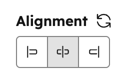
All fields share a set of common properties. These are general fields, such as the field’s name or the help text that displays for content creators using the field in the module or theme.Alignment
Can be used in modules as a style field.
- JSON
- React
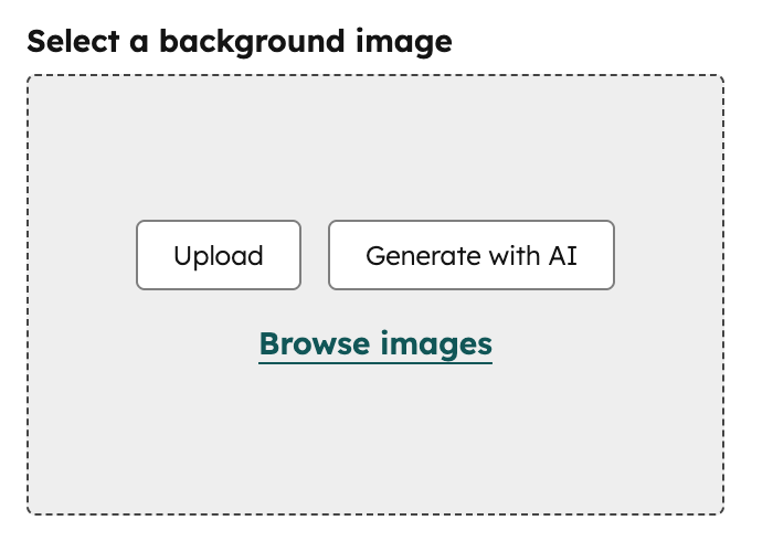
Background image
Can be used in modules as a style field.
.css property that returns CSS based on the field’s value. Learn more about the generated CSS property.
- JSON
- React
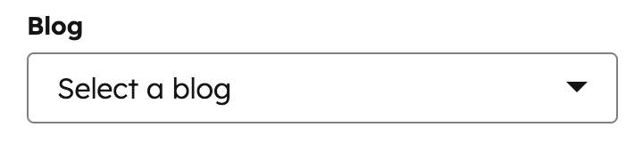
Blog
Can be used in modules.
- JSON
- React
Boolean
Can be used in modules and themes as a style field.
true or false. Often it makes sense to make groups or fields conditional based on boolean fields. If you think you might need to provide more than two states in the future, a choice field may be a better option as you can grow into that with less effort should needs change later.
- JSON
- React
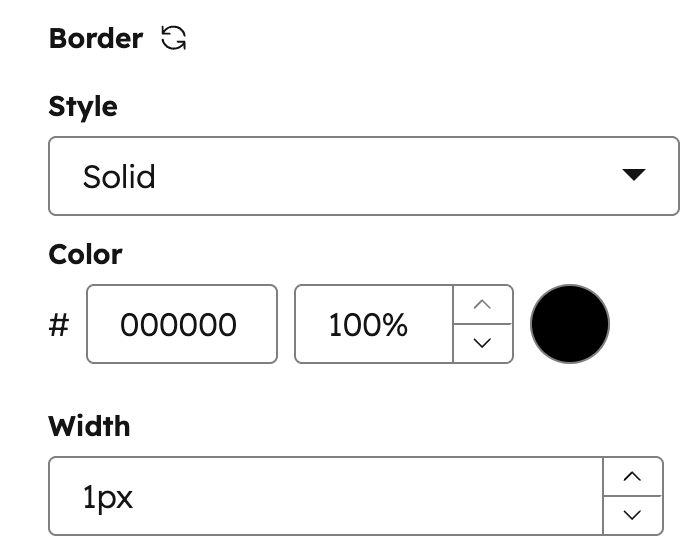
Border
Can be used in modules as a style field.
.css property that returns CSS based on the field’s value. Learn more about the generated CSS property.
- JSON
- React
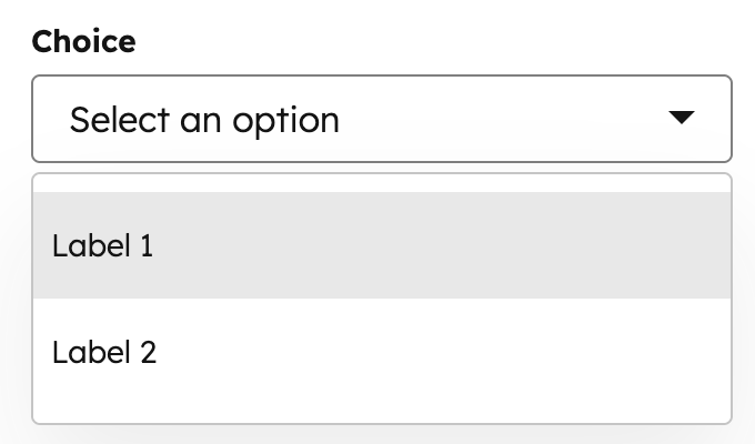
Choice
Can be used in modules and themes as a style field.
display property, you can set display the options in a dropdown menu, radio select, or checkboxes, or a range of buttons. Learn more about choice field display options below.
- JSON
- React
Choice button presets
To configure a choice field to display buttons instead of a dropdown menu, checkboxes, or radio selects, you can use any of the presets below. Each preset allows for a specific set of option labels, which you’ll need to include in thechoices array. These labels cannot be customized.
- JSON
- React
| Preset | Choice labels | Example |
|---|---|---|
case | none | title | upper | lower | 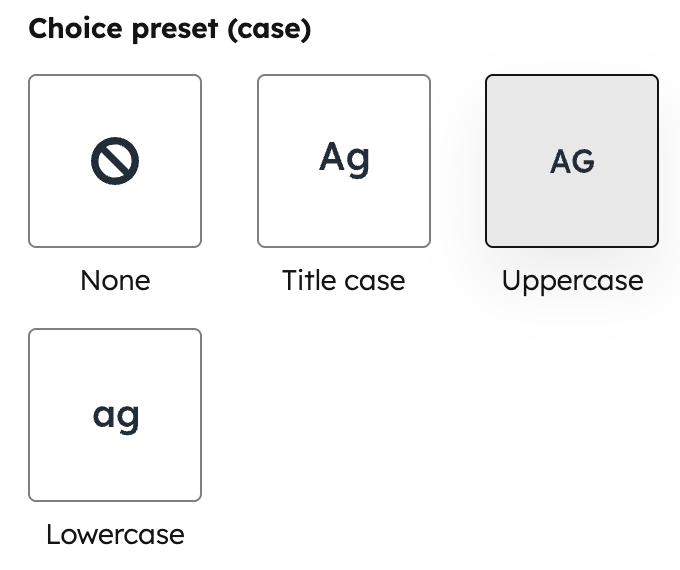 |
expand_icon | caret | plus | chevron | 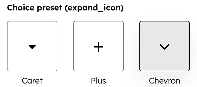 |
icon_background_shape | none | square | rounded | circle | 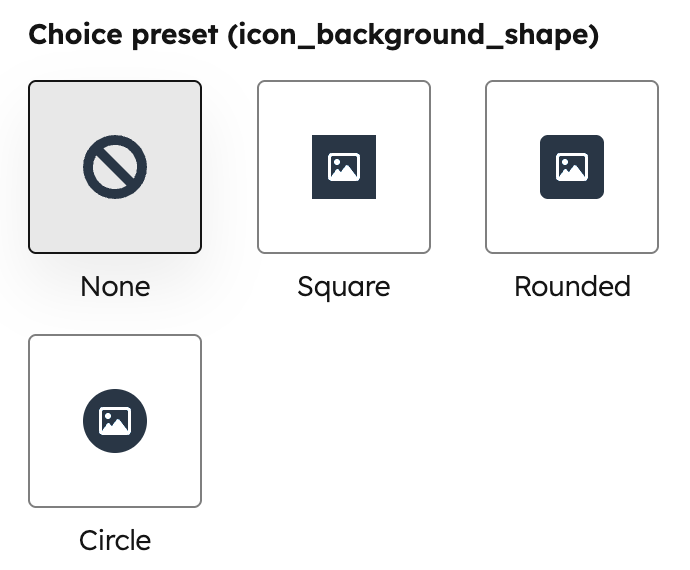 |
icon_size | small | medium | large |  |
layout | cards | tiles | minimal | 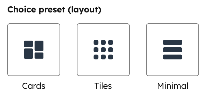 |
social_icon_background_shape | none | square | rounded | circle |  |
social_icon_size | small | medium | large | 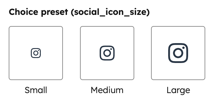 |
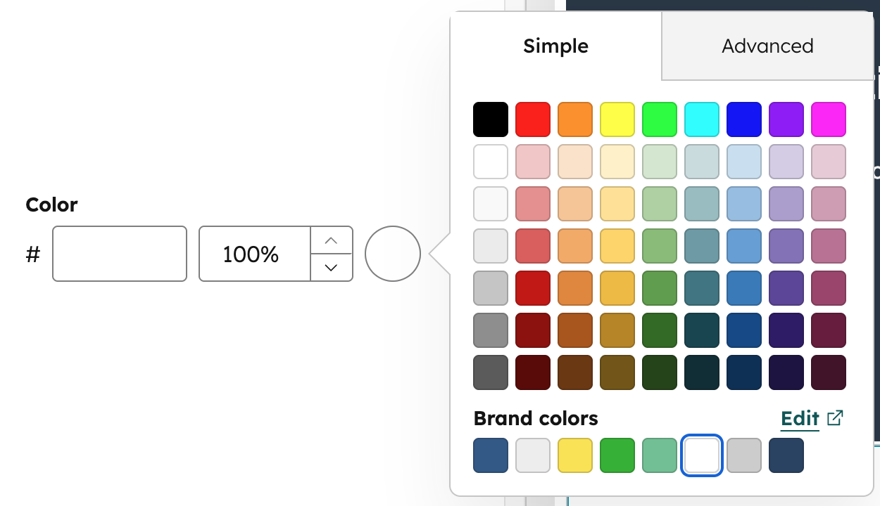
Color
Can be used in modules and themes as a style field.
show_opacity to true.
- JSON
- React
CTA
Can be used in modules.
- JSON
- React
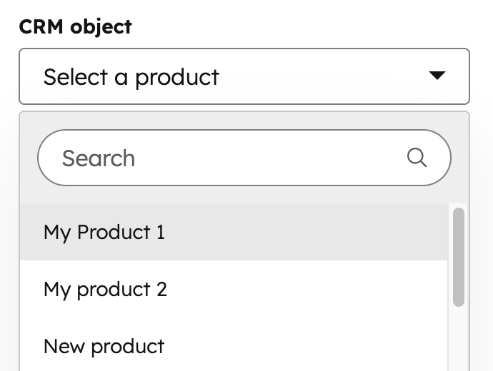
CRM object
Can be used in modules.
module.fieldname.properties returns the properties fetched from this object instance. This makes it so you don’t need to use the crm_object() function to get the data for the selected object instance.
module.fieldname.id returns the object instance ID.
- JSON
- React
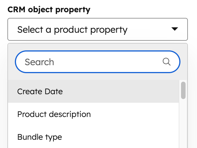
CRM object property
Can be used in modules.
- JSON
- React
In addition, you can use the following snippets to return other property details:
{{ module.fieldname.property }}: returns the property’s internal name.{{ module.fieldname.property_definition.label }}: returns the property’s label.{{ module.fieldname.property_definition.type }}: returns the property type (e.g., string).
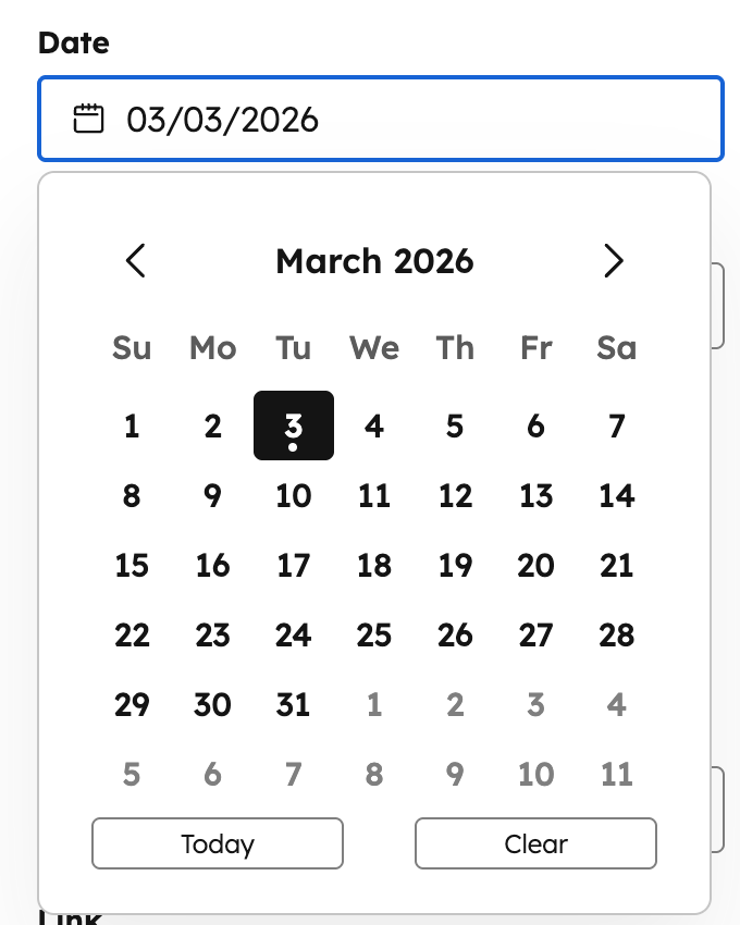
Date
Can be used in modules.
- JSON
- React
Date and time
Can be used in modules.
- JSON
- React
Email Address
Can be used in modules.
- JSON
- React
Embed
Can be used in modules.
- JSON
- React
File
Can be used in modules.
- JSON
- React
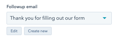
Followup email
Can be used in modules.
simple_email_campaign_id parameter.
- JSON
- React
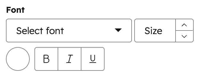
Font
Can be used in modules and themes as a style field.
- JSON
- React
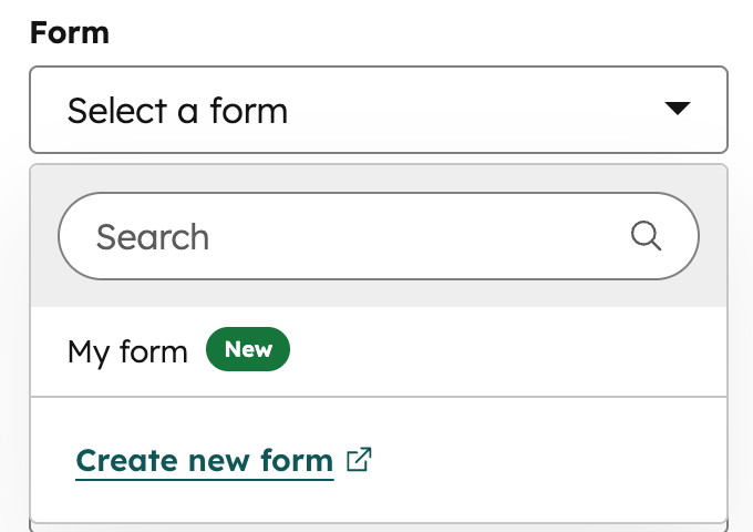
Form
Can be used in modules.
- JSON
- React
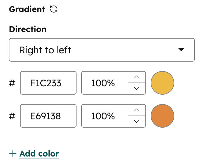
Gradient
Can be used in modules as a style field.
.css property that returns CSS based on the field’s value. Learn more about the generated CSS property.
- JSON
- React
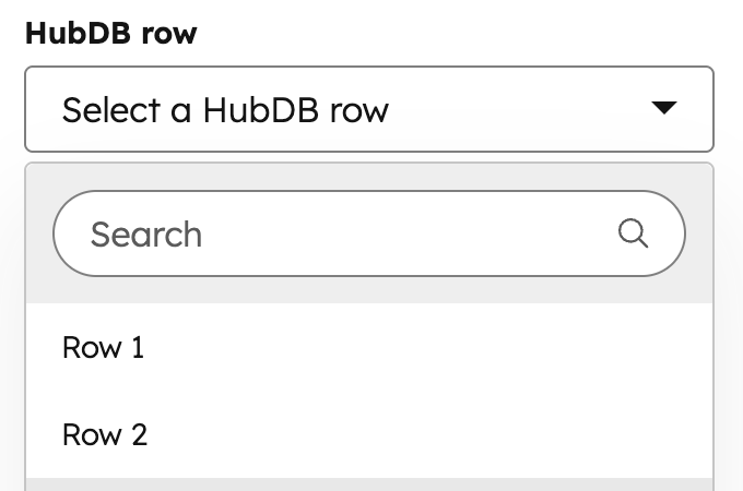
HubDB Row
Can be used in modules.
- JSON
- React
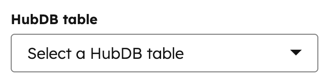
HubDB Table
Can be used in modules.
- JSON
- React
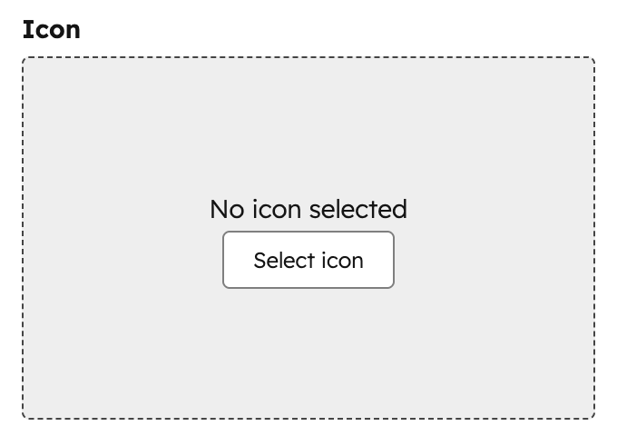
Icon
Can be used in modules as a style field.
- JSON
- React
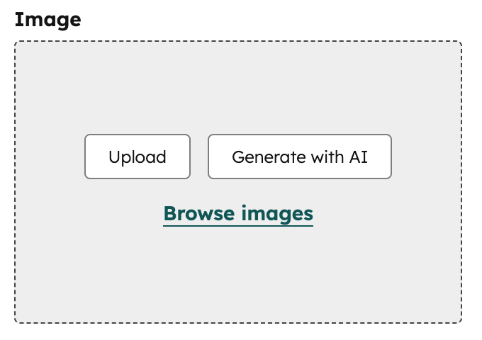
Image
Can be used in modules as a style field. Only use image fields as style fields when the image is purely presentational and does not convey meaning. For background images, use the background image field instead.
- JSON
- React
Link
Can be used in modules.
- JSON
- React
Logo
Can be used in modules.
- JSON
- React
Menu
Can be used in modules.
- JSON
- React
Number
Can be used in modules as a style field.
- JSON
- React
Suffix and prefix parameters are for display purposes in the content editor and have no effect on the numerical value of the field.
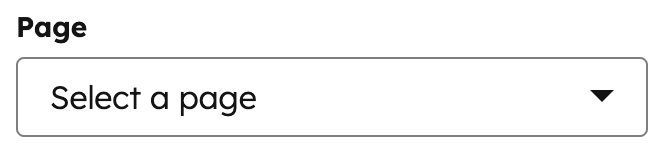
Page
Can be used in modules.
- JSON
- React
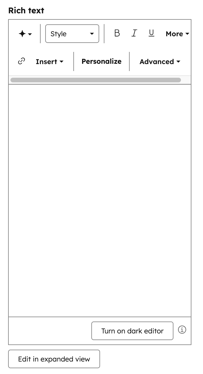
Rich text
Can be used in modules.
- JSON
- React
Simple menu
Can be used in modules.
- JSON
- React
Spacing
Can be used in modules as a style field.
.css property that returns CSS based on the field’s value. Learn more about the generated CSS property.
- JSON
- React
- You must include a
unitslist when setting aminormax. - The
unitsproperty supports the following unit types:%,ch,em,ex,in,lh,pc,pt,px,Q,rem,vh,vmax,vmin, andvw. - When a content creator edits all padding together, HubSpot will use the highest
minvalue and the lowestmaxvalue. In addition, only the units shared by all sides will be available to the content creator.
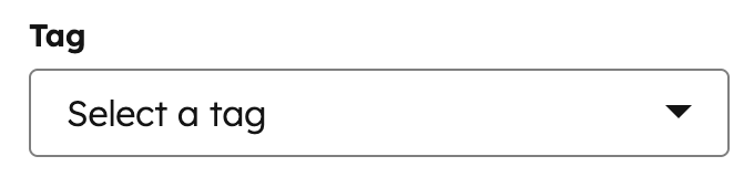
Tag
Can be used in modules.
- JSON
- React
Text
Can be used in modules.
- JSON
- React
Text Alignment
Can be used in modules as a style field.
- JSON
- React
URL
Can be used in modules.
- JSON
- React
Video
Can be used in modules.
- JSON
- React
conversion_asset object parameters: