Documentation Index
Fetch the complete documentation index at: https://developers.hubspot.com/docs/llms.txt
Use this file to discover all available pages before exploring further.
Supported products
Supported products
The Drag and Drop Template Builder
To create a drag and drop template, open the Design Manager and in the finder, create a new file, choose a template, and the type of template you’re creating. Drag and drop templates are made up of building blocks, these blocks are modules, groups, global groups, and flexible columns. Learn how to use the Drag and Drop template builder.Modules
Modules are reusable components that are editable portions of a page. Modules are made up of an HTML + HubL template fragment, CSS, JS, and fields. Modules can be placed inside of flexible columns and dnd_areas by content editors, and are the primary way that content editors manage the content of their website. You can build modules to handle any number of functions, search, image galleries, menus, complex marketing animations, calculators, product comparisons, the possibilities are down to your imagination and what you think provides a good experience for content creators. The fields are how the content editor controls their output. Modules are not unique to drag and drop templates, they are a very important core building block for the HubSpot CMS. In Drag and Drop templates the default values for module fields can be configured in the inspector. Learn more about Modules.
Groups
Groups are wrappers for other groups and modules, they can have CSS classes, and wrapping HTML. Groups manifest themselves as wrapping HTML with layout classes to facilitate placement and sizing of the groups. Groups can also have an internal-only name. With this, you can group modules in the Design Manager making it easier to visually identify parts of a page. An example of this might be for sidebars or banners.
Global Groups
Global groups are groups that when edited affect the entire website and not just the page they are on. Global groups can exist in multiple templates and most commonly are used for site headers and footers. Global groups are similar to partials but are limited to the structure that drag and drop templates enforce. They can be embedded into HTML + HubL files if needed, but most of the time it makes more sense to use a global partial instead.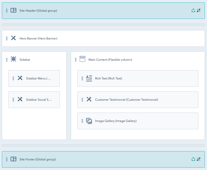
Flexible columns
Flexible columns are a special type of group. They can contain a default set of modules, but content editors can add, remove, and move modules within them. Flexible columns allow reordering of modules in a one dimensional way, vertically up and down. Unlike dnd_area tags, flexible columns do not support sections, or the styling capabilities, afforded to modules within them. Flexible columns are not unique to drag and drop templates, there is a HubL tag which can be used in HTML + HubL templates. Learn how to add a flexible column to a drag and drop template.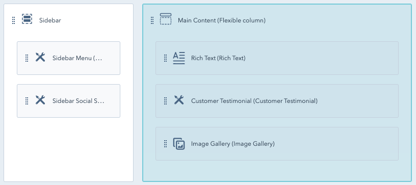
Add custom code to your drag and drop templates
There are a handful of ways to add custom code to your drag and drop templates. The primary method is through custom modules. Sometimes though you may need to add code that wraps around modules or groups. In order to do this, click on the module or group to view it in the inspector and find the wrapping HTML field. Add your HTML there. Sometimes you may need to add code to the head of your HTML or code right above the</body>. With your template open make sure you don’t have anything selected. The inspector will show fields for the template itself. Here you can link Stylesheets, and javascript files while also adding additional HTML in the head or just before the </body> tag.
For this you’ll use the inspector. The inspector has fields at the template level for stylesheets, javascript, <head> markup, etc.
