Themes as a package
Themes being a package cascades throughout the HubSpot app in various places to enable an efficient content creation experience. Developers can use themes to build a design system for content creators to work within. Whatever amount of flexibility, or guardrails can be built into a theme to meet the needs of your business.Page creation
When content creators start building new pages, they are prompted to start by selecting which theme they are building a page from, followed by selecting which template within the theme to use.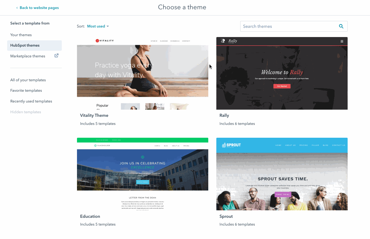
Theme fields
Themes allow developers to create a set of Theme Fields, similar to Module Fields, which allow content creators to tweak various knobs and dials designed by a developer to allow global stylistic control over a website without having to edit CSS. Developers use HubL to access the values of Theme Fields throughout their CSS. Content creators use the Theme Editor to modify Theme Fields, preview those changes against existing templates within a Theme, and publish their changes.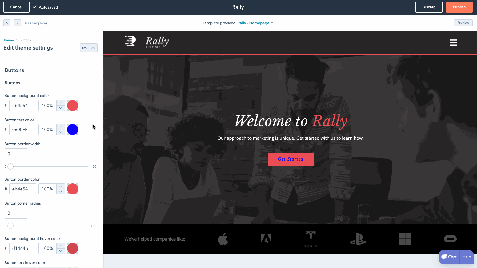
fields.json file.
Theme modules
The modules within a theme should be designed specifically for use within templates in that theme. The content editor will emphasize these theme modules, making it quick and easy for content creators to add modules to the pages they are building that are designed to work well in the context of that page. Default modules and the rest of the modules in your HubSpot account will still be available.
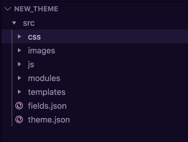
Theme file structure
A theme is a single directory of files. You can include HTML, CSS, and Javascript files, modules and additional files that can be organized in any manner within subdirectories of the parent theme folder. Two JSON files are necessary to build a theme:theme.json and fields.json. These files should be included at the root theme folder.
To start from an example, see the HubSpot CMS Boilerplate.
At this time .json files can only be created and uploaded to a HubSpot account through the local development tools.
theme.json
Thetheme.json file contains the meta-information for your theme directory, such as the themes readable label, its preview screenshot and various configurations for how the theme should behave. Your theme.json file will look similar to the following:
fields.json
Thefields.json file controls the available fields and field groups in the theme editor, including style fields. The fields you include will depend on how much control you want content creators to have in the page editor. The number of fields available for themes is more limited than for modules, as theme fields are best for styling options, while global content is better for theme content.
For example, rather than adding a text field to the theme’s field.json for your site’s tagline, it should add it as a global module so that content creators can update the tagline from the page editor rather than the theme editor.
The fields that are available for use in themes are:
For comprehensive documentation on the possible options for theme fields, see the module and theme fields documentation.
Using theme field values
To access field values, use dot notation and prefix the path to the value infields.json with theme. You can use a themes fields value in your stylesheets using syntax like {{ theme.path.to.value }}. For example, the font field outlined below:
Previewing themes
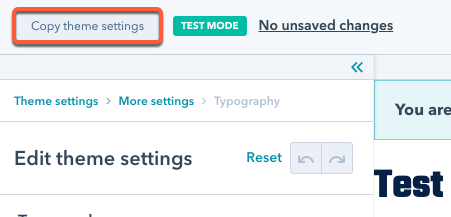
For developers sometimes you need to be able to test out that your theme fields are working properly but don’t want to impact real pages. That’s where theme test mode comes in.Test mode
Test mode gives you a safe environment to be able to play with your theme’s fields and ensure they are working as you expect. The interface looks exactly like the theme preview/editor that content creators can see, however you can rest assured that you are not changing your actual website’s settings. To protect against accidental theme setting updates, publishing is blocked in test mode. You can tell if you are in test mode as?testmode=true appears in your address bar, and a test mode icon will display in the header of the theme editor.

-
To activate test mode from the design manager:
- In the design manager, select your theme in the finder.
- At the top of the left sidebar, click the Preview button.
.png)
-
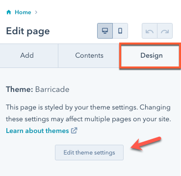
To activate test mode from the page editor:
- In the page editor, click the Design tab in the left sidebar, then click Edit theme settings.
- Add
?testmode=trueto the URL, then hit enter. You’ll then be in test mode.
?testmode=true to the URL in your address bar.