Module restrictions
Modules must not contain HubDB, calls to serverless functions, or the CRM object field. The following module types should not be built as independent modules- HTML
- Full-width modules
- Forms and multi-step forms
- Spacer modules or modules that create non-UI page structure
- Modules that duplicate default module functionality
- Commerce-specific modules
- Email-specific modules
Module content
Learn about the requirements for module labels and help text, fields, and default content.Module labels & help text
- Modules must have descriptive labels that convey the purpose of the module. The label Hero Banner with Parallax Scrolling is descriptive, whereas the labels Hero Banner and Gallery are not.
- Module labels must not contain numbers, such as Hero Banner 01.
- Module labels must not contain underscores.
- Module labels must not contain abbreviations, such as Col instead of Column.
- Modules must contain inline help text where applicable to further convey how to use the module.
- Modules should not be named the same as a default module.
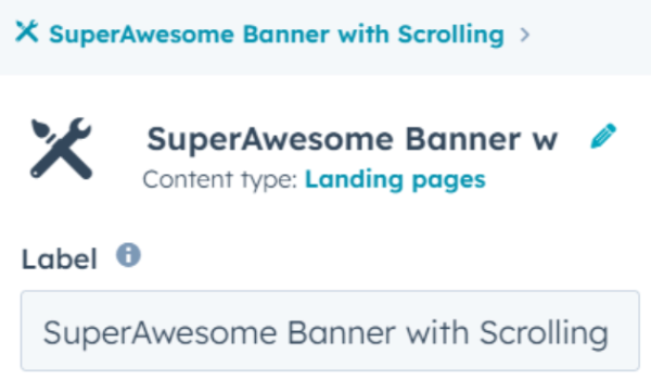
- For independent modules, the module label should match the name on the template listing. For example, if your template listing is SuperAwesome Banner with Scrolling, your module label should be the same.

Default content
- Default field cannot include Lorem ipsum text.
- Default field content should represent the field’s purpose:
- When including menu fields, modules must use Select a menu as the default content option.
- When including form fields, modules must use Select a form as the default content option.
- When including blog selector fields, modules must use Select a blog as the default content option.
- If adding default content to a module doesn’t make sense, use a module placeholder instead to help the content creator visualize the space that they’ll fill with content.
Module icons
Modules must include a custom icon assigned to the module (replacing the default icon). Do not use company logos as icons, such as Apple or Amazon logos. For modules included in a theme, each module should have a unique and relevant icon. Learn more about module icons.Modules that require 3rd party accounts
For individual modules, if the module requires a 3rd party account, it must be noted in the template description. For example, if your module makes use of the Google Maps Platform, you need to include a note, “The use of this module requires a Google Cloud (Google Maps Platform) account.”Module fields
Review specific requirements for modules in a theme and independent modules below:- For modules in a theme:
- Must contain inline help text and specific default content for certain fields.
- At least one logo field must inherit from the account’s brand settings. If using an image field to render a logo, the image field does not have to inherit from the brand settings.
- For both modules in a theme and independent modules:
- Module field names should describe the field’s intent. For example, if a text field is meant to include a person’s job title, Job Title would be a proper description whereas Title would not.
- All of HubSpot’s default modules must be styled and must display properly on all templates submitted.
fields.json and module.html configuration
To ensure compatible functionality between themes and independent modules, modules must inherit the color and font fields either by definingdefault_value_path or property_value_paths, or both in their fields.json file and add a reference to the theme fields in the module.html file. Learn more about these requirements.
Module code quality
Modules must be self-contained
Theme modules
Any files needed for your theme module, such as CSS or JavaScript, must be contained in the theme folder and included in the theme directory. You can use the Linked Files feature in the Design Manager. Or, include the files using the require_js() or require_css() functions with a relative path to the file. For common libraries, such as slick.js, you can include them using therequire_js() or require_css() functions with an absolute URL to the CDN where it’s hosted.
Independent modules
For independent modules, all CSS and Javascript files should be contained in either themodule.css or module.js. Alternatively, include the files using the require_js() or require_css() functions with an absolute URL to the CDN where it’s hosted. It is not possible to use the Linked Files feature in the Design Manager as that is only available for theme modules.
Since module.js is included in the DOM before any require_js or require_css files, Javascript contained in the module.js section should be deferred using the annotation below:
Code restrictions for independent modules
The following restrictions apply to only independent modules:- It is recommended to use vanilla JS where possible. Adding a jQuery library to a site that is not using jQuery can potentially cause conflicts and slow down the website page.
- If using a jQuery library, use the require_js() function to include the library in the event that jQuery is turned off with the checkbox (Boolean) in account settings to avoid conflicts from multiple jQuery libraries.
Categories
- All independent modules must have at least one category. Modules submitted as part of a theme are not required to have categories, but it’s best practice to include at least one. Learn more about adding categories to modules.
Class name selectors
- Any class name selectors must be prefixed with the module name, replacing spaces with hyphens. For example, below is the
module.htmlfile for a button namedexample-button, with each class name and CSS selector reflecting its name.
Styles and Javascript
- Styles:
- Modules must have a non-empty style group.
- Hardcoding inline styles within modules is not recommended. Instead, use dynamic inline styles by enabling fields to control styling.
- JavaScript:
- JavaScript must be able to represent multiple instances of a module. JavaScript in the JS Pane will only load once per page, regardless of the number of module occurrences.
- JavaScript should reference DOM elements by module-specific class names to ensure elements outside of the module are not unintentionally affected.
{{name}}. This variable pulls in the module’s instance ID (which can be used in the HTML+HubL panel only) to help in CSS and JS markup for complex modules. Learn more about this in our developer documentation.
Field organization
The following field organization and grouping requirements must be met.Content tab
- Where there is at least one control within a field group, all controls must be grouped into categories labeled by their function.
- Module fields added to the Content tab must give ways to customize the content of a module. For example, controls for image, icon, alt text, and link controls.
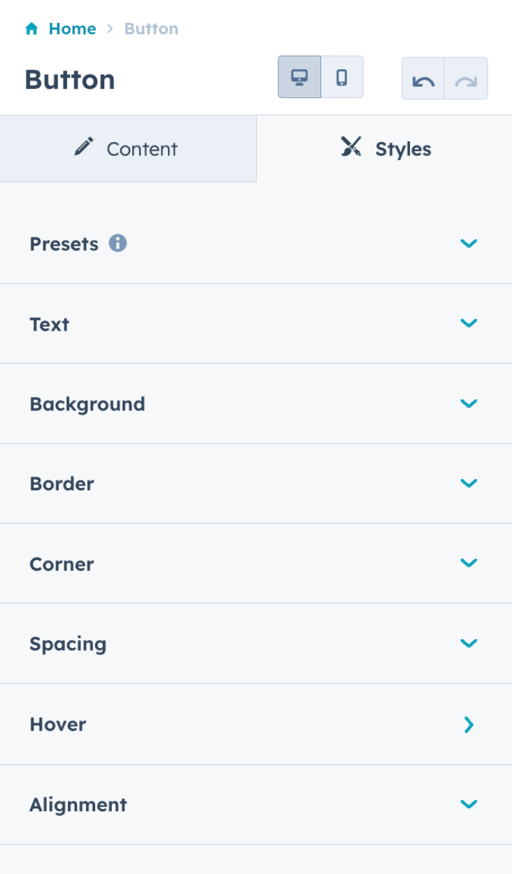
Styles tab
Module style field groups must be consistent and follow a pattern. Below is a recommended order for your style field groups. These groups can either be at the top level or nested one group deep. Empty groups may also be removed:- Presets
- Text
- Background
- Border
- Hover
- Corner
- Spacing
- Alignment
- Custom style groups that don’t fit the above
- Advanced
When moving fields from the Content tab to the Styles tab, learn how to use alias mapping to preserve styling for modules that are already in use on live pages.
- Animation options should always be positioned near the bottom of the field group list.
- Options that allow content creators to add code snippets or CSS should be grouped at the end of the field group list under a field labeled Advanced.
- Controls should be standardized across all modules. For example, all elements that can have a border radius control should offer that control. Avoid offering controls on some modules that are absent on others.
-
Module fields added to the Style tab must provide ways to style the module. For example:
- Style options such as color, text styling, alignment, spacing, border, and corner radius.
- Animations such as hover and slide-in effects.
- Presets such as dark and light themes that are meant to change many styles at the same time.
Examples of field organization
Presets
Presets can be used when wanting to give content creators a limited set of options, often tying back to theme settings. For example, the Icon module included in the Growth theme contains presents for Dark and Light colors, which enables consistency when used across the website.Multi-level grouping
When deciding whether to keep style fields at the top level or nest them, consider the following example. The Icon module included in the Growth theme lists all its styles at the top level because it’s one component, and therefore its style options all impact the one component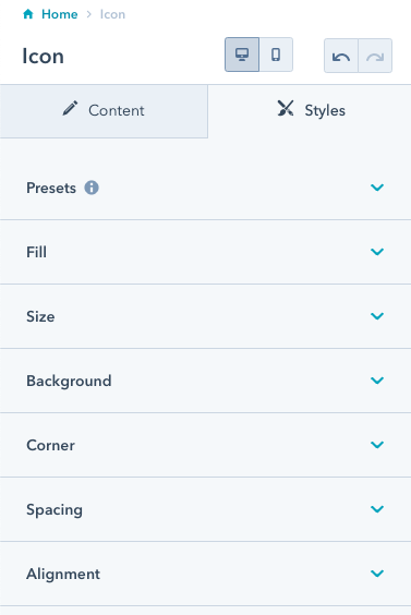
Grouping individual fields
The button module below contains groupings for Presets, Text, Background, and more. Although the Corner field group contains only the corner radius control, it’s still grouped to create a uniform content creation experience.