Figma Design Kit (BETA)

The Figma Design Kit is a visual representation of the UI components you can include in React-based app cards in UI extensions. Using this kit, you can create more detailed designs to plan out UI extensions, and can be particularly helpful when needing to share demos with stakeholders or keep teams aligned during the development process.

Along with containing visual examples of UI components, the kit also contains high-level UI extension design information, such as a breakdown of app card anatomy and examples of available locations. Note that HubSpot will update this kit over time as new components are added, but the UI component documentation will be the most up to date source of truth for available components. Be sure to check the changelog for any recent or upcoming additions.

figma-design-kit-button-component

Learn more about using UI kits in Figma's documentation.

Please note: the Figma Design Kit is in beta and is therefore subject to HubSpot's developer beta terms. The contents of the kit may change during this period.

Access the kit

Click the button below to access the Figma Design Kit (password: Extensibility0324).

Get the kit

After accessing the kit, it's recommended to open the kit in your Figma desktop app, then duplicate it to your drafts:

  • In the left sidebar, click Extensibility Components.
  • Select Duplicate to your drafts.

figma-design-kit-duplicate-to-drafts

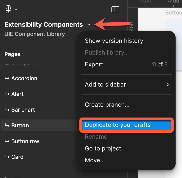
  • A copy will be created to your drafts, which you can then use as needed. As updates will be periodically released, you'll need to check the source kit and duplicate to your drafts again to access new components.

Learn more about copying UI kits.

Using the kit

In the Pages section of the left sidebar, you'll find a Documentation section which contains the following pages:

  • Introduction: a brief introduction to what the kit is and what it should be used for, along with links to documentation and a feedback form.
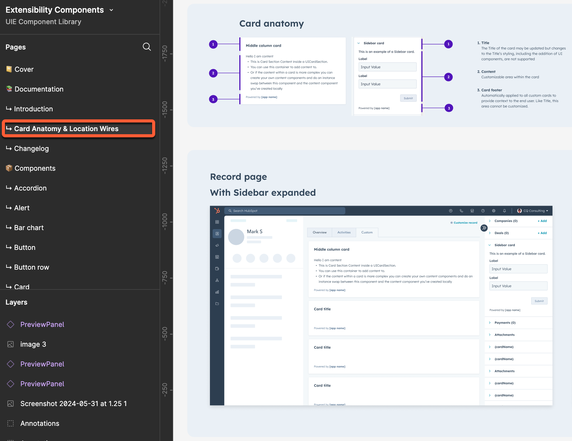
  • Card Anatomy & Location Wires: high-level breakdowns of app card anatomy, along with wireframes for the different locations you can build UI extensions for.figma-design-kit-card-anatomy-and-location-wires
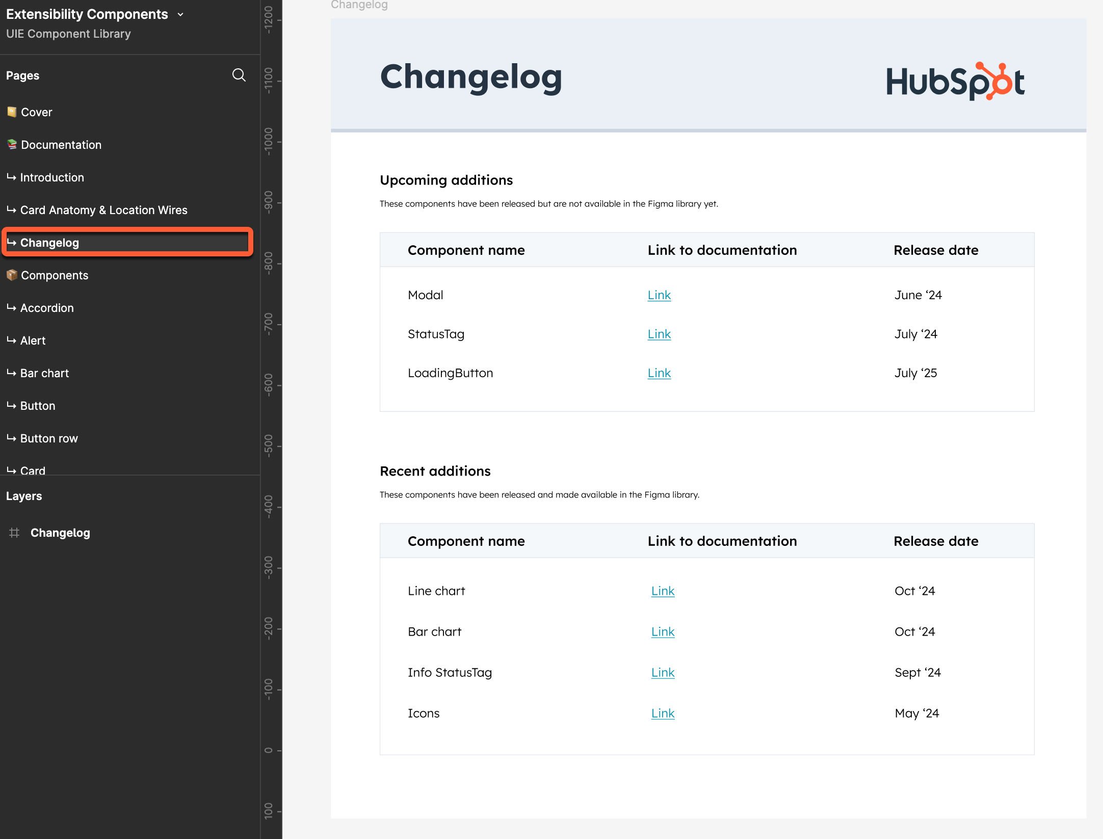
  • Changelog: recent additions and changes, along with upcoming additions. Each entry will include a link to relevant documentation when available, along with the release date.
    figma-design-kit-changelog-with-sidebar

In the Components section, you'll find the currently available design pages for UI components. Component pages will include a description of the component along with visual examples of different states and variants.

figma-design-kit-checkbox-component-with-sidebar


Was this article helpful?
This form is used for documentation feedback only. Learn how to get help with HubSpot.