Alert component to render an alert within a card. Use this component to give usage guidance, notify users of action results, or warn them about potential issues or failures. Alerts can be placed in components statically or triggered dynamically as the result of an action.
If you want to render an alert banner at the top of the page, Learn more about the AddAlert method.
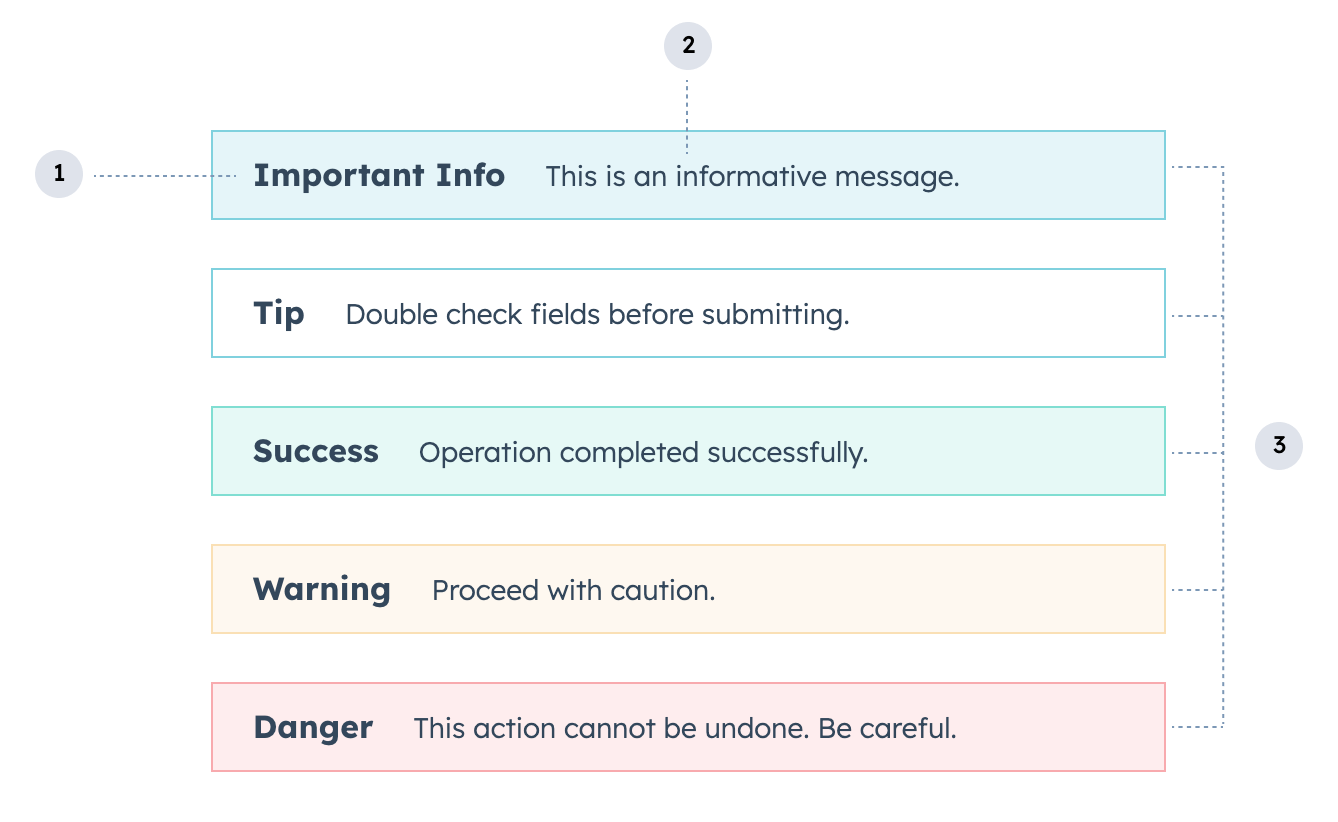
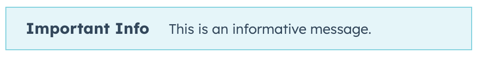
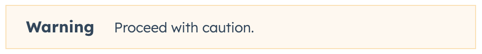
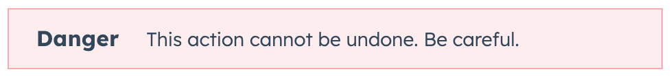
- Title: the alert’s bolded title text which should summarize its intent or an action outcome.
- Body: the descriptive text that follows the title, which should provide the user with the necessary information to proceed.
- Variant: the color of the alert. Learn more about when to use each variant below.
Props
| Prop | Type | Description |
|---|---|---|
title Required | ||
children | ||
testId | ||
variant |
Variants
There are five alert types, which can be set using thevariant prop.
'info': a blue alert for general messages to inform the user.
'tip': a white alert to provide guidance and tips.

'success': a green alert to indicate the successful completion of a task or to convey a positive CRM record status.

'warning': a yellow alert for general warnings related to the performance of the system or the status of the CRM record.
'danger': a red alert indicating an error, the degradation of a system, or a negative CRM record status. You should not use this alert type for anything other than errors and negative statuses.
Usage examples
- Use an
'info'alert to add instructions to a custom card, such as “Fill out this form using the contact’s company information.” - Use a
'success'alert when a user successfully submits a form in the UI extension, or to convey that a contact qualifies for enrollment in a promotional offering. - Use a
'warning'alert to call attention to a contact’s upcoming renewal date. - Use a
'danger'alert to notify the user of a form submission error or to signify that a high-urgency ticket has lapsed.
Guidelines
- DO: use alert text that clearly communicates to the user what they need to know.
- DO: make alert text actionable, especially for error alerts which should provide a clear path to resolution.
- DO: use proper punctuation, such as periods and question marks at the end of the descriptive text.
- DO: set the alert as the first component in the extension when possible for visibility. Extensions with alerts should also be placed at the top of the CRM record by a HubSpot admin. Learn more about customizing CRM record tabs.
- DON’T: use exclamation points in warning or error alerts. Exclamation points should only be used for short, positive messages (e.g. “Great!” or “Well done!”).