ErrorState component sets the content of an erroring extension. Use this component to guide users through resolving errors that your extension might encounter.
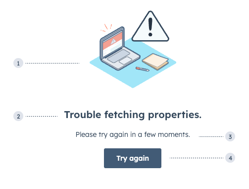
- Illustration: one of three error-themed illustrations.
- Title: the main error message to explain the root cause if known.
- Additional text: an additional
Textcomponent to provide further guidance. This does not come with the component by default. Error text should use the following formats:- Known cause: [what failed] + [why it failed] + [next steps]. For example, Failed to load extension due to outage, please wait a few minutes and try again.
- Unknown cause: [what failed] + [next steps]. For example, Couldn’t load data, try refreshing the page or contacting IT.
- Additional button: an additional
Buttoncomponent to can help users take action. This does not come with the component by default.
Props
| Prop | Type | Description |
|---|---|---|
title | String | The text of the component header. |
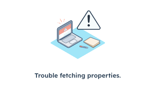
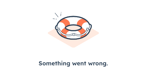
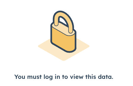
type | 'support' | 'lock' | 'error' (default) | The type of image that will be displayed. |
Variants
Using thetype prop, you can set one of three illustrations.
Usage examples
- Use the
defaulterror type when a card encounters an error when fetching data. - Use the
supporterror type when the user should contact internal or external support to resolve an error. - Use the
lockerror type when the user needs to log in or doesn’t have permission to access the card’s data.
Guidelines
- DO: use text that’s clear, direct, brief, and helpful.
- DON’T: use technical jargon.
- DON’T: say “sorry” or use frivolous language such as “oops,” “uh-oh,” and “it’s us, not you.”
- DON’T: use exclamation points.