Form component renders a form that can contain other subcomponents, such as Input, Select, and Button. Use this component to enable users to submit data to HubSpot or an external system.
Below, learn how to implement a form in a UI extension. For guidance on form design, check out the Form design patterns.
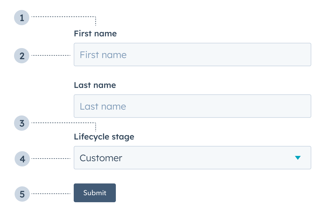
- Label: the input label.
- Text input: an Input component with a placeholder value of First name.
- Label: the select input label.
- Select input: a Select component with value of Customer.
- Button: a Button component to submit the form’s information.
Props
| Prop | Type | Description |
|---|---|---|
autoComplete | 'on' (default) | 'off' | Set this field to 'off' to prevent autocompletion software (e.g., browser, password managers) from auto-filling form fields. Based on the autocomplete HTML attribute. |
onSubmit | Function | The function that is called when the form is submitted. It will receive a RemoteEvent as an argument and its return value will be ignored. |
Usage examples
- A form to submit customer information to an external database.
- A form to place a product order on behalf of a customer.
Guidelines
- DO: include text inputs when a user should be able to submit any value.
- DO: include select inputs when a user should only be able to select from a set of values.
- DO: include descriptions and placeholder text to provide context to users.
- DO: always position the submit button at the bottom of the form.
- DON’T: include a form without a submit button.