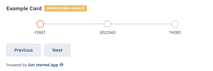
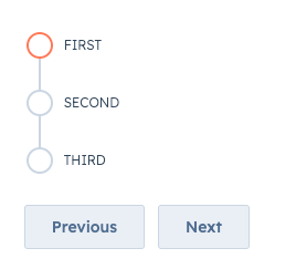
StepIndicator component renders an indicator to show the current step of a multi-step process.
Props
| Prop | Type | Description |
|---|---|---|
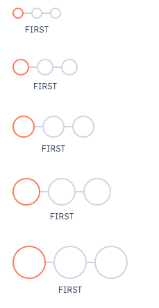
circleSize | 'xs', 'extra-small', | 'sm', 'small' (default) | 'md', 'medium' | 'lg', 'large' | 'xl', 'extra-large' | The size of the indicator circles. See the variants section for examples of sizing. |
currentStep | Number | The currently active step. Steps are zero-based, meaning the first step is assigned 0. |
direction | 'horizontal' (default) | 'vertical' | The orientation of the indicator. |
onClick | (stepIndex: number) => void | A function that is invoked when a step in the indicator is clicked. The function receives the current step index as an argument (zero-based). Use this to update the currently active step. |
stepNames | Array | An array containing the name of each step. |
variant | 'flush' | 'default' (default) | 'compact' | Sets component spacing.
|
Variants
By default, the step indicator will be laid out horizontally, but you can use thedirection prop to set the orientation to vertical instead.
circleSize prop, ranging from 'xs'/'extra-small' to 'xl'/'extra-large'.