The Tile component renders a square tile that can contain other components. Use this component to create groups of related components.
import { Tile, Text } from "@hubspot/ui-extensions";
const Extension = () => {
return (
<>
<Tile>
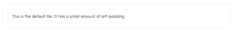
<Text>This is the default tile. It has a small amount of left padding</Text>
</Tile>
<Tile compact={true}>
<Text>This is a compact tile. It reduces the amount of padding within.</Text>
</Tile>
<Tile flush={true}>
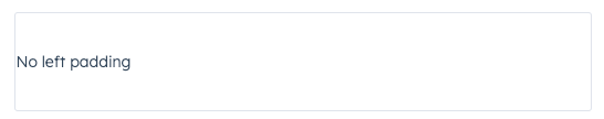
<Text>This is a flush tile. It has no left padding</Text>
</Tile>
</>
);
};
Props
| Prop | Type | Description |
|---|
compact | Boolean | When set to true, reduces the amount of padding in the tile. Default is false. |
flush | Boolean | When set to true, removes left and right padding from the tile contents. Default is false. |
Variants
Using the flush prop, you can remove left and right padding from the tile contents.
Usage examples
- Group a form and its inputs together.
- Group a bulleted text summary and statistics components together.
Last modified on January 28, 2026