Last modified: November 18, 2025
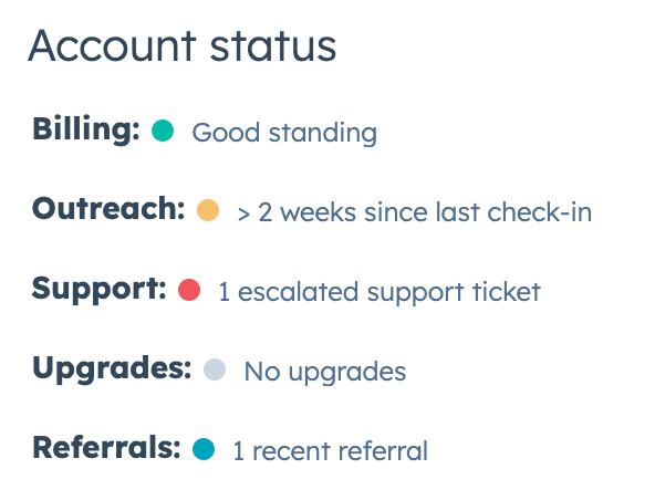
The StatusTag component renders a visual indicator to display the current status of an item. Status tags can be static or clickable for invoking functions with the onClick prop.
Props
| Prop | Type | Description |
|---|---|---|
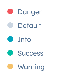
variant | 'default' (default) | 'info' | 'danger' | 'warning' | 'success' | The color of the dot indicator. See the variants section for more information. |
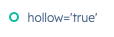
hollow | Boolean | When set to true, the status tag’s dot will be a ring instead of a filled-in circle. |
onClick | () => void; | A function that will be invoked when the status tag is clicked. It receives no arguments and its return value is ignored. |
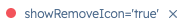
showRemoveIcon | Boolean | When set to true, the status tag will include a small, clickable x icon to remove it. Default is false. |
onRemoveClick | () => void; | A function that will be invoked when the remove icon is clicked. |
Variants
- Using the
variantprop, you can configure the indicator severity color:'danger': a red dot indicating a negative state, such as error or failure.'default'(default): a grey dot indicating a neutral state.'info': a blue dot indicating a general or informative state.'success': a green dot indicating a positive state, such as confirming success or completion.'warning': a yellow dot indicating a cautionary state, for when something needs attention or is time-sensitive.
- Using the
hollowprop, you can configure the dot to be a filled circle or a ring:
- Using the
showRemoveIconprop, you can include a clickable icon to remove the status indicator.
Usage examples
- Use an
'info'status tag to indicate that a customer is active. - Use a
'success'status tag to indicate that an item in a to-do list has been completed. - Use a
'warning'tag to indicate that a deal is expiring soon. - Use a
'danger'tag to indicate that an error happened when trying to sync a specific property in a table.
Guidelines
- DO: make tag text concise and clear.
- DO: ensure that tag variants are used consistently across the extension.
- DON’T: use tags in place of buttons or links.
- DON’T: rely on color alone to communicate the tag’s meaning. Ensure that tag text is clear and helpful.