Last modified: August 22, 2025
The Toggle component renders a boolean toggle switch that can be configured with sizing, label position, read-only, and more.
Props
| Prop | Type | Description |
|---|---|---|
name | String | The input’s unique identifier. |
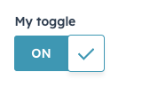
label | String | The text that displays above the input. |
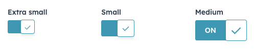
size | 'xs' |'sm' | 'md' (default) | The size of the toggle. Only 'md' sized toggles can display text on the toggle (ON, OFF). All other sizes will hide checked/unchecked text. |
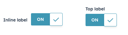
labelDisplay | 'inline' (default) | 'top' | 'hidden' | The display option for the toggle label. |
checked | Boolean | Whether the toggle is selected. Default is false. |
initialIsChecked | Boolean | When set to true, the toggle will be selected by default. Sets the default checked state when the component is uncontrolled. |
textChecked | String | The text that displays on the toggle when checked. Default is ON. Extra small and small toggles will not display any text. |
textUnchecked | String | The text that displays on the toggle when not checked. Default is OFF. Extra small and small toggles will not display any text. |
readonly | Boolean | When set to true, users will not be able to select the toggle. Default is false. |
onChange | (checked: boolean) => void | A function that is invoked when the toggle is clicked. |
Variants
Using thelabelDisplay and size props, you can customize toggle appearance.
labelDisplay: set to'inline'or'top'to configure the label position, or set to'hidden'to hide the label.
size: by default, toggles are set to'md'. Shrink the toggle size by setting this prop to'xs'or'sm'. Note that only medium toggles will display ON/OFF status text.