hs fetch @hubspot/linked_image.module).
To view a default module’s code, you can view and clone the module within the @hubspot folder of the design manager. In the code, some default modules use the default account ID 7052064, rather than the one belonging to the current account.
Blog comments
Supported in blog posts and blog listings.Blog email subscription
Supported in pages, blog posts, and blog listings.Blog posts
Add this module to blog listing pages to display blog post previews containing each post’s title, featured image, author, publish date, and more with a clickable button that navigates to the post. This default module has built using React, and you can view its source code on GitHub.Blog post filter
Supported in pages, blog listings, and blog posts.Blog post listing
Supported in pages, blog listings, and blog posts.Button
Supported in pages, blog posts, and blog listings.Call-to-Action
Supported in pages, blog listings, and blog posts.Delete data
As of May 26th, 2025, this module has been deprecated in favor of the data privacy request page feature. Reference information for this module has been moved to the deprecated modules documentation.Divider
Supported in pages. There’s a new version of this module available in accounts created after August 25th, 2022. Learn more about this change.Download data
As of May 26th, 2025, this module has been deprecated in favor of the data privacy request page feature. Reference information for this module has been moved to the deprecated modules documentation.Form
Supported in pages, blog posts, and blog listings.Header
Supported in pages, blog listings, and blog posts.Horizontal spacer
Supported in pages, blog listings, blog posts, and emails.Icon
Supported in pages, blog listings, and blog posts. Icons can be pulled from the Font Awesome 5.0.10 and 5.14.0 icon sets.Image
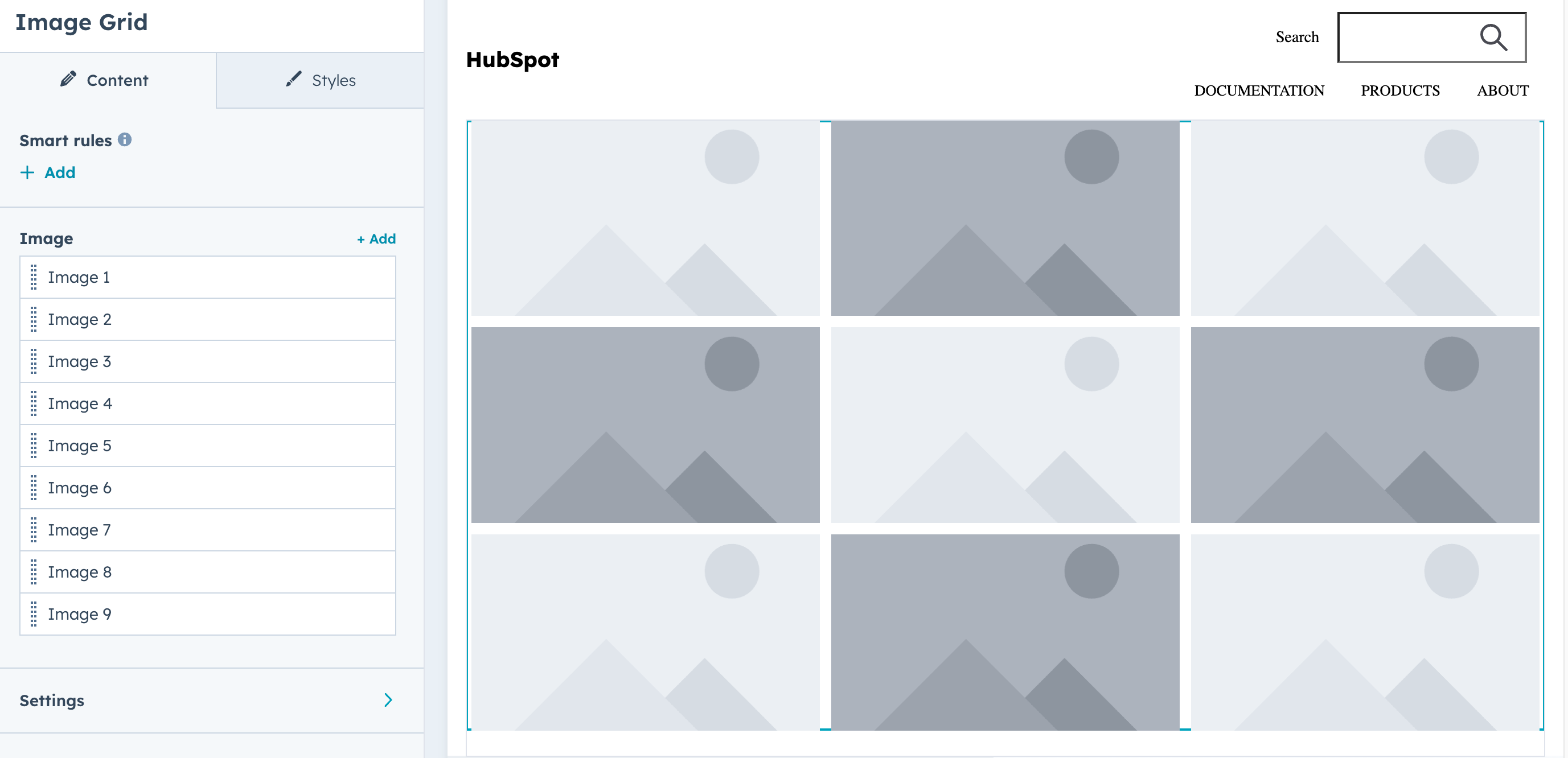
Supported in pages, blog listings, and blog posts.Image grid
Display a grid of images (9 images by default). Includes fields for selecting images, configuring grid settings, and styling. Keep in mind the following guidelines when using this module:- Use images with similar aspect ratios for visual consistency.
- Alt text should be provided for all images. Default text is available as a fallback.
Mobile responsive grids
To configure an image gallery to be mobile responsive, include the mobilegroup_uniform_display_options fields within grid_settings. You’ll first need to set mobile_columns to true, then set the number of columns for mobile devices with mobile_number_of_columns.
Below is an example of an image grid that’s configured to be mobile responsive, taken from the Event Signup Two template in the default Elevate theme. Based on the width of the viewport, the grid will either display the three images horizontally in one row (desktop) or vertically in three rows (mobile).
- Desktop
- Mobile
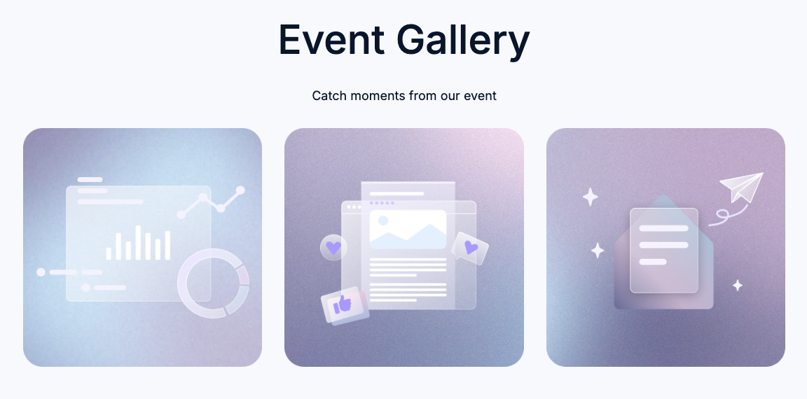

Image gallery
Supported in pages, blog posts, and blog listings.Image slider gallery
Supported in pages, blog posts, and blog listings.Language switcher
Supported in pages.Logo
Supported in pages, blog listings, and blog posts.Logo grid
A customizable grid of containers to display logos uniformly. Supported in pages, blog listings, and blog posts.Meetings
Supported in pages, blog posts, and blog listings.Membership social logins
This module provides Google and Facebook login capability to memberships sites. The user must sign-in with an account linked to the email for the contact in the CRM. You can choose which social logins to enable. Supported in membership login pages.Facebook requires having a Facebook developer account, and a facebook app created, with basic settings. Once you’ve done that your app id is what you pass to the module.Google requires a Google account, and authorization credentials created, once you have that your app’s client id is what you pass to the module.
Menu
Supported in pages, blog posts, and blog listings. Looking to build your own custom menu? Try our menu() function.Page footer
Supported in pages, blog listings, and blog posts.Password prompt
Supported in pages, blog posts, and blog listings.Payments
Supported in pages, blog posts, and blog listings.Product
Displays a product from the account’s product library. Supported in pages, blog posts, and blog listings.Legacy quote modules
The following modules can be used in legacy quote templates. For building quote templates, learn how to create quote templates in HubSpot.Quote download
Supported in legacy quote templates.Quote payment
Supported in legacy quote templates.Quote signature
Supported in legacy quote templates.esignature object:
When a legacy quote requires a printed signature, the following fields are available within a
print_signature object:
Line items
Supported in legacy quote templates. This module also includes the default text used on custom quotes.Rich text
Supported in all template types.RSS listing
Supported in pages, blog listings, and blog posts.Site search input
Supported in pages, blog posts, and blog listings.Search results
Supported in pages, blog posts, and blog listings.Section header
Supported in pages, blog listings, and blog posts.Simple menu
Supported in pages, blog listings, and blog posts.Social follow
Add links to your social media profiles, with drag and drop reordering in the content editor. Automatically inserts icons based on the social URL, but icons can be overridden. Supported in pages, blog listings, and blog posts.Social sharing
Supported in pages, blog listings, and blog posts.social_link_url in the default column below is the same value as the link parameter.