Learn about the accordion component for use in UI extensions.
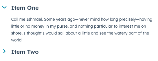
Accordion
component renders an expandable and collapsable section that can contain other components. This component can be helpful for saving space and breaking up extension content.
Prop | Type | Description |
---|---|---|
title | String | The accordion’s title text. |
defaultOpen | Boolean | When set to true , the accordion will be open on initial page load. The open prop takes precedence over this prop. |
disabled | Boolean | When set to true , the accordion’s state cannot be changed. Set to false by default. |
open | Boolean | Controls the accordion’s open state programmatically. When set to true , the accordion will open. Takes precedence over defaultOpen . |
onClick | () => void | A function that will be invoked with the accordion title is clicked. This function receives no arguments and its returned value is ignored. |
size | 'xs' , 'extra-small' | 'sm' , 'small' | 'med' , 'medium' (default) | The size of the accordion title. |