BarChart component renders a bar chart for visualizing data. This type of chart is best suited for comparing categorical data. Alternatively, you can use a LineChart component for time series plots or visualizing trend data. Learn more about charts.
To see an example of how to implement charts in a UI extension, check out HubSpot’s Charts example project. Note that this is a version 2025.1 project, but the chart component implementation would be similar for 2025.2.
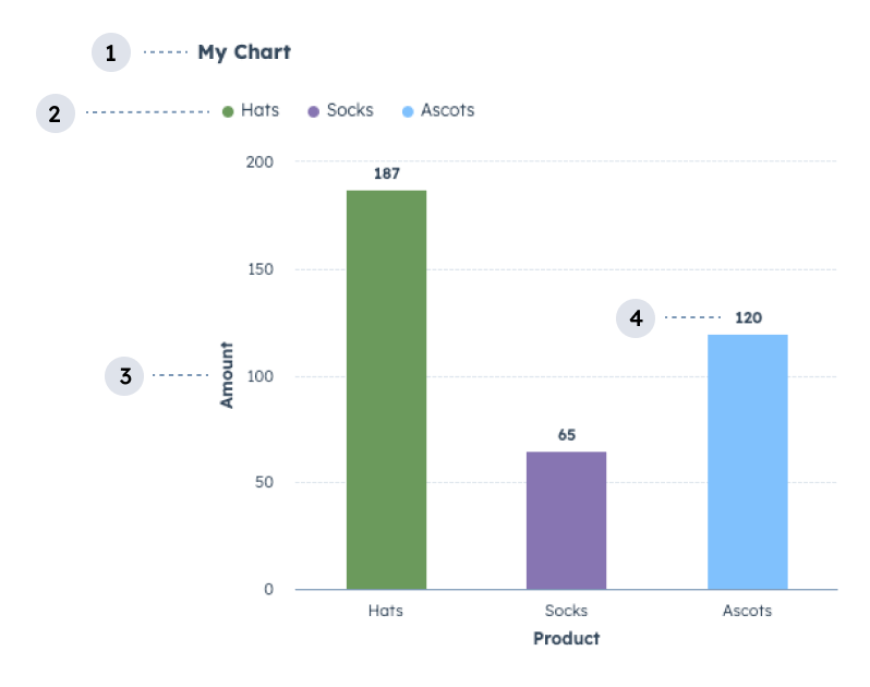
- Title: the title of the chart.
- Legend: lists the data categories with their corresponding color for readability.
- Axis label: the label for the axis.
- Data labels: labels for data points.
Props
| Parameter | Type | Description |
|---|---|---|
data | Object | An object containing the chart’s data in an array.
|
axes | Object | Configures the chart’s axes. Using the x and y fields, you’ll configure each axis individually with field and fieldType parameters, along with an optional label parameter:
options field to further configure the axes with the following options:
|
options | Object | Additional chart configuration options. Options include:
|
Colors
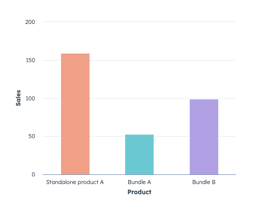
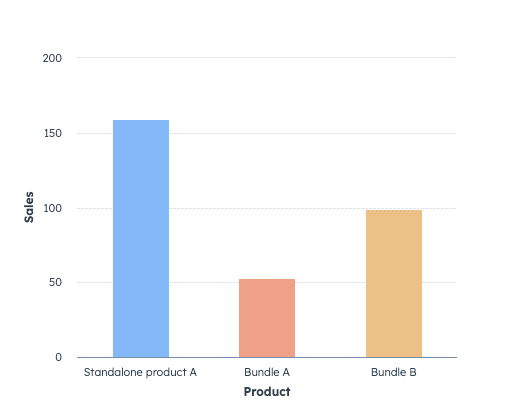
To apply colors to a chart for visual clarity, you can group data fields by color using thegroupFieldByColor parameter within the axes options. For example, the bar chart below use groupFieldByColor to add colors to each Product defined in the dataset.
groupFieldByColor configured for the axes:
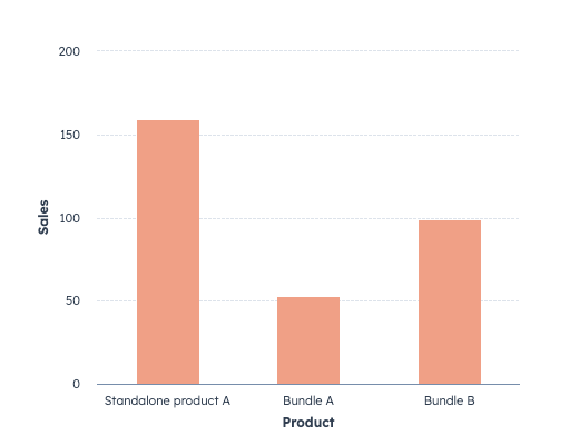
colorList field in the options prop, then specify the colors to pick from as shown below.
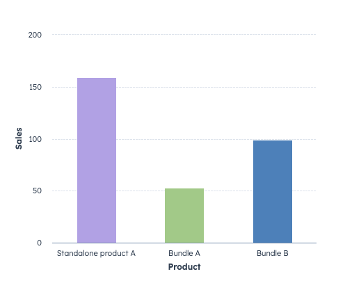
groupFieldByColor. To do so, include the colors field within the axes options, then specify each field value and color, as shown below. Learn more about colors.
Stacking
Use the stacking axes option to stack grouped data rather than rendering individual bars. For example, the following bar chart displays the number of deals by deal stage. The data also includes the sales rep who owns each deal. Because two sales reps have deals in the same deal stage,stacking has been set to true to visually combine the data into one bar.
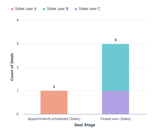
Because the
dealstage field data is not written in a human-readable format (e.g., appointmentScheduled), the data prop includes propertyLabels in its options to convert the labels. Note that the data prop formatting is slightly different to accommodate both the dataset and its options. Learn more about data options.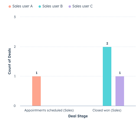
Guidelines
- DO: title your data categories with human-readable text so they are easy to understand.
- DO: use sentence-casing for the data categories and chart title (only first letter capitalized).
- DO: sort your data in ascending/descending order of your x-axis field to prevent unordered rendering prior to passing it to a charting component. If you intend to display information over time, your data will be displayed in the order you provide it.
- DO: display the chart legend if you’re graphing more than one category of data. This prevents your users from having to rely only on color to identify different data on your chart.
- DO: for readability, use larger surfaces to showcase charts, such as the record page middle column. Avoid using charts with many data points on smaller surfaces such as the preview panel or sidebar.
- DON’T: use more than 14 data categories unless it cannot be avoided for your use case.
- DON’T: use the same colors to indicate different data categories.